

- How the Best WordPress Site Examples Compare
- Top 10 Best WordPress Site Examples to Study
- 5 More WordPress Site Examples Worth Considering
- What the Best WordPress Site Examples Reveal About the Platform
- Design Patterns Shared by the Best WordPress Site Examples
- One Page and Long Scroll WordPress Design Ideas
- FAQ About the Best WordPress Site Examples
- Conclusion
The best WordPress site examples are not just pretty. They solve real publishing problems, they guide people fast, and they show how flexible WordPress can be when the brief gets bigger than a basic blog. In this roundup, we focus on sites worth studying if you want layout ideas, navigation ideas, and clearer answers to a simple question: what does good WordPress design actually look like in the wild? Some picks are huge public portals, some are brand-heavy editorial hubs, and some win because they do one thing unusually well.
How the Best WordPress Site Examples Compare
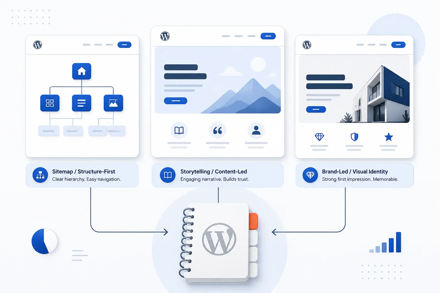
The fastest way to shortlist the right inspiration is to match each example to the lesson you need. Some of these sites are best for information architecture, some for storytelling, and some for brand personality without clutter. We would not copy any one site wholesale. We would study the part it does best, then apply that pattern to your own project.
FURTHER READING: |
| 1. How to Speed Up Ecommerce Website With 10 Fixes |
| 2. How to Build a WordPress Website Step by Step |
| 3. What Is a Content Delivery Network and How Does It Work? |
Quick Comparison of the Best WordPress Site Examples
| Example | Website Type | Best Lesson | Standout Site Element | WordPress Flavor | Score |
|---|---|---|---|---|---|
| The White House | Government portal | Deep information architecture | Search, livestream, video library, newsletter | WordPress VIP | 4.9 |
| NASA | Government science hub | Large topic libraries without chaos | Suggested searches, mission index, NASA+ | WordPress Enterprise | 4.9 |
| Spotify For the Record | Brand newsroom | Editorial variety with strong visual rhythm | Topic chips and category split | WordPress | 4.8 |
| TechCrunch | News publication | High-volume publishing flow | Topic nav, search, newsletter stack | WordPress Enterprise | 4.7 |
| Taylor Swift | Artist brand site | Fan hub design that keeps momentum | Shop, archive, sign-up, microsites | WordPress Enterprise | 4.6 |
| The Atavist Magazine | Longform publication | Immersive article presentation | Subscribe, archive, issue-led storytelling | WordPress | 4.8 |
| Noma | Restaurant brand site | Atmosphere-driven storytelling | News sign-up and shop handoff | WordPress | 4.6 |
| Microsoft Source | Corporate newsroom | Utility-first enterprise publishing | AI search and press tools | WordPress | 4.7 |
| PlayStation.Blog | Gaming news hub | Community publishing at scale | Category search and language support | WordPress | 4.7 |
| Harvard University | University portal | Institution-wide content hub design | Academics, research, Gazette, quick links | WordPress Multisite | 4.8 |
How We Researched and Evaluated Each Example
We looked at the live sites first, then cross-checked WordPress-specific details through WordPress showcase pages, official documentation, and public review listings where they existed. We also scored the top 10 examples consistently instead of treating fame as a shortcut to a high rank.
- Purpose fit: we judged whether the homepage makes the site’s job obvious within a few seconds, whether that job is public information, publishing, sales support, or community engagement.
- Navigation quality: we looked for search, clear menu groupings, archives, topic paths, and other signals that a site can handle growth without becoming a maze.
- Design clarity: we favored sites that communicate brand personality quickly but still keep content readable and actions easy to spot.
- Accessibility and trust cues: we gave extra credit when the site shows clear search behavior, service information, accessibility support, policy links, or structured ways to reach key content.
- WordPress stretch: we scored higher when an example proves the platform can handle more than a simple blog, such as enterprise newsrooms, longform storytelling, or distributed university publishing.
Our scores are editorial judgments from this research. They are meant to help you prioritize what to study first, not to mimic a third-party rating.
Top 10 Best WordPress Site Examples to Study
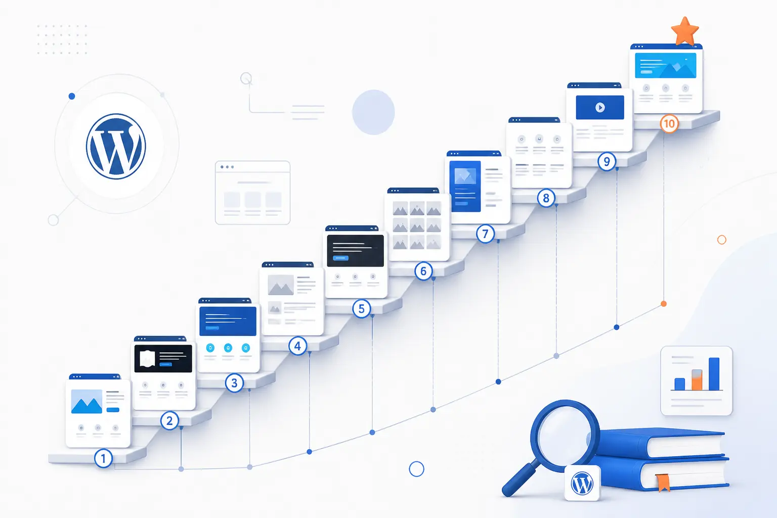
If you only have time to study a handful of examples, start here. These ten sites show the widest range of what WordPress can do, from government-scale publishing to magazine storytelling to brand-led fan experiences. We ranked them by how useful they are as design references, not by brand size alone. In other words, we care more about what you can learn from the site than how famous the organization is.
1. The White House
- Category: Government portal
- Best for: Studying large-scale public information architecture
- Platform flavor: WordPress VIP
- Standout feature: News, media, and public-action paths in one menu system
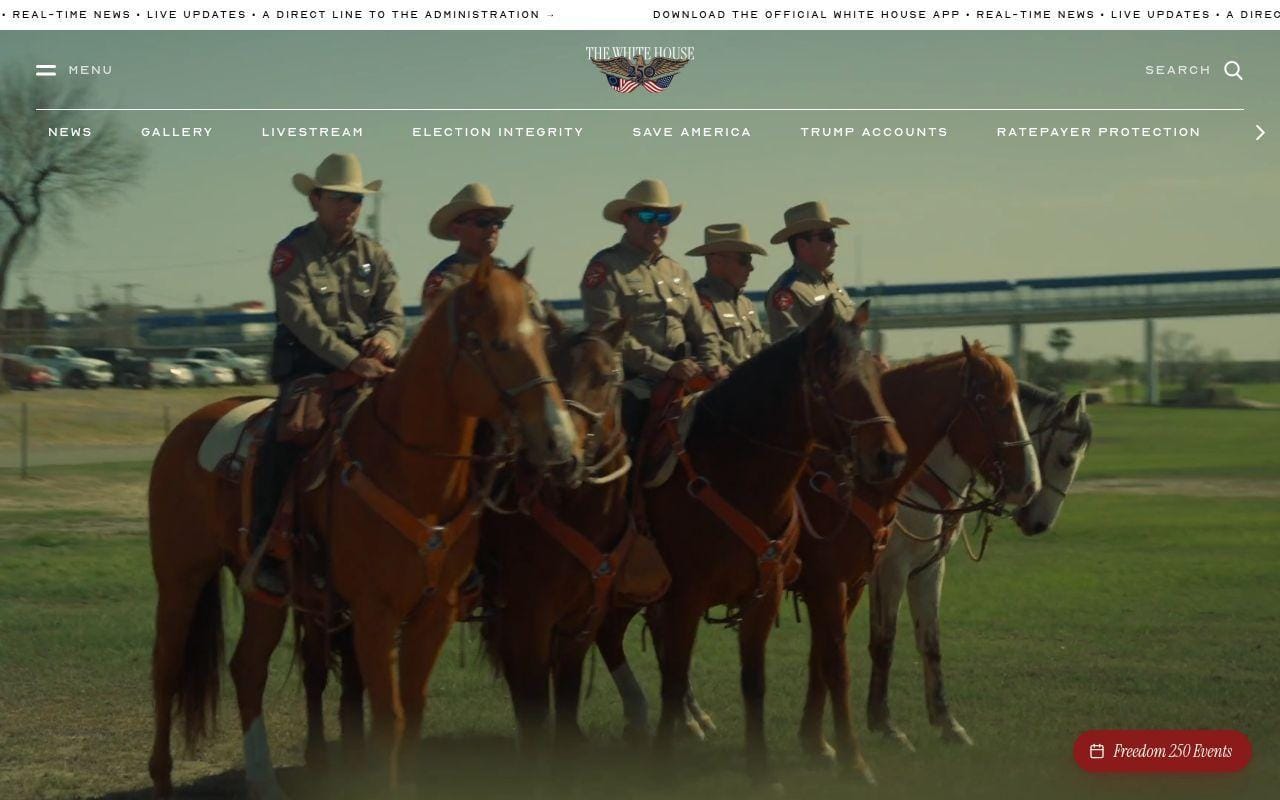
Few WordPress examples have to serve as many audiences at once as this one. Journalists, citizens, staff, and casual visitors all arrive with different goals, yet the site still pushes them into a few predictable pathways. That is exactly why we rank it first. If you want to see how WordPress can power a serious, high-visibility publishing machine, this is one of the clearest places to look.
What makes it especially useful as inspiration is not the politics. It is the structure. The homepage, mega-menu, media library links, and public sign-up options show how a content-heavy site can still feel directed instead of random.
How The White House organizes information
The menu does the heavy lifting. It groups the site into News, Administration, Media, Priorities, About The White House, and Get Involved, which instantly tells visitors how the institution thinks about its content. Under News, the site breaks publishing into Briefings & Statements, Fact Sheets, and Presidential Actions, then drills further into Executive Orders, Nominations & Appointments, Presidential Memoranda, and Proclamations. Media gets its own path with Photo Gallery, Video Library, Livestream, and White House Wire. There is also a prominent site search and a newsletter sign-up flow, plus app and text-alert prompts.
That combination is worth studying because it blends editorial publishing with service-style navigation. Many business sites overdo brand polish and underdo utility. This one does the reverse, and that is usually the smarter move once a site becomes a genuine information hub.
Who is The White House for?
We would study this example for city portals, universities, hospitals, trade groups, documentation centers, and any site that needs to organize a lot of public-facing content. It is also strong for teams that publish updates daily and need different content types to remain easy to find.
Small brochure sites should probably look elsewhere. The menu depth, content density, and institutional tone are overkill if your job is to explain five services and collect leads.
What to borrow from The White House
- Primary menu logic: split by user intent, not by internal department names alone.
- Content typing: separate releases, statements, fact sheets, and actions so archives stay usable.
- Media access: give video, image, and live coverage their own obvious path.
- Engagement layer: include newsletter, app, and contact routes without burying them.
Pros and cons
Pros
- Clear high-level navigation for a very large content set.
- Search, livestream, gallery, and video library all have visible entry points.
- Different content formats are named explicitly, which helps archives age well.
Cons
- The homepage copy is highly agenda-driven, so the design reference is stronger than the messaging reference.
- The mega-menu is dense enough to overwhelm small-site owners.
- It is more useful for structure ideas than for visual style ideas.
The White House rating and reviews
We did not find a meaningful independent review profile for this federal information portal, which is normal for a site in this category.
Our verdict is simple. Study this one when you need order, hierarchy, and publishing discipline. It is not the flashiest example in the list, but it is one of the most instructive.
2. NASA
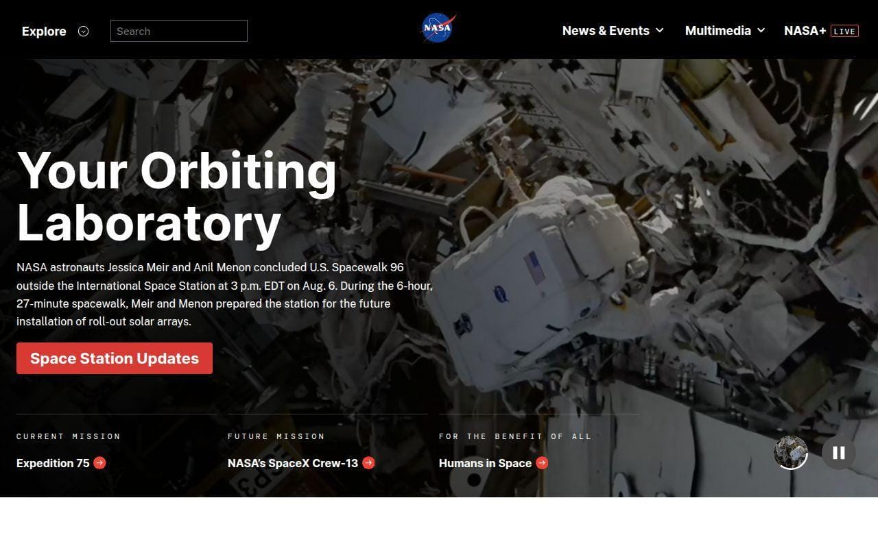
- Category: Government science hub
- Best for: Topic-rich sites that need strong discovery tools
- Platform flavor: WordPress Enterprise
- Standout feature: Search-led exploration of missions, media, and learning resources
When a site has to cover missions, education, images, launches, live programming, and decades of public interest, weak navigation shows fast. NASA does not collapse under that weight. Instead, it turns scale into a feature, which is why we place it near the very top.
This is one of the best WordPress site examples for anyone building a content library that needs both curiosity and control. Visitors can browse by mission, topic, media type, or current event without losing the thread.
How NASA organizes information
The top level splits the site into News & Events, Multimedia, NASA+, Missions, Humans in Space, Earth, Solar System, Universe, Science, Aeronautics, Technology, Learning Resources, About NASA, and Español. That already does two things well. First, it helps repeat visitors jump straight into a subject area. Second, it gives first-time visitors a map of the whole institution.
The details are just as useful. NASA surfaces Suggested Searches on the homepage, includes a Search All NASA Missions tool, an A to Z List of Missions, and direct links to Upcoming Launches and Landings. On the media side, it keeps NASA+, Images, NASA Live, Podcasts, apps, and Image of the Day within easy reach. This is exactly the kind of structure that content-heavy organizations should imitate.
Who is NASA for?
We would borrow from NASA if we were designing for museums, public agencies, research groups, publishers with deep archives, or education brands with many subject tracks. It is especially good for projects where search and browse need to work together.
It is less useful if your site only has a few core pages. A smaller business can copy the logic, but not the scale.
What to borrow from NASA
- Suggested searches: great for large sites where users may not know your exact taxonomy.
- Index pages: mission directories and A to Z pages reduce dead-end navigation.
- Parallel paths: the same subject can be reached through news, missions, or media.
- Mixed audiences: science topics and learning resources live side by side without confusion.
Pros and cons
Pros
- Exceptionally strong browse structure for a massive subject library.
- Search is supported by suggested topics rather than left to guesswork.
- Video, live content, podcasts, and images are treated as first-class content, not extras.
Cons
- The density can feel intimidating if you only came for one quick answer.
- Visual style is functional first, so it is stronger as a UX reference than as a brand-mood reference.
- Small teams may not have enough content to justify this many paths.
NASA rating and reviews
Mainstream public review platforms do not offer a useful score for NASA’s primary site, so there is no independent rating worth quoting here.
If your project lives or dies by discoverability, NASA is a must-study. It proves that a big WordPress site does not have to feel bloated.
3. Spotify For the Record
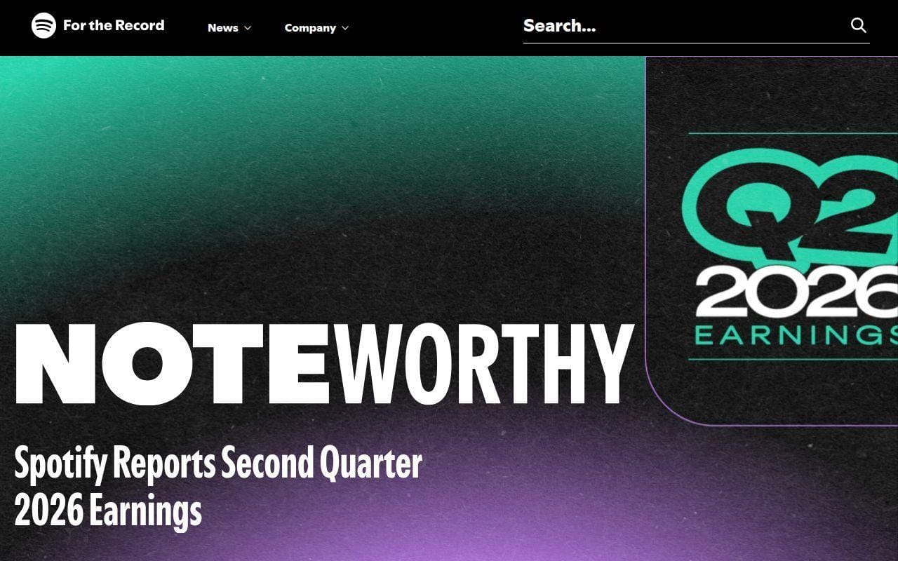
- Category: Brand newsroom
- Best for: Companies that need news, culture, and product stories in one place
- Platform flavor: WordPress
- Standout feature: Editorial categories and playful topic-led browsing
A lot of corporate newsrooms feel like filing cabinets. This one feels like publishing. That difference matters. Spotify’s newsroom keeps its business updates, creator stories, culture pieces, and product narratives under one roof without flattening them into a sterile press center.
We rank it highly because it shows how a brand can stay lively while still being organized. If your company blog feels dull, this is a better reference than yet another SaaS landing page.
How Spotify For the Record works
The site divides content into News & Announcements, Artists & Creators, Culture & Trends, and Behind the Business. It also supports browsing through Popular Topics such as Audiobooks, Podcasts, Wrapped, daylist, AI DJ, and Premium. That is a smart mix. Category pages explain the editorial lens, while topic chips help people jump into recurring themes.
The homepage also makes room for featured collections, search, and newer posts without feeling cramped. Instead of stacking text blocks endlessly, it uses a more magazine-like rhythm. That approach works especially well for companies that publish different story formats and do not want every post to look like a press release.
Who is Spotify For the Record for?
This is a strong model for tech brands, media companies, entertainment businesses, and startups that want a proper newsroom without losing personality. It is also useful for teams that publish to several audiences, including customers, press, creators, and investors.
If your site has no editorial pipeline, this may be too ambitious. A static brochure site will not benefit much from this level of category design.
What to borrow from Spotify For the Record
- Editorial splits: separate business news from human-interest stories and product updates.
- Topic chips: surface recurring themes before visitors hit a search box.
- Grid rhythm: mix article cards and featured sections to avoid visual monotony.
- Brand tone: keep the newsroom on-brand without making it hard to scan.
Pros and cons
Pros
- Excellent blend of brand personality and newsroom function.
- Topic-led browsing makes repeat visits easier.
- Category structure suits mixed audiences and mixed content types.
Cons
- Less helpful as a reference for service businesses that do not publish often.
- Some smaller brands may copy the visual energy without having the editorial depth to support it.
- The style is strong enough that careless imitation could feel derivative.
Spotify For the Record rating and reviews
We did not find a clean, site-specific public review profile for this newsroom, so there is no independent score we would treat as reliable.
This is one of the easiest examples to recommend to modern brand teams. It shows that WordPress can power a newsroom that feels current, not corporate by default.
4. TechCrunch

- Category: News publication
- Best for: Studying high-volume editorial publishing
- Platform flavor: WordPress Enterprise
- Standout feature: Strong sectioning for nonstop content flow
Some sites make a great first impression and then fall apart once they publish a lot. TechCrunch does the opposite. Its value as a reference comes from volume. The homepage has to support constant publishing, multiple beats, events, and newsletters, and it still keeps clear lanes for readers.
That makes it one of the most practical WordPress site examples on this list. You may not want its exact style, but the publishing system behind the look is worth studying.
How TechCrunch works
The site foregrounds a beat-based navigation with Latest, Startups, Venture, Apple, Security, AI, Apps, Events, Podcasts, and Newsletters. Search is visible right in the top interface. Lower on the homepage, it breaks out sections like Upcoming Events, Newsletters, AI, and Startups, which keeps the endless stream of stories from turning into one long wall of cards.
The newsletter section is especially telling. Instead of one generic sign-up, TechCrunch lists named options such as TechCrunch Daily News, Startups Weekly, Week in Review, and TechCrunch Mobility. That is a good reminder that high-frequency sites should segment subscriptions by reader interest, not force everyone into one inbox funnel.
Who is TechCrunch for?
We would study TechCrunch for magazines, newsrooms, startup media brands, association publications, and content teams that publish every day. It is also a useful reference if your site needs events and editorial to coexist cleanly.
It is a weak fit for minimalist portfolio sites. The page density is intentional here, but it would feel noisy on a lower-volume project.
What to borrow from TechCrunch
- Beat navigation: organize content by recurring interests, not just chronology.
- Section breaks: use homepage modules to control pace on high-volume sites.
- Newsletter segmentation: give users topic-specific subscription choices.
- Editorial plus events: let conference promotion live beside journalism without swallowing it.
Pros and cons
Pros
- Built for heavy publishing and frequent updates.
- Clear beat structure helps readers self-sort fast.
- Newsletters and events are integrated into the editorial ecosystem.
Cons
- The homepage is busy by design, which will not suit every brand.
- Visual inspiration is modest compared with more art-directed examples here.
- Smaller teams can copy the structure more safely than the full density.
TechCrunch rating and reviews
- Trustpilot: rated 2.6/5 across 13 reviews.
For pure publishing mechanics, TechCrunch still deserves serious study. It is not the prettiest site in this roundup, but it is one of the most useful if your content output is relentless.
5. Taylor Swift
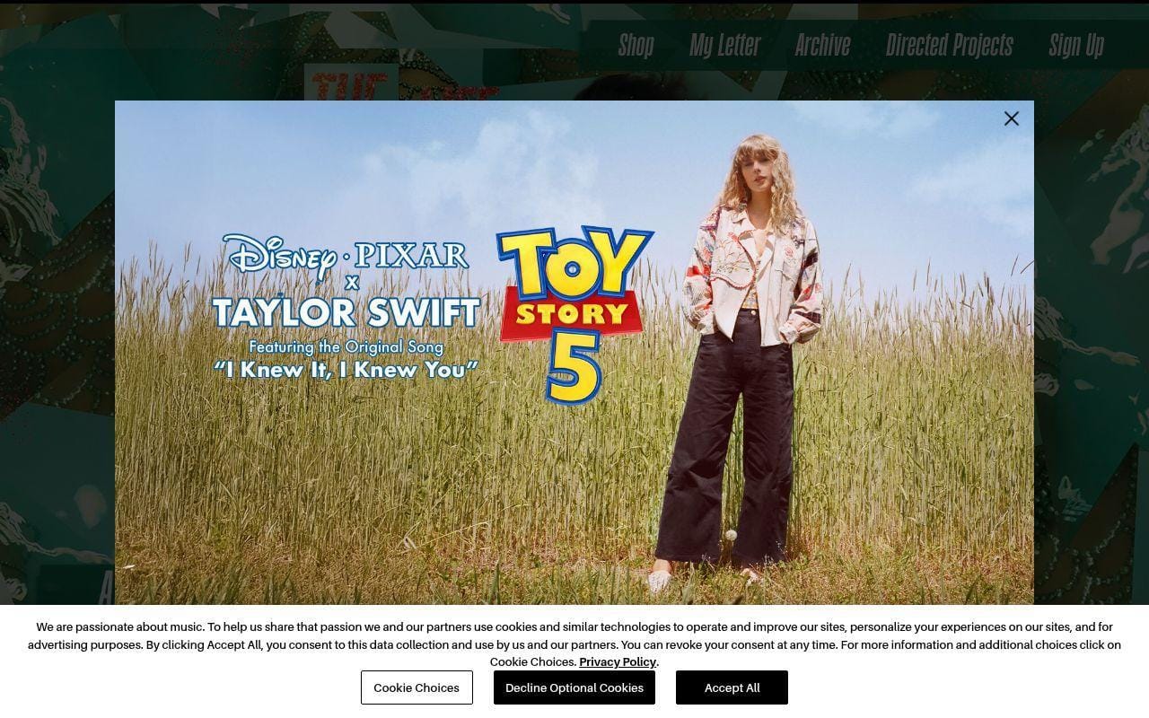
- Category: Artist brand site
- Best for: Fan hubs that need commerce, archive, and campaign pages together
- Platform flavor: WordPress Enterprise
- Standout feature: Main-site structure that hands off smoothly to shops and microsites
Not every inspiration site needs to be information-dense. Sometimes the lesson is momentum. Taylor Swift’s site is a good example of how WordPress can anchor a celebrity or campaign-driven brand without trying to keep every experience on one page.
We like this one because it understands what visitors want. Shop access is immediate, sign-up is easy to find, archival content has a place, and major campaign moments can branch into dedicated microsites. That is a smart pattern for any brand with recurring launches.
How Taylor Swift works
The core navigation is short and intentional: Shop, My Letter, Archive, Directed Projects, Sign Up, and Social. The homepage quickly hands visitors to the current merchandise push, then supports deeper exploration through archive material and campaign-specific experiences. It also links out to microsites for eras and tour-related content, which prevents the main site from becoming cluttered every time a major release lands.
The supporting details matter too. The homepage includes clear assistance text for visitors using a screen reader, which is a small but useful reminder that branded sites still need practical help content. In short, the site works less like a traditional content hub and more like a launchpad.
Who is Taylor Swift for?
This is a strong reference for artists, creators, entertainment brands, event-led businesses, and consumer brands with big campaign cycles. It is also useful for teams that need a home base plus spin-off landing environments.
If you run a content-heavy publication, this should not be your main model. Its strength is fan journey design, not archival discovery.
What to borrow from Taylor Swift
- Short navigation: keep only the actions fans actually need.
- Campaign handoffs: use microsites for major launches instead of cramming everything into one template.
- Archive path: preserve past eras without fighting the current release.
- Shop-first logic: put commercial intent in the open when that is the job.
Pros and cons
Pros
- Very clear fan-action paths with shop, archive, and sign-up all easy to find.
- Microsite handoffs help the main site stay focused.
- Strong example of campaign-driven brand design on WordPress.
Cons
- Less useful if your site depends on rich on-site publishing.
- The homepage is heavily shaped by current releases, so long-term browsing is not the main event.
- It is easy to copy the look and miss the underlying fan-journey logic.
Taylor Swift rating and reviews
- Trustpilot: rated 1.3/5 across 201 reviews.
As a design reference, this is best used selectively. Borrow the campaign structure, the archive idea, and the clear action paths. Leave the celebrity scale assumptions behind.
6. The Atavist Magazine
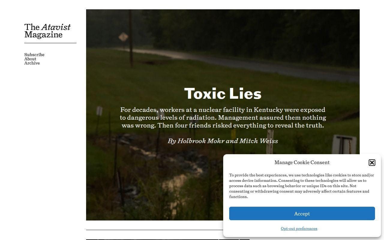
- Category: Longform publication
- Best for: Editorial storytelling and immersive reading
- Platform flavor: WordPress
- Standout feature: Magazine pacing that feels premium without being hard to use
Here is the proof that WordPress does not need to look templated. The Atavist Magazine is one of the strongest examples in this list for anyone who wants storytelling first. It feels curated, cinematic, and restrained, which is a tough combination to get right.
We rank it high because it teaches a very specific lesson. If your content deserves slower reading and stronger atmosphere, this is a better model than a standard blog grid.
How The Atavist Magazine works
The homepage stays focused. Subscribe, About, and Archive are the primary utility links, while current and featured stories take center stage. The site frames stories like issues, not disposable posts. It also supports updates, author audio tie-ins, and archival navigation without making those elements compete with the lead feature.
That pacing is the key takeaway. The homepage does not scream for clicks from every direction. Instead, it uses whitespace, issue framing, and carefully sequenced story modules to make one article feel worth entering. If your brand produces deep interviews, essays, or investigative work, that choice matters.
Who is The Atavist Magazine for?
We would recommend this example to magazines, studios, nonprofits with feature storytelling, branded editorial teams, and founders building thought-leadership publications that need more than a standard blog.
It is not the right model for fast-moving news. When the goal is frequency, this level of art direction can slow you down.
What to borrow from The Atavist Magazine
- Issue framing: package stories as editorial events, not just entries in a feed.
- Focused utilities: keep subscribe and archive visible, but secondary.
- Homepage pacing: let one or two stories breathe.
- Archival respect: treat older work as an asset, not clutter.
Pros and cons
Pros
- Excellent example of premium longform presentation.
- Archive and subscription support are present without hijacking the reading mood.
- Shows how WordPress can feel editorially custom.
Cons
- Less adaptable for sales-led or utility-led websites.
- Requires strong content to justify the presentation style.
- Teams chasing volume may find the model too deliberate.
The Atavist Magazine rating and reviews
We did not find a public review listing with enough relevance to quote for this publication, which is common for magazine-style editorial sites.
If your site lives on story quality, move this one near the top of your inspiration stack. It is one of the clearest examples of WordPress doing atmosphere well.
7. Noma
- Category: Restaurant brand site
- Best for: High-end hospitality and visual brand storytelling
- Platform flavor: WordPress
- Standout feature: Editorial mood paired with clear commerce and updates
Hospitality sites often swing too far in one of two directions. They either drown you in mood with no useful next step, or they reduce the brand to a reservation button and a few photos. Noma finds a better middle ground. That is why it earns a place in the top 10.
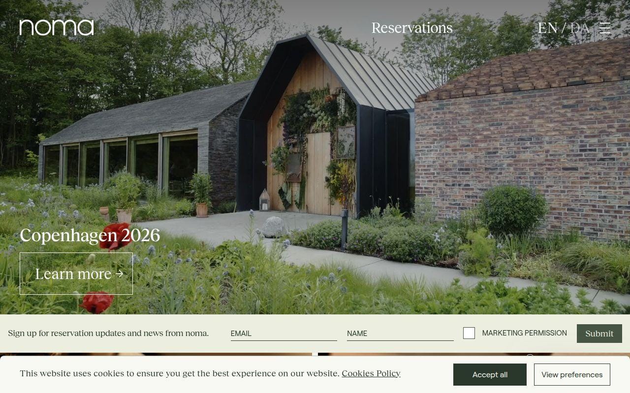
What we like here is the confidence. The site uses story, imagery, and seasonal framing, but it still gives visitors obvious routes to sign up for reservation updates, learn about the current concept, and buy pantry products.
How Noma works
The homepage opens with the current concept and a clear Learn more prompt, then moves quickly into sign-up for reservation updates and news. From there, it hands off to Noma Projects shopping flows and supporting brand stories. On the live page we reviewed, the site also surfaced a current destination theme and a letter-style editorial update, which gives the whole experience more narrative continuity than a normal restaurant site.
The smart part is the handoff. Commerce lives on the site’s edges through project shopping and subscriptions, while the core site still feels like a brand and editorial home. For premium hospitality, that balance is hard to fake.
Who is Noma for?
This is a strong reference for restaurants, hotels, travel brands, luxury retail, creative studios, and food companies that need to sell an experience before they sell a product. It is especially strong for brands with seasonal or campaign-like storytelling.
If your site’s main purpose is pure utility, such as menu lookup or simple bookings, this may feel too atmospheric.
What to borrow from Noma
- Story-first homepage: lead with the current chapter of the brand.
- Sign-up placement: pair emotional storytelling with a useful subscription offer.
- Commerce handoff: connect products without turning the homepage into a store grid.
- Seasonal framing: let the site reflect a specific program or destination when needed.
Pros and cons
Pros
- Strong brand atmosphere without losing practical actions.
- Good example of editorial storytelling for hospitality.
- Sign-up and shop paths are present but not pushy.
Cons
- Can feel too mood-led for straightforward local businesses.
- Navigation is lighter than on information-heavy sites.
- Success depends heavily on strong photography and story discipline.
Noma rating and reviews
We did not find a useful public review profile for the site itself, so there is no independent website score to report here.
Use Noma when you want a site to feel like entering a world. Just make sure your content can carry that ambition.
8. Microsoft Source
- Category: Corporate newsroom
- Best for: Enterprise communications hubs
- Platform flavor: WordPress
- Standout feature: News publishing paired with press utility tools
Corporate news hubs do not need to be exciting. They need to be useful. Microsoft Source succeeds because it treats newsroom design as an information service, not just a brand expression. That practical angle is why it ranks above several prettier sites.
We think it is especially instructive for B2B brands. The site is not trying to impress with flashy design tricks. It is trying to help journalists, customers, investors, and employees find the right material fast.
How Microsoft Source works
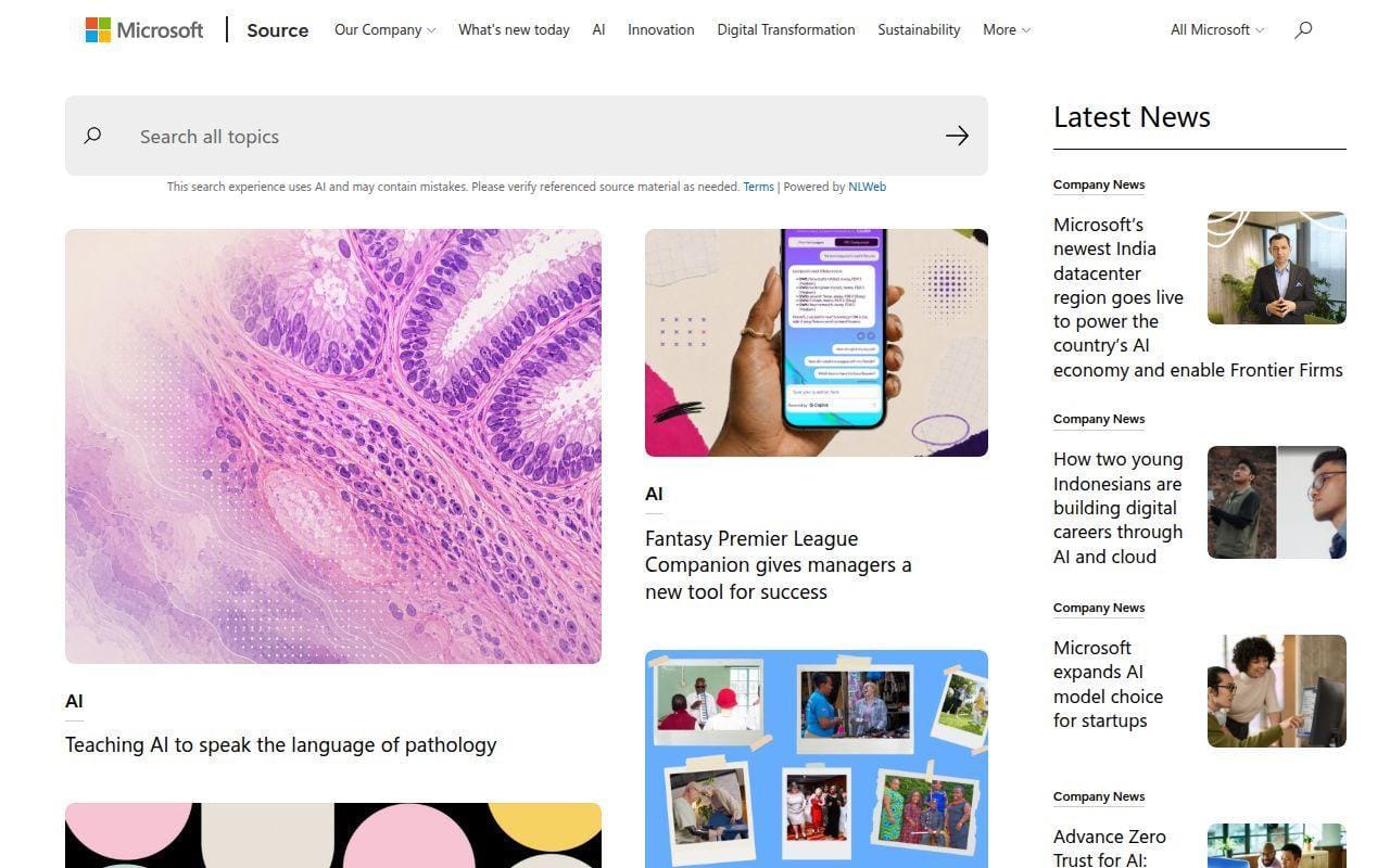
The site leads with a search box for all topics, then organizes current stories under named categories such as AI, Diversity & Inclusion, and Company News. It also gives a Latest News area plus a Press Tools block with links to press releases, company facts, executive biographies, investor relations, and more resources. That layout tells you immediately that the site is built for both discovery and verification.
One modern detail stands out. The search interface includes an AI note that tells users to verify referenced source material. We appreciate that candor. Whether or not you want AI search on your own site, the lesson is clear: if you add it, set expectations plainly.
Who is Microsoft Source for?
We would study this example for software companies, public companies, enterprise vendors, major nonprofits, and any organization that needs a central news hub with press-friendly utilities.
It is less relevant for small brands that do not maintain a formal news function. Without steady publishing, the structure will feel oversized.
What to borrow from Microsoft Source
- Search-first thinking: let experienced visitors jump straight to the topic they need.
- Press tools block: give journalists and analysts a dedicated utility area.
- Category labels: make it clear what kind of story a visitor is entering.
- Expectation setting: explain new search behavior rather than hiding it.
Pros and cons
Pros
- Very practical structure for enterprise communications.
- Strong separation between stories and newsroom utilities.
- Search is central instead of buried.
Cons
- Visual inspiration is modest compared with more art-directed picks.
- Feels formal, which may not suit consumer-facing brands.
- Best value comes from organizations with real press workflows.
Microsoft Source rating and reviews
We did not find a site-specific review listing for this newsroom that was accurate enough to cite, so no independent score is available.
For B2B and enterprise teams, this is one of the safer references in the whole list. It values utility, and that usually ages better than novelty.
9. PlayStation.Blog
- Category: Gaming news hub
- Best for: Community publishing and category-heavy editorial
- Platform flavor: WordPress
- Standout feature: Search, category filtering, comments, and language reach
Gaming audiences are fast-moving, opinionated, and very good at spotting clutter. PlayStation.Blog works because it respects those habits. It gives readers immediate category routes, prominent search, and clear article packaging without dressing everything up too much.
This site earns its place because it blends official announcements with community energy. That balance makes it a useful reference well beyond gaming.
How PlayStation.Blog works
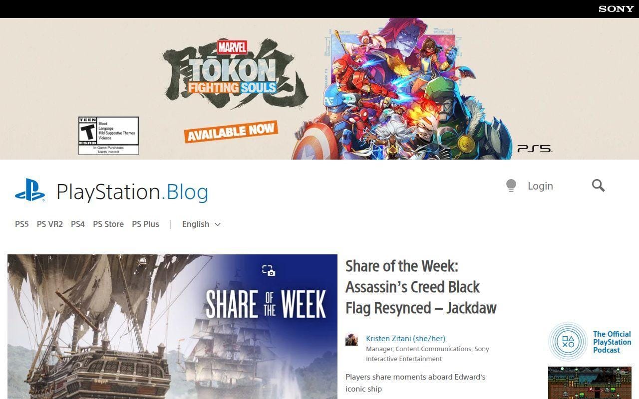
The top of the site surfaces categories for PS5, PS VR2, PS4, PS Store, and PS Plus, plus a search field for the blog itself. It also supports log in to comment, which gives the site a more participatory feel than many one-way corporate blogs. Another strong detail is language support. The interface links out to multiple regional language versions, which is a smart reminder that international content hubs need more than simple translation widgets.
On the homepage, article cards pair clear titles, author information, dates, and engagement counts. That is useful if your brand publishes news that fans will discuss rather than simply consume.
Who is PlayStation.Blog for?
We would study this site for entertainment brands, media publishers, app ecosystems, hardware brands, and any project that needs official news plus community discussion cues. It is also strong for organizations with multiple product lines.
It is not ideal for brands that want a minimalist luxury feel. The blog is designed for activity, not quiet elegance.
What to borrow from PlayStation.Blog
- Product-line categories: make each major product family a first-class navigation path.
- Visible search: never assume category browsing alone is enough.
- Comment-ready framing: show authorship and discussion cues clearly.
- Regional support: plan for language or market variations early.
Pros and cons
Pros
- Clear category structure for a large, fast-moving content stream.
- Strong fit for official news plus community-style engagement.
- Multi-language footprint adds credibility for global brands.
Cons
- The style is more functional than distinctive.
- Can feel busy if your content volume is low.
- Less useful for purely service-based businesses.
PlayStation.Blog rating and reviews
We did not find a public review page that cleanly represents the blog itself rather than PlayStation retail or network services, so we are not quoting a third-party score.
Study this one for product-led publishing. It is a good example of WordPress doing repeatable, community-friendly editorial work at scale.
10. Harvard University
- Category: University portal
- Best for: Institutional homepages with many sub-audiences
- Platform flavor: WordPress Multisite
- Standout feature: Broad subject coverage with clear academic and news pathways
University websites are hard to get right because they are rarely one site in spirit, even when they are one site in URL. Harvard handles that reality well. It gives academics, research, leadership, and news enough room to breathe while still presenting a coherent front door.
We include it in the top 10 because it is a strong model for any organization with many programs and many internal publishers. That is where WordPress really starts to show its depth.
How Harvard University works
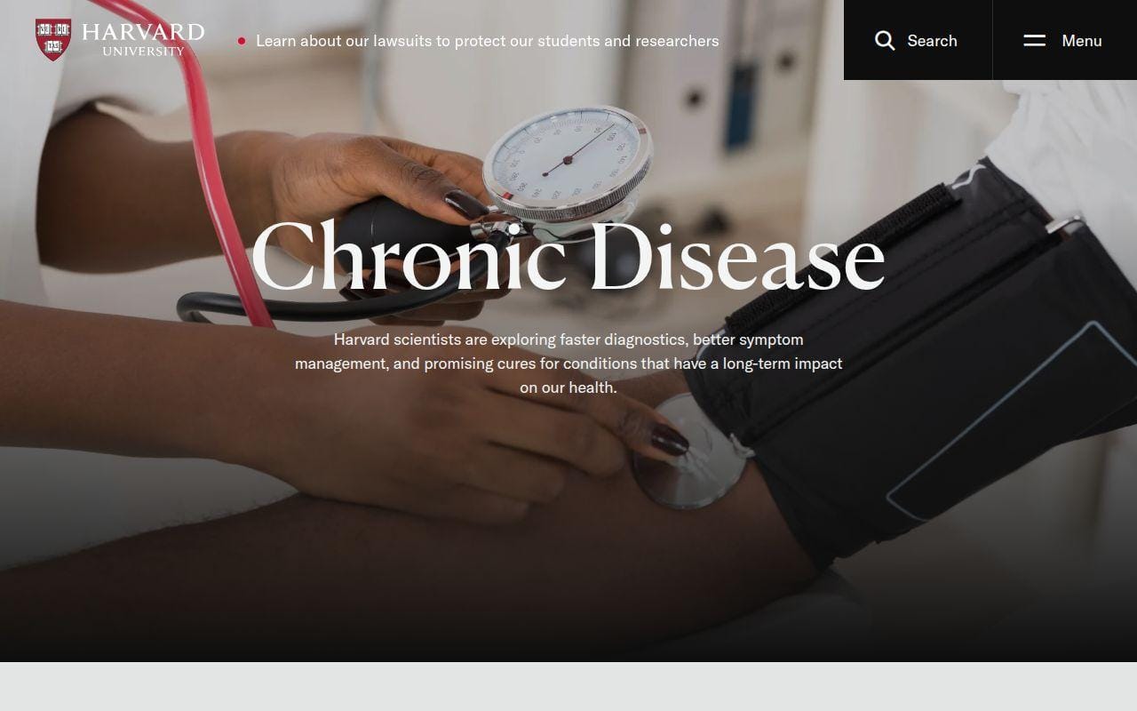
The homepage and mega-navigation break the institution into clear tracks, including Academics, About, and News. Within Academics, visitors can browse degree programs, professional and lifelong learning, online learning, and school-level destinations. In the news layer, the site routes people into The Harvard Gazette and trending stories, then offers a separate Daily Gazette sign-up path. It also features deeper research-led content modules and quick links to leadership, history, endowment, and community initiatives.
The design takeaway is not just that there is a lot here. It is that the site behaves like an orchestrator. It points visitors to the right part of a broader university ecosystem rather than pretending everything belongs on one page.
Who is Harvard University for?
We would study Harvard for universities, umbrella nonprofits, healthcare systems, enterprise groups with multiple sub-brands, and large associations. It is especially relevant if your homepage needs to direct visitors to many specialized areas.
Freelancers and local businesses should keep moving. This is front-door architecture for large institutions, not a small-site blueprint.
What to borrow from Harvard University
- Hub-and-spoke thinking: let the homepage route visitors instead of trying to contain everything.
- Audience-aware academics menu: group offerings by learner intent, not internal bureaucracy.
- News separation: keep newsroom content visible but distinct from core institutional pages.
- Quick-link depth: support history, governance, research, and school-level paths without chaos.
Pros and cons
Pros
- Strong front-door design for a very broad institution.
- Good balance between academic information and current storytelling.
- Useful reference for multisite-style ecosystems.
Cons
- The scope is far beyond what most businesses need.
- Navigation depth requires serious governance to stay clean.
- Visual style is more institutional than memorable.
Harvard University rating and reviews
We did not find a review listing that cleanly reflects the main university homepage rather than a separate school or program, so we are leaving out a third-party score.
Harvard closes the top 10 because it is a very practical model for large organizations. If your site is really a network in disguise, this is worth a close look.
5 More WordPress Site Examples Worth Considering

The next five did not crack our top tier, but they are still useful once you know what lesson you want. In some cases, they are more niche. In others, they are simply better as references for one specific pattern than as all-around examples. That still makes them worth your time.
11. Snoop Dogg
- Category: Artist brand site
- Best for: Music and entertainment hubs
- Starting point: Subscriber sign-up sits at the top of the experience
- Standout feature: News, releases, and tour dates on one homepage
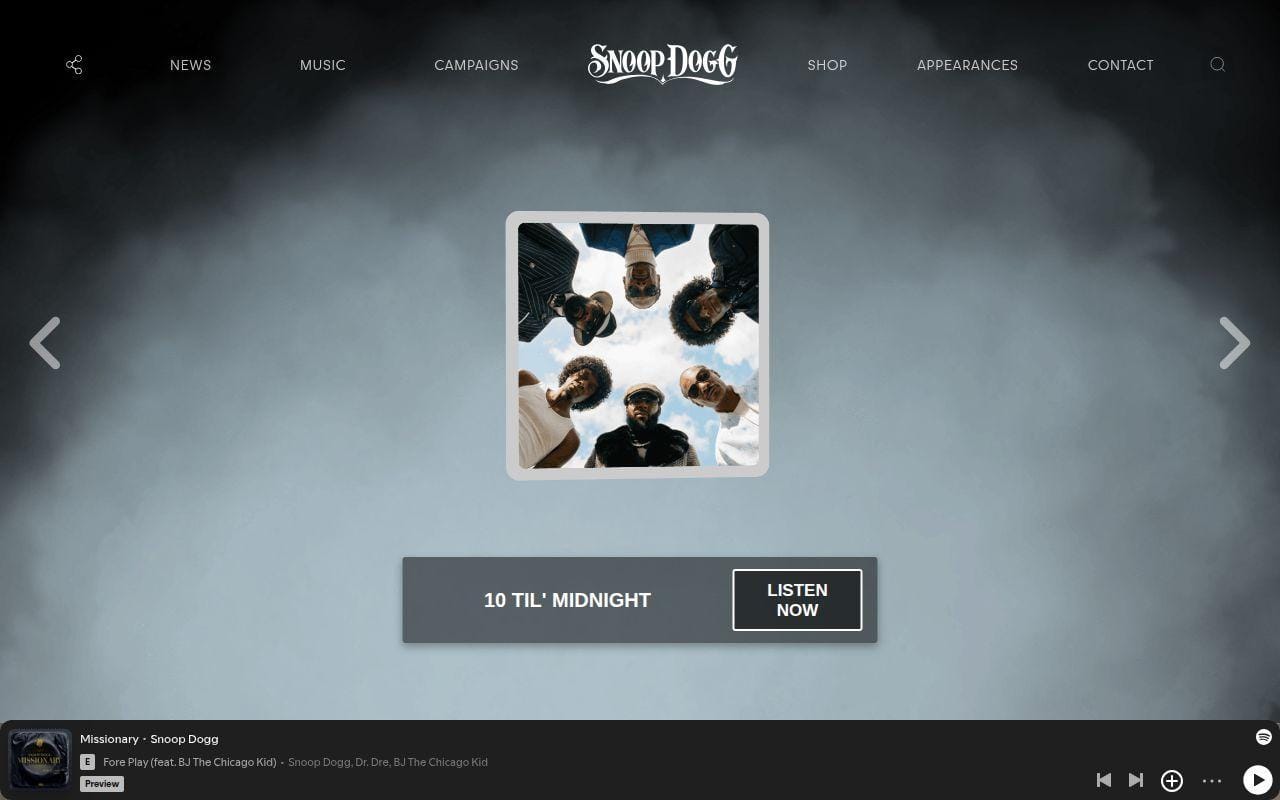
This one is less polished than the Taylor Swift example, but it is more direct. The site opens with a subscribe block for updates, then moves into recent news, featured releases, and tour dates. That makes it a practical reference for artists who need one site to support media coverage, discography highlights, and event promotion.
We also like that it does not hide the essentials. View All News, View Full Discography, and View Full Calendar are all explicit, which helps the site behave like a real fan hub instead of a vanity splash page.
What it does better than several higher-ranked entries is straightforward stacking. If you want a homepage that feels alive without getting too concept-heavy, this is a solid pattern. It keeps the content blocks familiar and scannable.
The tradeoff is visual distinctiveness. Compared with the stronger brand systems in the top 10, this one feels more functional. Still, for musicians and entertainment teams that need a newsletter-first site with current releases and event promotion, it is worth studying.
Who is Snoop Dogg for?
We would use this as inspiration for artists, podcasters, labels, and creator brands that need updates, releases, and events in one simple homepage flow.
12. The Mozilla Blog
- Category: Company blog
- Best for: Editorial programs tied to products and public-interest work
- Starting point: Clear topic rails for Firefox, policy, culture, and new products
- Standout feature: Blog, video, collections, and newsletter in one system
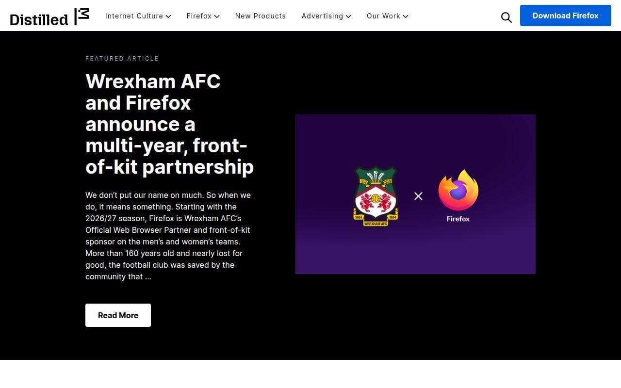
Mozilla’s blog is a good reminder that a company blog does not have to mean a reverse-chronological dump. The top navigation groups content into Internet Culture, Firefox, New Products, Advertising, and Our Work. That gives the blog a much cleaner editorial frame than most company-owned publications.
What it does better than several bigger news hubs is content packaging. Featured articles, featured video, featured collections, and newsletter signup all feel like parts of one editorial system. We think that is especially useful for brands that publish more than product updates and want room for ideas, policy, or education.
The site also mixes browse paths well. Visitors can enter through category menus, search, featured content, or recent posts. That flexibility matters once a blog serves both existing users and broader public readers.
This is not the most visually daring example, but it is one of the better references for a modern branded publication that still feels approachable. If your company blog needs more structure without turning into a formal newsroom, Mozilla is a smart middle ground.
Who is The Mozilla Blog for?
We would study this site for software companies, nonprofits, advocacy groups, and mission-driven brands that need a blog with several editorial lanes.
13. Astra
- Category: Theme brand site
- Best for: Product marketing with lots of feature explanation
- Starting point: Astra Pro starts at $69 per year for up to 3 websites
- Standout feature: Dense feature communication that still stays segmented
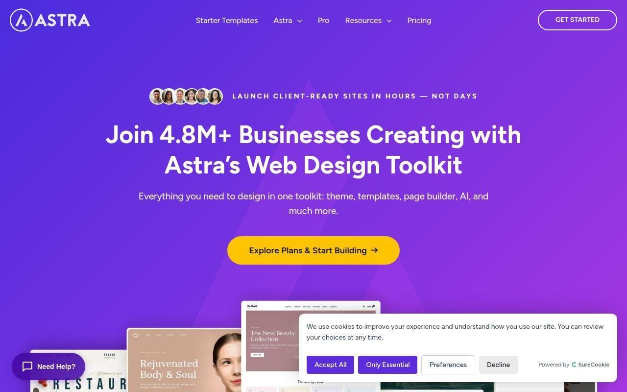
Astra makes this list for a different reason. We are not pointing to it because it is the most original brand site here. We are pointing to it because it shows how a WordPress business can explain a large product suite without making the homepage unusable.
The main site breaks the offer into Site Builder, No-Code Design, Blog Layouts, Mega Menu, Site Layouts, Header & Footer Builder, Starter Templates, Pro, and support resources. That is a lot of moving parts, yet the page still keeps distinct visual blocks and clear calls to action.
The pricing page is also useful as a reference. It segments buyers by project scale. Astra Pro + AI is positioned for smaller projects, Essential Toolkit + AI for freelancers managing multiple sites, and Business Toolkit + AI for agencies. If you sell layered plans, that kind of audience-based packaging is worth a look.
What Astra does better than many SaaS-style sites is feature chunking. It keeps dense information browseable. The risk, of course, is that the page can feel sales-heavy. Still, for product marketers, there is a lot to learn here.
Who is Astra for?
We would study Astra if you need to market a feature-rich digital product and explain several tiers without losing the visitor halfway down the page.
14. Plesk
- Category: Hosting platform site
- Best for: Technical product pages with role-based messaging
- Starting point: Web Admin Edition is listed from 12.04€/mo on the VPS pricing view
- Standout feature: Clear split between role messaging, extensions, and plans
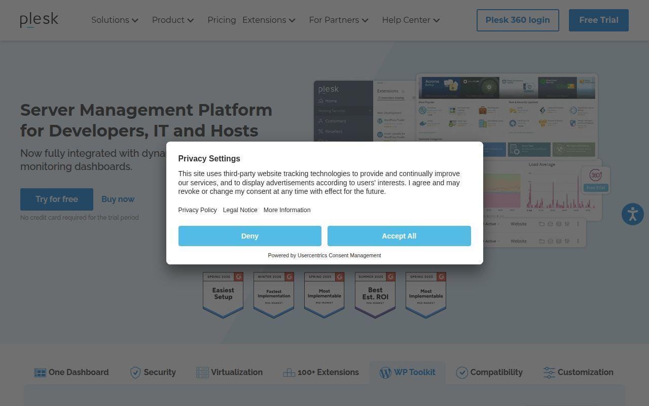
Plesk is a useful example when your site needs to speak to several technical audiences at once. The homepage frames the product for Developers, Content Managers, Digital Agencies, IT Admins, and Infrastructure Providers, then backs that up with concrete product areas like extensions, security, virtualization, and WP Toolkit.
That role-based structure is what makes it worth considering. A lot of technical brands say they serve everyone, then make everyone read the same vague copy. Plesk does a better job of separating needs without fracturing the whole site.
The pricing page keeps that logic going with Web Admin Edition, Web Pro Edition, and Web Host Edition, each tied to a clearer use case and domain allowance. For buyers who know they are comparing editions, that matters more than fancy design.
Visually, it is not a headline-grabber. Functionally, though, it is a strong reference for complex product marketing. If your own site serves distinct buyer types, Plesk is a better lesson than many prettier B2B homepages.
Who is Plesk for?
We would study Plesk for hosting, infrastructure, security, and developer-tool brands that need to explain editions, extensions, and audience-specific benefits cleanly.
15. National Organization on Disability
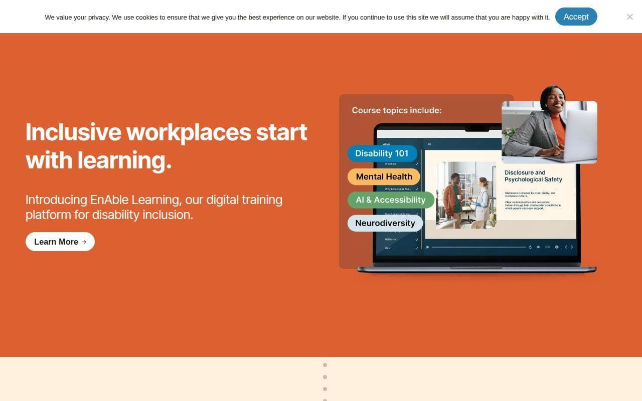
- Category: Nonprofit site
- Best for: Mission-led organizations with multiple stakeholder groups
- Starting point: The homepage routes employers, individuals, donors, and event attendees separately
- Standout feature: Strong audience-based navigation with learning offers
This is a smart nonprofit example because it does not assume every visitor wants the same thing. The navigation separates Driving Change, For Employers, For Individuals, Resources, About, Events, News, Donate, and Member Login. That is the right instinct for organizations balancing mission, training, advocacy, and fundraising.
What it does better than many nonprofit sites is audience labeling. Employers get products and offerings like Leadership Council, EnAble Learning, Employee Engagement Assessment, and Disability Inclusion Blueprint. Individuals get their own learning and community paths. That saves a lot of confusion.
The homepage also uses plain-language persuasion. It mixes mission statements, workforce inclusion arguments, event promotion, and clear join or donate routes. We think that is one of its strengths. It stays human without becoming vague.
This is not the most visually adventurous example in the roundup, but it is a practical reference for nonprofits and associations that need one site to do public education and program conversion at the same time.
Who is National Organization on Disability for?
We would study this site for nonprofits, associations, educational initiatives, and training-led organizations with several stakeholder audiences.
What the Best WordPress Site Examples Reveal About the Platform
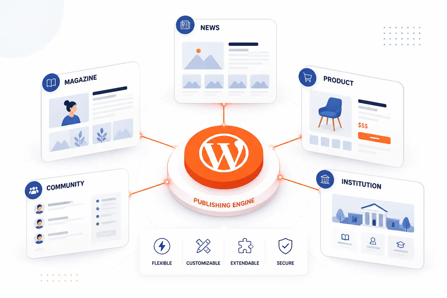
The big takeaway is simple. WordPress is still a publishing system first, and that is a strength, not a limit. Across these examples, the platform handles government information, magazine storytelling, product marketing, fan communities, and institutional hubs. According to 41.2% of all websites and 59.1% of sites with a known CMS, the platform remains deeply relevant, and this list helps explain why.
Government, Media, and High Traffic Publishing
The White House, NASA, TechCrunch, and PlayStation.Blog all show the same core truth. WordPress works best when the publishing job is clear and the taxonomy is disciplined. These sites succeed because they do not rely on decorative design to hide weak structure. They rely on categories, search, archives, and repeatable templates.
That lines up well with public-service guidance too. A federal memo on digital experience stresses accessible, searchable, digital-first public services, and the strongest government examples here follow that spirit closely. If you are building a large information site, this is the lesson to steal first.
Corporate, SaaS, and Brand Publishing Hubs
Spotify For the Record, Microsoft Source, Mozilla, Astra, and Plesk show how wide the middle ground is between a blog and a product site. These examples use WordPress as a publishing layer that explains launches, tells stories, supports SEO, and routes visitors to deeper commercial pages. That is one reason the block editor and pattern system matter so much now. The official guide to reusable layout patterns helps explain how teams can keep branded pages consistent without rebuilding every section from scratch.
The practical takeaway is this. If your marketing site needs fresh content but your design team wants consistency, WordPress is often strongest when it acts as a structured editorial system rather than a pile of custom pages.
Ecommerce, Nonprofit, Education, and Community Use Cases
Taylor Swift, Noma, Harvard, and the National Organization on Disability show a different side of the platform. These sites are not just publishing to inform. They are publishing to route people toward stores, programs, schools, events, or sign-up flows. That is why audience-aware navigation matters so much.
For bigger institutions, multisite thinking is part of the story as well. WordPress training on networked site structures for universities and multi-brand organizations mirrors what you can see in practice on large educational ecosystems. The platform is not one-size-fits-all, but it does adapt well when the content model is honest about how people enter and what they need next.
Design Patterns Shared by the Best WordPress Site Examples
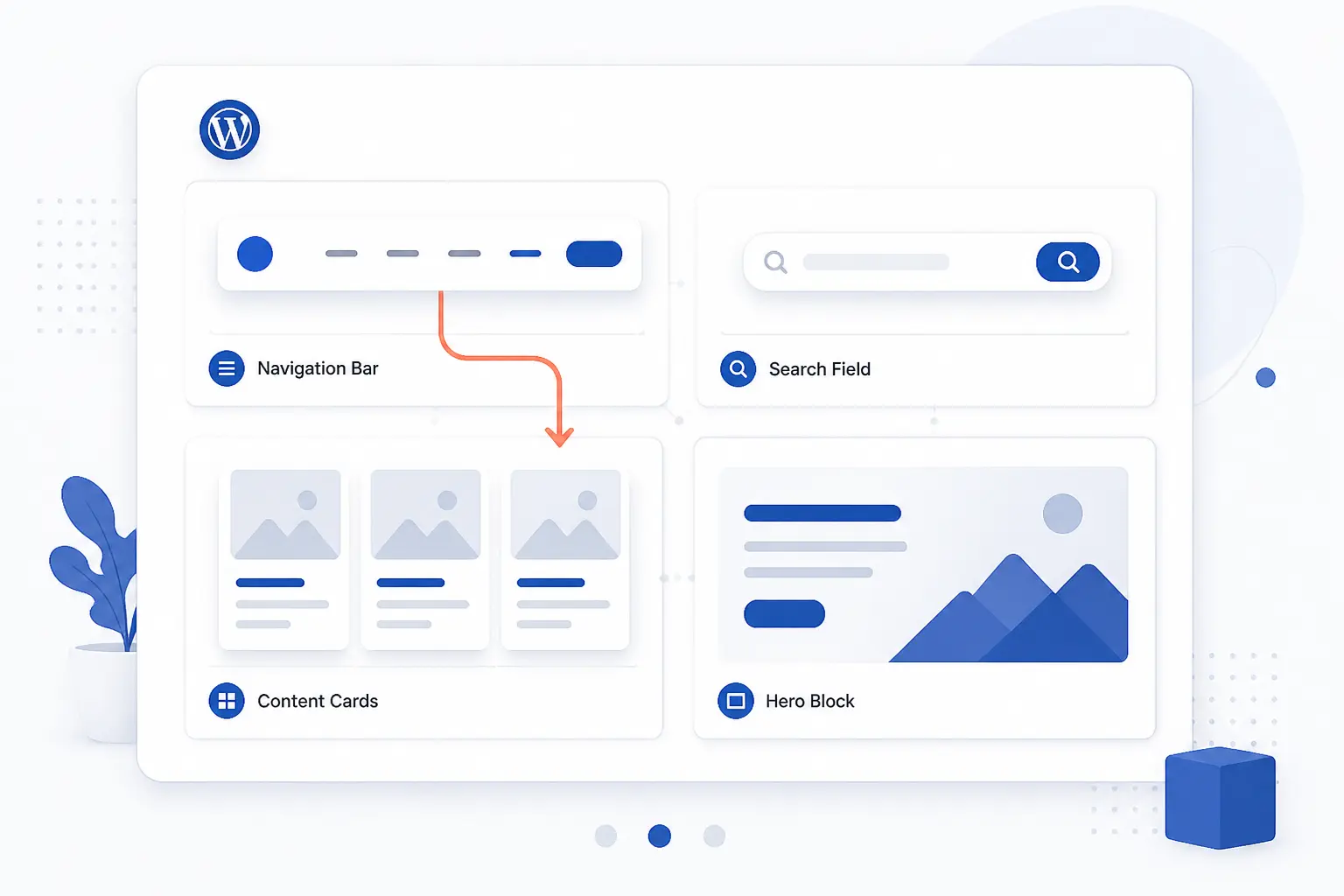
The best WordPress site examples do not all look alike, but they do repeat a few design habits. Those habits are more valuable than any one color palette or hero image style. If you are studying this list for ideas, focus on the reusable patterns below. They travel well across industries.
Clear Navigation, Search, and Content Hierarchy
The highest-ranked examples all respect hierarchy. NASA uses mission indexes and suggested searches. Microsoft Source centers topical search. PlayStation.Blog and TechCrunch lead with strong category rails. Even Noma, which is more mood-led, keeps a tight path to updates and shopping.
The pattern is not complicated. People need to know where they are, what bucket a page belongs to, and what to click next. WordPress itself supports this well through the media-rich editor and structured content tools, but the examples in this list show that good hierarchy still depends on editorial choices, not just software features.
Strong Hero Sections and Fast Value Communication
The better examples tell you the point of the site quickly. NOD spells out its mission and then points visitors to employers, individuals, resources, events, and donations. Astra explains its toolkit focus near the top. Harvard immediately signals academics, news, and broader university access. That speed matters.
We think this is one place beginners often go wrong. They build a pretty hero with weak copy and no route forward. The examples here do better because the top of the page is a decision aid, not just a billboard.
Image Led Storytelling, Video, and Brand Personality
Taylor Swift, Spotify For the Record, Noma, and The Atavist Magazine prove that WordPress can feel branded and expressive without becoming unreadable. They use visuals to set tone, but they still preserve obvious content groupings and clear actions. The trick is restraint. The image system serves the story. It does not replace the story.
That is where patterns help again. When sections repeat with discipline, visual flair can sit on top without breaking usability. A creative team can move much faster if it is building on a reusable system instead of re-arguing every block layout from zero.
Accessibility, Trust Signals, and Conversion Paths
The most credible examples here also show their homework on trust. NASA states that its web pages are designed to meet or exceed Section 508 and WCAG 2.0 Level AA. Harvard’s digital accessibility policy expects university digital content to conform to applicable accessibility standards as fully as possible. Those are not decorative promises. They shape how people move through the sites.
You can see the same principle in softer ways too. Search boxes are visible. newsletters are named clearly. contact or support paths are easy to find. On NOD’s site, audience routes are explicit because a mission-led organization cannot afford vague navigation when serving people with different needs.
One Page and Long Scroll WordPress Design Ideas
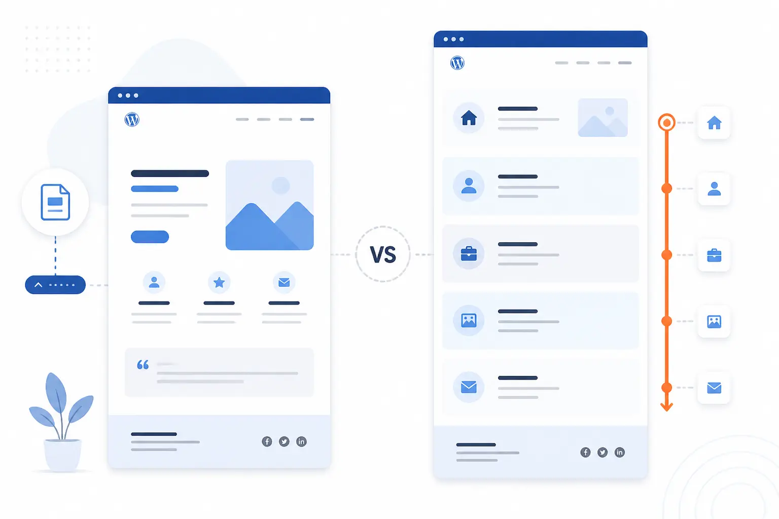
Not every WordPress site needs a deep menu tree. Some of the best design ideas come from knowing when one page is enough and when a long page needs stronger internal wayfinding. Several examples in this list hint at that balance, even when they are not pure one-page sites.
When a One Page Layout Works Best
A one-page layout works best when the offer is narrow, the audience is specific, and the next step is singular. Artist campaigns, event promotions, product launches, and simple service pages often fit that model. Taylor Swift’s campaign handoffs and Noma’s seasonal framing both point in this direction. They keep the main site broader, but they use focused destinations when the story narrows.
If you want to build that kind of page in WordPress, reusable sections matter more than fancy widgets. Following the platform’s accessibility and coding guidance is a good safeguard, especially when long visual sections can easily become hard to navigate.
How Sticky Navigation Keeps Long Pages Usable
Long pages stop feeling elegant the second a visitor loses orientation. Sticky navigation, jump links, section labels, and repeated calls to action help prevent that. Astra’s sales pages and many enterprise product sites rely on this logic because they need to explain a lot before the visitor converts.
Our rule of thumb is simple. If the page scroll is doing the job of a small website, it needs the same courtesy signals as a small website. That means section hierarchy, a stable navigation anchor, and a clear next step more than once.
FAQ About the Best WordPress Site Examples
These are the questions readers usually ask after seeing a list like this. The short answers matter, because choosing inspiration is easier when you know what WordPress is good at, where it struggles, and what beginners should actually copy first.
What Is the Most Popular WordPress Site?
There is no single official winner, because popularity can mean traffic, brand recognition, or publishing scale. In practical terms, sites like the White House, NASA, TechCrunch, and major entertainment properties prove that WordPress can support globally recognized destinations. For design study, though, the better question is not which site is biggest. It is which site solves the same problem you have.
Is WordPress Outdated in 2026?
No, WordPress is not outdated in 2026. It is still widely used, and the examples in this list show it powering current government portals, corporate newsrooms, and modern brand sites. What has changed is the expectation that teams will use patterns, structured content, and better governance instead of treating every page like a one-off layout experiment.
Why Are Some Businesses Moving Away From WordPress?
Some businesses move away because their content governance is weak, not because the platform cannot handle the job. Too many plugins, unclear ownership, neglected updates, or a design system built without editorial discipline can make any CMS feel messy. In many cases, the problem is less WordPress itself and more the lack of rules around how content, templates, and extensions are managed.
Can ChatGPT Build a WordPress Website?
Yes, ChatGPT can help build a WordPress website, but it should be treated as an assistant, not as the whole process. It can help with copy, structure, wireframes, schema ideas, and even code snippets, but you still need a real theme, plugin strategy, accessibility checks, and someone to verify the output. Think of it as a fast drafting partner, not a magic publish button.
What Should Beginners Look for in WordPress Site Examples?
Beginners should look for clear structure before they look for flashy visuals. Study how the homepage introduces the site, how navigation is grouped, where search appears, and how the next action is presented. If you copy only one thing from the best WordPress site examples, copy the clarity.







Conclusion
The best WordPress site examples are useful because they solve different problems well. The White House and NASA are great for structure. Spotify For the Record and Microsoft Source are strong for brand publishing. The Atavist Magazine and Noma show how WordPress can carry mood and storytelling without losing direction.
If we were building a shortlist, we would pick three examples that match your exact site type, then copy their navigation logic before anything else. Want to make this practical? Open your favorite three from the list and note what their first screen asks the visitor to do.