
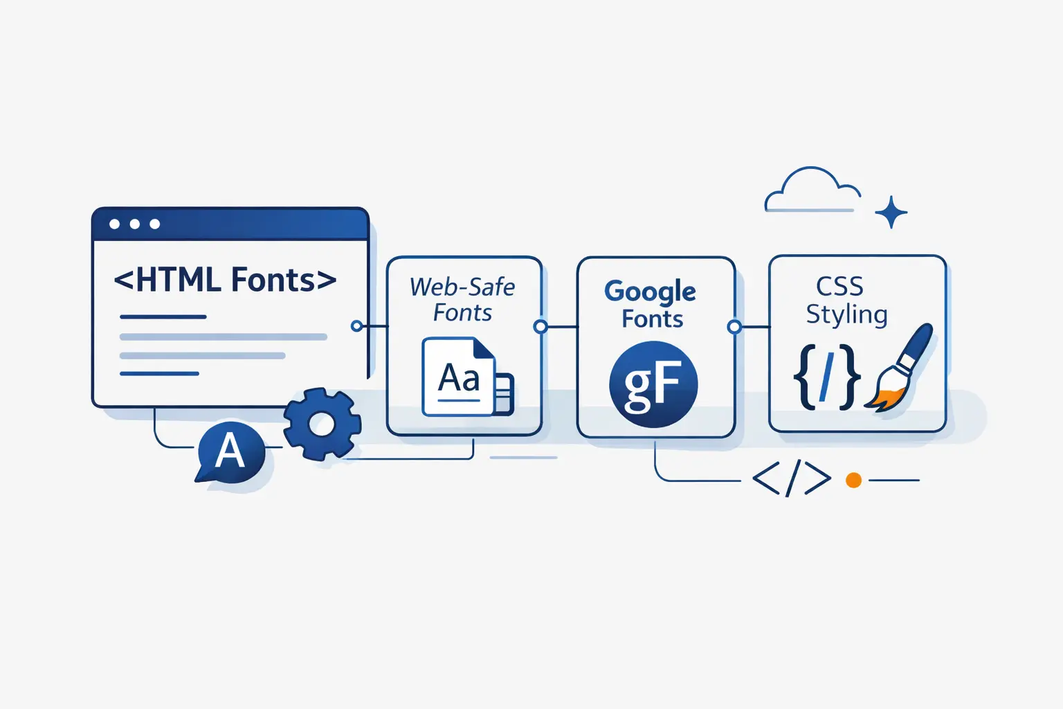
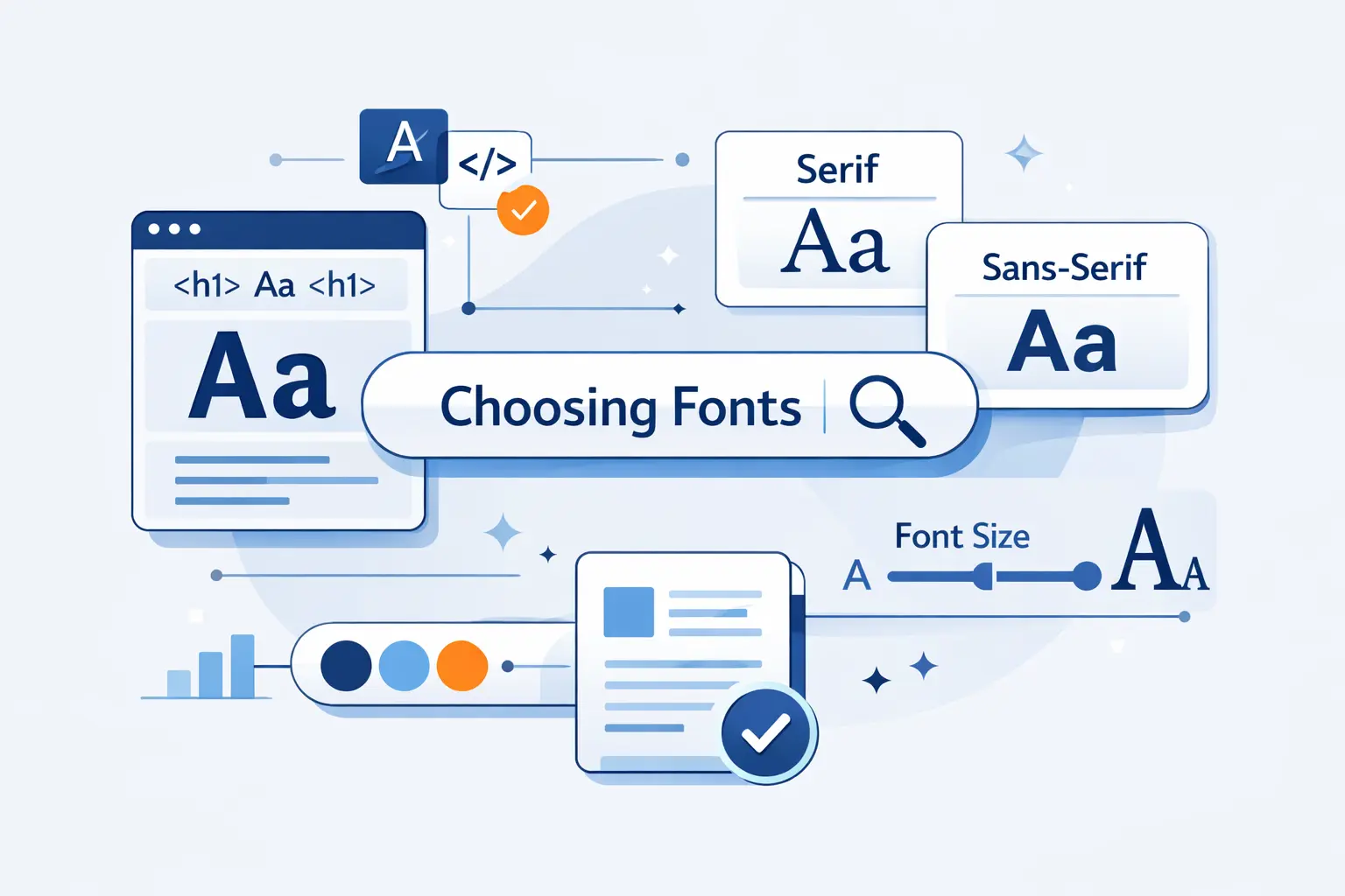
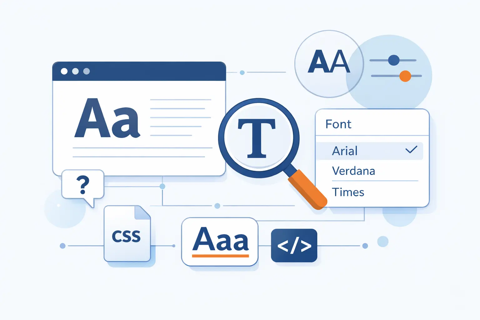
- What Are HTML Fonts?
- What Types of HTML Fonts Are Available?
- Best Web-Safe HTML Fonts to Know
- How Does the CSS Font Family Property Work?
- How to Put Different Fonts in HTML
- How to Use Google Fonts and Custom Fonts in HTML
- How to Style HTML Fonts with Weight and Emphasis
- How to Choose Good HTML Fonts for Your Website
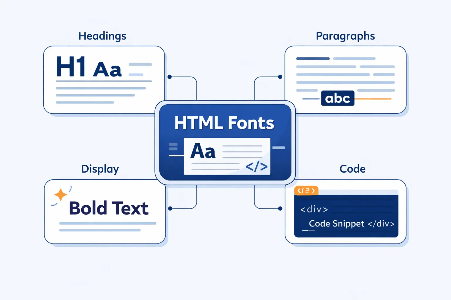
- Best HTML Fonts by Use Case
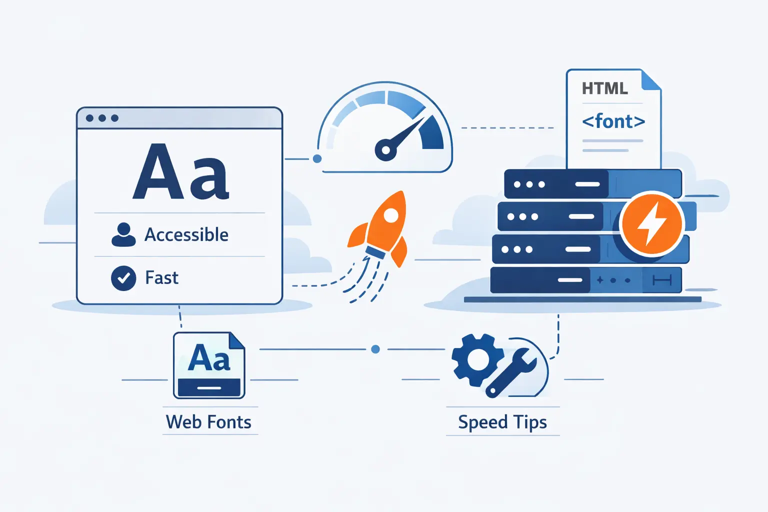
- How to Make HTML Fonts Accessible and Fast
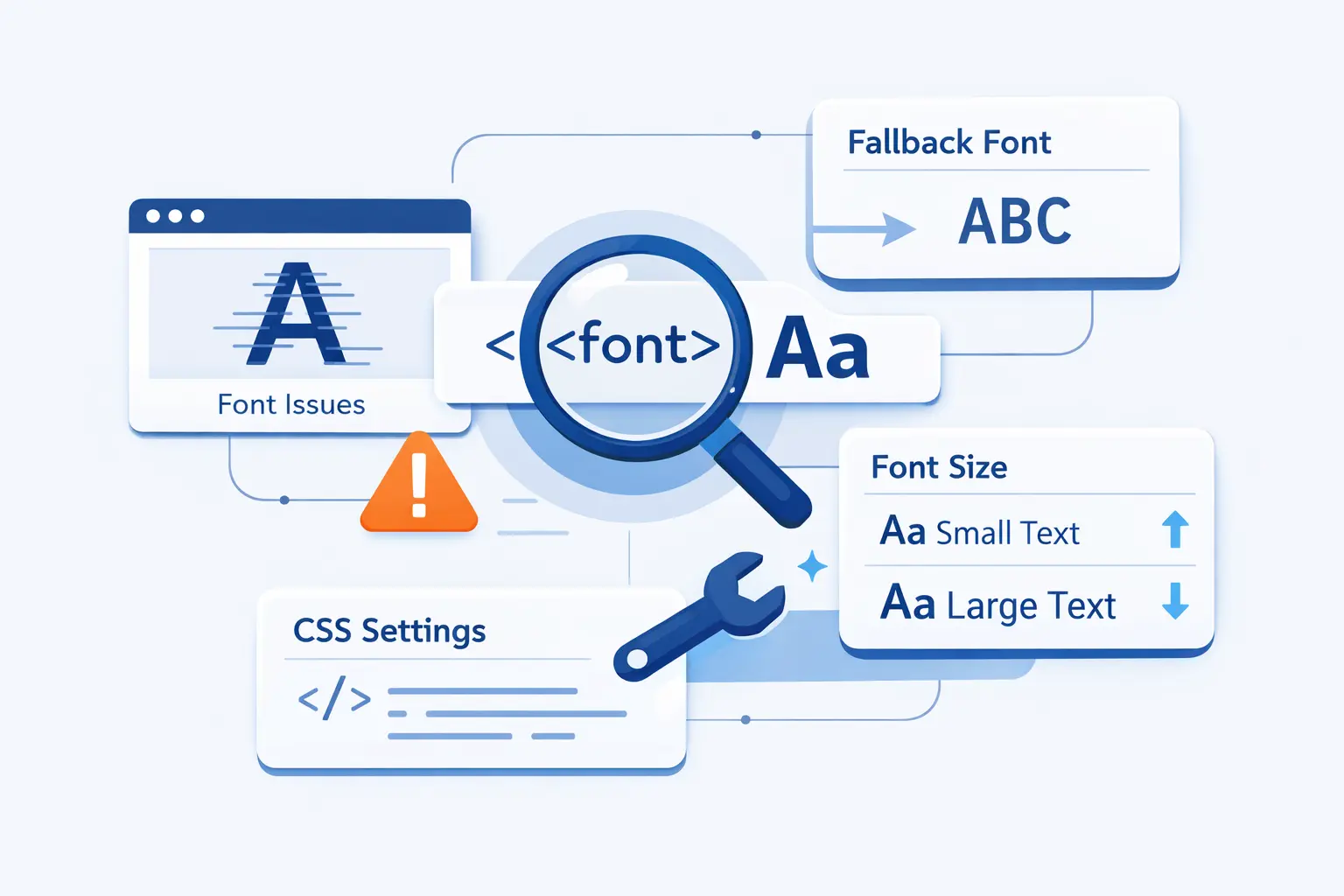
- Common HTML Font Problems and How to Fix Them
- HTML Fonts FAQ
- How 1Byte Supports Websites That Use HTML Fonts
- Final Thoughts on HTML Fonts
At 1Byte, we treat HTML fonts as part of infrastructure, not frosting. They shape reading speed, trust, and text stability while assets load. The 2025 Web Almanac found that roughly 88% of websites use web fonts. That tells us typography is now a core web choice, not a boutique extra.
In this guide, we explain what HTML fonts really mean, when web-safe fonts still make sense, how Google Fonts and custom files work, and how to choose type that stays readable on small screens. We also bring our hosting perspective as 1Byte, because typography and delivery always meet in the browser.
What Are HTML Fonts?
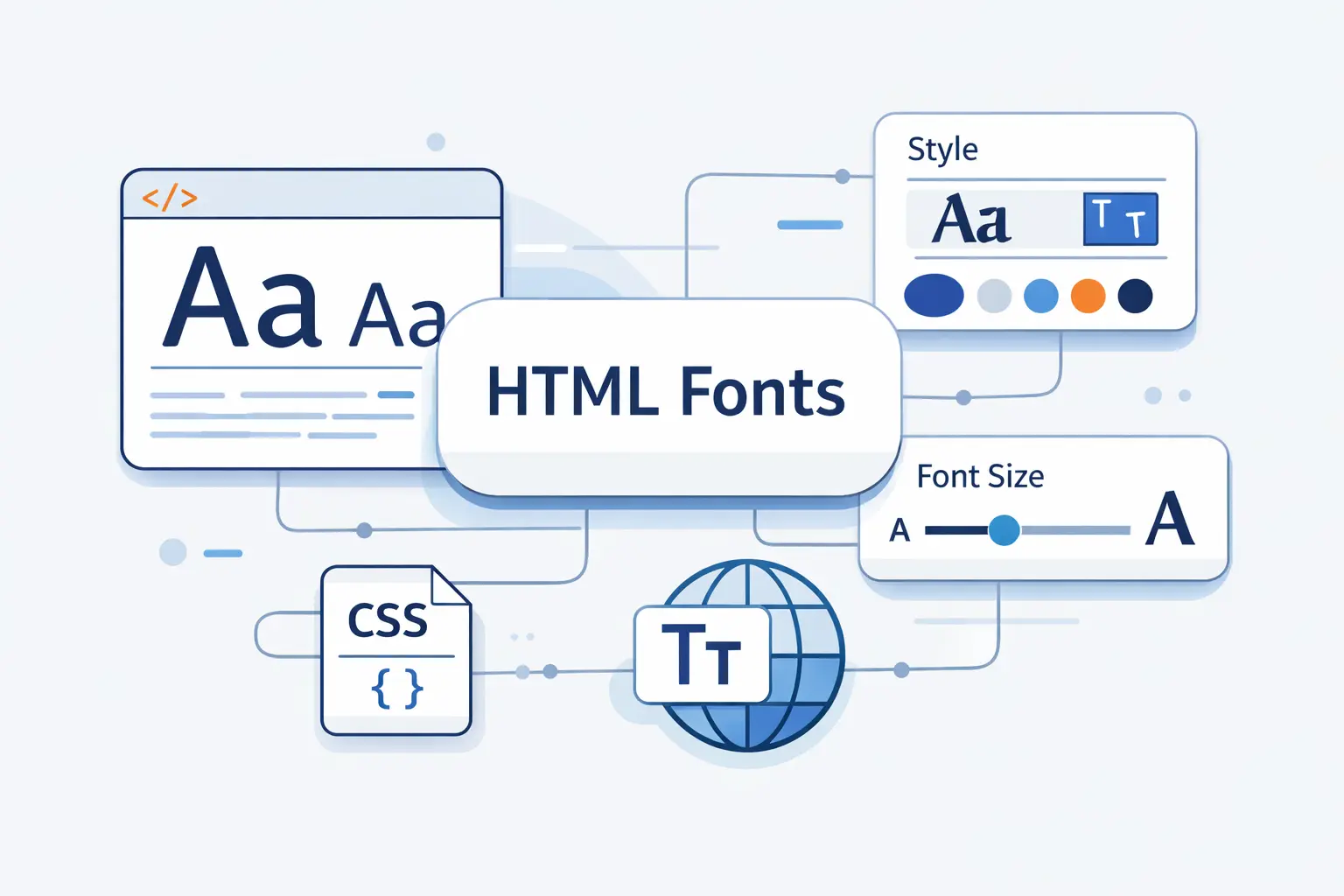
We should clear up one common confusion first. HTML gives text structure. CSS decides how that text is rendered on the page. When most people say HTML fonts, they really mean CSS font choices applied to HTML content.
1. What HTML Fonts Control in CSS and Web Design
Whenever clients ask us about HTML fonts, we point them to CSS. The prioritized list of fonts lives in font-family. Then font-size, font-weight, font-style, font-stretch, and line-height shape the final reading experience. If you use the font shorthand, you can set several of those choices at once.
2. System Fonts, Web-Safe Fonts, and Web Fonts
We split HTML fonts into three buckets. System fonts follow the operating system. Web-safe fonts are the familiar installed faces you can usually trust. Web fonts are delivered with the site, either from a font service or from your own server. That last group is what frees us from the old, tiny web-safe set.
3. How HTML Fonts Influence Readability, Branding, and User Experience
Fonts influence more than mood. Thin text, weak contrast, or cramped spacing can make a page harder to read. Poor loading behavior can also delay text or cause a visible swap after the page appears. We have learned to judge font choices with both designer eyes and operator eyes.
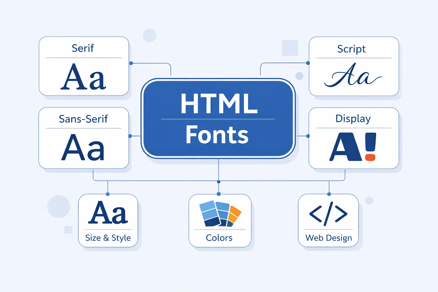
What Types of HTML Fonts Are Available?
Once the basics are clear, the next question is category. Most sites do not need many categories. They need the right category in the right place.
1. Serif, Sans Serif, Monospace, Cursive, and Fantasy
The classic groups are serif, sans serif, monospace, cursive, and fantasy. Serif fonts have finishing strokes and often suit reading-heavy pages. Sans serif fonts feel cleaner and usually win in interfaces. Monospace keeps every character the same width, which is why code blocks love it. Cursive and fantasy are more expressive, but we use them with a light hand.
2. Slab Serif and Script Fonts for Display Use
Slab serifs push more weight into the serifs, so headings feel firmer and more poster-like. Script fonts imitate handwriting or lettering. They can look memorable in a logo or hero banner, but they tire the eye fast in navigation, forms, or paragraphs. We treat display fonts like spice, not the main meal.
3. When Different Font Types Work Best
We like calm fonts for body copy, practical fonts for interfaces, and distinctive fonts for headlines. A serif can steady a long article. A sans serif can simplify a dashboard. A monospace can clarify code. Once you match font type to reading task, most font debates get much easier.
Best Web-Safe HTML Fonts to Know
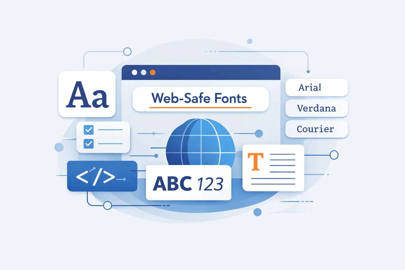
Web-safe HTML fonts still earn their place. They ask almost nothing from the network, and they give you predictable fallbacks when you want speed and simplicity.
1. Sans Serif Choices: Arial, Verdana, Tahoma, and Trebuchet MS
Arial is the safe middle ground. Verdana feels roomier. Tahoma squeezes more text into tight UI spaces. Trebuchet MS brings a little more personality without turning decorative. On older admin panels and utility pages, these four can still solve real problems.
2. Serif Choices: Times New Roman, Georgia, and Garamond
Times New Roman is familiar, but it can feel busy on screens. Georgia is usually the better serif choice for web reading because it feels more open. Garamond looks refined, though availability is less universal, so we prefer it as part of a stack, not as your only plan.
3. Monospace and Decorative Choices: Courier New and Brush Script MT
Courier New still works for code samples, command snippets, and any place where fixed character width helps. Brush Script MT is the opposite. It is decorative and nostalgic, which makes it useful only in small accents. We would never use it for menus, buttons, or long copy.
How Does the CSS Font Family Property Work?
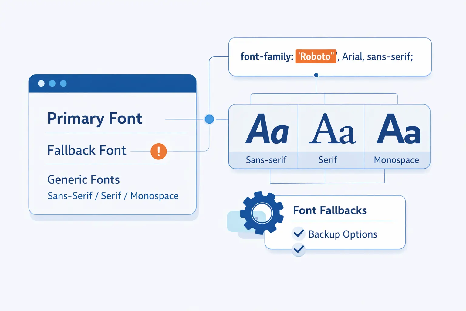
The CSS font-family property is where most font decisions become real. A good stack does not chase perfection. It gives the browser a clear order, a sane fallback, and a graceful failure path.
1. How to Build a Reliable Font Stack
We build stacks from most preferred to least preferred. Start with your first choice, follow with close fallbacks, and finish with a generic family. That order matters because browsers try the list in priority order and can still fall through when a font is missing or lacks a needed glyph.
body { font-family: Inter, -apple-system, BlinkMacSystemFont, "Segoe UI", Roboto, Arial, sans-serif;}A real production example helps. GitHub’s font stack starts with Mona Sans VF and then drops through platform fonts before ending on sans-serif. We like that pattern because it respects both brand voice and device reality.
Bootstrap’s native stack takes a similar route with system-ui, major platform fonts like "Segoe UI" and Roboto, then a generic fallback. That is a strong default when you want a site to feel familiar on each operating system.
2. When to Quote Font Names and When Not to
Quote font names when they contain spaces, digits, or punctuation. So write "Times New Roman" or "Trebuchet MS". Do not quote generic keywords like serif or sans-serif. They are CSS keywords, not literal family names.
3. Common Generic Families: Serif, Sans Serif, Monospace, Cursive, and Fantasy
The common generic families are serif, sans-serif, monospace, cursive, and fantasy. Each one tells the browser what broad style to preserve if your preferred font is unavailable. We also keep system-ui in our working vocabulary for interface work, even though the classic five are still the foundation.
4. Why Generic Families Should Come Last
Generic families should come last because they are your safety net. If every named font fails, the browser still has a style direction to follow. That one last keyword can save missing glyphs, odd devices, and unexpected environments.
How to Put Different Fonts in HTML
There are three common ways to apply fonts in HTML. We use each one, but not for the same job. The trick is choosing the level that matches the scope of the change.
1. Use Inline Styles for Quick One-Off Changes
Inline styles are fine for a one-off demo, a quick test, or an HTML email snippet. For example, <span style="font-family: Georgia, serif;">Hello</span> changes only that element. We avoid inline font rules in real sites because they are hard to reuse and harder to maintain.
2. Use Internal CSS for Page-Level Font Rules
Internal CSS works when the rule belongs to one page only. A landing page with its own hero type treatment is a good case. You place the rules inside <style> in the document head, such as <style> h1 { font-family: Georgia, serif; } </style>, and keep the typography close to the page it serves.
3. Use External Stylesheets for Sitewide Consistency
External stylesheets are the grown-up choice for sitewide consistency. One file can define body text, headings, buttons, forms, and code blocks across the whole site. It also makes audits, updates, and theme changes far less painful. A simple <link rel="stylesheet" href="styles.css"> is still the cleanest path for most production sites.
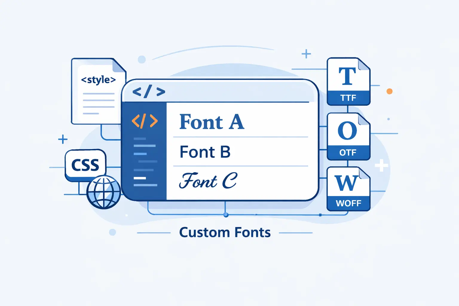
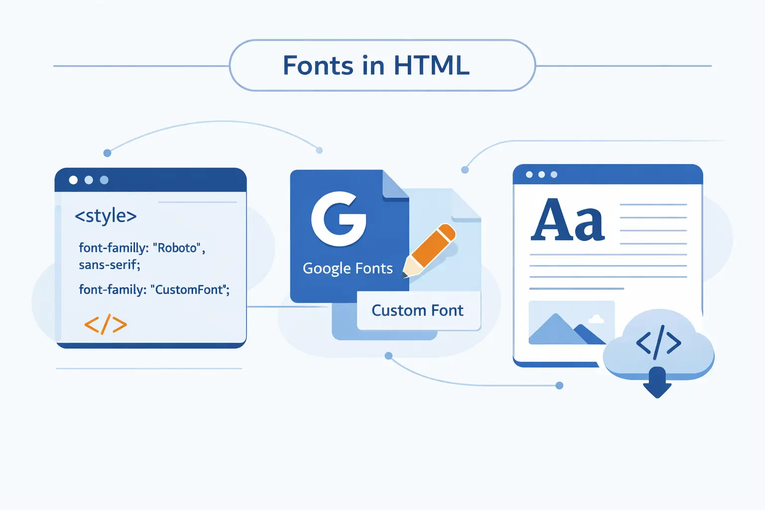
How to Use Google Fonts and Custom Fonts in HTML
When web-safe fonts feel too plain, we either load fonts from a service or self-host them. Both paths work. The right choice depends on how much control, privacy, and operational simplicity we want.
1. Add Google Fonts with a Link Tag
Google Fonts is the easiest starting point. Google’s own docs show that you can add a stylesheet link in your HTML and then call the family in CSS. We still recommend ending the stack with a fallback like Arial, sans-serif, because convenience should not replace resilience.
<link rel="stylesheet" href="FONT_STYLESHEET_URL">body { font-family: "Inter", Arial, sans-serif;}2. Self-Host Fonts with Font Face Rules
When we want more control, we define a custom font with @font-face. That lets us host the files ourselves, choose formats like WOFF2, and define loading behavior with font-display. Self-hosting is often the better call when performance, privacy, and third-party dependency limits matter.
@font-face { font-family: "MyBrand"; src: url("fonts/mybrand.woff2") format("woff2"); font-display: swap;}body { font-family: "MyBrand", Georgia, serif;}3. Use Third-Party Font Services When Needed
Third-party font services still make sense when licensing is tricky or when a brand depends on commercial typefaces. They also save teams from writing the full delivery setup by hand. We just tell clients to check privacy expectations, fallback behavior, and what happens if the service stalls.
How to Style HTML Fonts with Weight and Emphasis
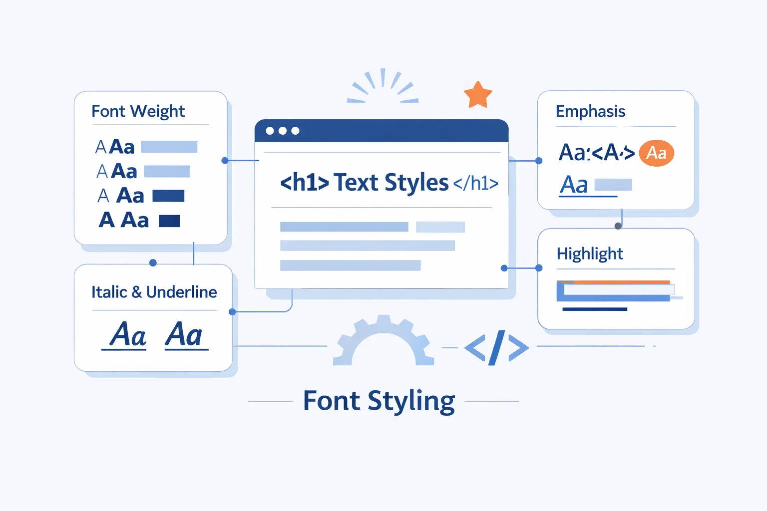
A font family by itself does not create hierarchy. Hierarchy comes from the mix of style, weight, size, and spacing. That is where HTML fonts stop being a list and start becoming a readable system.
1. Use Normal, Italic, and Oblique Styles Purposefully
Italic and oblique are cousins, not twins. Italic often uses a purpose-drawn shape, while oblique usually slants the normal form. For emphasis, we prefer true italics when the family has them. They almost always look more deliberate.
2. Choose Font Weights from Light to Bold
Weight is where tone shows up fast. Light feels airy. Regular feels stable. Semibold and bold create emphasis without shouting. Variable fonts can pack many styles into a single file, which is handy when you need range without collecting a pile of separate font assets.
3. Combine Font Families, Weights, and Sizes for Hierarchy
We usually build hierarchy with one text family, one accent family if needed, and a narrow weight range. For example, body copy can stay regular, headings can move to semibold, and code can switch to a monospace face. That is often enough to make a page feel organized.
How to Choose Good HTML Fonts for Your Website
Choosing good HTML fonts is mostly about judgment. The prettiest specimen page in the world does not matter if the text feels annoying after thirty seconds of reading.
1. Prioritize Readability, Contrast, and Mobile Legibility
Readability comes first. We want clear letterforms, sensible spacing, and strong contrast on mobile as well as desktop. WCAG’s guidance for normal text calls for a 4.5:1 contrast ratio, and that is a good floor, not a ceiling.
2. Match Font Choices to Brand Tone and Audience
Match the font to the audience and the promise of the brand. A legal site usually wants steadiness. A modern product UI wants clarity and speed. A boutique studio can push further into character. We think good typography sounds like the business before the user reads a single sentence.
3. Choose Versatile Families with Multiple Weights, Good Pairings, and Language Support
Versatile families save effort later. We look for families with enough weights, a usable italic, clean pairings, and solid language coverage. If your site serves names, currencies, or multilingual content, missing glyphs will find you sooner or later.
Best HTML Fonts by Use Case
Readers often want a shortlist. Here is ours. It is practical, not precious, and it reflects the kinds of sites we see most often.
1. Good HTML Fonts for User Interfaces: Inter, Roboto, Open Sans, and Montserrat
For user interfaces, we like Inter, Roboto, Open Sans, and Montserrat. Inter and Roboto feel especially at home in product UI. Open Sans stays approachable. Montserrat adds more visual flavor, which can help in marketing-heavy layouts as long as body copy stays calm.
2. Good HTML Fonts for Editorial Content: Georgia, Libre Baskerville, and Lora
For editorial content, Georgia, Libre Baskerville, and Lora are strong bets. Georgia remains one of the easiest screen serifs to trust. Libre Baskerville brings a more literary note. Lora gives you a softer voice without losing readability.
3. Good HTML Fonts for Headings, Branding, and Code: Playfair Display, Arvo, Soria, and Courier New
For headings and branding, Playfair Display and Arvo are useful opposites. Playfair Display feels elegant. Arvo feels sturdy. Soria is the wild card in this list. We would use it only for short display text. For code, Courier New still works, though we often prefer a modern UI monospace first and keep Courier New as fallback.
How to Make HTML Fonts Accessible and Fast
Accessible and fast typography is usually quieter than flashy typography. That is exactly why it works. Users notice when text is hard to read or late to appear, even if they cannot name the cause.
1. Use Relative Units, Line Height, and Strong Color Contrast
We prefer relative units like rem for text, a roomy line height, and color pairs that stay readable outdoors as well as indoors. Layouts also need to survive when text grows. W3C says text should resize up to 200 percent without losing content or functionality, which is a very practical test to run on every template.
2. Optimize Loading with Variable Fonts, Efficient Files, and Font Display Strategies
Speed lives in the details. Request only the weights you use. Prefer WOFF2. Set a deliberate font-display value. When a page uses only a short logo or headline, Google notes that the text= parameter can cut font files by up to 90%. That is the kind of small decision that changes how fast a page feels.
3. Test Fonts Across Browsers, Devices, and Screen Sizes
Test on real browsers and real screens. Fonts can wrap differently on Windows and macOS, look darker on one device, or feel too thin on a bright phone outdoors. We like to check headings, buttons, forms, tables, and zoomed views before calling typography done.
Common HTML Font Problems and How to Fix Them
Most HTML font problems are boring, which is good news. Boring problems are usually fixable. We would rather debug a font stack than a mystery conversion drop any day.
1. Fonts Not Loading or Falling Back Unexpectedly
If fonts do not load, start with the basics. Check the file path, the family name, the declared weight and style, and whether the asset is blocked by origin rules or missing from the server. Unexpected fallbacks often come from simple mismatches between the name in @font-face and the name used in font-family.
2. Rendering Differences Across Browsers
Rendering differences across browsers are normal. Different systems smooth type differently. System fonts are not identical across platforms. Fallback fonts can also shift line breaks. That is one more reason to use sensible stacks and to judge text on actual devices, not just one designer laptop.
3. Small or Low-Contrast Text on Mobile
Small or faint text on mobile is the fastest way to sabotage good content. If the page feels hard to read, make the text darker, roomier, and less delicate. If zoom breaks the card layout, fix the layout before blaming the font.
HTML Fonts FAQ
Here are the short answers we give most often. They are not exhaustive, but they are enough to get a beginner moving in the right direction.
1. What Fonts Are There in HTML?
HTML itself does not come with a huge built-in font menu. In practice, you can use any installed font or downloadable font that CSS can reference, plus generic families like serif, sans-serif, and monospace.
2. What Is a Good Font for HTML?
A good font for HTML is one that matches the job. For UI, we lean toward clear sans serifs or system stacks. For articles, we often like Georgia, Lora, or a calm sans serif. The right answer is the one readers stop noticing because it feels easy.
3. How Do I Put Different Fonts in HTML?
You put different fonts in HTML by targeting elements with CSS. That can mean inline styles, page-level rules in a <style> block, an external stylesheet, a Google Fonts link, or a self-hosted @font-face rule. Pick the method that matches the scale of the change.
4. What Is the Difference Between Web-Safe Fonts and Web Fonts?
Web-safe fonts are the widely available faces that usually exist on user devices already. Web fonts are delivered with the site, either by a service or from your own server. Web fonts give you more design freedom. Web-safe fonts give you less operational overhead.
5. Can You Use More Than One Font on a Website?
Yes, you can use more than one font on a website. We do it often. We just recommend restraint. One primary text family and one contrasting display family is usually enough. Once you add a third or fourth voice, the page often starts arguing with itself.
How 1Byte Supports Websites That Use HTML Fonts
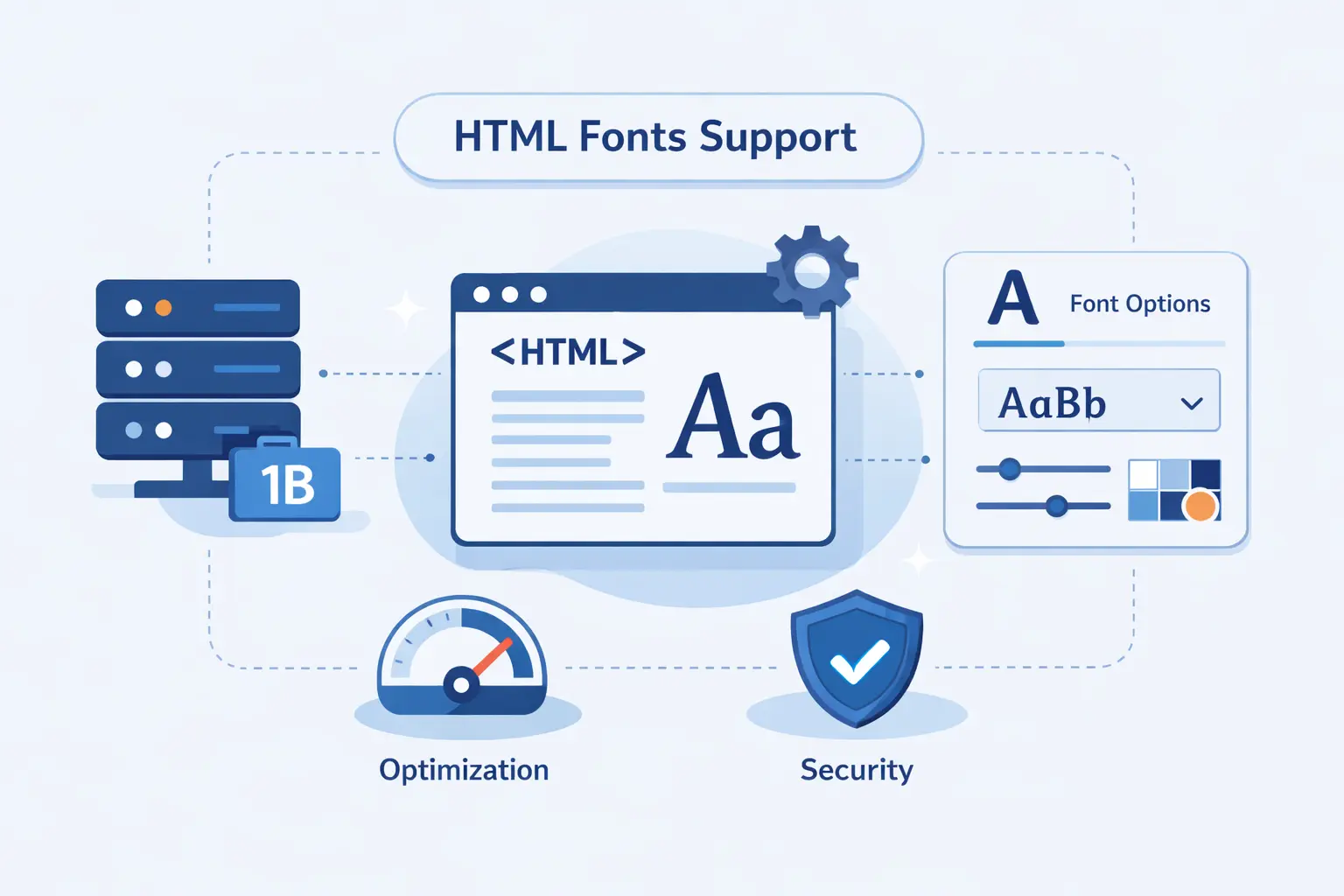
At 1Byte, we see fonts as part of delivery, not just design. The prettiest CSS stack in the world still depends on domain setup, HTTPS, hosting, and the way assets reach the browser.
1. Launch Secure Sites with Domain Registration, SSL Certificates, and Shared Hosting
We support the launch layer with domain registration, SSL certificates, and shared hosting. That matters for HTML fonts because stylesheets and font files need a stable domain, secure delivery, and a reliable place to live from day one. For smaller sites, shared hosting is often enough to keep the typography pipeline simple.
2. Build Flexible Websites with WordPress Hosting and Cloud Hosting
We also support WordPress hosting and cloud hosting, which is useful when themes, builders, or custom CSS controls the site typography. In our experience, that is where many teams first start mixing Google Fonts, local fallbacks, and plugin-managed font settings, so the hosting needs to stay predictable.
3. Scale Faster with Cloud Servers and an AWS Partner
As traffic grows, font delivery becomes part of a bigger performance story. We offer cloud servers and AWS Partner support for teams that need more control over infrastructure, migration, and custom deployment choices. When a website outgrows a simple setup, we would rather plan the move early than patch it late.
Final Thoughts on HTML Fonts
HTML fonts are not a side detail. They influence clarity, tone, and speed all at once. We think the smartest path is usually simple. Pick a dependable text face, build a sensible fallback stack, and let hierarchy come from weight, spacing, and contrast.
If we could leave one rule on the whiteboard, it would be this. Choose fonts for readers first. Brand voice matters, but readability pays the bills. When the text feels effortless, the whole site feels finished.