

- Brand Identity Design Is the Visual and Verbal System That Makes a Brand Recognizable
- How It Differs From Branding, Brand Image, and a Logo
- The Core Elements That Shape a Brand Identity
- Why Brand Identity Design Matters to Businesses
- How the Design Process Comes Together
- What Strong Identity Systems Look Like in Practice
- Keeping the Identity Consistent as the Brand Grows
- Frequently Asked Questions
- How 1Byte Supports Online Brand Consistency
- Conclusion
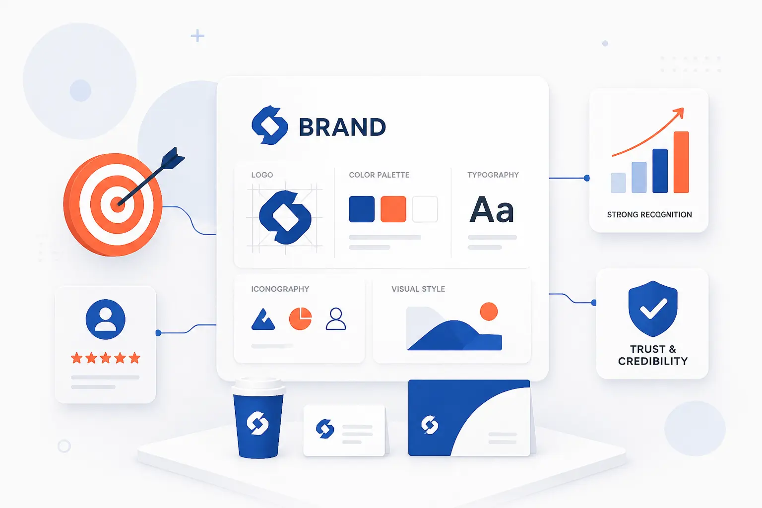
Brand identity design is the planned system of visuals, words, and usage rules that makes a business recognizable wherever people meet it. It includes the logo, colors, typography, imagery, voice, messaging, and practical guidelines for using them. A logo may be the quickest shortcut in that system, but the whole identity is what makes a website, ad, invoice, app screen, and email feel like they came from the same company. At 1Byte, we see brand identity design as the bridge between strategy and customer memory, because people cannot trust what they cannot recognize consistently.
The useful test is simple. If someone covers your company name, can they still sense that a page, package, or social post belongs to you? Strong identity design makes that possible without shouting. It gives teams a shared language, so every customer touchpoint feels intentional rather than accidental.
Brand Identity Design Is the Visual and Verbal System That Makes a Brand Recognizable
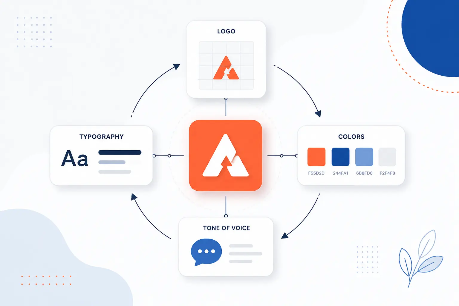
Brand identity design is the complete set of chosen design and messaging elements that show who a business is. It turns abstract ideas, such as quality, friendliness, speed, luxury, or security, into concrete signals people can see, hear, and remember. The system usually includes a logo, color palette, typefaces, imagery style, voice, tone, tagline, layout rules, and usage guidelines. Done well, it gives a brand a repeatable look and sound across a website, product, sales deck, storefront, social profile, and support email.
We like to think of it as the “recognition layer” of a business. Strategy decides what the company stands for. Brand identity design decides how that promise appears in the real world. That difference matters, because customers do not experience a positioning statement in a workshop document. They experience buttons, colors, headlines, packaging, photos, replies, and the little details that either feel coherent or feel off.
A strong identity is also practical, not decorative. It reduces guesswork for founders, marketers, designers, developers, and customer-facing teams. If the color palette says the main call-to-action button is green, nobody needs a fresh debate every week. If the voice guide says to write short, direct help copy, the support team can answer customers with the same character the homepage promised.
There is also a legal edge to recognition. In the United States, a trademark identifies goods or services as coming from a particular source, and names or logos are common examples of what may be protected when used properly, according to federal guidance. Brand identity design is broader than trademark law, of course, but both are built around the same human idea: people need clear signals that tell them who they are dealing with.
FURTHER READING: |
| 1. Crowdfunding Definition, Types, Process, and Platforms |
| 2. How to Start a Business and Launch With Confidence |
| 3. What Is a Landing Page? Purpose, Types, and Uses |
How It Differs From Branding, Brand Image, and a Logo
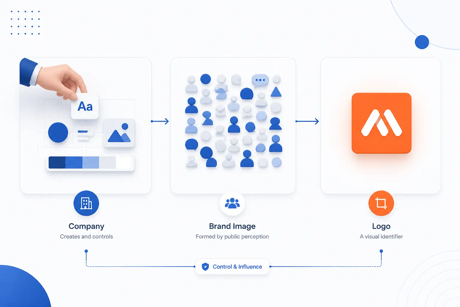
Brand identity design is the system a company creates, while branding is the broader work of shaping meaning, brand image is what people actually believe, and a logo is one identity element. These terms overlap, so they often get used loosely. The cleanest way to separate them is by control. A business can design its identity and practice branding, but the audience ultimately forms the image in its own mind.
| Term | What it means | Who controls it most |
|---|---|---|
| Branding | The ongoing work of shaping how people understand the business | The company, partly |
| Brand identity | The planned visual and verbal system used across touchpoints | The company |
| Brand image | The perception customers, prospects, and the public hold | The audience |
| Logo | A symbol or wordmark that represents the business | The company |
Brand Identity vs Branding
Branding is the broader discipline, while brand identity is one visible and repeatable output of that discipline. Branding includes positioning, customer research, pricing cues, product experience, advertising, reputation, service quality, and company behavior. Identity design gives that wider strategy a consistent look and sound. If branding is the whole orchestra, identity design is the written score everyone can follow.
This distinction saves teams from a common trap. A new logo cannot fix a weak promise, confusing offer, or poor customer experience. We have seen small businesses change colors three times when the real issue was unclear positioning. Start with what the business should mean, then design the system that expresses it.
Brand Identity vs Brand Image
Brand identity is what a company sends into the world, while brand image is what people take away from it. A company may design itself to feel premium, but customers may see it as overpriced if the product quality or service does not match. A startup may aim for playful, yet come across as careless if its emails, checkout flow, and support replies feel sloppy.
The gap between identity and image is where honest measurement belongs. Surveys, reviews, sales conversations, support tickets, social comments, and user testing reveal what people really perceive. We cannot design perception by command. We can only send clearer signals, behave consistently, and listen when the market tells us something different.
Why a Logo Is Only One Part of the Identity
A logo is a compact recognition mark, but it cannot carry the whole brand experience alone. It works best when supported by color, typography, layout, imagery, copy, motion, and behavior. Think of the Nike swoosh without the athlete photography, sharp language, and performance culture around it. The symbol still has power, but the surrounding system gives it meaning.
This is why “I need a logo” is often an incomplete brief. Most businesses really need a logo plus rules for where it appears, how much space surrounds it, what colors support it, how headlines sound, and what a landing page should feel like. A logo opens the door. The full identity invites people in and helps them recognize every room.
The Core Elements That Shape a Brand Identity
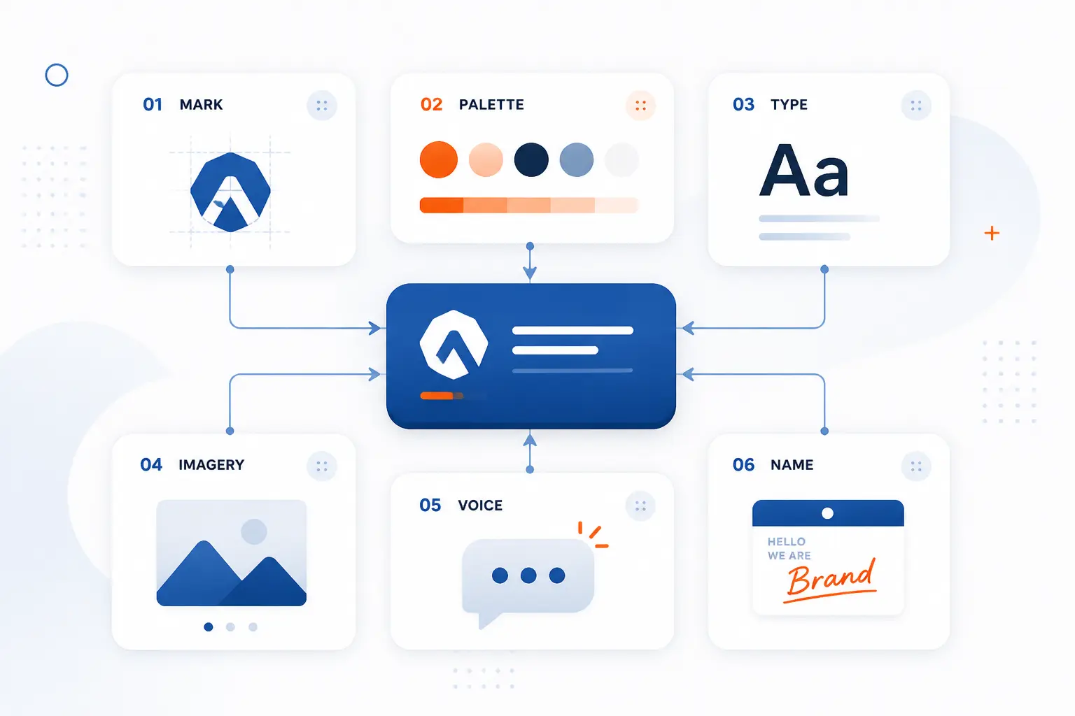
The core elements of a brand identity are the repeatable signals that make a business look, sound, and feel consistent. Each element has a job. The logo identifies, color creates fast association, typography shapes tone, imagery builds atmosphere, voice carries personality, and the name or story anchors meaning. Together, they become a toolkit teams can use without starting from scratch every time.
| Element | Main job | Practical example |
|---|---|---|
| Logo | Provide fast recognition | Website header, app icon, invoice |
| Color palette | Create association and hierarchy | Buttons, banners, packaging |
| Typography | Shape readability and mood | Headlines, body copy, labels |
| Imagery style | Set visual atmosphere | Photos, illustrations, icons |
| Voice and messaging | Make communication sound consistent | Homepage, emails, support replies |
| Name, tagline, story | Anchor memory and meaning | Pitch deck, ads, company profile |
Logo
A logo is the primary mark that helps people identify the brand quickly. It may be a wordmark, symbol, monogram, mascot, emblem, or a combination of these. The best logos are simple enough to work at small sizes and distinctive enough to avoid blending into the category. They also need clear rules for spacing, backgrounds, color versions, and misuse.
We prefer logos that earn recognition over time rather than trying to explain everything at once. A cloud provider does not need a literal cloud in its mark. A bakery does not need a rolling pin. A logo should be memorable, usable, and aligned with the company’s character, not overloaded with every product feature.
Color Palette
A color palette gives the brand emotional cues, visual hierarchy, and fast recognition across touchpoints. Most systems include primary colors, secondary colors, neutrals, background colors, and status colors for alerts or interface feedback. The trick is restraint. Too many colors create noise, while too few can make complex layouts hard to use.
Color also has to work for real people on real screens. A pale gray headline may look elegant in a mockup and fail badly on a low-quality monitor. For web content, the W3C explains that the common text contrast threshold accounts for vision differences and uses a 4.5 to 1 ratio for normal text in the relevant success criterion. We treat that as a design constraint, not a chore.
Typography
Typography controls how the brand’s words look, read, and feel. A type system usually defines fonts, sizes, weights, line heights, spacing, and rules for headings, body copy, captions, buttons, and labels. It can make a company feel formal, warm, technical, editorial, playful, or utilitarian before a reader processes the message. That is why type choices deserve more care than “this font looks nice.”
Good typography also protects comprehension. A beautiful headline font may be poor for long paragraphs. A display typeface may look strong in a poster and clumsy in a mobile menu. In our view, the right system balances character with endurance, because a website, dashboard, and email program all need type that can work hard.
Imagery, Illustration, and Photography Style
Imagery style defines what the brand’s pictures, illustrations, icons, and graphics should look like. It covers subject matter, lighting, composition, framing, filters, icon style, illustration detail, and the level of realism or abstraction. Without those choices, teams often grab random stock photos and wonder why the brand feels inconsistent. The eye notices before the brain complains.
A cybersecurity company may use restrained photography, dark interfaces, and abstract network graphics. A children’s learning product may use expressive illustration and warm colors. Neither style is “better” by itself. The right style is the one that matches the promise and stays recognizable across formats.
Brand Voice, Tone, and Messaging
Voice is the brand’s consistent personality in words, while tone adapts that personality to the situation. A brand can be clear, witty, expert, warm, bold, calm, or rebellious. Tone changes when the customer is excited, confused, angry, or making a risky purchase. The voice stays recognizable underneath.
Messaging turns that voice into practical language. It includes value propositions, product descriptions, elevator pitches, benefit statements, calls to action, and answers to common objections. We pay close attention to this because websites often fail from fuzzy wording, not weak visuals. If a visitor cannot tell what you do, who it is for, and why it matters, the prettiest palette in the world will not save the page.
Name, Tagline, and Brand Story
The name, tagline, and story give the identity a memorable verbal anchor. A name identifies the business, a tagline compresses the promise, and the story explains why the company exists. These pieces do not need to be poetic. They need to be clear, ownable, and easy to repeat.
Some names are descriptive, some are invented, and some borrow from founders, places, or metaphors. The key is fit. A playful name can help a consumer app but hurt a regulated financial service if it feels unserious. A brand story should be equally disciplined. Customers do not need a company autobiography. They need the part of the story that helps them understand the value.
Why Brand Identity Design Matters to Businesses
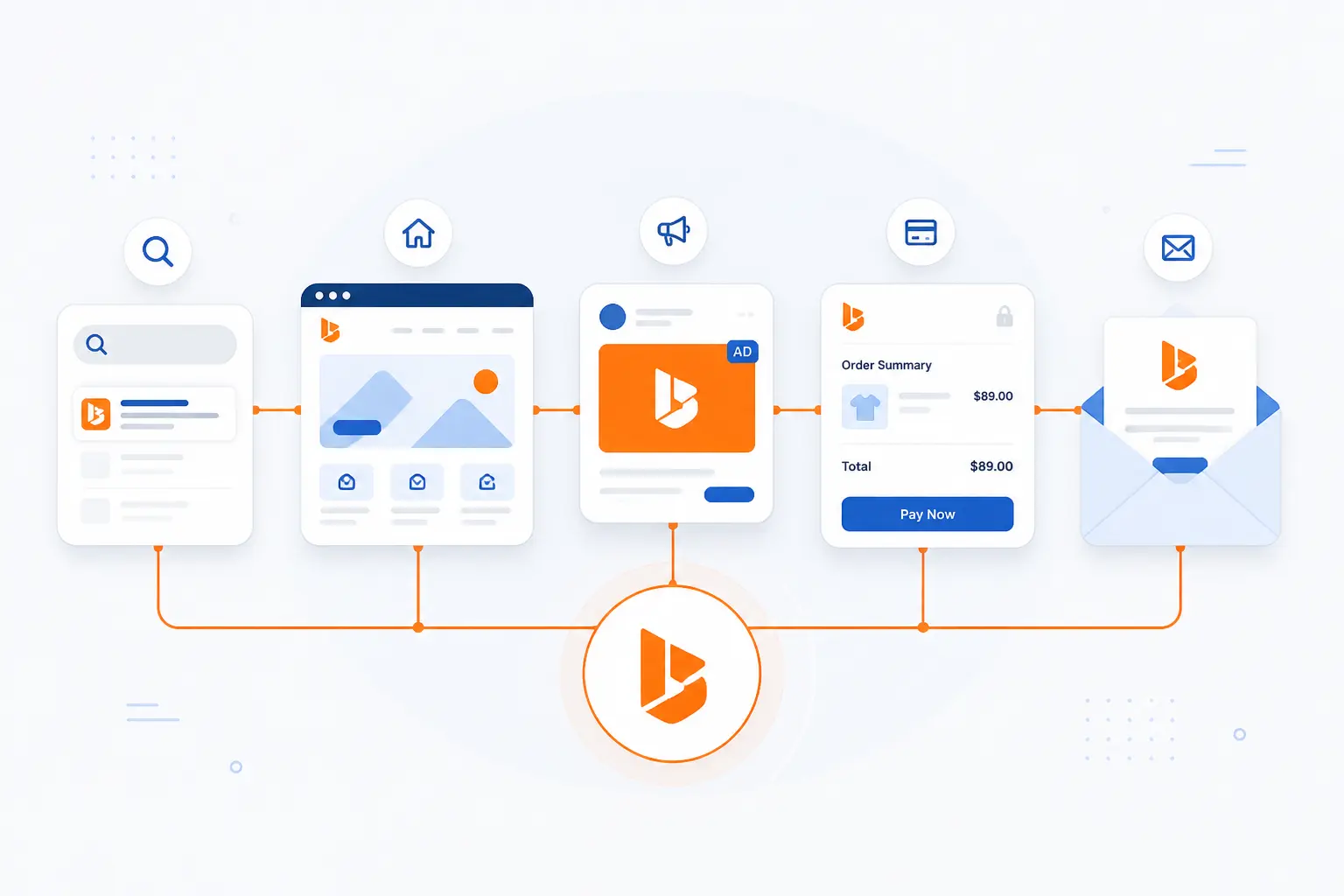
Brand identity design matters because it makes a business easier to recognize, easier to trust, and easier to manage across many channels. Customers meet brands in fragments: a search result, a homepage, an ad, a checkout screen, a proposal, or a support email. Identity design ties those fragments together. For teams, it turns taste into standards, which reduces confusion and protects quality as more people create customer-facing work.
Recognition and Market Differentiation
Recognition is the first business value of brand identity design. If people cannot pick you out, they cannot remember you, recommend you, or return to you with confidence. Strong identity systems create memory shortcuts through repeated colors, shapes, words, layouts, and behaviors. That matters most in crowded markets where products look similar.
Differentiation does not always mean being loud. Sometimes it means being calmer, clearer, warmer, more technical, or more refined than competitors. We often advise businesses to study their category before choosing a visual direction. If every competitor uses blue shields and lock icons, a security company may need another way to signal protection without disappearing into the wallpaper.
Trust, Loyalty, and Perceived Value
Trust grows when the promise, appearance, and experience keep matching. People read consistency as a signal of care. A polished website followed by a messy checkout flow creates doubt. A clear product page followed by an unclear invoice does the same.
Research supports the commercial weight of that feeling. In Edelman’s 2024 special report, 82 percent say trust in the parent company is important or a dealbreaker when deciding what to buy or use. That does not mean design alone creates trust. It means identity design should make trust easier to feel, while the business earns it through delivery.
Perceived value also changes with presentation. A restaurant menu set in careless type feels cheaper. A SaaS dashboard with inconsistent spacing feels less mature. A proposal with mismatched colors may make a buyer wonder what else is improvised. Fair or not, people judge quality from cues before they have proof.
Consistency Across Touchpoints and Teams
Consistency turns brand identity design from a creative exercise into an operating system for communication. It helps sales, marketing, product, support, leadership, and outside partners make materials that look and sound related. That is a big deal once a company grows beyond one founder or one designer. Without shared rules, every new asset becomes a tiny reinvention.
The same principle appears in digital product work. Nielsen Norman Group describes design systems as standards for managing design at scale and notes that reusable UI libraries help teams avoid redundant work through shared building blocks. Brand identity systems do the same for public-facing communication. They give teams a common source of truth.
How the Design Process Comes Together
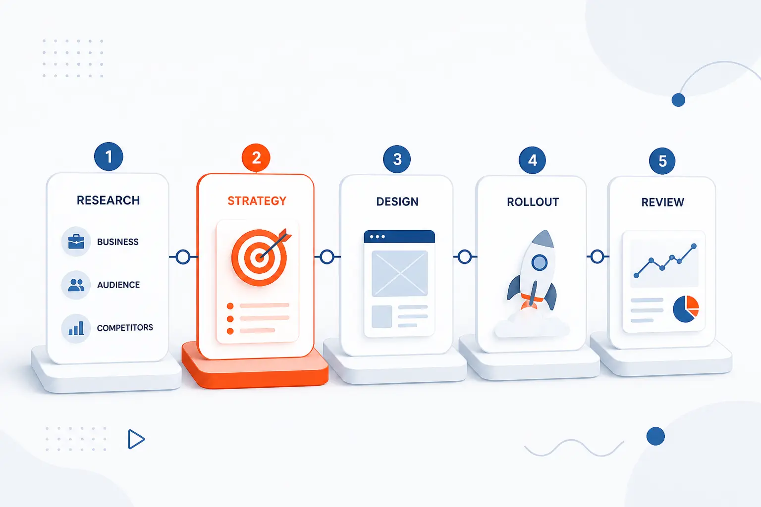
The brand identity design process moves from understanding to strategy, then from creative direction to practical rollout. It should not begin with colors. It should begin with the business, audience, competitors, and promise. Once the strategy is clear, the visual and verbal system can be developed, documented, launched, measured, and refined.
Research the Business, Audience, and Competition
Research starts the process by revealing what the identity must communicate and what it must avoid. We look at the business model, offer, margins, customer segments, buying triggers, objections, competitors, and current customer perception. For a hosting company, for example, customers may care about clarity, security, uptime expectations, control, and cost predictability. For a fashion label, the signals may be taste, aspiration, materials, and community.
Competitive research is not about copying. It is about mapping the visual and verbal patterns in the category. If everyone uses the same colors, claims, photo style, and buzzwords, the opening becomes visible. Good research gives creative work a target. It keeps the team from designing in a vacuum.
Define Strategy, Positioning, and Personality
Strategy defines what the brand should stand for before anyone draws the system. This usually includes positioning, audience priorities, value proposition, personality traits, competitive difference, and messaging hierarchy. A practical strategy answers: who are we for, why should they choose us, and what must they remember? If that answer is weak, design choices become subjective.
Personality should be specific enough to guide decisions. “Friendly” is a start, but it is vague. Friendly like a patient teacher, a witty friend, or a calm expert? Those are different identities. We prefer traits that create trade-offs, because real strategy says yes to some choices and no to others.
Develop the Visual and Verbal Direction
The creative direction turns strategy into visible and verbal options. Designers explore logos, colors, typography, imagery, layout, and sample applications. Writers shape voice, messaging, taglines, headlines, and product language. The goal is not to make isolated artwork. The goal is to see how the identity behaves on real touchpoints.
This is where mood boards, concept routes, and prototypes help. A color palette may look good on a slide and fail on a pricing table. A playful tone may work on social media and feel wrong in a payment error message. We want those tensions early, before the system hardens.
Create Guidelines, Templates, and Real-World Applications
Guidelines turn approved design choices into repeatable instructions. They should show correct logo use, color values, type rules, layout principles, image examples, voice guidance, and sample copy. They should also include common mistakes. A “don’t stretch the logo” example can prevent more damage than a page of theory.
Real-world applications make the system believable. For a small business, that may mean a website homepage, social post, email signature, pitch deck, and invoice. For a digital product, it may include landing pages, app screens, onboarding messages, and notification copy. We like templates because they turn standards into habits rather than museum pieces.
Measure Results and Refine Over Time
Measurement shows whether the new identity is helping people recognize, understand, and trust the business. Useful signals include direct traffic, branded search, conversion rate, bounce behavior, sales feedback, customer surveys, recall testing, support confusion, and campaign performance. A new identity should make the business clearer, not merely newer.
Refinement is normal. After launch, teams often discover missing templates, unclear rules, or messages that need tightening. That does not mean the identity failed. It means the system is meeting real work. The best teams treat brand identity design as a living system with governance, not a one-time file delivery.
What Strong Identity Systems Look Like in Practice

Strong identity systems look consistent across many contexts without becoming rigid. They have a recognizable core, but they can stretch across products, campaigns, locations, and media. Apple, Coca-Cola, and Duolingo show three different paths. One is restrained and product-led, one is heritage-rich and highly recognizable, and one is playful, character-driven, and digital-native.
Apple
Apple shows how restraint can become a powerful identity choice. Its system is known for simple product presentation, clean layouts, careful spacing, and disciplined use of marks and product imagery. The company’s App Store marketing materials include detailed rules for badges, minimum sizes, clear space, product images, and messaging, which shows how much control sits behind what looks effortless in public. The lesson is not “use white space and become Apple.” The lesson is that restraint must be governed to stay consistent.
We admire Apple’s discipline because it resists clutter. Many companies add more when they feel uncertain. Apple often removes until the product and message carry the weight. That is hard to imitate honestly, but it is easy to learn from.
Coca-Cola
Coca-Cola shows how distinctive assets can build recognition for generations. The script, red, bottle shape, and holiday associations all work together as memory cues. The company’s own history notes that its contour bottle was recognized as a trademark in 1961 after earlier competitors had created consumer confusion with similar names and scripts, a reminder that design can become a business asset when people recognize it reliably through official history. Few brands get that kind of cultural footprint, but the principle scales down.
A local coffee shop can own a color combination, cup stamp, illustration style, and tone in its neighborhood. A B2B software company can own a clear diagram style and headline rhythm in its niche. The asset does not need to be world famous to be useful. It needs to be repeated with purpose.
Duolingo
Duolingo shows how character, illustration, and voice can make a digital product feel alive. Duo the owl, bright colors, expressive illustrations, and playful copy create a personality that people recognize quickly. The public guidelines point visitors toward logos, writing, illustration, marketing materials, and downloadable assets, showing how the system spreads across communication through written rules. This is identity as behavior, not just decoration.
We find Duolingo useful because it proves that consistency does not have to mean stiffness. A brand can be structured and still have a wink. The guardrails create room for play, because creators know which parts should stay stable.
Keeping the Identity Consistent as the Brand Grows
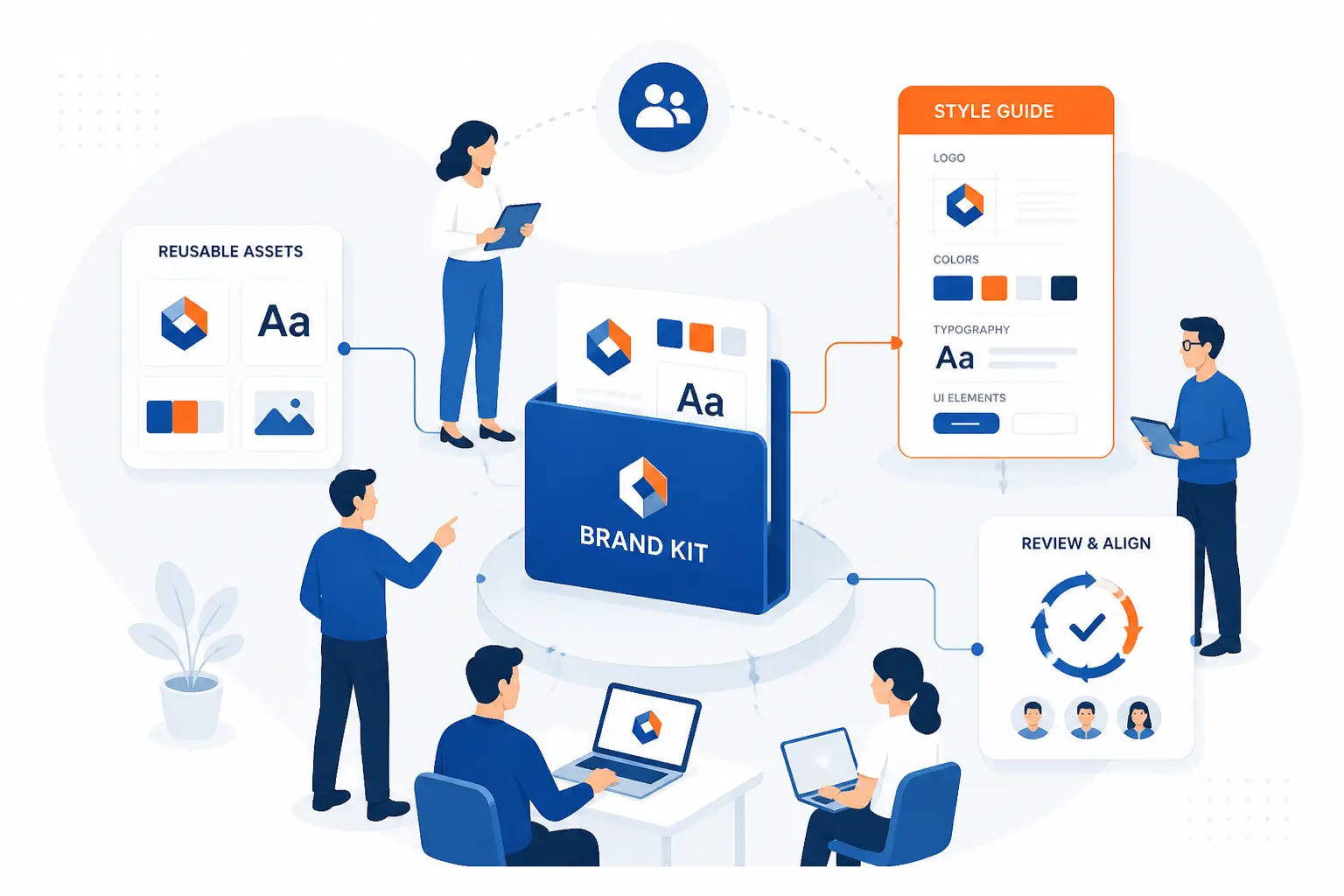
Keeping a brand identity consistent requires documentation, reusable assets, clear ownership, and periodic review. Growth creates pressure. More people make more materials, channels multiply, and old files keep floating around. A good identity system anticipates that mess and gives teams simple ways to do the right thing.
Create a Brand Style Guide or Brand Kit
A style guide or brand kit is the central reference for how the identity should be used. It should include logos, colors, typography, spacing, imagery, icons, voice, tone, messaging, examples, and prohibited uses. A lightweight guide is better than a beautiful but ignored document. The best one is easy to find and easy to apply.
For small teams, a short PDF and shared asset folder may be enough. Larger teams often need a web-based guide, asset library, and approval workflow. Whatever the format, the goal is the same: reduce interpretation. If people keep asking the same questions, the guide is missing something.
Turn Guidelines Into Reusable Templates
Templates make consistency easier by giving teams approved starting points. Useful templates include landing pages, social posts, ads, slide decks, email headers, sales sheets, case studies, invoices, and proposal pages. They protect core elements while letting people change the parts that should change. That balance matters.
A locked template can prevent a stretched logo, wrong color, or off-tone headline from reaching customers. It also gives non-designers confidence. They do not need to become brand experts to create routine materials. They need good rails, clear examples, and a place to find the latest version.
Review, Update, and Govern the System Over Time
Governance keeps the identity useful after launch. Someone must own the system, answer questions, review edge cases, remove outdated assets, and approve meaningful changes. Without ownership, the guide becomes an archive. People quietly make their own versions, and consistency erodes.
Updates should be deliberate rather than constant. A brand may need refinement when the audience changes, the product expands, the company enters new markets, or the current system no longer supports digital needs. But change for novelty is risky. Customers build memory through repetition, so every update should protect what still works.
Frequently Asked Questions
This FAQ gives quick answers to the questions beginners ask most about brand identity design. The short version is that identity is a system, not a single graphic. It should be clear enough for customers to recognize and practical enough for teams to use. If the system cannot survive daily work, it is not finished.
What Are the Five Pillars of Brand Identity?
The five practical pillars of brand identity are visual style, voice, messaging, values, and consistency. Visual style covers logo, color, type, and imagery. Voice and messaging control how the brand speaks and what it says. Values and consistency keep the system grounded in behavior rather than surface-level decoration.
What Is the Difference Between Brand Identity and Branding?
Brand identity is the visual and verbal system, while branding is the broader work of shaping meaning and reputation. Branding includes strategy, customer experience, positioning, marketing, and behavior. Identity design gives that wider work a recognizable form. A company can refresh its identity without fully changing its branding strategy.
How Often Should a Brand Identity Be Refreshed?
A brand identity should be refreshed when it no longer reflects the business, audience, market, or practical needs of the team. Many companies make small refinements more often than full redesigns. Good reasons include a major repositioning, merger, product expansion, outdated digital performance, or persistent customer confusion. Weak reasons include boredom or chasing a trend.
Do You Need Brand Guidelines After the Design Work Is Finished?
Yes, brand guidelines are necessary after the design work is finished because they turn creative decisions into repeatable rules. Without guidelines, teams guess, vendors improvise, and old assets keep resurfacing. The guide does not need to be huge. It needs to answer the questions people face when creating real materials.
How 1Byte Supports Online Brand Consistency
1Byte supports online brand consistency by helping businesses put their identity on stable, professional digital foundations. A brand system becomes real when customers meet it on a website, landing page, checkout flow, or hosted application. Domain registration, SSL certificates, WordPress hosting, shared hosting, cloud hosting, and cloud servers all connect identity decisions to public experience. As an AWS Partner, 1Byte also understands the importance of cloud infrastructure choices when digital touchpoints need room to grow.
| 1Byte service | How it connects to identity | Best-fit use |
|---|---|---|
| Domain registration | Secures the name customers type and remember | New websites and campaigns |
| SSL certificates | Supports a trusted browser experience | Public websites and forms |
| WordPress hosting | Keeps content and templates in one managed site | Marketing sites and blogs |
| Shared hosting | Gives smaller sites a practical online home | Starter websites |
| Cloud hosting | Supports growing digital touchpoints | Campaigns and business sites |
| Cloud servers | Gives teams more control over hosted experiences | Custom websites and applications |
Launch a Branded Website With Domain Registration and SSL Certificates
Domain registration and SSL certificates help turn a brand name into a credible online destination. The domain is often the first identity asset a customer types, shares, or sees in search. A mismatched or hard-to-remember domain can weaken recall before the homepage even loads. We see the domain as part of the identity system, not just a technical address.
SSL certificates support the trust layer of that experience. When a visitor reaches a site, the browser should not raise avoidable security warnings. For forms, account pages, and checkout flows, that trust signal matters even more. A strong visual identity loses force if the technical experience feels unsafe.
Keep Marketing Sites Reliable With WordPress Hosting and Shared Hosting
WordPress hosting and shared hosting help keep branded marketing sites accessible and manageable. For many businesses, WordPress is where the identity lives day to day through pages, posts, landing pages, forms, and content templates. Good hosting choices help teams keep those assets available to customers. The design system still needs discipline, but the site also needs a dependable home.
Shared hosting can be a practical starting point for smaller branded sites. A new company may need a home for its domain, SSL certificate, homepage, service pages, and basic content before it needs a more complex environment. Our viewpoint is simple: choose the hosting model that matches the site’s real workload, then keep the brand presentation clean and consistent.
Scale Digital Experiences With Cloud Hosting and Cloud Servers
Cloud hosting and cloud servers support brand experiences that need more flexibility than a simple starter site. As campaigns, applications, portals, or regional experiences grow, the identity system must appear consistently across more digital surfaces. That means design files, templates, front-end components, and infrastructure decisions begin to meet. A brand can look polished in a mockup and still suffer if the online experience cannot support the work.
Cloud servers give teams more control over custom environments, while cloud hosting can support growing web experiences. As an AWS Partner, 1Byte connects this discussion to the practical side of publishing and operating digital brand touchpoints. We do not believe infrastructure replaces brand identity design. We believe it helps the identity show up reliably when customers look for it.






Conclusion
Brand identity design is the system that makes a business recognizable through visuals, words, and rules. It is bigger than a logo and more controlled than public perception. The best identity systems connect strategy to everyday execution, so customers see the same character across websites, emails, products, ads, and support moments.
For beginners, the main lesson is this: do not start with decoration. Start with what the business should mean, who it serves, and what customers must remember. Then build the logo, colors, type, imagery, voice, and templates around that answer. If your current materials feel scattered, the next step is not always a full rebrand. It may be a clear audit of what is working, what is inconsistent, and what needs rules.
So here is our practical challenge: open your homepage, latest sales deck, newest social post, and last customer email side by side. Do they feel like the same company made them? If not, your brand identity design is telling you exactly where to begin.