

- What Is a Landing Page? A Standalone Page Built for One Conversion Goal
- How Visitors Move From Ad or Email to Action
- The Two Core Landing Page Formats
- What Makes a Landing Page Convert
- Where Landing Pages Fit in Marketing Campaigns
- How to Create and Improve a Landing Page
- FAQ About Landing Pages
- How 1Byte Supports Landing Page Projects
- Conclusion
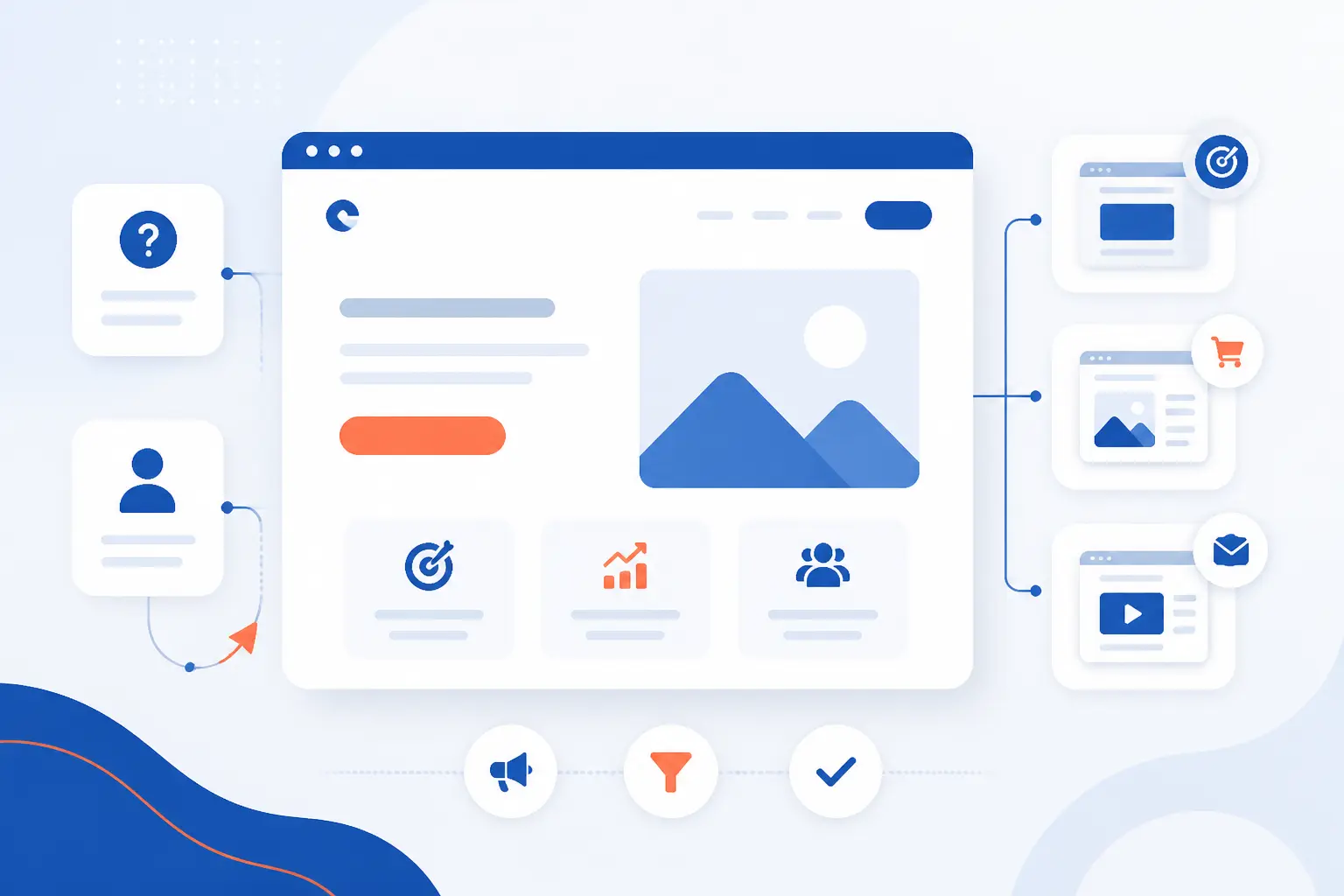
At 1Byte, we define a landing page as a focused web page built to get one specific action. That action might be a form submission, a trial signup, a purchase, or a demo request. If you are asking what is a landing page, the short answer is this: it is not a full website section meant to do everything at once. It is a standalone page designed to move one visitor toward one decision.
We think the best landing pages feel almost boring in their clarity. They cut distractions, repeat the offer that brought the visitor there, and make the next step obvious. That is why they show up everywhere in digital marketing, from paid ads and email campaigns to product launches and lead magnets.
What Is a Landing Page? A Standalone Page Built for One Conversion Goal
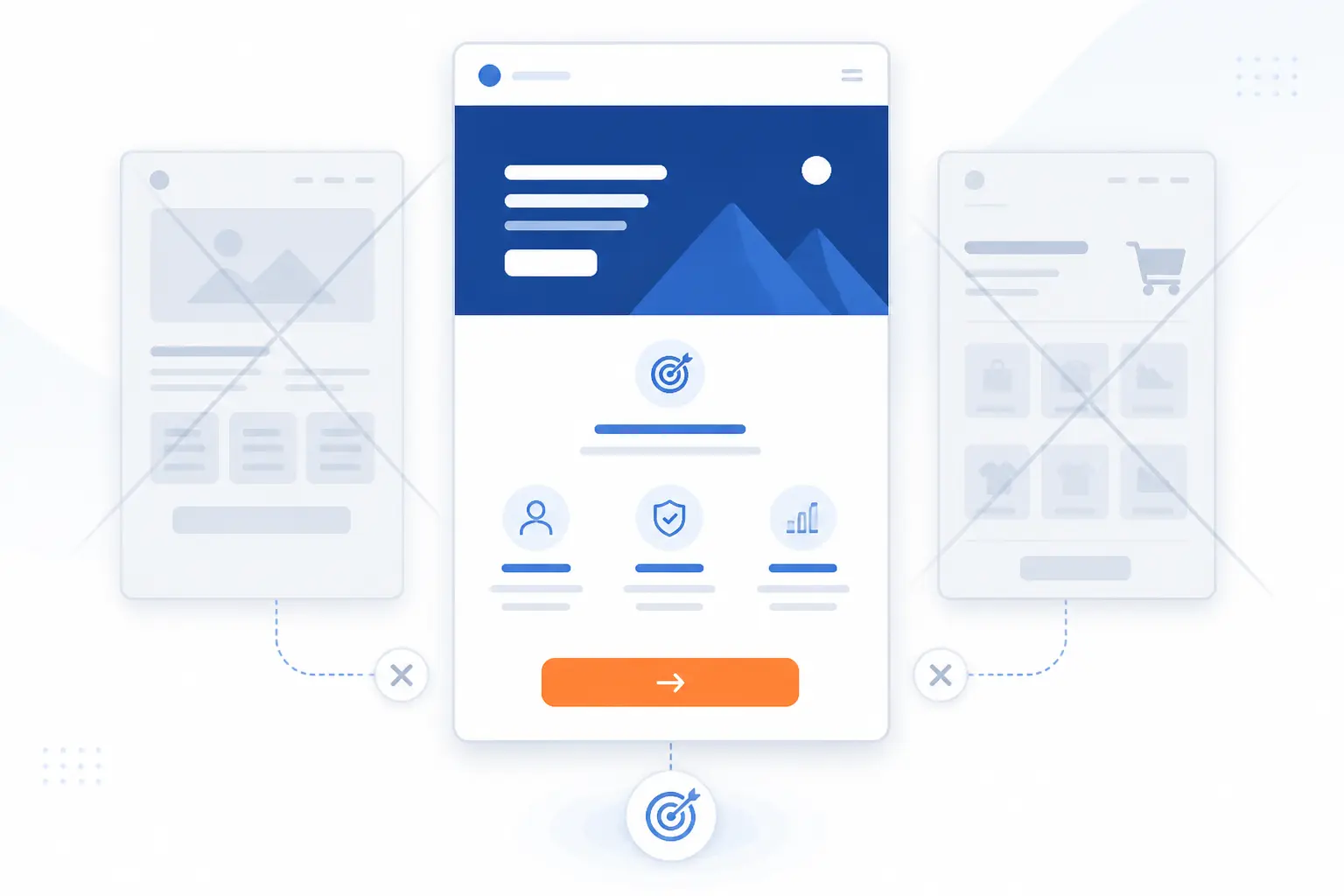
A landing page is a standalone page created for one conversion goal. Unlike a homepage, it is not built to introduce every part of a business. Its job is narrower and sharper. It asks the visitor to do one thing, and it removes as many competing choices as possible.
We usually think of it as the place where intent gets tested. A person clicks because something caught their attention, and the page either confirms that promise or wastes the click. When the page is aligned with the offer, the visitor knows what to do next. When it is not, the visitor bounces and the campaign leaks money.
How Visitors Move From Ad or Email to Action
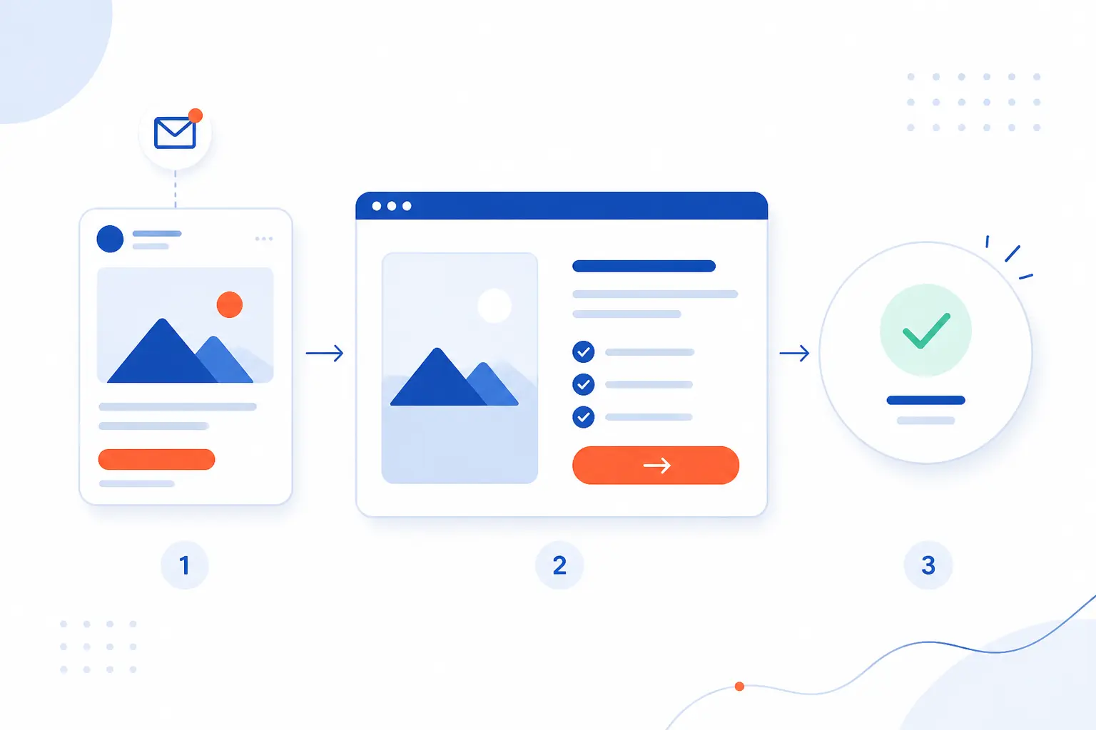
Visitors move from ad or email to action when the message stays consistent, the offer is simple, and the next step feels easy. That flow sounds obvious, but it breaks fast when the page tries to do too much. We see the strongest results when every element supports the same destination. In practice, that means matching the click, reducing friction, and measuring the action that matters.
Post-Click Message Match
Post-click message match means the page repeats the promise that earned the click. If the ad says “Start your free trial,” the page should lead with that same offer, not a generic company intro. Google’s destination rules say ad pages should be functional, useful, and easy to navigate, which is a practical way to think about message match too.
We like to ask one blunt question here: does the visitor feel they arrived in the right place within a few seconds? A strong yes builds trust. A weak maybe usually kills momentum.
One Clear Offer and Fewer Exit Points
One clear offer converts better because attention is limited. When a page asks people to subscribe, book a demo, read a case study, and browse the blog at the same time, most people choose none of them.
Layout matters here because design controls attention. Nielsen Norman Group describes good page structure as a way to guide the eye in the intended order, which is exactly what a conversion page needs. We prefer a visual path that starts with the headline, explains the value, and ends at one call to action.
Lead Capture and Sales Goals
Landing pages usually pursue either a lead goal or a sales goal. A lead goal collects contact details for later follow-up. A sales goal moves the visitor straight toward checkout, booking, or subscription. In analytics terms, actions like form submits, purchases, and signups can be tracked as key events.
That distinction matters because the page structure should follow the goal. A lead page can ask for an email and a few fields. A sales page often needs stronger proof, pricing clarity, and fewer doubts before the click.
The Two Core Landing Page Formats
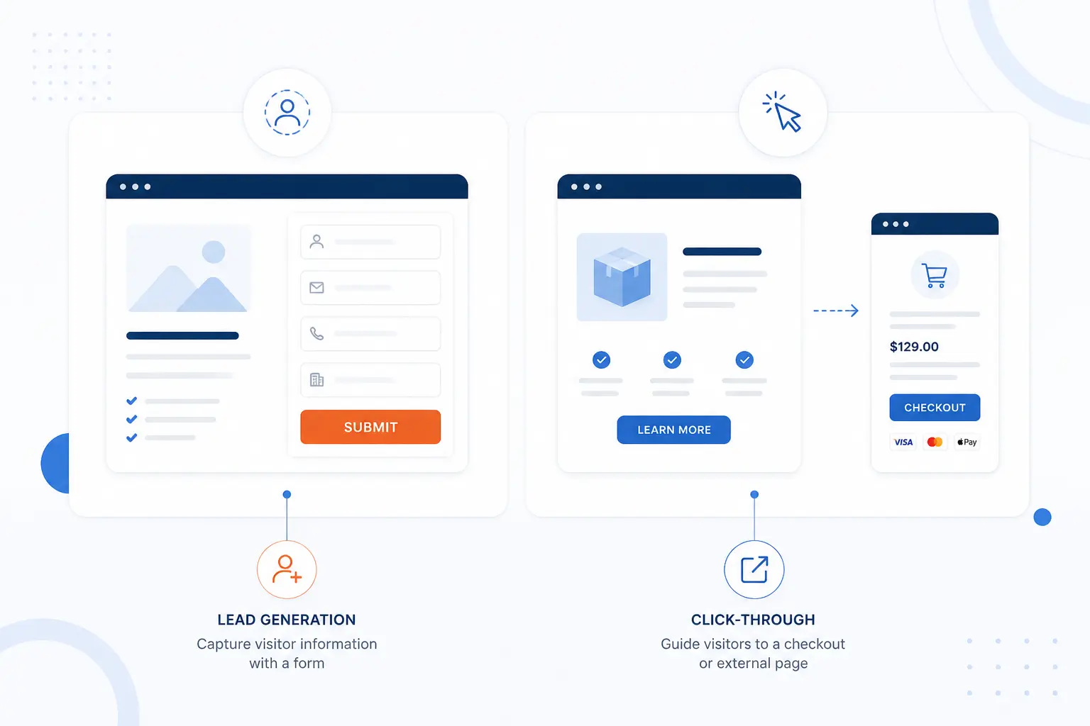
Most landing pages fall into two formats: lead generation pages and click-through pages. The first collects information on the page itself. The second warms the visitor up, then sends them to the next step, such as checkout or account creation. We treat these formats differently because they solve different moments in the buyer journey.
| Format | Best for | Main action |
|---|---|---|
| Lead generation | Capturing interest | Submit a form |
| Click-through | Moving buyers forward | Continue to signup or checkout |
Lead Generation and Lead Capture Pages
Lead generation pages ask for information in exchange for value. That value might be a quote, a demo, a consultation, a free tool, or a downloadable resource. The page wins when the offer feels worth the form.
A familiar real-world example is Netflix’s signup flow, which begins by asking for an email before it collects more details. That is a classic capture move. It lowers the first barrier and turns anonymous traffic into an identifiable lead or prospect.
We think this format works best when the form asks only for what the business truly needs right now. Every extra field adds a little drag. If the next step is a conversation, ask for enough detail to make that conversation useful, not enough to satisfy every department at once.
Click-Through Pages
Click-through pages exist to persuade first and collect details later. They explain the offer, answer objections, and send the visitor to the next page to complete the action. That next page is often checkout, account creation, or plan selection.
A clean example is Shopify’s start page, which focuses on the trial offer and moves visitors into the signup flow. We like this format for products or subscriptions where a short persuasive step can increase intent before a more detailed form or payment page appears.
In our view, click-through pages are often the better choice when the commitment is bigger. If money, time, or setup effort is involved, people usually need a short case for why they should continue.
What Makes a Landing Page Convert
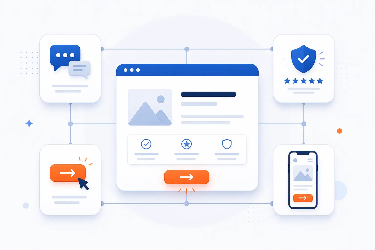
A landing page converts when the visitor quickly understands the offer, trusts the claim, and sees an easy next step. Conversion is rarely one magic button color or one clever phrase. It is the result of many small choices working together. We usually look at four things first: the message, the action, the proof, and the experience on mobile.
Headline and Value Proposition
The headline should tell the visitor what they get and why it matters. If it is vague, cute, or slow to explain itself, the page starts with friction.
We favor headlines that answer three questions fast: what is this, who is it for, and what happens next? The supporting copy can add detail, but the first screen has to do the heavy lifting. A good value proposition does not just sound appealing. It makes the offer feel specific and believable.
Calls to Action, Forms, and Visual Hierarchy
Calls to action work best when they are obvious, specific, and placed where the eye expects them. “Get the guide” is usually stronger than “Submit” because it tells the visitor what happens after the click.
Forms also need to be easy to understand. The W3C’s forms guidance says all form controls need labels, which is helpful for usability as well as accessibility. We take that as a reminder to avoid clever placeholders that disappear and leave people guessing.
Visual hierarchy does the rest of the work. The page should make the most important thing look important, not just present. If the form, button, and proof points compete equally for attention, the visitor has to think too hard.
Images, Testimonials, and Trust Signals
Trust signals matter because visitors decide with incomplete information. A relevant product image, a short testimonial, a recognizable client logo, or a clear security cue can reduce doubt at the moment it matters most.
Still, proof only helps when it is honest. The FTC’s guidance on reviews and endorsements is a useful reminder that social proof should be genuine and properly disclosed. We would rather show one credible testimonial than a wall of vague praise.
Mobile Experience and Page Speed
Mobile performance is no longer optional because phones generated 51.48% of global web traffic in Q2 2026. If a page is hard to read, slow to tap, or awkward to scroll on a phone, it is fighting the way many people actually browse.
Speed is part of conversion, not just a technical detail. Google’s research found bounce probability rises 32% as load time moves from 1 to 3 seconds. We have a simple rule here: if the offer is urgent, the page must feel immediate.
Performance should also be measured, not guessed. Google’s Core Web Vitals guidance gives a practical framework for checking how real users experience loading, responsiveness, and layout stability. Those metrics do not replace copy or strategy, but they do protect good marketing from bad delivery.
Where Landing Pages Fit in Marketing Campaigns
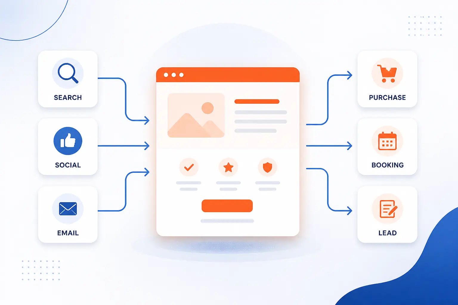
Landing pages fit wherever a campaign needs a focused destination. They are the bridge between traffic and outcome. We use that word carefully because a page should not exist on its own just because a team built one. It should exist because a campaign needs a precise place to send people.
Paid Search and Paid Social Campaigns
Paid campaigns are where focused pages often matter most. The click costs money, so every mismatch hurts twice. First, you pay for the visitor. Then you lose the chance to convert them.
Search traffic usually arrives with clearer intent, so the page should mirror the search promise closely. Social traffic can be colder, so the page often needs stronger framing and proof before the call to action. In both cases, we think relevance beats cleverness.
Email Campaigns and Lead Magnets
Email campaigns pair well with landing pages because both can stay tightly focused on one offer. A newsletter promoting a webinar, checklist, or free consultation should not dump readers onto a busy homepage.
This is where lead magnets shine. The email creates context, and the page finishes the job. If the page repeats the benefit and keeps the form short, the path feels natural.
Organic Search and Evergreen Offers
Organic search can also send visitors to focused pages, especially for evergreen offers. A page built around a stable need, such as booking a demo or requesting a quote, can serve both SEO and conversion goals.
We would not force every ranking page into a hard-sell format. Sometimes people still need education. But when the intent is clear, a focused destination can outperform a broad service page because it asks for less interpretation from the reader.
How to Create and Improve a Landing Page
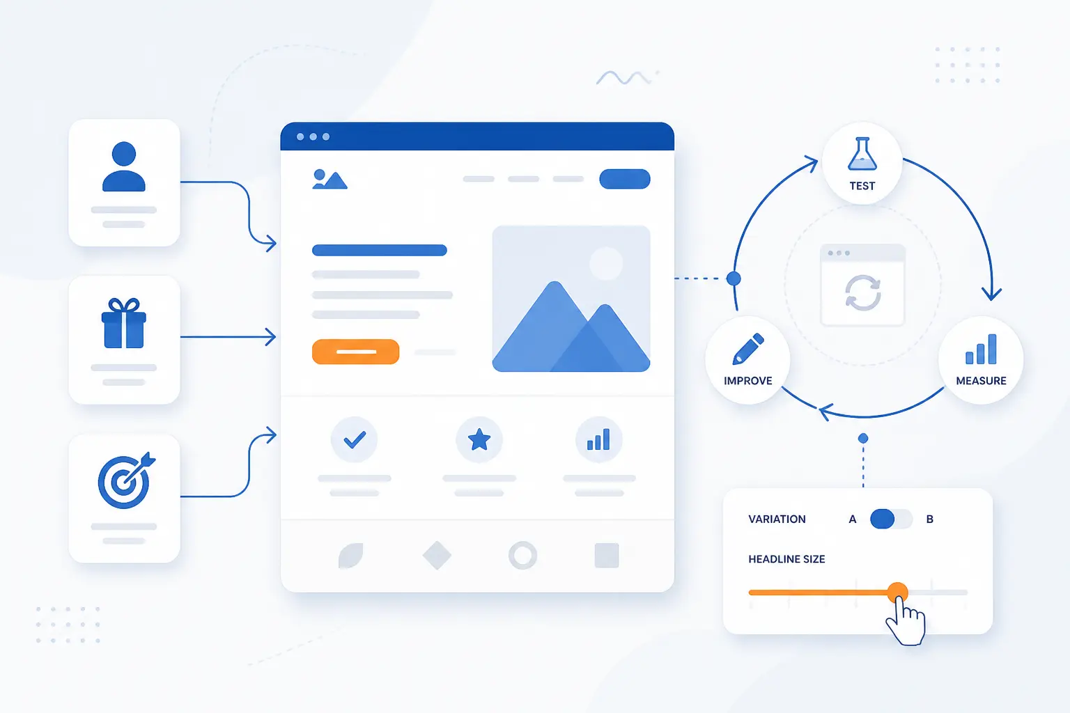
To create a good landing page, start with one audience, one offer, and one measurable goal. That sounds restrictive, and that is the point. Focus is the feature. Once the page is live, improve it by testing what changes understanding, trust, or friction, not by tinkering at random.
Start With One Audience and One Goal
Start by choosing exactly who the page is for and what you want them to do. A page for first-time visitors should not sound like a renewal page for existing customers.
We recommend writing a single sentence before any design work begins: “This page helps [audience] do [action] because [benefit].” If that sentence feels muddy, the page will too. Clarity at the strategy stage saves endless revision later.
Build the Page Around the Offer
Build the page around the offer, not around a template. The offer decides the proof, the CTA text, the form length, and the amount of explanation required.
A free checklist needs far less persuasion than an enterprise software demo. A discount page may need urgency, while a consultation page may need authority and reassurance. We think many weak pages fail because they copy a layout before they define the exchange.
Measure Results With Testing and Tracking
Measure results by tracking the action that matters and testing meaningful changes. If your goal is a qualified lead, a vanity metric like time on page is not enough.
We like to test one important variable at a time, such as the headline, the CTA, the proof block, or the form length. Keep the winning version, then test the next biggest friction point. Over time, small gains compound when the page is tied to real conversion tracking and real performance data.
FAQ About Landing Pages
Most landing page questions come down to scope, structure, and examples. The short answers are straightforward. A landing page is narrower than a website, simpler than most service pages, and more intentional than a generic page built to “cover everything.”
What Is the Difference Between a Landing Page and a Website?
A website is a collection of pages, while a landing page is usually one page built for one action. A website helps visitors explore, compare, and learn about a business in different ways. A landing page narrows the path and asks for a single next step.
What Is a Landing Page Example?
A landing page example is a signup, trial, demo, or download page tied to one campaign goal. A streaming signup screen, a software free-trial page, or a webinar registration page all fit the pattern. If the page exists mainly to turn a visitor into a lead or customer, it is probably serving as one.
What Does a Landing Page Look Like?
A landing page usually looks simpler than a typical website page. It often has a headline, short supporting copy, one call to action, some proof, and few navigation links. The best ones look calm, direct, and purpose-built rather than stuffed with options.
How 1Byte Supports Landing Page Projects
At 1Byte, we support landing page projects by helping teams secure the page, publish it on the right hosting model, and prepare for traffic spikes when a campaign succeeds. As an AWS Partner, we think the practical question is never just “Can we put this page online?” It is “What setup fits this campaign’s goal, traffic pattern, and level of control?”
| 1Byte service | Best fit | Practical role |
|---|---|---|
| Domain registration + SSL certificates | Brand trust and secure access | Give the page a clean address and HTTPS |
| WordPress hosting + shared hosting | Fast campaign launches | Publish straightforward marketing pages |
| Cloud hosting + cloud servers | Heavier traffic and more control | Handle larger promotions and custom setups |
Register a Domain and Protect Your Page With SSL Certificates
A clear domain and valid SSL certificate are the basic foundation of a credible campaign page. Domain registration gives the page a branded home, while SSL certificates make sure the connection is encrypted and the browser shows HTTPS.
For a landing page, that matters in plain terms. People hesitate when the URL looks off or the browser throws warnings. We see domain registration and SSL certificates as the first trust layer, especially for forms, quote requests, and checkout-related actions.
Launch Campaign Pages on WordPress Hosting or Shared Hosting
WordPress hosting or shared hosting can be the practical choice for simple campaign launches. If the page does not need complex infrastructure, these options can be enough to publish a focused offer quickly.
From our perspective at 1Byte, WordPress hosting makes sense when the marketing team wants familiar content editing. Shared hosting fits straightforward pages with lighter technical demands. In both cases, the real goal is to keep the build process simple enough that the offer gets tested, not delayed.
Scale High-Traffic Promotions With Cloud Hosting and Cloud Servers
Cloud hosting and cloud servers make more sense when a campaign needs room to grow or more control over the environment. That is especially relevant for launches, seasonal promotions, or paid campaigns that may send sudden traffic spikes.
As an AWS Partner, we think this is where planning pays off. A focused page can still attract a lot of demand when the offer is strong. If you expect heavier traffic, custom application logic, or tighter infrastructure control, cloud hosting and cloud servers are the more practical direction.



Conclusion
A landing page is a focused page built to drive one action. That is the simplest answer, and it is still the most useful one. When the message matches the click, the offer is clear, and the page removes friction, conversion becomes far more likely.
We think that is why landing pages remain so valuable. They turn vague interest into measurable intent. If you are planning one now, the next smart step is simple: choose one audience, one offer, and one action, then ask whether your page makes that choice feel easy.