
- What Is a Favicon
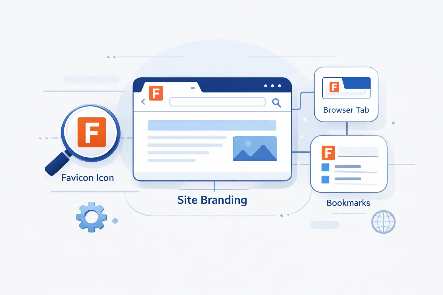
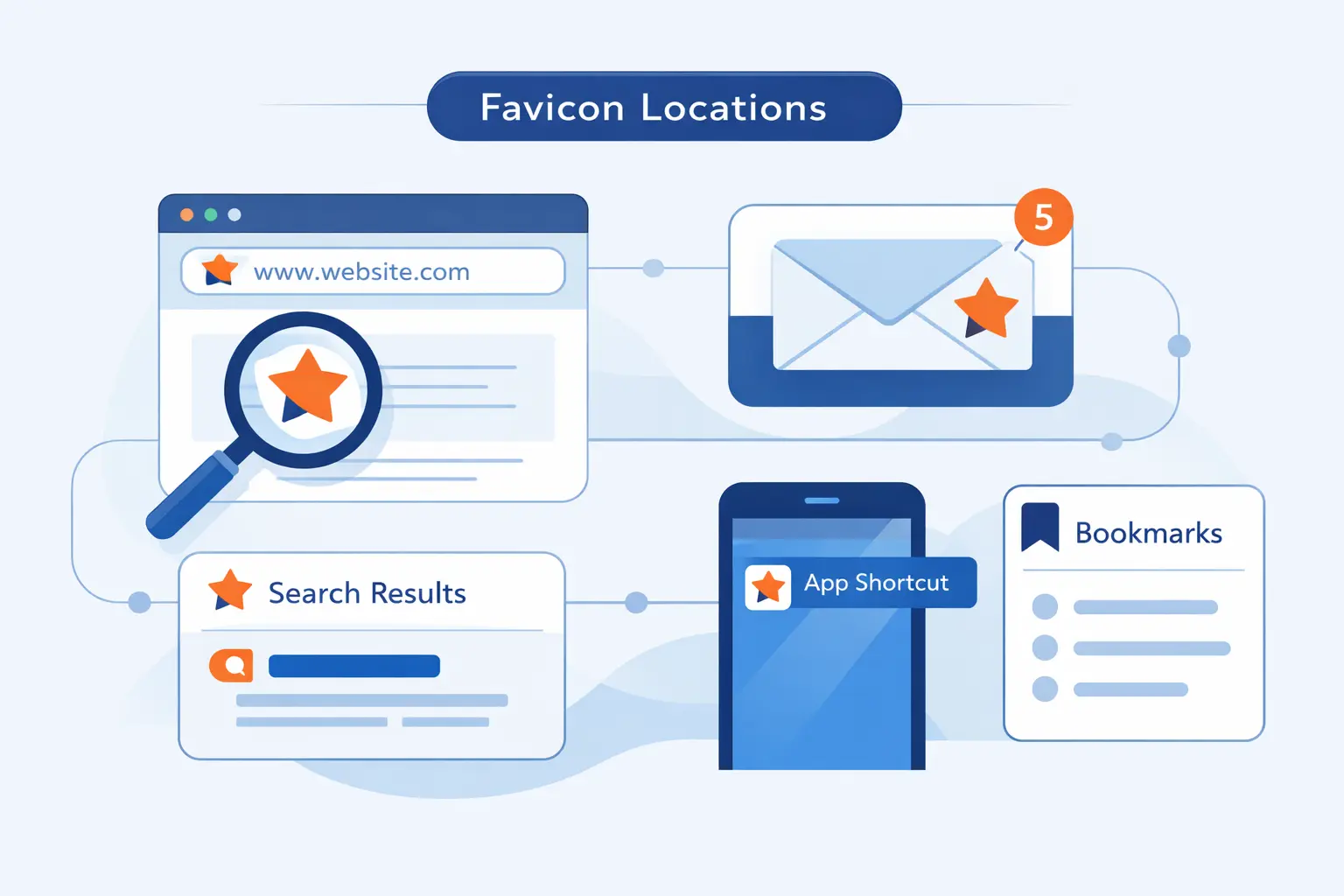
- Where Favicons Appear Online
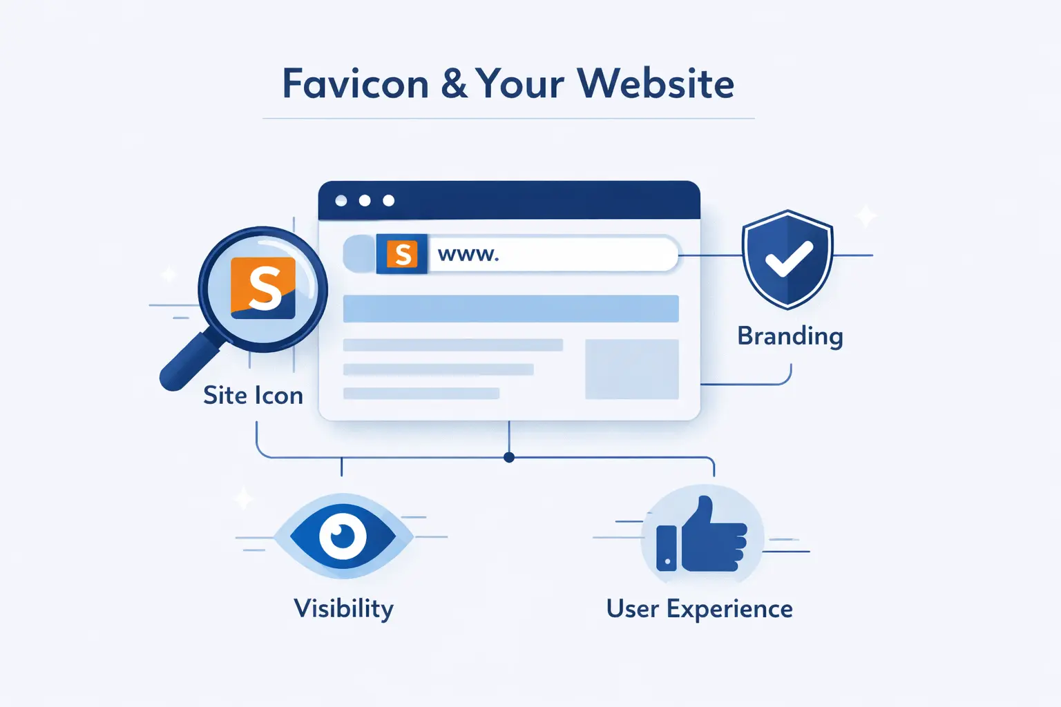
- Why Favicons Matter for Branding and User Experience
- Do Favicons Affect SEO
- Common Favicon Examples and Design Patterns
- How to Design a Good Favicon
- What Size Should a Favicon Be
- Which File Formats Work Best
- How to Create a Favicon
- How to Add a Favicon to Your Website
- How to Test and Troubleshoot a Favicon
- FAQ
- How 1Byte Supports Website Owners With Web Hosting and Cloud Services
- Final Thoughts on What Is a Favicon
When people ask us what is a favicon, we usually give a simple answer first. It is the tiny image that represents a website in places where space is tight and attention is even tighter. Small as it is, it carries a surprising amount of branding weight.
We have seen website owners spend days polishing layouts, copy, and hosting performance, then leave the favicon blank. That is a mistake. This little asset follows a site into browser tabs, bookmarks, saved shortcuts, and app-like installs. It is often the first visual cue people use to recognize a page they already trust.
What Is a Favicon
At 1Byte, we think of a favicon as a website’s smallest brand badge. It does not explain your business on its own, but it helps people spot your site quickly and remember it later.
1. Definition and Core Purpose
A favicon is a small square image that browsers and devices use to represent a website. Its core purpose is recognition. When someone has many tabs open, a favicon helps them find your page without rereading every title.
That is why we treat it as a usability element, not decoration. A good favicon reduces friction. A weak one adds just enough confusion to be annoying.
2. Alternative Names for a Favicon
You will hear a few names used for the same idea. Some people call it a site icon, tab icon, browser icon, or shortcut icon. In website builders, the label is often “site icon,” which can throw beginners off even though it usually points to the same file family.
The naming varies, but the job does not. It is still the visual marker for your site across browser and device surfaces.
3. Favicon Compared with a Logo and an Icon
A logo is your full brand mark. A favicon is the reduced version that still has to work when space is scarce. A general icon can mean almost any small UI symbol. A favicon is more specific. It stands for the whole site, not just one button or action.
We often tell clients to think of a favicon as the fingerprint of the brand. It is smaller than a logo, but it still has to feel unmistakably yours.
Where Favicons Appear Online
We pay attention to these tiny files because Chrome alone represented 70.25% of worldwide browser usage in May 2026, which tells us browser surfaces still matter at enormous scale.
1. Browser Tabs, Bookmarks, and History
This is the classic use case. Favicons appear in browser tabs, bookmark bars, bookmark folders, and browsing history lists. In those places, users scan shapes and colors far faster than they scan full page titles.
We notice this most with power users. If someone works with a dozen tabs open, the favicon becomes the quickest path back to your site.
2. Search Results and Desktop Shortcuts
Search engines may also reuse the site icon in search presentation, and Google recommends something larger than 48×48 pixels so it stays readable across different surfaces.
Desktop shortcuts behave in a similar way. When someone saves your site for quick access, the little image becomes the thing they click. If that image is generic, the shortcut looks forgettable before the page even opens.
3. Mobile Home Screens and Installed Web Apps
On phones and tablets, the icon can travel even further. It may be used when a user saves a site to the home screen or installs it like a web app. At that point, the favicon is no longer just a browser detail. It starts acting like a mini app badge.
That shift matters. A website that looks polished in a tab but messy on a home screen feels half-finished. We would rather keep the experience consistent from the start.
Why Favicons Matter for Branding and User Experience
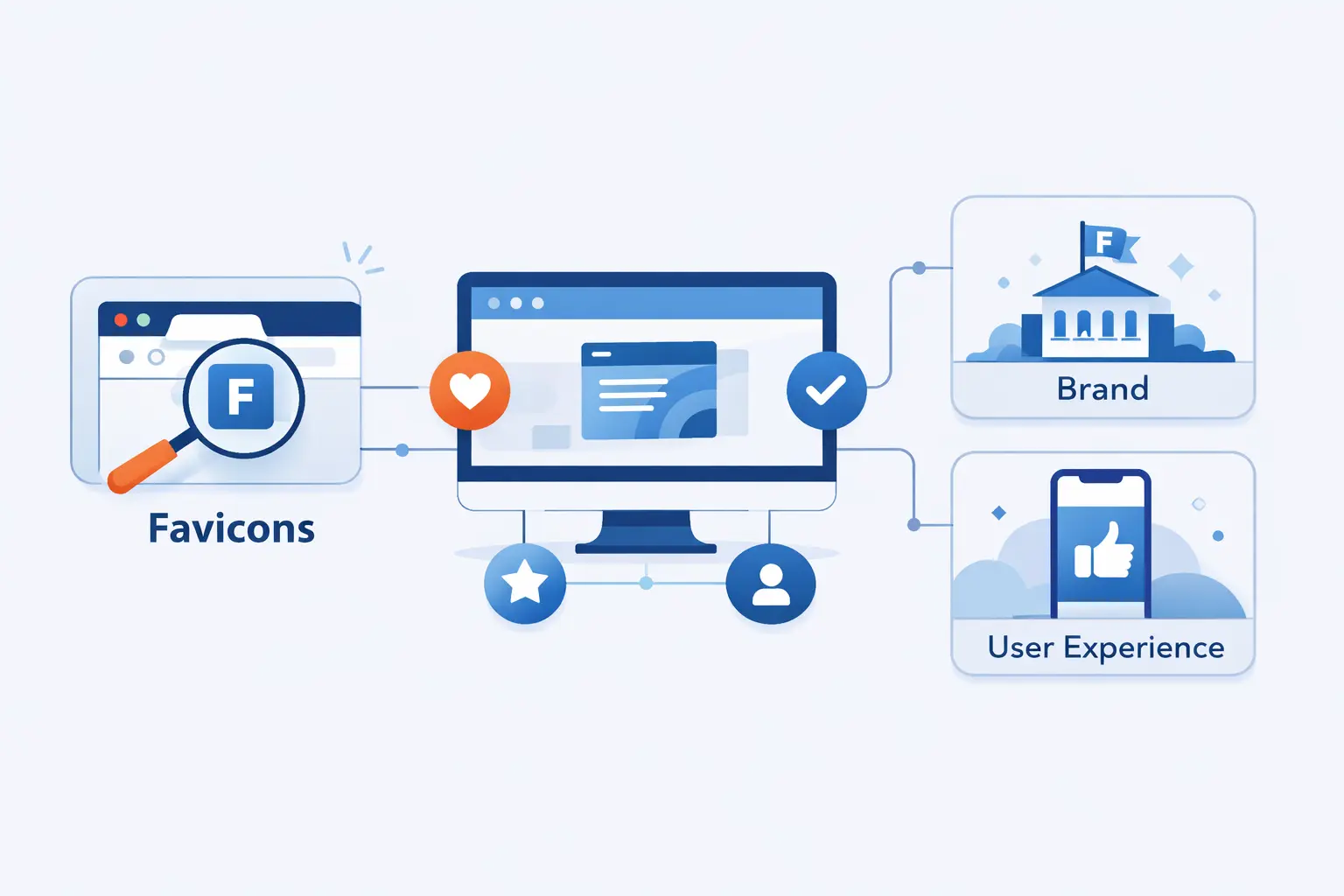
For us, the value of a favicon comes down to one simple idea. People remember visual cues quickly, and the web gives you many tiny moments to use them well.
1. Better Brand Recognition
A strong favicon helps people recognize your brand with almost no effort. They do not need to read your domain or page title every time. They see the shape, register the color, and know where they are.
That is especially useful for returning visitors. Over time, the favicon becomes part of your brand memory, much like packaging on a store shelf.
2. More Trust and Professionalism
Missing favicons make sites feel unfinished. Generic ones are not much better. When a browser falls back to a blank document icon or a default globe, users may not say anything out loud, but many will feel the site was assembled in a hurry.
We do not think a favicon creates trust by itself. Still, it supports the broader impression that the site owner pays attention to details, and details are where confidence is built.
3. Faster Tab Recognition and Easier Navigation
A favicon helps people move faster. That is the user experience angle that often gets overlooked. If someone can jump back to your page in a crowded browser with one glance, the site has done part of its job well.
It is a small win, sure. But the web is full of small wins that add up.
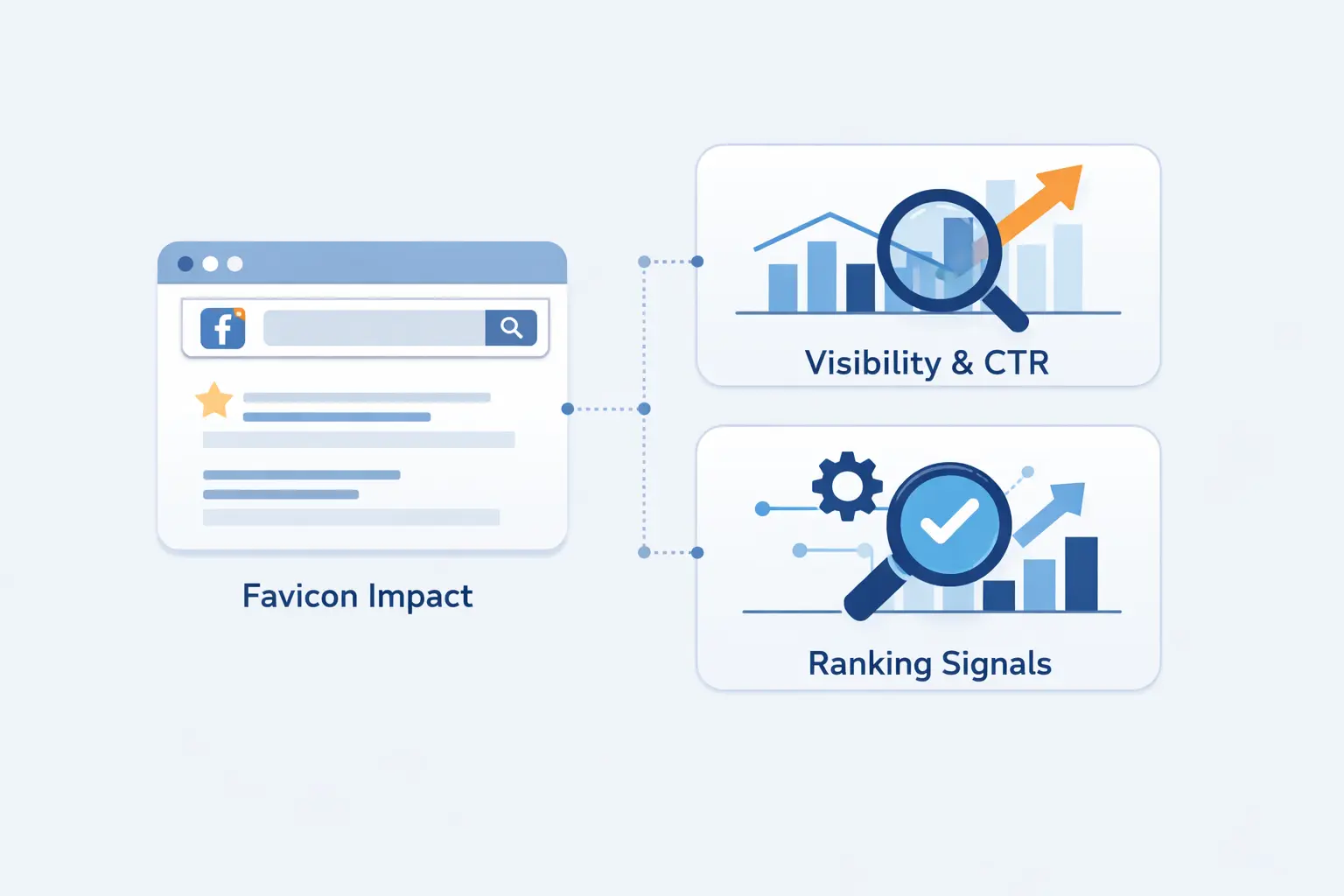
Do Favicons Affect SEO
This is where we like to trim expectations. A favicon matters, but not for the reasons people sometimes hope.
1. Why Favicons Do Not Directly Change Rankings
We do not treat a favicon as a direct ranking factor. It does not suddenly make a page more relevant, more authoritative, or more useful. If your content is weak, a polished icon will not rescue it.
In our view, a favicon belongs to search appearance and user recognition more than ranking mechanics. It shapes presentation, not the core quality signals that push pages up the results.
2. How Favicons Can Improve Clicks and Engagement
Where a favicon can help is behavior. A clean, recognizable icon can make a result or saved shortcut easier to spot. That may improve the odds that users choose your result when several familiar brands sit close together.
We would never oversell this. It is an indirect effect. Still, better recognition can support clicks, repeat visits, and smoother navigation, which is worth having.
3. What a Missing or Generic Favicon Signals
A missing favicon signals neglect. A generic one signals that branding was never adapted for real-world use. Both create tiny moments of hesitation.
Those moments matter more on crowded screens. If your page is fighting for attention in a row of tabs or a saved list of bookmarks, a default-looking icon is a quiet disadvantage.
Common Favicon Examples and Design Patterns
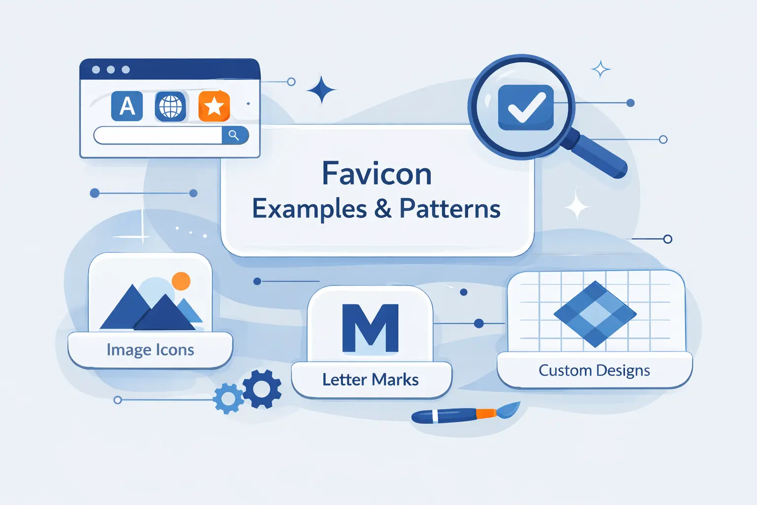
Good favicon design usually follows a few repeatable patterns. The best ones are not busy. They are reduced, confident, and easy to recognize from a few pixels away.
1. Single Letter Favicons
Single-letter favicons work well for brands with long names or strong initials. They are compact and easy to read if the letterform is bold enough. We often recommend this route when the full logo is too detailed to survive shrinking.
The catch is simplicity. A thin or ornate letter can disappear fast, so we prefer heavy shapes with clear contrast.
2. Simplified Logo Favicons
One pattern we admire is this familiar cat silhouette, which keeps enough personality to feel branded even after the rest of the logo has been stripped away.
This is often the sweet spot. You keep the brand DNA, but you remove fine detail, long wordmarks, and background clutter.
3. Symbol Based Favicons
We also like that multicolor hash mark, because the symbol stays recognizable even when the tab is cramped and the page title is truncated.
Symbol-based favicons are great when a company already has a clean emblem. If the symbol is distinctive, it usually outperforms tiny text.
How to Design a Good Favicon
Designing a favicon is less about showing everything and more about choosing what to leave out. We think restraint wins almost every time.
1. Keep It Simple and Legible
Simple shapes survive reduction. Fine lines, shadows, gradients, and tiny internal details usually do not. If a mark gets muddy when viewed small, it is too complex for the job.
Our rule is blunt. If we cannot recognize it instantly, we simplify it again.
2. Limit Text and Use Space Wisely
Most favicons should avoid full words. There is rarely enough room. One letter can work. Two letters can work sometimes. More than that is asking for trouble.
White space matters too. Crowding the edges makes the icon feel blurry, even if the file itself is technically sharp.
3. Use Brand Colors and Test on Different Backgrounds
Color helps recognition, but contrast does the real lifting. A favicon should look good on light tabs, dark tabs, bookmarks, and phone launch surfaces. We always test it against more than one background before calling it done.
This is one of those moments where practical testing beats theory. A design that looks lovely on a white artboard may vanish on a dark browser theme.
What Size Should a Favicon Be
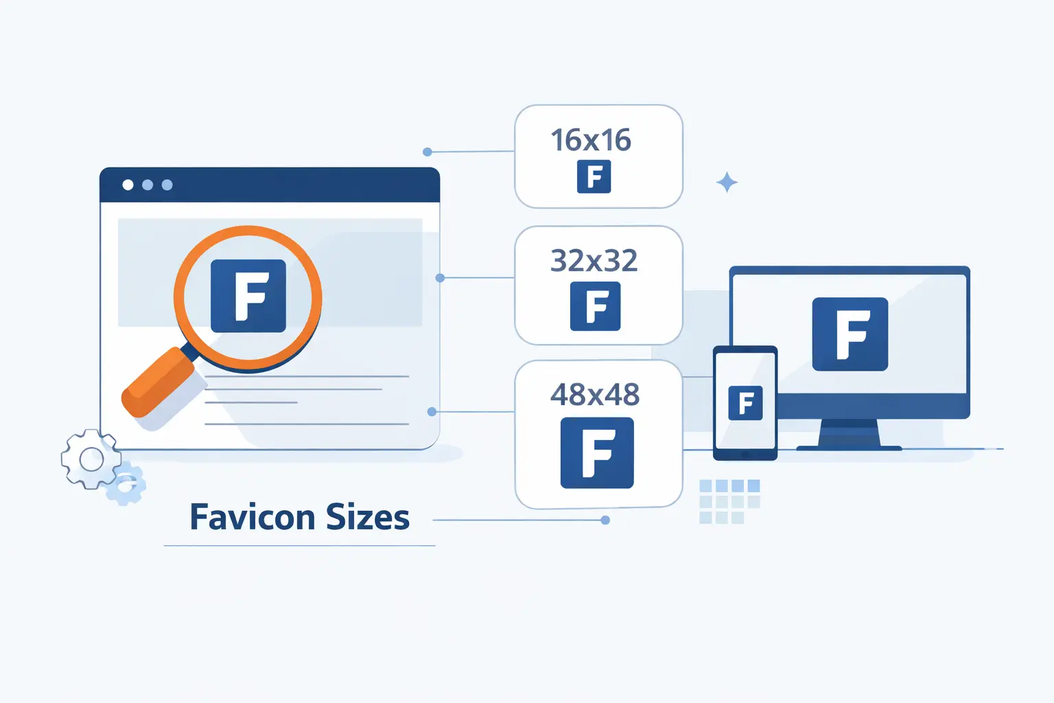
There is no single universal size anymore. We think in sets now, because websites appear in more places than a browser tab.
1. Standard Browser Sizes
For browsers, we usually export a small tab-friendly asset, a mid-sized version, and a larger square file. That gives browsers and platforms room to choose what works best without forcing one file to do every job.
The exact mix depends on your stack, but the principle stays steady. Prepare more than one clean square asset and keep them visually consistent.
2. Apple Touch Icons for iPhone and iPad
For iPhone and iPad home screen saves, we usually ship 180×180 pixels so the saved shortcut looks intentional instead of improvised.
We also prefer an opaque background for this file. Transparent edges can behave oddly on some saved-home-screen contexts, and solid fills usually look more deliberate.
3. Android and PWA Icon Sizes
For installed web apps, we normally include 192×192 and 512×512 in the manifest, then add a maskable version if the design can tolerate cropping.
This matters because installed web apps behave more like software than documents. The icon has to hold up on launch screens, switchers, and OS-level app lists, not just inside a browser.
Which File Formats Work Best
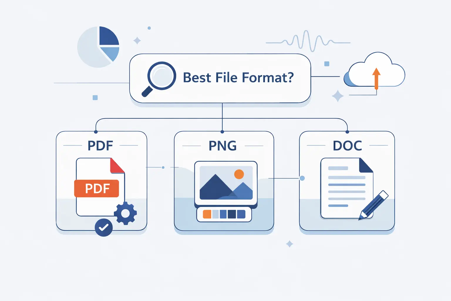
Format choices are mostly about compatibility and convenience. We do not think there is one perfect file type for every site.
1. ICO for Broad Compatibility
ICO is still useful because many browsers and tools expect it, especially at the conventional root path. We still like to include it as a catch-all option, particularly when a site needs broad compatibility without surprises.
It is old, yes. But old and dependable still counts for something on the web.
2. PNG for Simplicity and Transparency
PNG is easy to export, easy to manage, and great for crisp flat artwork. If a beginner wants the safest starting point, PNG is usually where we begin.
It also handles transparency well, which is useful when the design needs a shaped mark rather than a filled square.
3. SVG with Fallbacks for Modern Setups
SVG is excellent when the artwork is simple and vector-friendly. It stays sharp at large sizes and can reduce the number of separate files you need. Still, we do not trust SVG alone.
Our preference is modern plus practical. Use SVG where it makes sense, then keep PNG or ICO fallbacks so smaller or less flexible contexts still render cleanly.
How to Create a Favicon
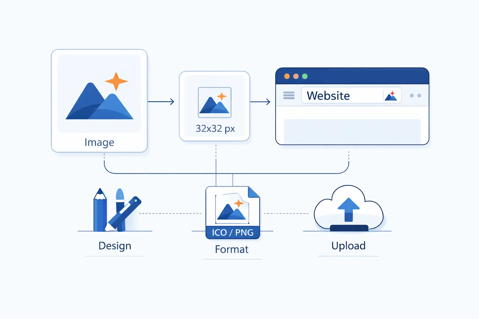
Creating a favicon is usually quicker than people expect. The hard part is not the export. It is choosing the right reduced mark.
1. Start with a Logo, Initial, or Symbol
We usually start from the main logo, then strip it down. If the full logo is too detailed, we move to an initial or a distinct symbol. The best starting point is the element people already associate with the brand.
That keeps the favicon from feeling random. It should look like a natural extension of the brand, not an afterthought invented at the last minute.
2. Use a Favicon Generator or Design Tool
You can make the artwork in any design tool you already know, then export it through a favicon generator if you want the extra file variants. That route is practical for beginners because it removes a lot of manual resizing.
We like tools when they save repetitive work. We do not like them when they encourage bad design. Start with a solid mark first, then let the tool package it.
3. Export a Complete Favicon Package
A complete package usually includes browser files, a home screen icon, and any manifest assets your site needs. We also keep filenames tidy and predictable so maintenance stays easy later.
If you skip this step, the icon may look correct in one place and wrong somewhere else. That is the classic half-working favicon problem.
How to Add a Favicon to Your Website
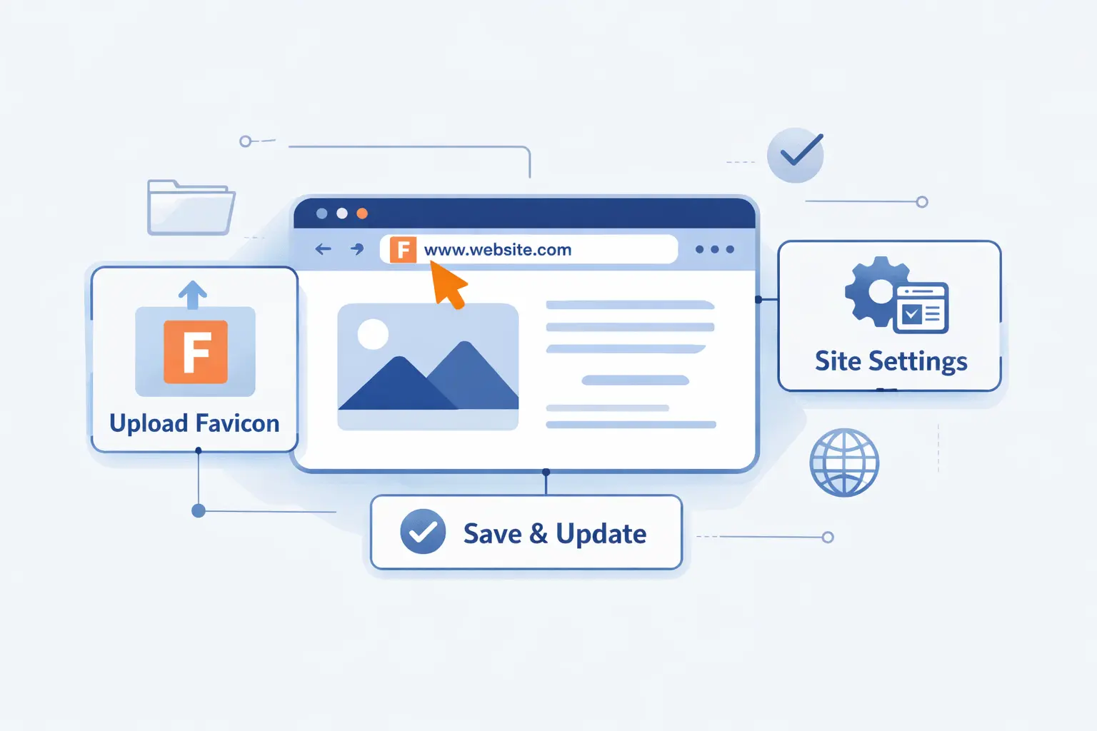
The technical step is often straightforward. The real trouble comes from caching, inconsistent filenames, and builders that generate more markup than people realize.
1. Add a Favicon in HTML
The simplest setup is placing a link tag in the document head.
<link rel="icon" href="/favicon.ico">That alone can be enough for a basic site. We still prefer to go a bit further when the project needs mobile and app-style coverage.
2. Provide Multiple Sizes and Fallback Formats
When we publish more than one asset, the browser picks the best match based on type, size hints, and what it supports.
<link rel="icon" href="/favicon.ico"><link rel="icon" type="image/png" href="/icon.png"><link rel="icon" type="image/svg+xml" href="/icon.svg" sizes="any"><link rel="apple-touch-icon" href="/apple-touch-icon.png">We like this layered approach because it gives modern browsers options while still covering older expectations.
3. Use Platform Settings in WordPress, Wix, and Other Builders
If you use WordPress, Wix, Shopify, Squarespace, or another site builder, there is usually a visual setting for the site icon. We recommend using that first because the platform often generates some of the necessary markup for you.
Still, we never assume it handled everything. We always inspect the live page after publishing and check which files the platform actually output.
How to Test and Troubleshoot a Favicon
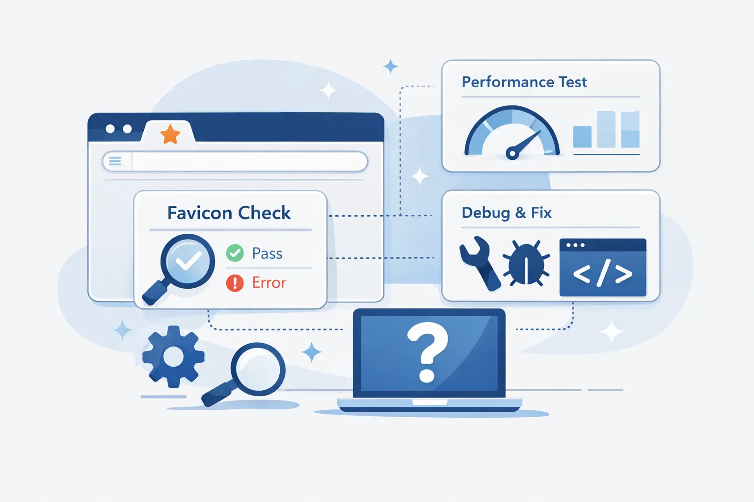
Testing matters because favicons are cached aggressively and reused in many places. A file that looks fine in one browser can stay stale somewhere else for a while.
1. Check Tabs, Bookmarks, History, and Search Results
We test the icon in open tabs first, then bookmarks, history lists, and saved shortcuts. If search visibility matters, we also check how the site appears after search engines recrawl it.
The key is patience. Some surfaces update instantly. Others take longer than people expect.
2. Confirm All Icon Files Are Reachable
Open the icon files directly in a browser and make sure they load. If a file path is wrong, blocked, or returns an error, the browser will quietly fall back to something else.
We also verify that the file names in the HTML match the files on the server exactly. Small naming mistakes cause a lot of wasted time.
3. Fix Missing, Broken, or Blurry Favicons
If the favicon is blurry, the artwork is usually too detailed or the source file was exported poorly. If it is missing, the issue is often caching or a wrong path. If it shows inconsistently, the markup may be incomplete.
Our advice is simple. Simplify the artwork, confirm the paths, clear caches, and avoid frantic filename changes every hour. Slow, methodical checks win here.
FAQ

These are the questions we hear most often from website owners who are setting this up for the first time.
1. Is a Favicon the Same as a Logo?
No. A favicon is usually a reduced version of the brand, while a logo can include more detail, text, and layout. Many favicons are derived from logos, but they are not identical files.
2. How Do I Create a Favicon?
Start with a simple symbol, letter, or trimmed-down logo. Then export the needed files manually or use a generator to package them for browsers and mobile devices.
3. What Is an Example of a Favicon?
A classic example is a single recognizable symbol in a browser tab, such as a letter, an emblem, or a simplified brand mark. The best examples stay readable even when the tab is tiny.
4. Can I Use My Logo as a Favicon?
Yes, if the logo survives shrinking. If it becomes muddy or unreadable, use a simplified logo, one initial, or a core symbol instead.
5. What Size Should a Favicon Be?
Think in a set of square assets, not a single file. You want one for browser use and additional ones for saved shortcuts and installed web apps.
6. What File Format Should a Favicon Use?
ICO and PNG are safe choices for most sites. SVG is excellent for modern setups, but we still prefer to pair it with raster fallbacks.
7. Does a Favicon Affect SEO?
Not as a direct ranking signal. It can still help recognition, presentation, and sometimes clicks, which makes it worth doing well.
How 1Byte Supports Website Owners With Web Hosting and Cloud Services
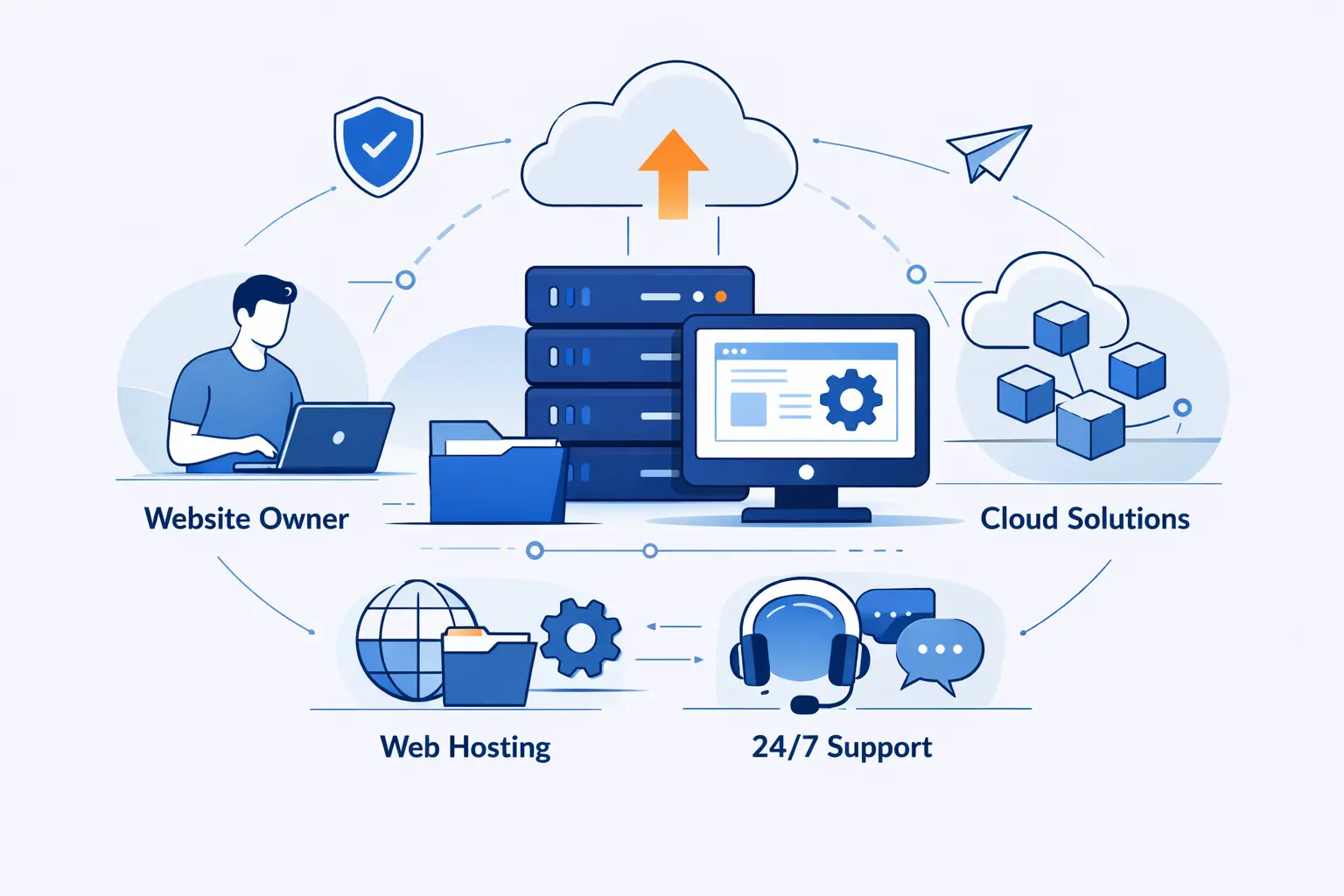
At 1Byte, we help site owners with the technical groundwork that makes details like favicons easier to manage. Good branding needs stable hosting, clear file paths, and dependable deployment.
1. Register Domains and Add SSL Certificates
We help customers secure the basics first. That means registering domains, pointing DNS correctly, and adding SSL certificates so browsers can load sites over HTTPS without warning messages.
When those foundations are clean, assets like favicons are easier to publish and troubleshoot. There is less guesswork and fewer moving parts.
2. Launch Sites with Shared Hosting and WordPress Hosting
For new websites, we offer shared hosting and WordPress hosting that give owners a practical place to launch, upload assets, and manage site settings without doing every server task by hand.
That matters for small teams. If you can publish a site, add the right icon files, and verify the result quickly, you spend more time improving the website and less time wrestling with setup.
3. Scale with Cloud Hosting, Cloud Servers, and AWS Partner Expertise
As sites grow, we support moves into cloud hosting and cloud servers when workloads become heavier or more specialized. That can mean more control over the stack, cleaner isolation, and a better fit for busy applications.
We also bring AWS Partner experience to the table when a simple website starts turning into a more demanding platform. In those moments, infrastructure choices stop being abstract and start shaping uptime, deployment, and day-to-day maintenance.
Final Thoughts on What Is a Favicon
A favicon is tiny, but it is not trivial. It helps users recognize your site, trust what they are clicking, and move through the web with less friction. For something so small, that is a solid return.
Our view at 1Byte is simple. If you care enough to build a website, you should care enough to give it a proper favicon. It is one of the quickest improvements you can make, and once it is done well, it keeps working quietly in the background every day.