
- Quick Comparison of Web Developer Portfolio Examples
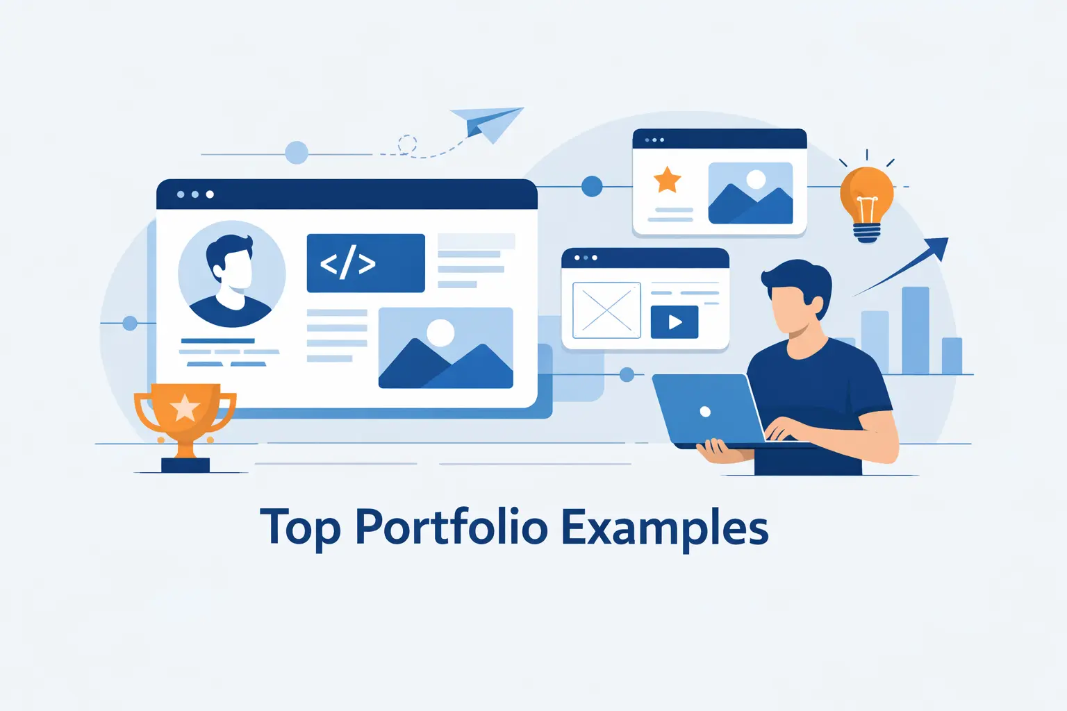
- Top 20 Web Developer Portfolio Examples Worth Studying
- What the Best Web Developer Portfolio Examples Include
- Design Trends Behind Standout Web Developer Portfolio Examples
- Where to Find More Web Developer Portfolio Examples and Design Inspiration
- FAQ About Web Developer Portfolio Examples
- How 1Byte Supports Web Developer Portfolio Websites
At 1Byte, we think the best web developer portfolio examples do one job fast. They make the right people trust your work. Some win with sharp copy and clean project pages. Others win with motion, games, or 3D scenes. In this list, we are not chasing flashy screenshots. We are looking at which examples actually teach you how to build a portfolio that gets remembered.
The space is crowded. GitHub’s latest Octoverse says the platform now serves 180 million-plus developers, which is one reason a generic portfolio now disappears into the wallpaper.
Opportunity still exists, though. The U.S. Bureau of Labor Statistics expects web developers and digital designers to grow 8% from 2023 to 2033, so the right portfolio still matters for job seekers, freelancers, and specialists who want better-fit work.
We also think range matters. Bruno Simon turns navigation into a game. Brittany Chiang does the opposite and wins with clarity. If we were advising a junior engineer, we would copy more from Brittany than Bruno. If we were selling creative technology work, that advice would flip. That is exactly how we ranked the examples below.
Quick Comparison of Web Developer Portfolio Examples
We do not think every strong portfolio needs fireworks. Some of the best examples below win with one sharp headline and a few well-framed projects. Others go full playground mode. This quick table helps us match the first ten examples to the kind of portfolio they are best suited to inspire.
| Service/Tool | Best for | From price | Trial/Free | Key limits |
|---|---|---|---|---|
| Brittany Chiang | Clean hiring portfolio | Free | Free | Low on spectacle |
| Bruno Simon | 3D creative roles | Free | Free | Harder to scan fast |
| Cassie Codes | SVG and motion learning | Free | Free | More educator than recruiter-first |
| Charles Bruyerre | Hybrid design-dev branding | Free | Free | Less technical depth |
| Jesse Zhou | Interactive storytelling | Free | Free | Novelty can slow navigation |
| Jhey Tompkins | UI demo personal brand | Free | Free | Light project detail |
| Monica Dinculescu | Experimental frontend identity | Free | Free | Less traditional hiring flow |
| Lynn Fisher | Editorial personality sites | Free | Free | Few business case studies |
| Brice Clain | Freelance client pitch | Free | Free | More service-led than dev-led |
| Olaolu Olawuyi | Senior engineering credibility | Free | Free | Very restrained visuals |
Top 20 Web Developer Portfolio Examples Worth Studying
We ranked these web developer portfolio examples by what they teach, not by novelty alone. Some are built for recruiters. Others are built to attract clients, design teams, or creative technology work. We call out where each site shines, where it overreaches, and what kind of builder should study it before borrowing the pattern.
1. Brittany Chiang
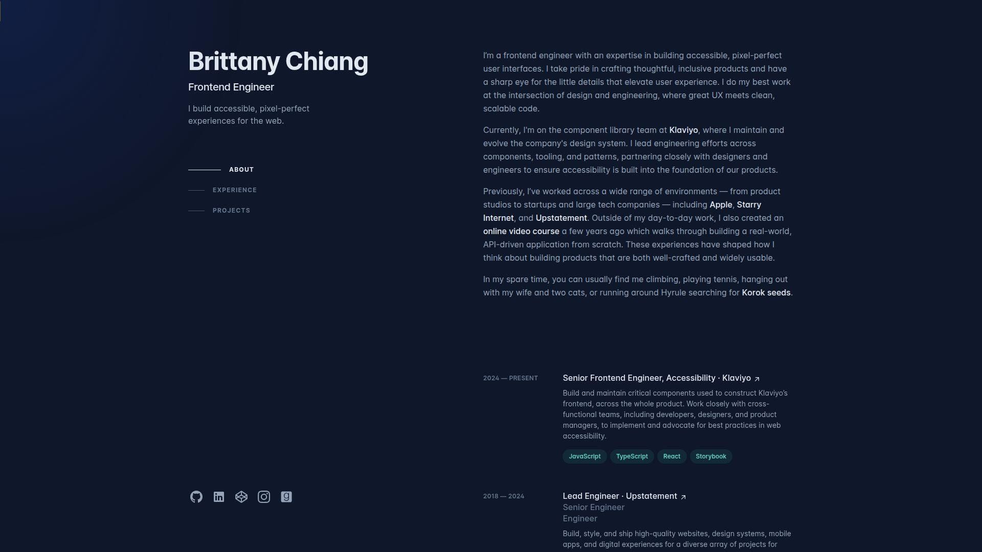
Brittany Chiang’s site is a solo portfolio with the calm of a mature product team. It feels deliberate from the first screen. The dark palette, left-side structure, and tight section order all support one message. She is a serious front-end engineer who cares about accessibility, detail, and shipping polished interfaces. Best for: product front-end engineers and accessibility-minded job seekers.
- Left rail and section anchors → reviewers see role, experience, and projects without hunting.
- Direct proof paths → GitHub, social links, and project archives remove extra clicks when someone wants evidence.
- Restrained layout → time-to-first-value is almost immediate.
From $0/mo to browse. No trial. There is no seat count, support desk, or exportable starter. You are studying a live example, not buying a portfolio theme.
Honest drawbacks: this style has been copied so often that weaker clones now feel generic. It is also light on spectacle, so creative-coding roles may want more personality up front.
Verdict: If you want a portfolio that looks senior, readable, and trustworthy, this helps you get there quickly.
2. Charles Bruyerre
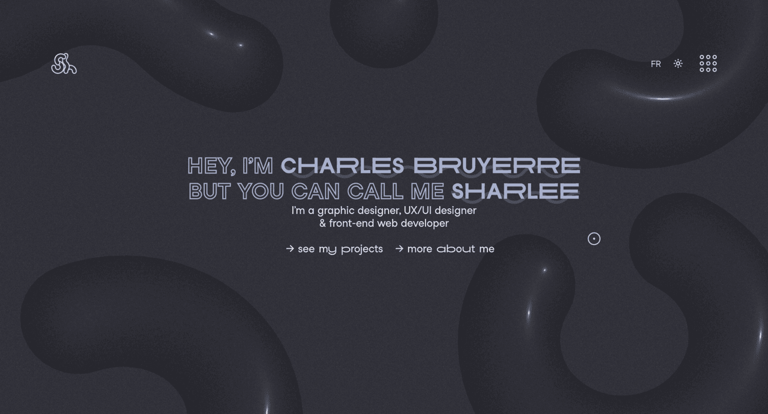
Charles Bruyerre, who also brands himself as Sharlee, presents a portfolio that feels like a one-person creative studio. The site is visual, personal, and direct. It tells us he works across graphic design, UX/UI, and front-end development, then backs that up with a compact project list spanning branding, web work, and illustration. Best for: hybrid designer-developers and creative freelancers early in their positioning.
- Nickname plus role trio → the hybrid skill set is clear fast.
- Mixed work categories → range shows up without a long explanation.
- Minimal navigation and bilingual feel → first value lands early.
From $0/mo to browse. No trial. You get inspiration, not a reusable framework, seat bundle, or white-label starter.
Honest drawbacks: technical depth is not the point here, so engineering-heavy buyers may want more build notes and project context. The portfolio is stronger at selling taste than selling architecture.
Verdict: If you want a portfolio that sells versatility and a clear visual identity, this helps right away.
3. Jesse Zhou
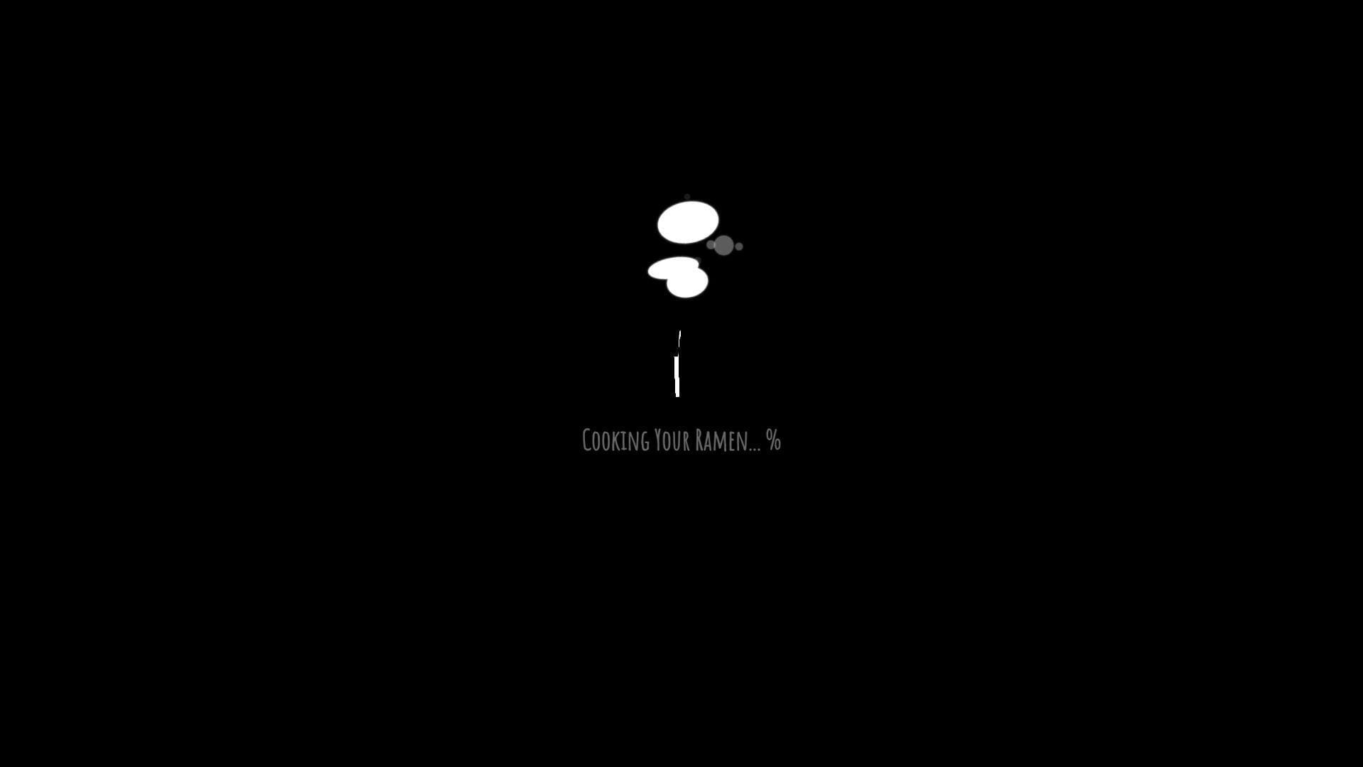
Jesse Zhou turned his portfolio into a cyberpunk ramen shop. That sounds gimmicky until you see how much craft sits underneath it. The world-building is cohesive, the interactions feel purposeful, and the site works as both a portfolio and a case for his 3D web skills. Best for: creative developers, Three.js learners, and freelancers targeting interactive brand work.
- Ramen shop concept → browsing feels like story, not admin.
- Screen-based interactions and hotspots → projects and background live inside the world instead of outside it.
- Strong technical restraint → the spectacle still feels guided, not random.
From $0/mo to browse. No trial. There is no downloadable starter, CMS export, or support channel. You are studying a crafted environment, not licensing a product.
Honest drawbacks: some recruiters will love it and still ask for a plain resume. The novelty also slows direct scanning. It beats generic 3D landers on coherence and trails minimal sites on speed of comprehension.
Verdict: If you want to be remembered for creative engineering, this helps within minutes.
4. Jhey Tompkins
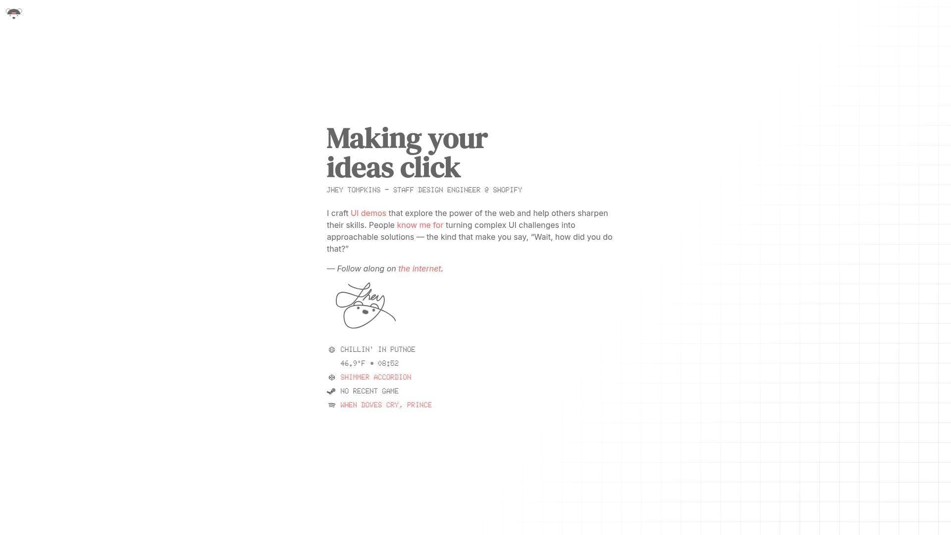
Jhey Tompkins keeps his site intentionally small. That is the strategy. Rather than burying visitors in sections, he leads with a sharp role label, a clear promise, and fast paths to the demos and channels that already carry his reputation. It feels like a mature personal brand page, not a scrapbook. Best for: design engineers, dev advocates, and UI specialists with public work elsewhere.
- One-line positioning → the value proposition is clear without filler.
- Demo-first proof → visitors can move from promise to examples quickly.
- Tiny interface footprint → value lands almost instantly.
From $0/mo to browse. No trial. There are no plan tiers or usage caps, but there is also no deep archive, downloadable kit, or built-in case study library.
Honest drawbacks: this format relies on existing reputation. If you are unknown or need richer project explanations, the home page alone may feel too sparse.
Verdict: If you already have proof in public and need a clean wrapper for it, this helps fast.
5. Monica Dinculescu
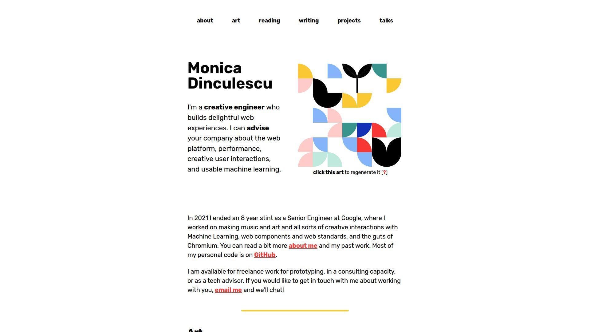
Monica Dinculescu’s site feels like a creative engineer’s lab notebook that never lost its personality. Art, projects, talks, reading, and writing all live together. That sounds messy on paper. On her site, it feels coherent because the tone is honest and the work is unmistakably hers. Best for: experimental front-end developers and consultants who want to show web depth, curiosity, and taste.
- Generative art header → personality shows before any scroll.
- Large archive of experiments and talks → visitors see depth without digging through social feeds.
- Plain labels and playful copy → the site becomes useful quickly.
From $0/mo to browse. No trial. No seats, no gated content, and no packaged source bundle. It is a living example site.
Honest drawbacks: this is not a conventional recruiter-first portfolio. Some older projects are openly broken or dated, which is charming and honest, but not every reviewer will appreciate that.
Verdict: If you want your portfolio to signal deep web curiosity and originality, this helps almost immediately.
6. Lynn Fisher
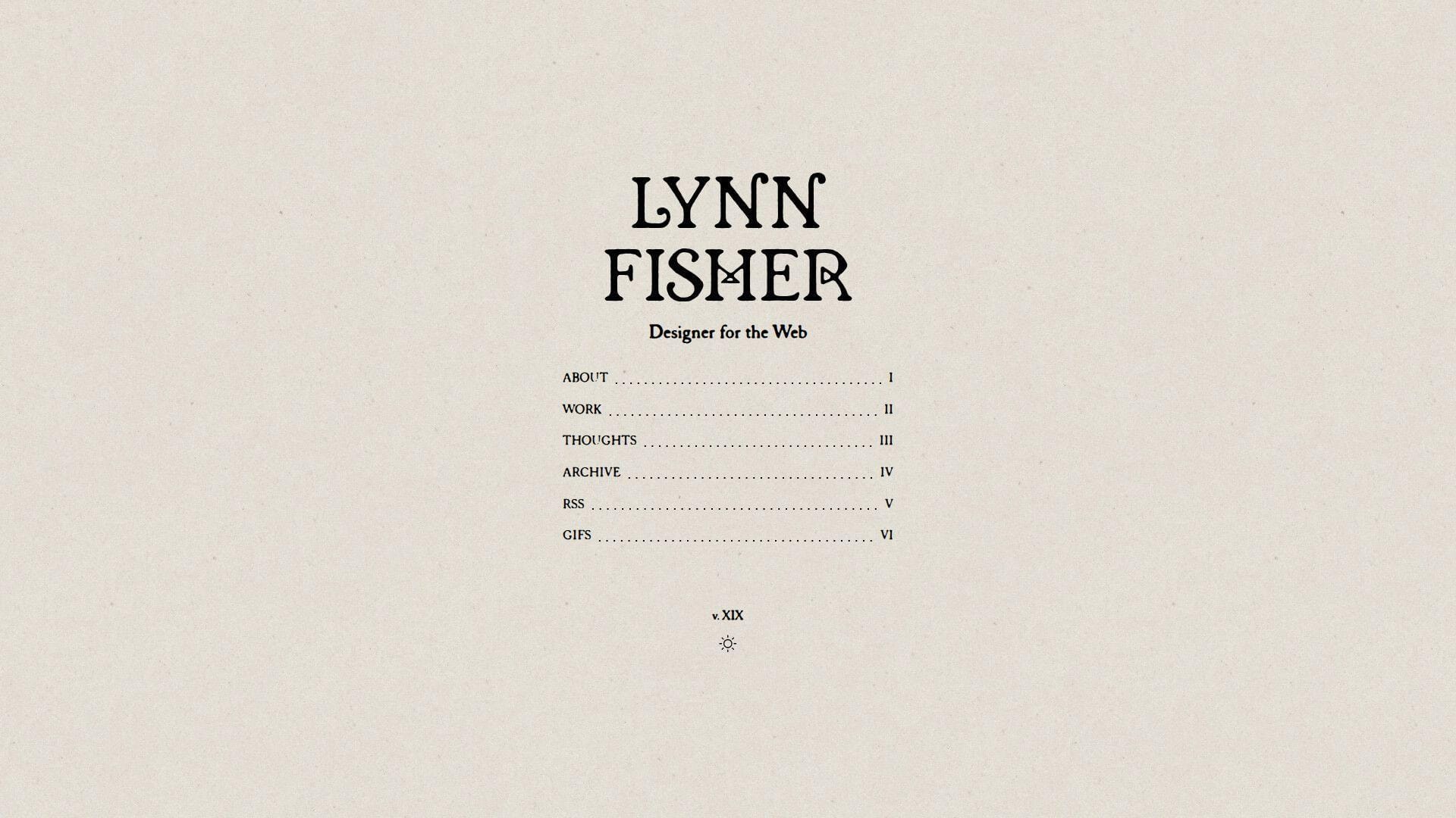
Lynn Fisher’s portfolio reads like authored web media. That is one reason it sticks. She brings design, CSS craft, illustration, and weirdly specific side projects into one identity without making the site feel unfocused. We like it because the personality is strong, but the navigation still does its job. Best for: creative developers, editorial web designers, and anyone building a portfolio around personal voice.
- Editorial framing → the site feels intentional, not templated.
- Memorable project archive → each click teaches something different about her range.
- Clear structure and strong thumbnails → browsing stays easy.
From $0/mo to browse. No trial. There is no installable portfolio system here. You are learning from structure, tone, and curation.
Honest drawbacks: enterprise product teams may want more conventional project outcomes and technical writeups. The site is stronger at showing authorship than showing software-process detail.
Verdict: If you want your portfolio to feel unmistakably yours, this helps you stand out quickly.
7. Brice Clain
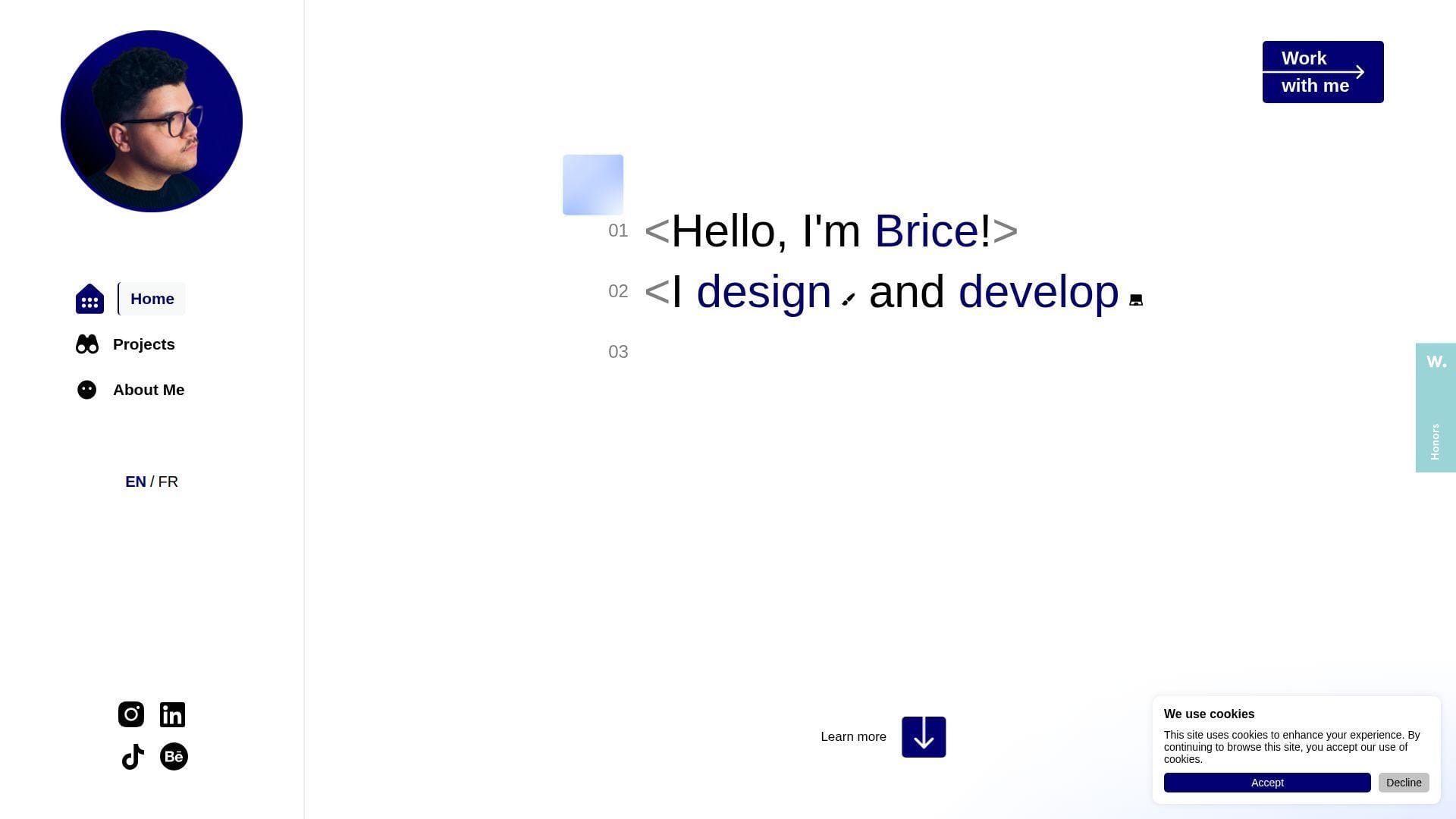
Brice Clain presents himself like a one-person studio that can handle design, branding, and development together. That framing is smart for freelance work. The site walks visitors through process, example thinking, testimonials, and contact paths in a way that feels client-aware from the start. Best for: freelance web designers, front-end builders working with small businesses, and service-led creatives.
- Process storytelling → clients understand how work would run before asking.
- Testimonials and project narratives → early trust objections get handled on site.
- Prominent contact paths → attention can turn into inquiry fast.
From $0/mo to browse. No trial. There are no seats or software limits because this is not a SaaS tool. It is a service portfolio and reference point.
Honest drawbacks: hiring managers looking for a pure developer portfolio may find the service framing too sales-led. It is stronger at winning clients than at documenting engineering depth.
Verdict: If you want a portfolio that sells process and confidence to paying clients, this helps quickly.
8. Olaolu Olawuyi
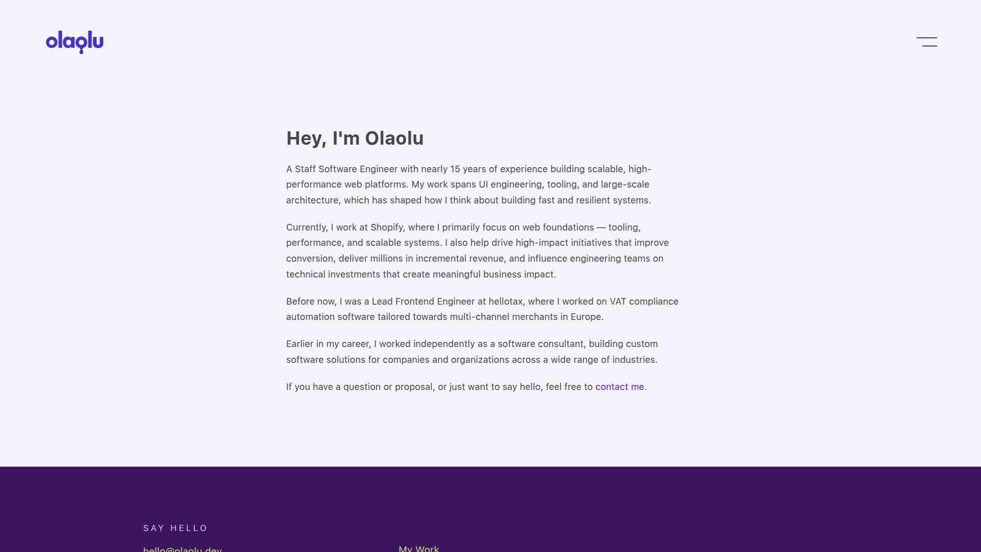
Olaolu Olawuyi’s site is what senior engineering credibility looks like when it stops trying too hard. The copy is measured. The structure is simple. The work and resume routes tell us exactly what level of builder we are looking at. We like that restraint. Best for: senior front-end engineers and engineering leaders who need signal more than decoration.
- Clear senior framing → visitors understand level and focus right away.
- Work and resume routes → serious proof is easy to access.
- Minimal visual treatment → the content carries the site.
From $0/mo to browse. No trial. There is no starter kit, template export, or gated feature set. You are learning from positioning and structure.
Honest drawbacks: if you need to sell motion, brand personality, or creative direction, this can feel too quiet. It beats most portfolios on credibility and trails many on visual theater.
Verdict: If you want a senior portfolio that reads like signal instead of noise, this helps immediately.
9. Adham Dannaway
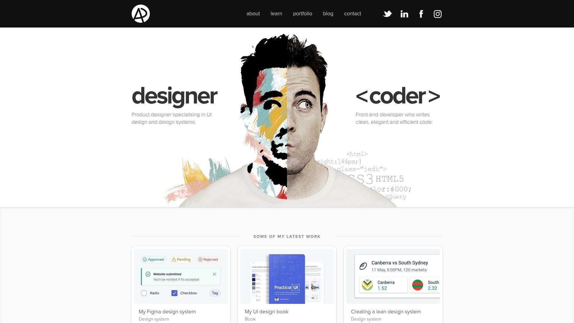
Adham Dannaway’s site remains one of the clearest examples of hybrid positioning on the web. His designer-versus-coder concept is direct, memorable, and still useful because it answers the question many hybrid builders struggle to explain. What exactly do you do? He answers it in a glance. Best for: design engineers, product designers with code skills, and consultants selling both craft and implementation.
- Split designer-coder concept → dual skill sets make sense fast.
- Portfolio plus products and resources → authority extends beyond project thumbnails.
- Single-page familiarity → the site becomes useful right away.
From $0/mo to browse. No trial. There is no downloadable framework or white-label version, only a strong reference for hybrid branding.
Honest drawbacks: parts of the visual language feel more classic than current. It is also heavier on design proof than software depth, so pure engineering buyers may want more technical substance.
Verdict: If you need your portfolio to explain a split skill set cleanly, this helps in one pass.
10. Dustin Brett
Dustin Brett’s personal site, daedalOS, is less a portfolio page and more a browser desktop environment. That sounds excessive until you remember the point. He is showing what he can build in the browser, and he does it with almost absurd commitment. Best for: open-source engineers, browser platform builders, and systems-minded front-end developers.
- Desktop metaphor → technical ambition is visible from the first moment.
- Live apps and experiments → proof is interactive, not merely described.
- Familiar window model → visitors can learn the pattern quickly after load.
From $0/mo to browse. No trial. No seats, support channel, or starter package. This is a public project and portfolio hybrid.
Honest drawbacks: it can overwhelm people who just want to know who you are and what you built. Accessibility, scan speed, and recruiter friendliness all take a back seat to the concept.
Verdict: If you want to demonstrate serious browser engineering depth, this helps in a very memorable way.
11. Tamal Sen
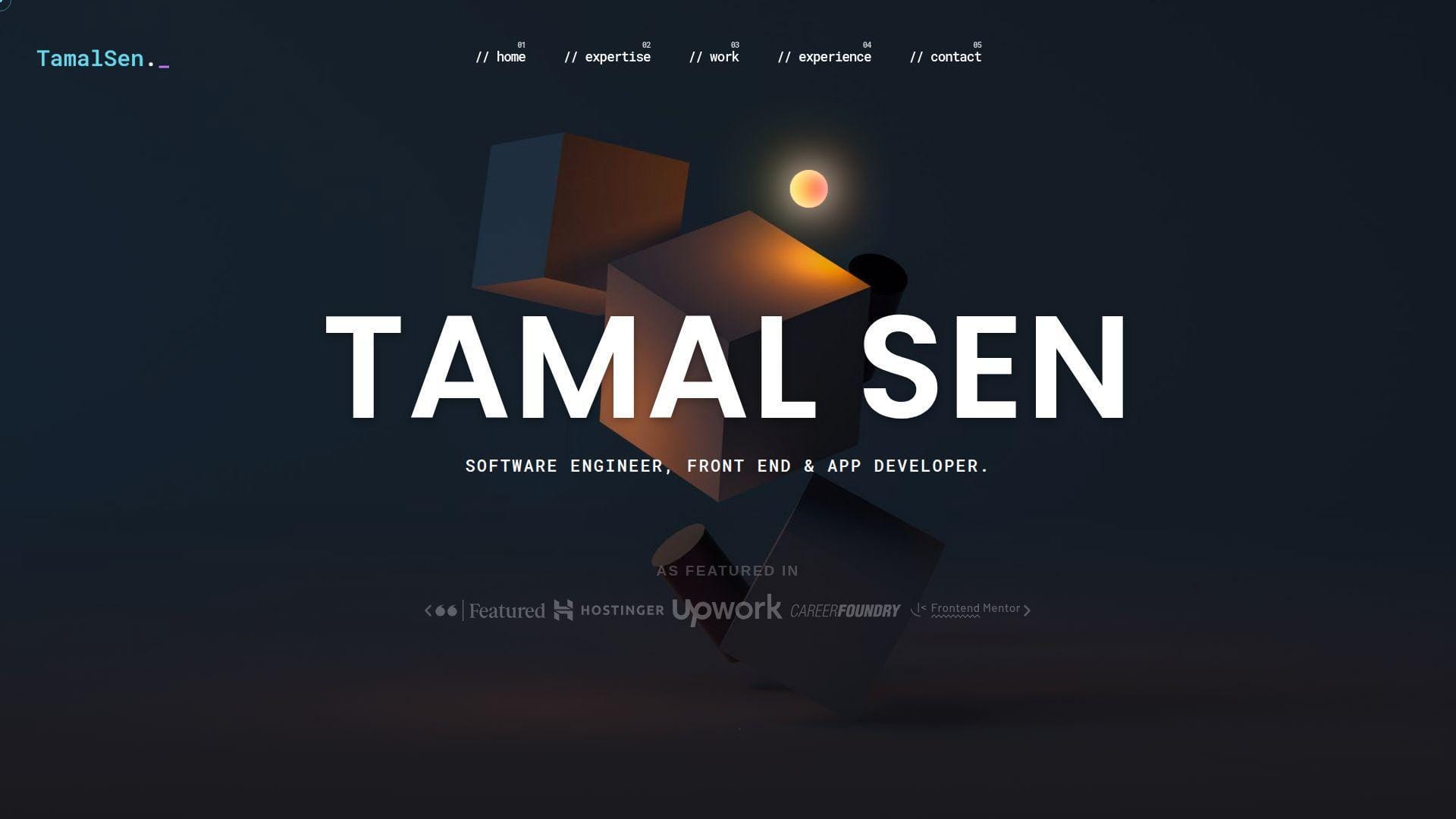
Tamal Sen’s portfolio is a good reminder that clarity and volume can work together when the structure is disciplined. The site covers expertise, project work, experience, testimonials, and contact without hiding the freelance angle. It feels practical and business-ready. Best for: freelance front-end developers, React specialists, and app developers who need a proof-heavy site.
- Clear expertise buckets → clients know what he does early.
- Project filters and testimonials → qualification friction drops before outreach.
- Conventional section flow → both recruiters and clients can scan it easily.
From $0/mo to browse. No trial. There is no installable starter or packaged theme, only a live reference for organizing a service-oriented portfolio.
Honest drawbacks: the visual identity is competent but less distinctive than the more design-led examples here. If you want boutique polish or heavy originality, this may feel safer than stylish.
Verdict: If you need a portfolio that sells reliability and proof, this helps quickly.
12. Constance Souville
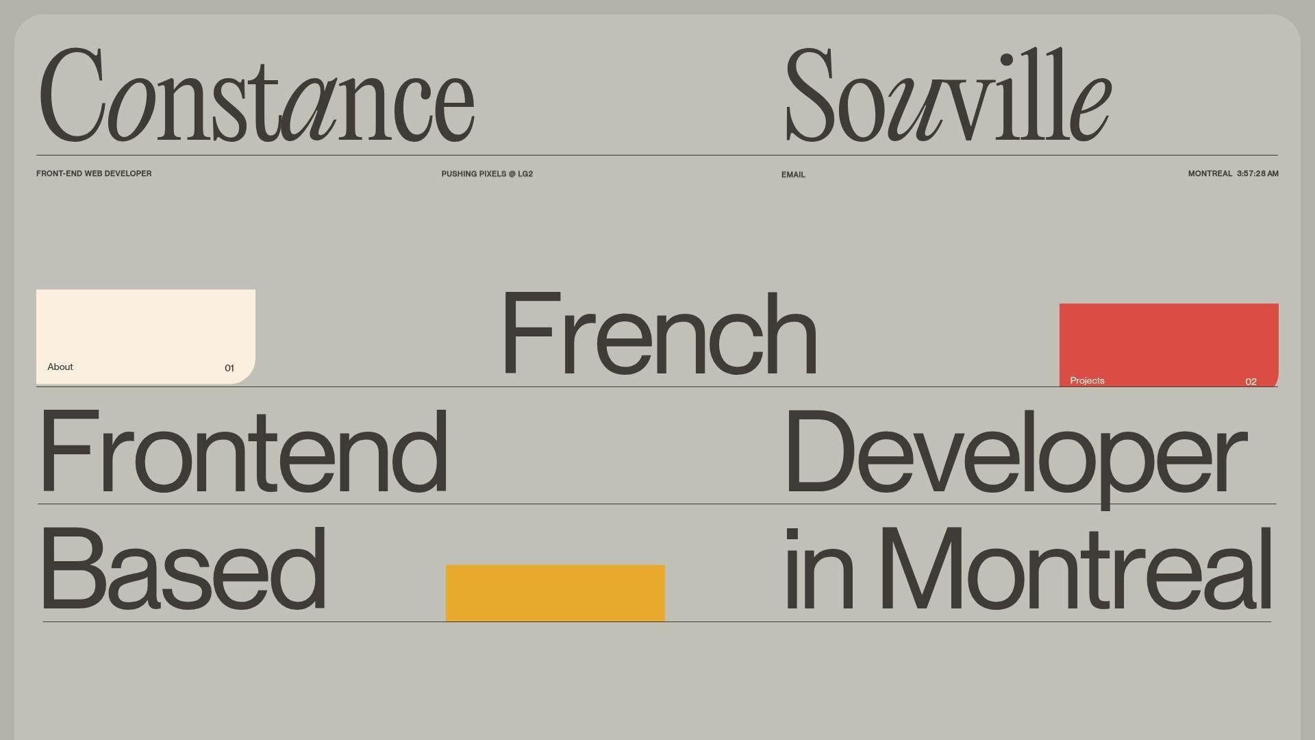
Constance Souville’s site is polished, quiet, and clearly built by someone who cares about layout control. The intro is fast, the project list is selective, and the whole portfolio feels tuned for agency-quality front-end work rather than generic personal branding. Best for: agency front-end specialists and motion-aware UI developers.
- Fast professional framing → role and current context are clear early.
- Selected client work → relevance shows without a long explanation.
- Precise typography and motion accents → the site feels polished immediately.
From $0/mo to browse. No trial. You are not buying a reusable package. You are studying refinement, pacing, and project selection.
Honest drawbacks: it is more window than deep narrative. Teams that want long case studies, metrics, or technical postmortems may want more context than the homepage provides.
Verdict: If you want a portfolio that looks polished and agency-ready, this helps within minutes.
13. Mason Wong
Mason Wong’s portfolio is strong because it respects the reader who actually cares how things were built. His case studies do not stop at aesthetics. They get into constraints, architecture, search, localization, CMS choices, performance trade-offs, and interactive work. Best for: full-stack engineers, front-end specialists with systems depth, and WebGL builders who need serious case studies.
- Problem-challenge-stack detail → engineering depth is easy to verify.
- CMS, search, and interactive examples → buyers can see breadth without a sales call.
- Documentation-like structure → serious readers get value fast.
From $0/mo to browse. No trial. There is no theme, no export, and no support plan. This is a case-study reference site.
Honest drawbacks: it can feel dense for visitors who only want a quick sense of personality. Junior builders may also find it intimidating because the examples are technically mature.
Verdict: If you want your portfolio judged on implementation quality, this helps in one strong reading session.
14. Adam Hartwig
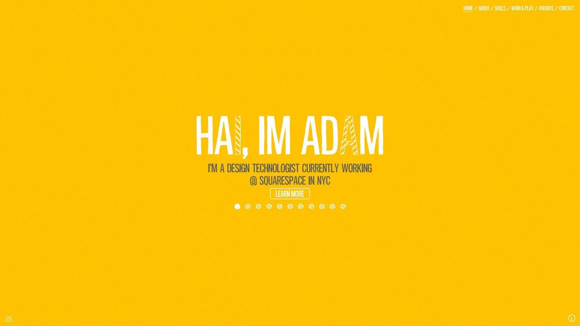
Adam Hartwig’s site feels like the work of a design technologist who enjoys building experiences, not just pages. Interactive elements, skill visualizations, and a mix of client work and experiments all point to someone who lives between design and development. Best for: design technologists, interactive media candidates, and hybrid creatives with broad digital experience.
- Interactive landscape and skill visuals → the design-tech blend is obvious early.
- Work and play framing → professional work and experiments support each other.
- Exploration-heavy structure → curious visitors get a lot of value.
From $0/mo to browse. No trial. There are no product tiers or template files to install. You are studying a personal archive and interaction model.
Honest drawbacks: parts of the site show their era. Some patterns feel more archival than current, which can weaken the first impression if your goal is ultra-modern product work.
Verdict: If you need a portfolio with range, personality, and hybrid digital craft, this helps after a few clicks.
15. Keita Yamada
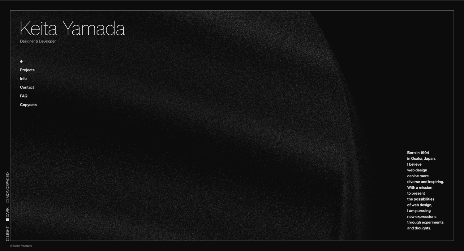
Keita Yamada’s portfolio is one of the clearest examples of strong visual authorship in this list. The site feels designed, coded, and defended by someone with a real point of view. We like that it pairs expression with a useful FAQ, tool notes, and a current-looking project stream. Best for: creative developers, studio-ready designers who code, and experimental front-end builders.
- Live visual system and background effects → originality is obvious immediately.
- FAQ and tool notes → common questions get answered before email.
- Current-looking work stream → the portfolio feels active, not stale.
From $0/mo to browse. No trial. There is no public starter pack or reusable code access. This is inspiration, not a borrowable asset.
Honest drawbacks: recruiter friendliness is secondary to expression. Closed source limits direct learning, and some hiring teams may prefer plainer explanations of role and impact.
Verdict: If you want to prove originality and visual confidence, this helps fast.
16. Matt Farley
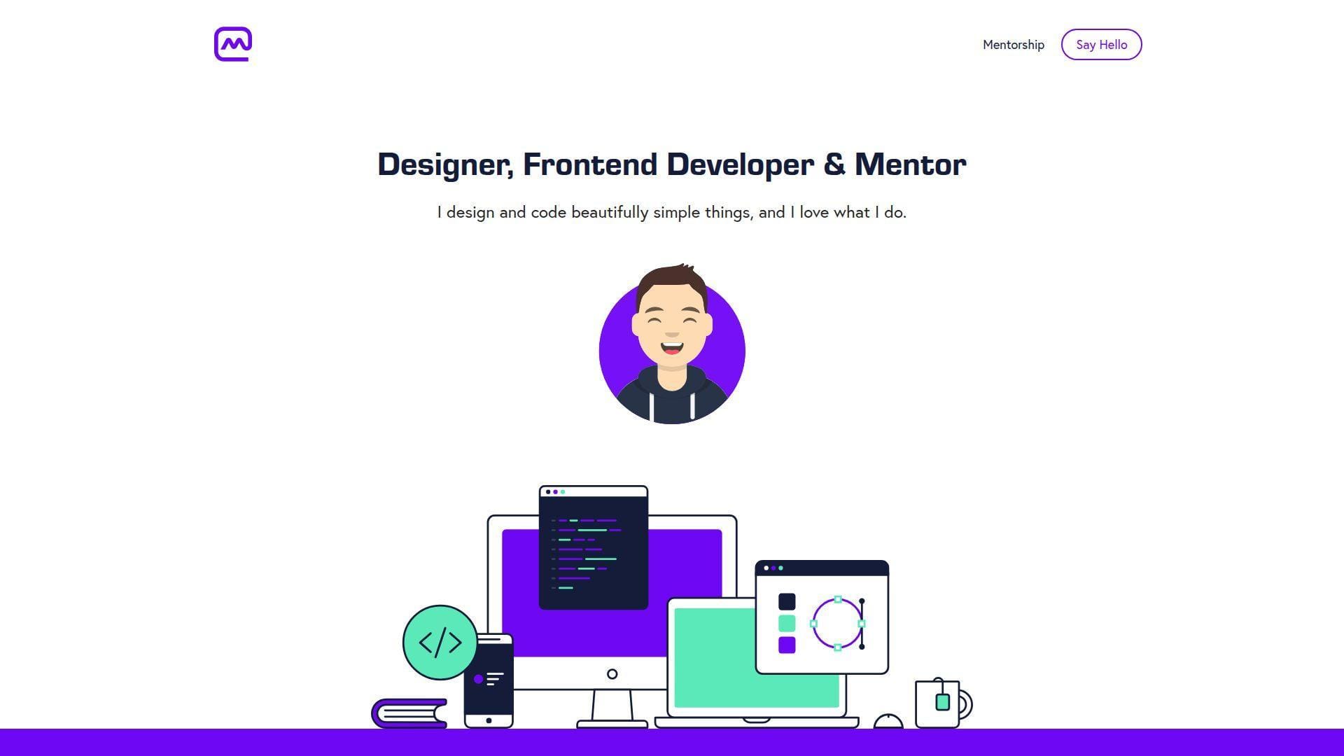
Matt Farley’s site feels like a solo studio with a mentorship arm. That is a useful mix. He is not just saying he can design and code. He is also showing that he can teach, collaborate, and build trust. The structure is simple, but the positioning is strong. Best for: freelance designer-developers, mentors, and founders selling thoughtful digital craft.
- Designer-developer-mentor framing → service mix is clear immediately.
- Work, startups, and testimonials → trust builds before the first call.
- Friendly copy and direct CTAs → next steps feel easy.
From $0/mo to browse. No trial. There is no installable product here, only a strong model for a service-led personal brand site.
Honest drawbacks: it is visually safer than the most inventive examples on this list. If you need to signal advanced engineering depth, the site leans more toward design, craft, and mentoring.
Verdict: If you want a portfolio that turns attention into conversations, this helps in one visit.
17. Kay Evans-Stocks
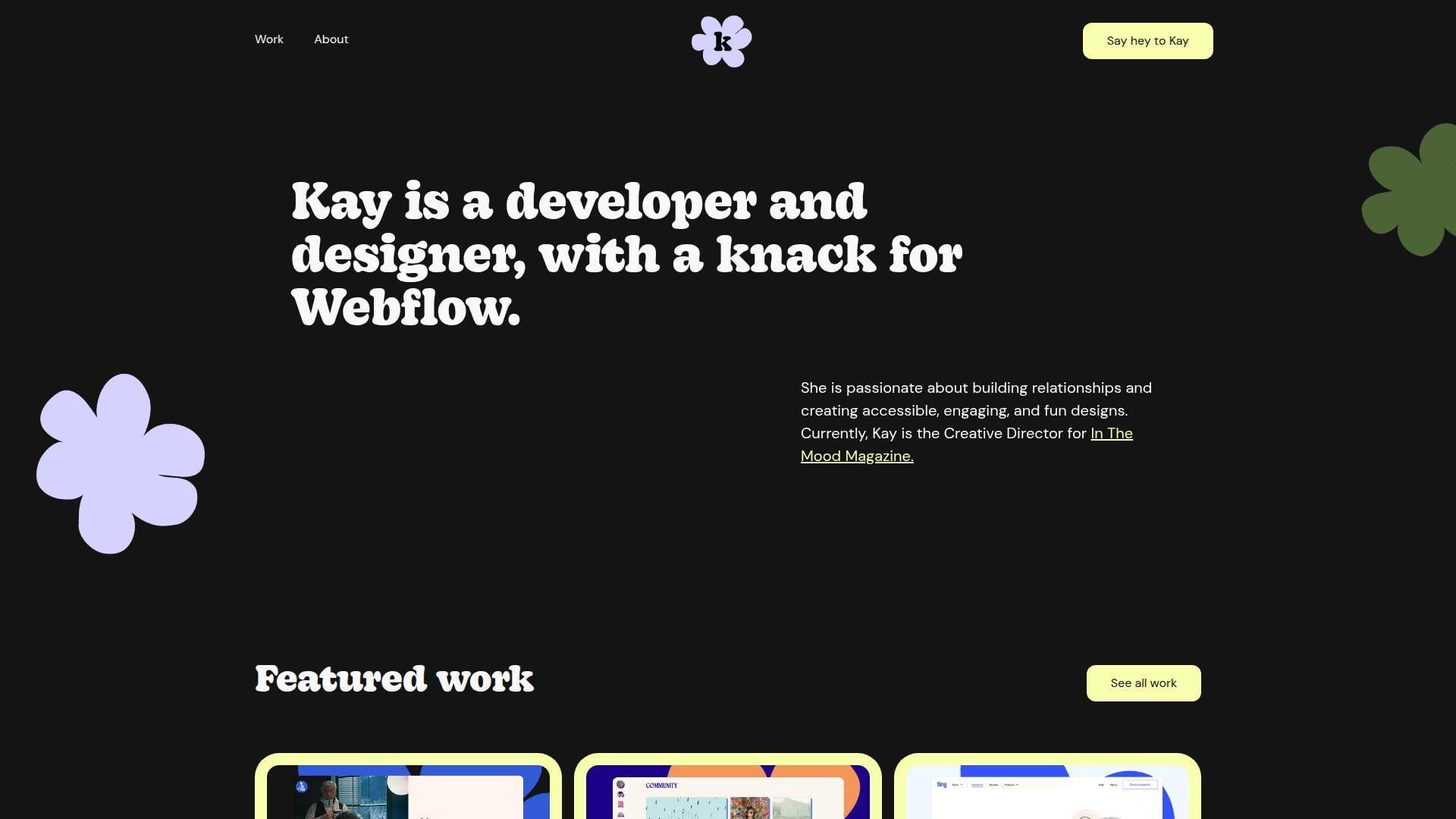
Kay Evans-Stocks frames her site like a bright, friendly Webflow practice. That focus is a strength, not a weakness. Visitors know what kind of work she wants, what tools she uses, and how her projects feel. The portfolio is warm, approachable, and specific. Best for: Webflow freelancers, content-led web builders, and accessible marketing-site specialists.
- Clear Webflow specialization → the right leads self-select quickly.
- Project pages with tools and context → fit becomes clear without a long call.
- Warm tone and bright visuals → the site feels approachable immediately.
From $0/mo to browse. No trial. No seats, no starter export, and no packaged code handoff. It is a live service portfolio and study example.
Honest drawbacks: code-first engineering proof is lighter than in React-heavy portfolios. If you are applying to low-level engineering roles, the Webflow-forward framing can narrow how people read you.
Verdict: If you want to sell accessible, brand-forward web builds, this helps quickly.
18. Akasha Michelle
Akasha Michelle’s site reads like a small creative studio run by one person with a broad skill set. Web, graphic, and motion work all sit inside the same portfolio, and the personal tone keeps it from feeling corporate. Best for: freelance designer-developers and builders serving local businesses or brand-focused clients.
- Category split across web, graphic, and motion → visitors can self-sort quickly.
- Broad client gallery → service range is obvious without extra explanation.
- Personal voice and direct contact path → the site feels human and ready.
From $0/mo to browse. No trial. There is no reusable product layer here, only a reference for how to package multidisciplinary freelance work.
Honest drawbacks: it is more service showcase than technical case-study library. Advanced engineering buyers may want repos, deeper build notes, or more explicit technical proof.
Verdict: If you want a portfolio that feels approachable, broad, and client-ready, this helps within one browse.
19. Bruno Simon

Bruno Simon built a portfolio that acts like a playable demo. Instead of giving us a normal menu, he lets us drive through a 3D world and discover projects, notes, and behind-the-scenes details through interaction. That is bold, memorable, and very on-brand for a creative developer. Best for: WebGL specialists and creative developers selling immersive front-end work.
- Drivable 3D world → the portfolio itself becomes the proof of skill.
- Interactive secrets and stack notes → visitors keep exploring instead of leaving after the hero.
- Quality settings and recovery controls → unusual navigation stays usable.
From $0/mo to browse. No trial. There are no usage caps or paid tiers, but there is also no plug-and-play template waiting behind the curtain.
Honest drawbacks: scan speed is weak compared with text-first portfolios. If your audience wants a resume and a project list right now, this format can feel like extra work. It beats almost every portfolio here on memorability and trails several on immediate clarity.
Verdict: If you sell immersive web work, this helps you prove range in a single visit.
20. Cassie Codes
Cassie Evans uses her site less like a classic portfolio and more like a public home for writing, speaking, workshops, and playful code. That difference matters. We are not looking at a recruiter-only site. We are looking at a credibility hub for someone known for interactive front-end work and motion. Best for: animation-focused front-end developers and technical educators.
- Writing, speaking, and workshop split → expertise feels broader than a job title.
- CodePen-led proof → visitors can verify motion skill without guesswork.
- Friendly microcopy and compact layout → value lands fast.
From $0/mo to browse. No trial. There are no seats or gated features, but there is also no packaged product, starter repo, or client-ready case study kit.
Honest drawbacks: it is lighter on commercial case studies than many hiring managers expect. If you need a site that sells product work to conservative companies, this format may feel too content-led.
Verdict: If you want to position yourself as a recognizable motion and SVG specialist, this helps you earn trust quickly.
What the Best Web Developer Portfolio Examples Include
We would not optimize a portfolio for one kind of reviewer. Stack Overflow’s 2024 survey drew responses from more than 65,000 developers, and your actual audience is even broader. Recruiters, founders, design leads, and engineers all read the same site differently. The best portfolios stay clear no matter who lands there first.
1. Show, Don’t Tell With Clear Positioning, Specific Skills, and Personal Branding
The best portfolios state a job-sized promise fast. We want to know whether we are looking at a front-end engineer, a design engineer, a Webflow specialist, or a creative developer. Brittany Chiang, Olaolu Olawuyi, and Jhey Tompkins do this well. Their headlines are specific. None hide behind vague copy about being passionate, driven, or obsessed with technology.
Good positioning also shows taste. That can be a repeated type treatment, a clear photo choice, one strong color system, or a sharper tone of voice. Adham Dannaway’s split designer-coder concept is still memorable because it turns a blurry identity into a visual idea. Lynn Fisher does something similar in a more editorial way. If your hero section needs a paragraph to explain who you are, it probably is not doing enough.
2. Curated Projects With Live Demos, Repositories, and Process Details
The strongest portfolios curate hard. They do not dump every class assignment, abandoned clone, and half-finished repo into one wall of cards. We would rather see a small set of strong projects with real context than a giant archive with no point of view. That is one reason Mason Wong and Tamal Sen work so well. Their projects feel chosen, not merely collected.
A useful project entry usually includes the final output, your role, the tools used, the constraint, and the trade-off. Live demos help when the work is visual. Repositories help when the code is part of the sell. Process details matter most when the project involved hard decisions around performance, CMS structure, accessibility, localization, or interaction design. Jesse Zhou’s work gets stronger because the build logic exists, not just the wow moment.
3. GitHub Links, Testimonials, Resume Downloads, and Clear Contact Paths
Proof points remove doubt. GitHub links are great when the code is clean and relevant. Live demos matter when motion or interface quality is central. Resume downloads still help in formal hiring loops. Testimonials matter more for freelancers than job seekers, but they are powerful when you are selling services. Matt Farley, Brice Clain, and Kay Evans-Stocks all use social proof differently, and each choice matches the type of work they want.
We also prefer portfolios that make contact easy. Email should be visible. Calls to action should feel direct. One active social profile can help, but five dead ones do not. Brittany Chiang, Matt Farley, and Brice Clain all make proof and contact easy to find. That pattern matters more than flashy animation. If people have to hunt for how to reach you, the site is leaking opportunity.
Design Trends Behind Standout Web Developer Portfolio Examples
Design trends can help or hurt. We love motion when it proves skill, but we dislike it when it hides the point. The Web Almanac found only 42% in 2024 of mobile pages met the good TTFB bar, so every animation choice in a portfolio needs a speed budget.
1. Minimal Layouts, Bold Typography, and One-Page Navigation
Minimal layouts work because they respect scanning. Most reviewers are not studying your portfolio for an hour. They are scanning role labels, project names, proof links, and signs of taste. Clean one-page layouts from Brittany Chiang, Olaolu Olawuyi, Matt Farley, and even Adham Dannaway show how much mileage you can get from hierarchy, spacing, and selective content.
The danger is sameness. Minimal portfolios blur together very fast when the copy is generic and the projects are framed the same way. To avoid that, give the hero section an opinion, give each project a clear angle, and use one visual move that belongs to you. Minimal should mean intentional. It should not mean anonymous.
2. 3D Motion, Dark Mode, Microinteractions, and Unusual Navigation
3D motion, dark mode, microinteractions, and unusual navigation can work brilliantly when the site itself is the demo. Bruno Simon, Jesse Zhou, Dustin Brett, and Keita Yamada prove that. They are not just decorating the portfolio. They are showing the kind of interaction design or browser craft they can build. That distinction matters. Google has reported that 53% of visits are likely to be abandoned if pages take longer than three seconds, so motion only earns its place when it also respects performance.
We would not recommend these patterns to every developer. If the role you want is mainstream product engineering, a drivable world or fake operating system is usually too much. But if your work depends on WebGL, animation, game-like interfaces, or creative technology, unusual navigation can become a hiring filter in the best way. It says, this is the kind of work I do.
3. Editorial Storytelling, Retro Elements, and Personality-Driven Visuals
Editorial storytelling is the most underrated middle ground in this list. Lynn Fisher, Monica Dinculescu, Kay Evans-Stocks, and Akasha Michelle all show different versions of it. The site still reads cleanly, but it has a point of view. That makes the portfolio feel authored instead of assembled.
Retro type, collage, grain, stickers, hand-drawn elements, and personal voice can work extremely well when your audience values taste. They are weaker when your audience wants hard proof of engineering depth. That does not mean you need to remove personality. It means you need to pair the visuals with project framing, context, and proof so the site feels credible as well as cool.
Where to Find More Web Developer Portfolio Examples and Design Inspiration
Once you know the styles that fit your goals, the next step is collecting better references. We recommend looking in places that show real portfolios in the wild, not just polished roundup posts. The best inspiration is not the prettiest screenshot. It is the pattern you can actually adapt to your own work, audience, and hosting setup.
1. Community Repositories Filled With Real Developer Portfolio Sites
Community repositories are useful because they show real developer portfolios, not just designer-curated favorites. We like them for pattern spotting. You can quickly compare hero sections, project cards, GitHub placement, resume links, and contact blocks across many sites.
Use them with discipline. Save the patterns that solve a problem you actually have. For example, maybe you need a better way to frame a case study or surface code proof. Do not save something only because it looks impressive. The goal is not to copy a site. The goal is to understand why the structure works.
2. Award Galleries for Interaction, Storytelling, and Motion Ideas
Award galleries are where we go for interaction ideas, scroll pacing, cursor behavior, and visual storytelling. They are especially helpful when you want references for motion, 3D, or unusual navigation. That is where portfolios like Bruno Simon and Jesse Zhou tend to live and get discussed.
The catch is obvious. Award-winning sites often optimize for wow first. That is fine if your portfolio is a creative demo. It is less fine if your audience mainly wants speed and clarity. Study the tricks. Then cut them down until they match your actual job target.
3. Design Shot Platforms for Landing Pages, Minimal Styles, and Concept Work
Design shot platforms are best for micro-inspiration. They help when you need a hero composition, a project intro layout, a bold type direction, or a cleaner card pattern. They are especially useful for minimalist portfolios that need one fresh visual move to avoid looking generic.
We treat them as sketch fuel, not blueprints. Many shots are concepts, not working sites. Pressure-test the idea in a browser before you borrow it. Can it survive mobile? Does the typography still hold up with real project names? Does the contact section still feel human once the placeholder copy disappears? Those questions separate pretty inspiration from usable inspiration.
FAQ About Web Developer Portfolio Examples
The questions below come up every time we review a portfolio plan. They also matter because speed and trust decide whether people stick around. Google has reported that 53% of visits are likely to be abandoned if pages take longer than three seconds, which is why even simple portfolio choices matter.
1. What Should a Web Developer Portfolio Include?
A web developer portfolio should include a clear role statement, a short personal intro, a small set of strong projects, live demos when possible, code links when helpful, and a direct contact path. We also like to see either a resume download or a clean experience section. If you are freelancing, add testimonials. If you are job hunting, add role clarity and project ownership.
What it should not include is every tool you have ever touched. A portfolio is not a database dump. Keep the focus on the work you want more of.
2. How Many Projects Should a Web Developer Portfolio Show?
We usually recommend three to five strong projects on the main portfolio. That is enough to show range without burying the reader. If you have more work, keep an archive or separate project index.
The key is curation. A few excellent projects with context beat a long list with weak framing every time.
3. Should You Add GitHub Links, Live Demos, and Case Studies?
Yes, but only when they help the reader understand your work faster. GitHub links are useful when the code is clean, readable, and relevant to the role. Live demos help when the interface or motion is part of the value. Case studies help when the problem and trade-off matter more than the final screenshot.
We would not add a repo just to prove you have one. Curate the proof as carefully as you curate the projects.
4. Is a One-Page Portfolio Better Than a Multi-Page Portfolio?
For most developers, a one-page portfolio is easier to get right. It is faster to scan, easier to maintain, and less likely to spread weak content across too many pages. That is why so many good examples in this list lean that way.
A multi-page structure makes sense when you have several deep case studies, a writing practice, a real archive, or distinct service areas. Choose the format that matches the amount of real content you can maintain.
5. Can WordPress Work for a Web Developer Portfolio?
Yes. WordPress can work very well for a web developer portfolio, especially if you want a blog, easy content updates, flexible project pages, or a content-heavy case-study site. It is often a smart choice for people who want more control over editing than a hand-coded static site gives them.
The main warning is bloat. A heavy theme, too many plugins, and weak performance choices can make a portfolio feel slower and less professional than it should.
6. Do You Need a Custom Domain, SSL, and Reliable Hosting for a Portfolio Site?
Yes. A custom domain is basic professionalism. SSL is basic trust. Reliable hosting is basic usability. You can launch a first version on simple hosting, but your final public portfolio should feel stable, secure, and intentional.
This matters even more if your site includes motion, media-heavy case studies, or contact forms. A strong portfolio can still underperform if the hosting setup makes it feel fragile.
How 1Byte Supports Web Developer Portfolio Websites
Hosting is part of portfolio design whether people admit it or not. At 1Byte, we treat server response as a feature, and web.dev uses 0.8 seconds or less as the threshold for good TTFB. That is a useful benchmark when we plan a fast portfolio launch.
1. Domain Registration and SSL Certificates for a Professional Portfolio Launch
At 1Byte, we usually start with the basics that shape trust fast. That means a clean custom domain, working DNS, and SSL from day one. A personal portfolio on a random subdomain can be fine for testing. It should not be your final public home.
SSL matters for browser trust, forms, analytics, and the general feeling that the site is finished. Even a simple portfolio deserves that. If your goal is to look professional, the setup around the site has to look professional too.
2. WordPress Hosting, Shared Hosting, and Cloud Hosting for Different Portfolio Stages
Not every portfolio needs the same hosting model. We usually point simple brochure-style portfolios and lightweight static sites toward shared hosting because the setup is straightforward and cost-conscious. If the site is content-heavy, blog-driven, or easier to update through a dashboard, WordPress hosting often makes more sense.
Cloud hosting becomes the better fit when the site is custom, media-rich, or less predictable in traffic. That is especially true for animation-heavy front ends, headless setups, React or Next.js builds, and portfolios that combine case studies, forms, APIs, and richer assets. The goal is not to overbuy. It is to choose a setup that does not become the weak link.
3. Cloud Servers and AWS Partner Support for Scalable Portfolio Performance
Cloud servers give us more control when a portfolio starts behaving like a small application instead of a static page. That matters for custom front ends, staged deployments, asset-heavy 3D work, CDN delivery, backups, and tighter runtime tuning. If your portfolio uses modern frameworks or interactive scenes, that extra control can protect the experience.
AWS Partner support is useful when the conversation moves from launch to architecture. That can mean choosing the right compute pattern, planning storage for media, handling traffic spikes, or setting up a path from personal portfolio to client-facing product. We like that because good hosting should support the site you have now and the work you want next.
If you already know whether your portfolio should be minimalist, editorial, or immersive, the next move is simple. Pick your structure, ship your first version, and refine it with real feedback. Which example above feels closest to the work you want to win next?