

- What Makes a Website Mobile Friendly
- Choose the Best Path to Make a Website Mobile Friendly
- Build the Technical Foundation for Mobile Responsiveness
- Improve Mobile Readability and Accessibility
- Simplify Navigation for Mobile Users
- Speed Up Your Mobile Website
- Make Mobile Forms and Conversions Easier
- Design for Real Mobile Behavior
- Test How Mobile Friendly Your Website Really Is
- FAQ About How to Make a Website Mobile Friendly
- How 1Byte Supports Mobile-Friendly Websites With Cloud Computing and Web Hosting Services
- Conclusion and Next Steps for a Mobile-Friendly Site
If you want to make a website mobile friendly, start with the obvious. Mobile accounted for 58.5 percent of global web traffic in 2025, so the phone experience is now the front door for many brands. At 1Byte, we treat that as the baseline, not a side project.
We also think the phrase gets oversimplified. A mobile-friendly site is not just a smaller desktop page. It is readable, tappable, fast enough to trust, and complete enough to finish the task that brought the visitor there in the first place.
What Makes a Website Mobile Friendly
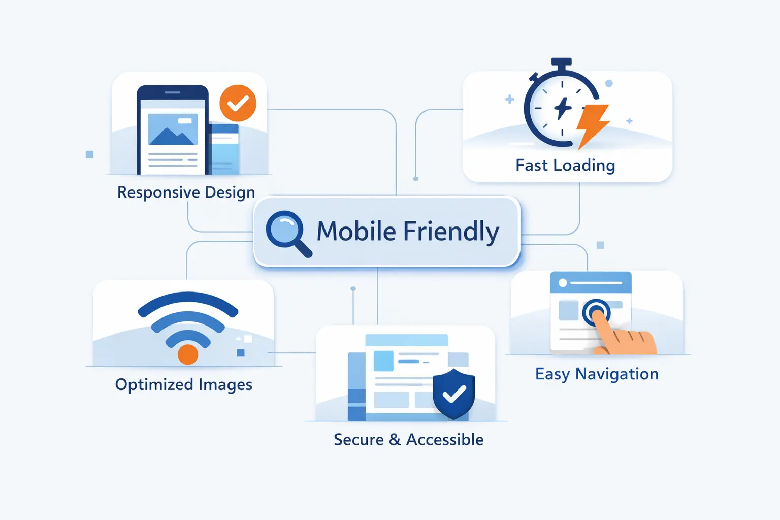
A mobile-friendly website works well on a small screen without asking people to pinch, zoom, squint, or guess. In our view, that means the layout adapts, the copy stays readable, the buttons are easy to hit, and the most important content still shows up where it matters.
1. How Mobile-Friendly Design Differs From Responsive and Adaptive Design
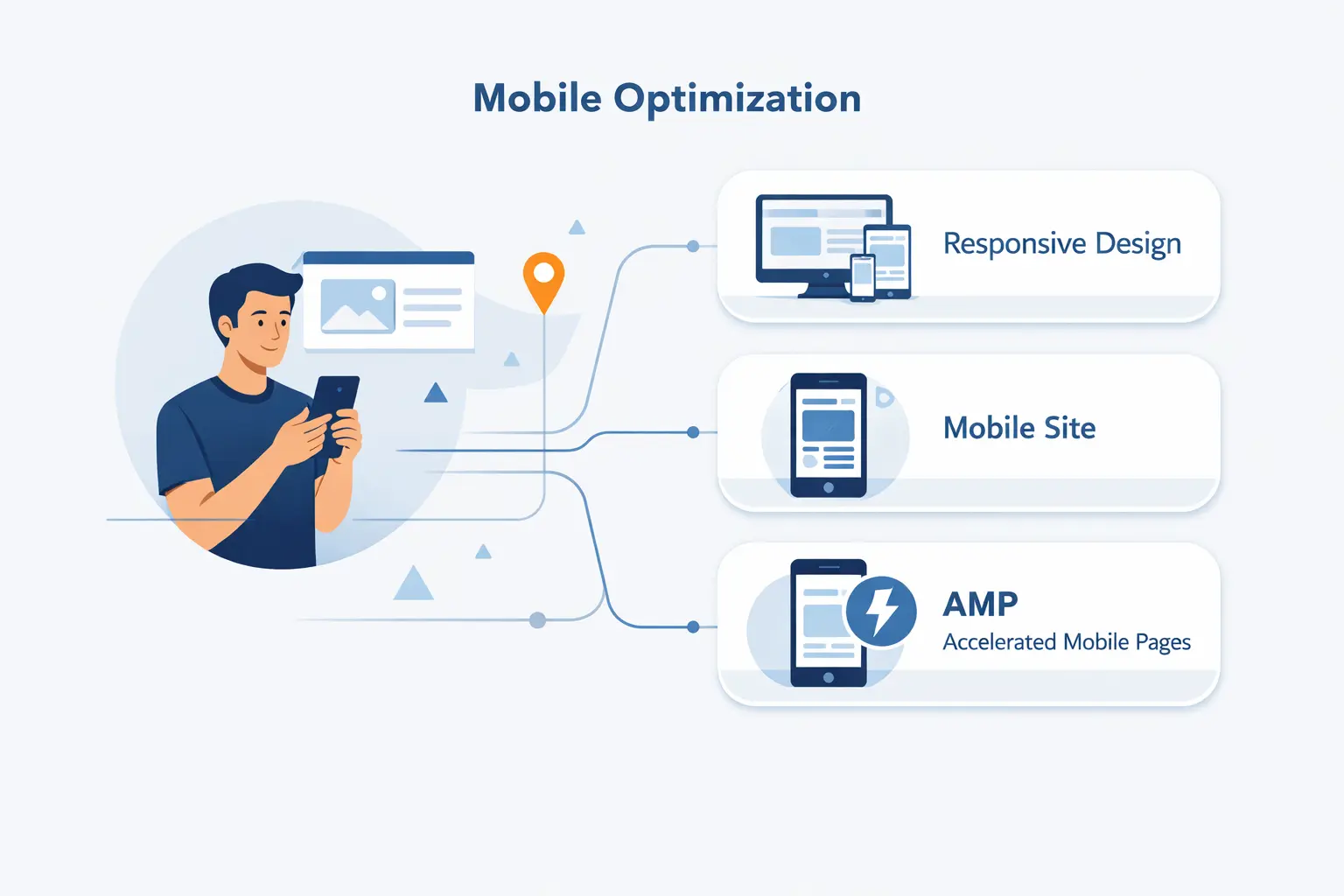
We think of mobile-friendly as the result, not the method. Responsive design is the most common way to get there. It uses one codebase and lets layouts flex with the screen. Adaptive design uses several preset layouts and swaps between them at chosen widths. Both can work. Responsive is usually easier to maintain because content, templates, and updates stay in one system.
A site can also be technically viewable on a phone and still fail the mobile-friendly test. We see this all the time. Pages load, but text feels cramped, sidebars crowd the content, and forms become thumb traps. If the experience feels awkward, the label does not help.
2. Why Mobile-Friendly Websites Matter for User Experience, Conversions, and SEO
Mobile-friendly websites matter for SEO because Google now indexes from the smartphone version first. If your phone layout hides key copy, weakens headings, or strips metadata, desktop polish will not rescue the page.
They matter for revenue, too. AliExpress reported a 104% increase in conversion for new users after improving its web experience. We would never treat one case study as a promise, but we do take the lesson seriously. Easier mobile journeys reduce friction right where people decide whether to continue.
3. Signs Your Website Is Not Mobile Friendly
The warning signs are usually loud. Text looks tiny. Headlines wrap badly. Buttons sit too close together. Menus cover the screen. A contact form asks for too much and triggers the wrong keyboard. Images overflow their containers. Horizontal scrolling appears. If your own site annoys you on your own phone, your visitors are probably already gone.
Choose the Best Path to Make a Website Mobile Friendly
There is no single fix for every site. A basic brochure site, a busy online store, and a custom web app all need different levels of work. We usually choose the path that removes the most friction now without creating a maintenance mess later.
1. Start With a Mobile-First Strategy
We almost always start with mobile-first thinking. That does not mean designing only for phones. It means deciding what deserves the first screen, the first scroll, and the first tap. Your core message, main call to action, pricing cues, trust elements, and contact path should win that fight.
This approach forces useful discipline. When space is limited, weak content gets exposed fast. Giant sliders, filler banners, and decorative sidebars stop looking essential the moment they compete with the real job of the page.
2. Use a Responsive Theme or Template
If your site runs on WordPress, Shopify, or another common platform, a good responsive theme or template is often the fastest route forward. We still recommend caution. A slick demo does not prove real-world quality. Test it with your actual pages, menus, product cards, blog posts, and forms before you commit.
We also prefer themes that stay close to standard web behavior. The more a theme depends on heavy animations, unusual page builders, or piles of add-ons, the more likely it is to wobble on smaller screens.
3. Know When a Plugin or Temporary Mobile Version Is a Short-Term Fix
A plugin can help when you need quick relief. It may improve menus, image scaling, pop-up behavior, or form usability. A temporary mobile version can also buy time during a rebuild. We still treat both as stopgaps.
The reason is simple. Two experiences mean two sets of problems. Content drifts. fixes get duplicated. Tracking breaks. SEO gets harder if parity slips. If you can move toward one strong responsive site, that is usually the cleaner long-term call.
Build the Technical Foundation for Mobile Responsiveness

This is the part many teams rush past. We do not. If the technical base is shaky, every later design fix becomes fragile. Good mobile behavior starts with the browser understanding the page correctly, then letting the layout adapt without hacks.
1. Add the Viewport Meta Tag
Without a viewport meta tag, phones may squeeze the page into a wider virtual canvas, which makes text and controls look smaller than they should. Put the standard tag below in the <head> of every page so the layout starts at the device width instead of fighting it.
<meta name="viewport" content="width=device-width, initial-scale=1">That line is small, but it carries a lot of weight. If a site feels strangely zoomed out on phones, this is one of the first places we look.
2. Use Media Queries and Flexible Layouts
Media queries let you change layout rules when space, orientation, or other conditions change. We pair them with flexible units, Flexbox, or Grid so cards wrap, columns stack, and spacing stays proportional instead of fixed. Our advice is simple. Choose breakpoints where the content starts to feel cramped, not where a device list says you should switch.
Fixed-width containers are where many mobile problems begin. When a layout assumes a wide screen, it keeps fighting the phone. Flexible containers stop that fight early.
3. Scale Images, Text, and Columns for Smaller Screens
Images should shrink with their container, not spill past it. Text columns should narrow into a comfortable reading width, not stay locked to desktop proportions. Sidebars that help on large screens often need to move below the main content or disappear entirely on mobile.
We also recommend checking cards, testimonials, pricing blocks, and tables by hand. These are frequent trouble spots. They often look fine in the CMS preview and break the moment real content gets longer than the sample text.
Improve Mobile Readability and Accessibility

Readability is where mobile trust gets won or lost. People make quick judgments on phones. If the page looks cramped, messy, or confusing, they assume the business behind it is careless. That is harsh, but it is real.
1. Use Readable Fonts, Scannable Headings, and Proper Heading Hierarchy
We keep body copy plain, headings clear, and paragraph lengths short. Long walls of text are hard enough on desktop. On a phone, they feel endless. Good heading hierarchy matters too. It helps readers scan, helps assistive tools make sense of the page, and keeps your content structure honest.
Our rule is easy to remember. If someone lands in the middle of the page, the headings should tell them where they are and what comes next. If they cannot tell, the structure needs work.
2. Keep Content Consistent Across Devices
We do not like mobile pages that hide the good stuff. If desktop has pricing details, specs, FAQs, or trust copy, mobile should have them too. Reorganize the layout if you need to, and use accordions or tabs when space is tight, but keep the primary information available on phones.
This is one of the most common mistakes we see during redesigns. Teams call it simplification, but what they really do is remove context. Then conversion drops and nobody knows why.
3. Replace Tables and Dense Sections With Tabs, Accordions, or Stacked Content
Wide tables are a classic mobile nuisance. They force sideways scrolling and hide the comparison people came to read. We usually replace them with stacked cards, grouped rows, or tap-to-open sections that reveal one chunk at a time.
The same goes for long policy text, technical specs, and feature grids. If the section feels dense on a phone, break it into logical pieces. The goal is not to hide information. The goal is to let people absorb it without losing their place.
Simplify Navigation for Mobile Users
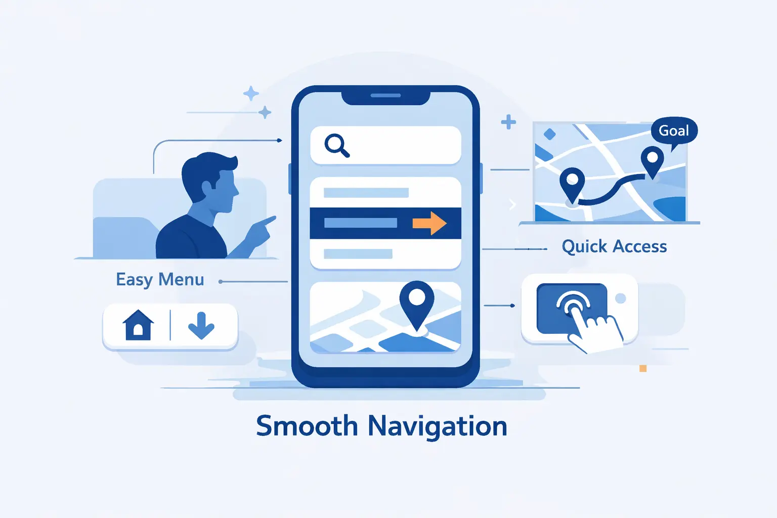
Navigation should reduce thinking, not add it. On desktop, users can rescue themselves with more visible links. On mobile, every wrong tap costs more. We like navigation that feels obvious enough to disappear into the task.
1. Keep Important Information Within One to Two Taps
Important actions should be close. Contact details, pricing, booking, checkout, core categories, and support paths should sit within a couple of taps from the page where the need appears. If a visitor has to dig through nested menus for basic answers, the structure is doing too much work and too little helping.
We map key tasks before we redesign menus. What are people actually trying to do here? Buy, call, compare, book, read, or get directions? Put those routes first and let secondary pages fall behind them.
2. Add Search, Quick Links, and Clear Menus
Search earns its place on content-heavy sites, stores, documentation hubs, and any site where users arrive with intent. Quick links help when a small set of destinations gets most of the traffic. We also prefer plain menu labels over clever labels. Mystery words are bad navigation.
Hamburger menus still have a place, but they should not become junk drawers. If everything is important, nothing is. Cut hard, group cleanly, and let the menu reflect how users think, not how the org chart looks.
3. Make Calls to Action Easy to Find and Tap
Your main call to action should stand out without shouting. Contrast helps. Placement helps more. We like CTAs that appear near the moment of decision, not buried after filler copy or repeated so often they lose force.
On some pages, a sticky button works well. On others, it becomes clutter. We decide based on the task. A booking page may deserve it. A blog article usually does not.
Speed Up Your Mobile Website

Speed is not a polishing step. On a phone, it shapes trust before the copy can. As a working benchmark, aim for 2.5 seconds or less for Largest Contentful Paint on the pages that matter most, especially your home page, product pages, and landing pages.
1. Compress Images and Use Modern Formats
Images are usually the first suspect. Compress them hard, serve the right dimensions, and use newer formats like WebP or AVIF when your stack supports them. Logos and simple icons often belong in SVG. Our rule is that a hero image should earn its weight, not just decorate it.
We also avoid uploading a huge desktop image and hoping the browser will sort it out. That habit wastes bandwidth fast. Serve the image sizes the layout actually needs.
2. Remove Flash, Reduce Heavy Media, and Avoid Slow Elements
Interaction speed matters as much as raw load time. redBus reported sales rising by 7% after improving responsiveness. That is why we trim script bloat, audit third-party widgets, and question every animation that delays the next tap.
If any old Flash asset still exists on your site, replace it. Then look at autoplay video, social embeds, sliders, chat widgets, and tracking scripts. Each one may look harmless in isolation. Together, they can turn a decent page into molasses.
3. Declutter Pages, Minimize Pop-Ups, and Lazy Load Content
Decluttering helps as much as compression. Fewer above-the-fold elements mean fewer things competing for bandwidth, attention, and taps. Use lazy loading for content farther down the page, but do not make core text or key images wait for swipes or clicks to appear, because that can hurt both usability and search visibility.
We are especially skeptical of aggressive pop-ups on phones. If a screen-filling offer blocks the content before a user even understands the page, it is not helping. It is heckling.
Make Mobile Forms and Conversions Easier

Forms are where mobile promise turns into mobile pain. For online stores, 70.22% of carts are abandoned on average. We take that as a warning to remove every field that does not help the sale, the lead, or the support request move forward.
1. Shorten Forms and Use Autofill-Friendly Fields
Shorter forms win. Ask only for the information you truly need, use the right input types, and add autocomplete tokens so browsers can help users fill fields instead of making them start from scratch. We also prefer labels above fields on mobile, because placeholders vanish the moment typing begins.
We are ruthless here. If a field does not support fulfillment, contact, compliance, or qualification, it probably does not belong in the first form. You can always ask for more later.
2. Disable Unhelpful Autocorrect Where Needed
Autocorrect is useful until it is not. Email addresses, coupon codes, usernames, model numbers, and proper names often suffer when devices try to be clever. Turn it off where correction creates more errors than it saves.
That does not mean disabling helpful input assistance everywhere. A support message box may benefit from spelling help. A discount code field usually will not. Use judgment, not a blanket rule.
3. Use Click-to-Call, Contact Options, and GPS Directions When Relevant
For service businesses, clinics, restaurants, real estate teams, and local stores, a phone call is sometimes the real conversion. In those cases, click-to-call buttons, map links, and clear directions deserve prime placement. Why make a hurried user type through a long form when one tap can solve the problem?
We also like giving people options. Call, message, email, or get directions. Different users want different exits, and mobile visitors are often acting with more urgency than desktop visitors.
Design for Real Mobile Behavior

Phones are used in messy conditions. People browse one-handed, switch between apps, get interrupted, and rotate the screen without warning. Good mobile design respects this reality instead of pretending every user is sitting calmly at a desk.
1. Space Links and Buttons for Thumb-Friendly Taps
Small tap targets create big mistakes. As a practical baseline, aim for 24 by 24 CSS pixels or enough spacing around smaller controls. We would rather give buttons more room than ask visitors to be precise with their thumbs.
This matters most near destructive or high-value actions. Delete, pay, submit, cancel, and save should never sit on top of each other like crowded elevator buttons.
2. Support Portrait and Landscape Orientation
Most users stay in portrait mode, but not all tasks do. Videos, galleries, maps, comparison views, and some forms become easier in landscape. We design layouts that survive both orientations instead of breaking the moment the screen turns.
We rarely recommend locking orientation for a normal website. It usually solves one design problem by creating a user problem.
3. Provide a Desktop View Option When It Helps
A desktop view option can help on dashboards, large comparison pages, technical documentation, or anything with dense data. Power users sometimes want the fuller layout, even on a phone. Giving them the option is fine.
We just would not use it as an excuse. A desktop view is a fallback, not a strategy. The default experience still has to work on mobile by itself.
Test How Mobile Friendly Your Website Really Is

Guesswork is not enough. Teams often assume the site is fine because it looks acceptable in one browser window. Real testing is where the truth shows up, and the truth is usually more specific than people expect.
1. Check High-Traffic Pages First
Start with the pages people actually use. Home page, landing pages, pricing, product pages, contact pages, booking flows, blog posts with search traffic, and top category pages should come first. Fixing a buried archive page before the main revenue page is backward.
We also test by task, not just by template. Can a visitor read, compare, trust, and act on this page from a phone without frustration? That question is better than any vanity checklist.
2. Use Real Devices, Browser Tools, and Speed Tests
Browser emulators are useful, but they are not enough. We test on actual phones because thumb reach, keyboard behavior, and connection quality change the story. Then we use browser developer tools and speed testing tools to inspect layout shifts, blocking scripts, oversized images, and interaction delays.
If you can, test on both Android and iPhone. Test on strong Wi-Fi and weaker mobile data. Test with one hand. Test while logged in and while logged out. That is where hidden friction appears.
3. Re-Test After Every Content, Design, or Theme Update
Mobile quality is not a one-time milestone. New plugins, new banners, new embeds, new tracking tags, new theme updates, and even innocent content edits can create fresh breakage. We have seen one pop-up undo months of careful cleanup.
That is why we recommend a recurring mobile QA habit. If the site changes often, test often. The cost of small checks is lower than the cost of public frustration.
FAQ About How to Make a Website Mobile Friendly

We hear these questions often from founders, marketers, and small site owners. The short answers are useful, but the real gains come from applying them page by page.
1. How Do I Convert My Website to Mobile Friendly?
Start with the structure. Add a proper viewport tag, switch to a responsive layout or theme, remove fixed-width elements, resize images, simplify navigation, shorten forms, and improve load time. Then test your highest-traffic pages on a real phone. That is the fastest honest path.
2. How Do I Make My Website Mobile Friendly and Accessible?
Keep text readable, headings logical, contrast clear, and tap targets large enough to use comfortably. Do not hide important content on mobile. Make forms labeled, error messages specific, and zoom available. Accessibility and mobile usability are close cousins, and they tend to improve together.
3. How Do I Make My Website Mobile Responsive?
Use a flexible layout system, add media queries, scale images with their containers, and avoid fixed widths that assume a large screen. Responsive design is usually the most practical way to make one site adapt well across phones, tablets, and desktops.
4. How Mobile Friendly Is My Website?
Your website is as mobile friendly as its hardest common task. Try reading the main page, opening the menu, searching, filling a form, and completing the main conversion on your own phone. If any step feels clumsy, your site still has work to do.
5. Do I Need a Separate Mobile Website?
Usually, no. A separate mobile site can make sense for a legacy system or a very specialized use case, but it adds maintenance and raises the risk of content drift. For most teams, one strong responsive site is easier to manage and harder to break.
6. What Is the Difference Between a Mobile Site and a Responsive Website?
A mobile site is often a separate version with its own templates or URLs. A responsive website uses the same site and adapts the layout to the screen. We usually recommend responsive because it keeps content, maintenance, and SEO more aligned.
How 1Byte Supports Mobile-Friendly Websites With Cloud Computing and Web Hosting Services

At 1Byte, we support the infrastructure behind the front end. Design decisions matter, but hosting choices still shape speed, uptime, trust, and the room you have to improve. A mobile-friendly website needs a stable platform under it, not just a nice theme on top of it.
1. Launch and Secure Your Site With Domain Registration and SSL Certificates
We start with the basics. Domain registration and SSL certificates are part of our core service mix, and they matter because mobile visitors notice trust signals fast. If the browser throws a warning, many users will leave before your layout even gets a chance to help.
HTTPS also supports the cleaner experience we want on phones. No scary warning screens. No mixed-content confusion. Just a secure first impression and a safer path into the site.
2. Host Responsive Websites With WordPress Hosting and Shared Hosting
For brochure sites, blogs, and many small business websites, we often recommend WordPress Hosting or Shared Hosting when the content model is straightforward. The goal is to give teams a stable home for a responsive theme, predictable updates, and enough headroom that simple pages stay quick on phones.
We like solutions that keep management simple. If your team can publish, update, back up, and maintain the site without wrestling the platform, mobile improvements become easier to sustain.
3. Improve Speed and Scale With Cloud Hosting, Cloud Servers, and AWS Partner Support
When traffic patterns are less predictable, we move the conversation toward Cloud Hosting, Cloud Servers, and our AWS Partner support. That lets us plan for heavier media, regional audiences, traffic spikes, and application growth without treating infrastructure as an afterthought.
Our view is practical. A fast mobile front end and a weak hosting setup will eventually collide. We would rather align the design, delivery, and hosting layers early than patch around bottlenecks later.
Conclusion and Next Steps for a Mobile-Friendly Site
1. Prioritize Responsive Design, Speed, and Simple Navigation
If you want a clear next step, start here. Get the viewport and layout right. Clean up navigation. Compress images. Cut the clutter. Shorten forms. Make buttons easy to tap. Keep the mobile version complete, not watered down. That is the core of how we make a website mobile friendly in real projects.
2. Keep Testing and Improving as Mobile Expectations Change
Mobile expectations keep moving. Browsers change. devices change. user patience definitely does not increase. So we treat mobile friendliness as an operating habit, not a launch checkbox. Test the pages people use most, fix what blocks the task, and keep improving from there.