

- How to choose the best font for coding for long, comfortable sessions
- Quick Comparison of best font for coding
- Top 30 best font for coding options to try in editors and terminals
- Best font for coding with ligatures: when they help and when they distract
- Best font for coding in VS Code: setup tips and common gotchas
- Best font for coding across macOS, Windows, and Linux environments
- Best font for coding for presentations, workshops, and printed handouts
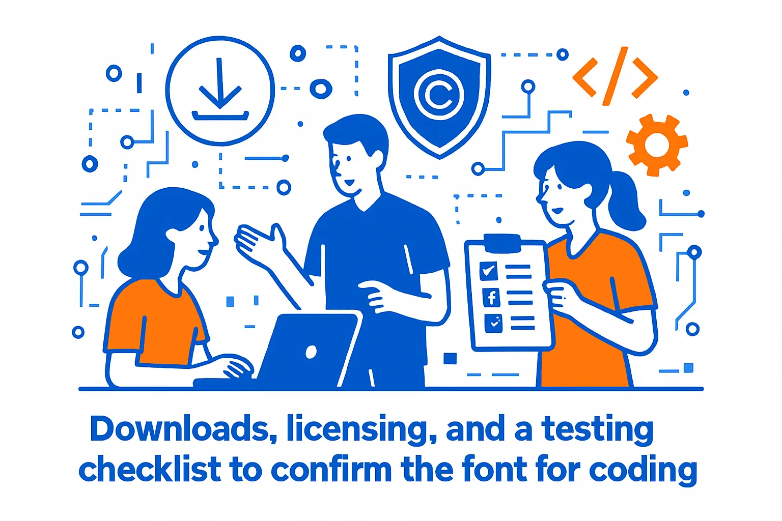
- Downloads, licensing, and a testing checklist to confirm the best font for coding
We are 1Byte, and we spend our days living inside monospace. Our engineers ship fixes from terminals. Our support team reads logs during incidents. Our docs team sweats every code block in a control panel guide. Fonts sound cosmetic until a single ambiguous glyph burns an hour.
In our world, a “good coding font” is risk management. It reduces misreads in diffs. It makes pairing less tiring. It keeps a demo from collapsing because the projector smears punctuation into mush. Even better, it makes a team’s tooling feel consistent across laptops, VMs, and remote desktops.
Budgets and attention follow market gravity. Gartner forecasts public cloud end-user spending at $723.4 billion in 2025, and that scale funds the developer workspaces we host. Forrester projects global technology spend will reach $5.6 trillion, so micro-ergonomics compound across organizations. Statista expects a global developer population of 28.7 million people by 2024, and each of those people stares at glyphs for hours.
We also see the human side. A good font helps junior developers spot patterns faster. It helps seniors avoid “operator soup” fatigue. If we had to sum it up, we would say this: pick a font like you pick a keyboard. Then test it like you test a backup.
How to choose the best font for coding for long, comfortable sessions
1. Legibility first: test 1 l I and O 0 in any best font for coding shortlist
Legibility is the whole game. If we misread a character, everything downstream gets noisy. That noise shows up as failed deployments, broken credentials, or one more comment in code review.
Our first test is brutally simple. We paste a “confusables” snippet into a scratch file. Then we scan fast, as if we are triaging an incident. A good font makes the differences obvious without effort.
What we check in practice
- Distinct shapes for similar glyphs, especially in identifiers.
- Clear punctuation, including commas, colons, and periods.
- Readable braces and brackets at small sizes.
- Unambiguous quotes, since config files are full of them.
For business teams, this is not picky. A single confusing glyph can slip past review and ship. We would rather lose a little “style” than lose correctness.
2. Use x-height and spacing to match your screen size and editor font size
X-height is the quiet hero of coding fonts. A generous x-height keeps lowercase readable in long sessions. It also helps when you are forced into smaller sizes on dense displays.
Spacing matters just as much. Tight spacing can look sleek, yet it raises the chance of collisions. Loose spacing can feel calm, yet it may reduce visible context per line. We aim for “calm, but not wasteful.”
Our rule-of-thumb workflow
- Pick a font that stays readable at your usual size.
- Open a file with mixed symbols and long identifiers.
- Scan indentation levels without focusing on each character.
- Stop if you feel strain, even if it looks pretty.
In our hosted dev environments, we optimize for many screens. That pushes us toward fonts that keep rhythm and spacing predictable.
3. Decide on ligatures: aesthetic upgrade vs potential readability trade-offs
Ligatures are a rendering trick. They combine multi-character operators into a single glyph. Some developers read faster with them. Others feel they hide what is really typed.
We treat ligatures as an optional layer. They can reduce visual noise in arrow-heavy code. They can also create ambiguity when a glyph resembles a different operator. That risk grows during high-pressure debugging.
Where ligatures tend to help us
- Functional pipelines and arrow-heavy transformations.
- Dense boolean logic where operators repeat.
- Presentations where “pretty operators” aid scanning.
For production incident work, we prefer conservative ligatures. In a war room, clarity beats flair every time.
4. Look for multiple weights plus italic styles for comments and emphasis
Weights are not a luxury. They are how we create contrast without changing size. A good “regular” and “semi-bold” pairing can make headings pop in a README. It can also make selected text stand out in a diff.
Italic is more controversial. Many monospace italics are cramped or overly cursive. Still, tasteful italics help separate comments from code. They also reduce the need for loud colors in syntax themes.
What we like to have available
- At least a normal weight and a heavier weight.
- An italic that stays legible in small sizes.
- Distinct punctuation at every weight.
When teams standardize fonts, weights matter for docs too. A font that works only in an IDE is half a solution.
5. Confirm editor support: ligatures, variable fonts, and fallback behavior
Editors differ in what they support. Some handle ligatures cleanly. Others stumble on advanced OpenType features. Variable fonts add another dimension, since not every renderer handles them the same way.
Fallback behavior matters more than people admit. If a glyph is missing, the editor may “borrow” it from a different font. That creates mismatched widths and broken alignment. In terminals, it can wreck prompt layouts.
We validate these specifics
- Ligatures toggle reliably, without partial failures.
- Bold and italic render cleanly in the chosen editor.
- Fallback glyphs do not break monospace alignment.
On our side, we care because customers paste commands from dashboards. A broken glyph can become a broken command.
6. Adjust line height and OS rendering settings for cleaner code blocks
Line height is the simplest comfort dial. Too tight, and lines blur together. Too loose, and code loses vertical cohesion. The sweet spot depends on x-height and on your display.
Operating systems render fonts differently. Subpixel settings, smoothing, and hinting affect sharpness. Remote desktops add more complexity, since compression can smear fine stems. We test fonts inside remote sessions, not only locally.
Small adjustments we use often
- Increase line height until braces stop “stacking.”
- Reduce bold usage if stems look too heavy.
- Try a different weight before switching fonts.
Business impact shows up in fatigue. Fewer headaches means fewer context switches. That is hard to measure, yet easy to feel.
7. Consider availability across machines for teams, pairing, and demos
Availability is the hidden constraint. A font that only exists on one machine is a trap. It will break alignment in shared screenshots. It will change line wraps in pasted snippets. It will make pairing feel “off” between machines.
We prefer fonts that install easily across systems. Open licensing helps. Simple distribution helps even more. For teams, “boring and available” often wins.
Our shortlist of thirty coding fonts we see work well
- JetBrains Mono — balanced, modern shapes for daily IDE work.
- Fira Code — popular ligatures, with sane defaults for operators.
- Cascadia Code — crisp Windows rendering with a matching Mono variant.
- Source Code Pro — neutral tone, strong readability in docs.
- IBM Plex Mono — distinctive personality without sacrificing clarity.
- Inconsolata — airy rhythm that stays readable in long files.
- Iosevka — highly customizable, especially for compact layouts.
- Hack — pragmatic spacing and sturdy punctuation for terminals.
- Ubuntu Mono — familiar shapes, good for mixed Linux fleets.
- DejaVu Sans Mono — dependable coverage on many Linux systems.
- Noto Sans Mono — broad Unicode coverage with a clean look.
- Liberation Mono — practical substitute when metric compatibility matters.
- Droid Sans Mono — older, yet still serviceable for conservative setups.
- Menlo — reliable macOS coding default with solid proportions.
- Monaco — classic compact feel, still loved by many.
- SF Mono — Apple’s modern monospace, great for macOS consistency.
- Consolas — Windows workhorse with clear letterforms.
- Courier Prime — classic vibe with improved readability for print.
- Anonymous Pro — clean forms, especially in terminals and shells.
- Space Mono — bold personality for headings and slides.
- PT Mono — compact and readable, with a technical feel.
- Fantasque Sans Mono — playful, yet surprisingly legible for many.
- Victor Mono — expressive italics that can separate comments well.
- Hasklig — ligatures tuned for operator-heavy code.
- Intel One Mono — engineered clarity, with strong punctuation.
- Monaspace — a family system built for mixing styles consistently.
- Recursive Mono — flexible design that adapts across contexts.
- Input Mono — configurable variants for glyph preferences.
- Operator Mono — premium look with signature cursive italics.
- PragmataPro — dense, information-first design with wide glyph coverage.
For team standards, we usually propose two fonts. One is the default. The second is an approved alternative. That keeps individuality without chaos.
Quick Comparison of best font for coding
We keep a “top shelf” list for fast decisions. These picks balance legibility, IDE behavior, and availability across real workstations. Pricing is intentionally simple here, since licenses and bundles vary by context.
| Tool | Best for | From price | Trial/Free | Key limits |
|---|---|---|---|---|
| JetBrains Mono | All-day IDE coding | Free | Free | Ligatures are limited |
| Fira Code | Ligature fans | Free | Free | Some glyphs feel stylized |
| Cascadia Code | Windows terminals | Free | Free | Some IDEs need static files |
| Source Code Pro | Docs and code blocks | Free | Free | No ligatures by default |
| IBM Plex Mono | Readable, distinctive tone | Free | Free | Not the most compact |
| Iosevka | Dense layouts | Free | Free | Choice overload without a plan |
| Inconsolata | Comfortable reading | Free | Free | Some prefer heavier punctuation |
| Hack | Terminals and SSH | Free | Free | Less “design flair” |
| Intel One Mono | Clarity-first work | Free | Free | Fewer “fun” alternates |
| Monaspace | Mixing styles consistently | Free | Free | Variable behavior varies by app |
From our hosting-side viewpoint, the “best” pick is the one you can standardize. That standard should survive a new laptop, a CI runner, and a screen share. Consistency reduces friction when work crosses environments.
Top 30 best font for coding options to try in editors and terminals
Good coding fonts don’t “feel nice.” They reduce tiny frictions that compound all day. Think fewer misreads, calmer scanning, and less squinting in terminals.
Our picks favor fonts that stay crisp at small sizes and survive long sessions. We also reward designs that keep similar glyphs distinct. Zero and O must not flirt.
Scoring uses a weighted 0–5 rubric. Value-for-money and feature depth carry the most weight. Setup effort and ecosystem fit matter next. UX, trust, and support round it out.
Each font gets a practical read, not a museum critique. We look at ligatures, italics, weights, and spacing control. We also check how well it renders in common editors.
Finally, we note the unglamorous bits. Licensing, missing glyphs, and uneven italics can be deal-breakers. The goal is simple: help you pick faster, then ship code with less visual drag.
1. JetBrains Mono
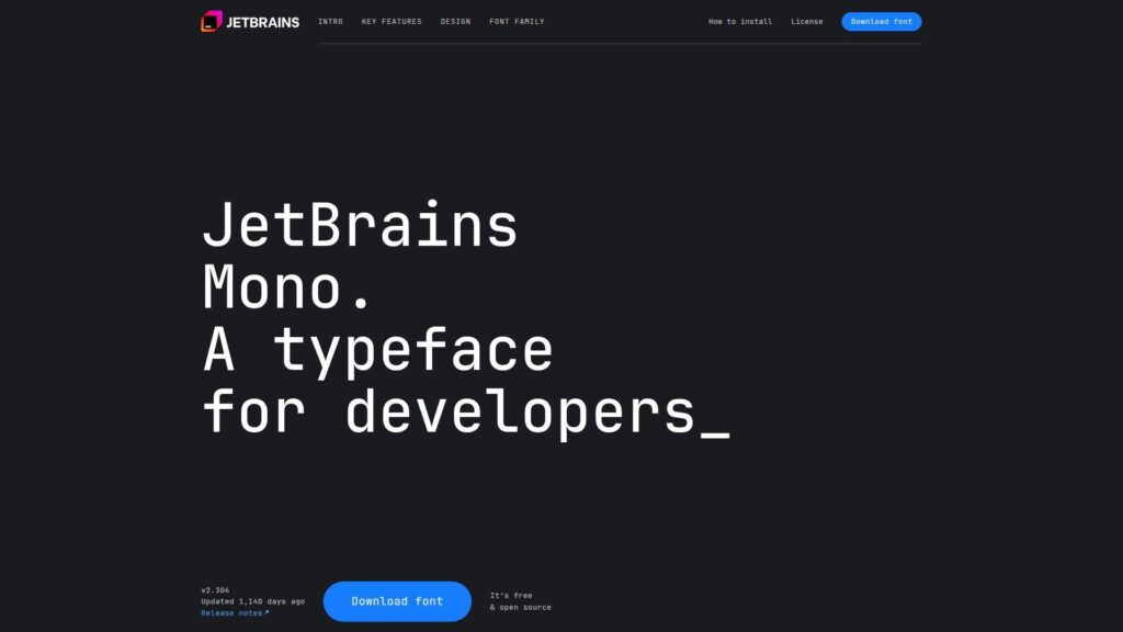
JetBrains builds developer tools, and this font comes from a team that lives in IDEs. That proximity shows in the details. Shapes stay distinct without looking fussy.
Outcome: Scan dense code faster, with fewer “wait, is that an l?” moments.
Best for: JetBrains IDE users, and backend engineers living in terminals all day.
- Careful glyph differentiation → fewer rereads when scanning identifiers and stack traces.
- Ligatures in supported editors → skip 1–2 visual parsing steps on common operators.
- Sensible defaults out of the box → time-to-first-value is often under 5 minutes.
Pricing & limits: From $0/mo. Trial: N/A for free fonts. Caps: none for typical open licenses, but verify rules for commercial redistribution.
Honest drawbacks: The bold weight can feel heavy in small terminals. Ligatures can distract if you prefer literal characters.
Verdict: If you want a modern, steady workhorse, this helps you read and refactor quicker in a week. Beats many classics at clarity; trails some niche fonts on extreme customization.
Score: 4.7/5
2. Fira Code
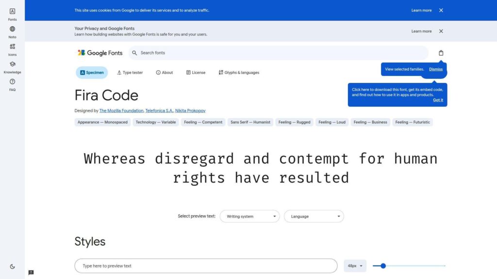
Fira Code grew from the Fira family and a developer-heavy community. It’s maintained with coding use in mind. The design’s headline is ligatures, done with restraint.
Outcome: Turn common operator soup into calmer, faster-to-parse shapes.
Best for: Frontend developers, and teams standardizing a font across VS Code.
- Clean ligature set → quicker recognition of patterns like arrows and equality chains.
- Wide editor support → avoid extra plugins, beyond one ligature setting toggle.
- Easy install on most OSes → time-to-first-value is usually 5–10 minutes.
Pricing & limits: From $0/mo. Trial: N/A. Caps: none for typical open-source use, yet packaging in products may have rules.
Honest drawbacks: Ligatures can confuse code reviews when teammates don’t use them. Some people find the rhythm too “designed” for long backend work.
Verdict: If you read a lot of modern syntax, this helps you parse expressions faster within a few days. Beats many fonts at ligature polish; trails JetBrains Mono on plain, no-ligature neutrality.
Score: 4.5/5
3. Iosevka
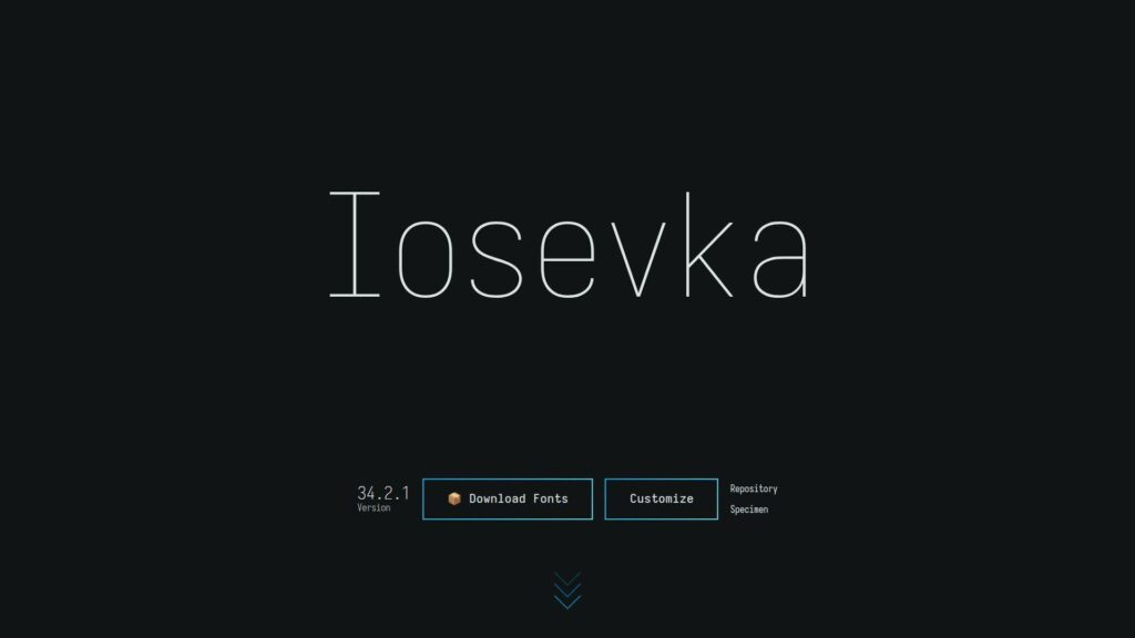
Iosevka is an engineer’s font, shaped by an open-source maintainer and contributors. Its superpower is configurability. You can dial it from humanist to sharp, then generate your own build.
Outcome: Fit more code per screen without sacrificing legibility.
Best for: Power users, and teams that want one font tuned for many languages.
- Highly condensed, modular shapes → more columns visible during reviews and diffs.
- Custom builds and variants → skip manual compromises across editors and terminals.
- Scriptable workflow for variants → time-to-first-value is 15–30 minutes, then faster later.
Pricing & limits: From $0/mo. Trial: N/A. Caps: open-source usage is flexible, though custom build distribution should follow the license.
Honest drawbacks: Choice overload is real, and it can slow adoption. Some variants feel sterile if you want warmth.
Verdict: If you crave control, this helps you craft a “house font” in an afternoon. Beats most fonts at customization; trails simpler picks on instant, no-decisions setup.
Score: 4.6/5
4. Monoid
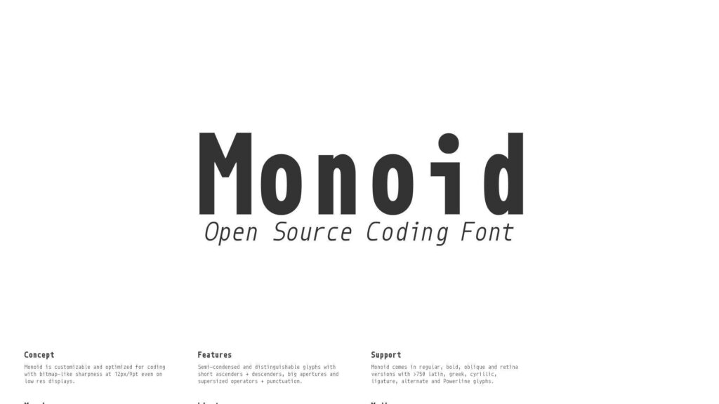
Monoid comes from an independent studio, with a hacker’s eye for ambiguity. It’s designed around distinct forms and smart ligatures. The overall feel is technical, not decorative.
Outcome: Reduce symbol confusion when you’re tired and moving fast.
Best for: DevOps engineers, and anyone living inside logs and diffs.
- Strong character disambiguation → fewer mistakes between similar glyphs in terminals.
- Ligature support where available → cut mental parsing steps on operator-heavy code.
- Simple install and predictable metrics → time-to-first-value is often under 10 minutes.
Pricing & limits: From $0/mo. Trial: N/A. Caps: license terms vary by distribution, so confirm before bundling it.
Honest drawbacks: The aesthetic can feel “industrial” in prose-heavy docs. Ligatures remain a taste call, not a universal win.
Verdict: If you want clarity over charm, this helps you debug faster within a week. Beats many classics at symbol distinction; trails newer families on breadth of weights and italics nuance.
Score: 4.2/5
5. Hasklig
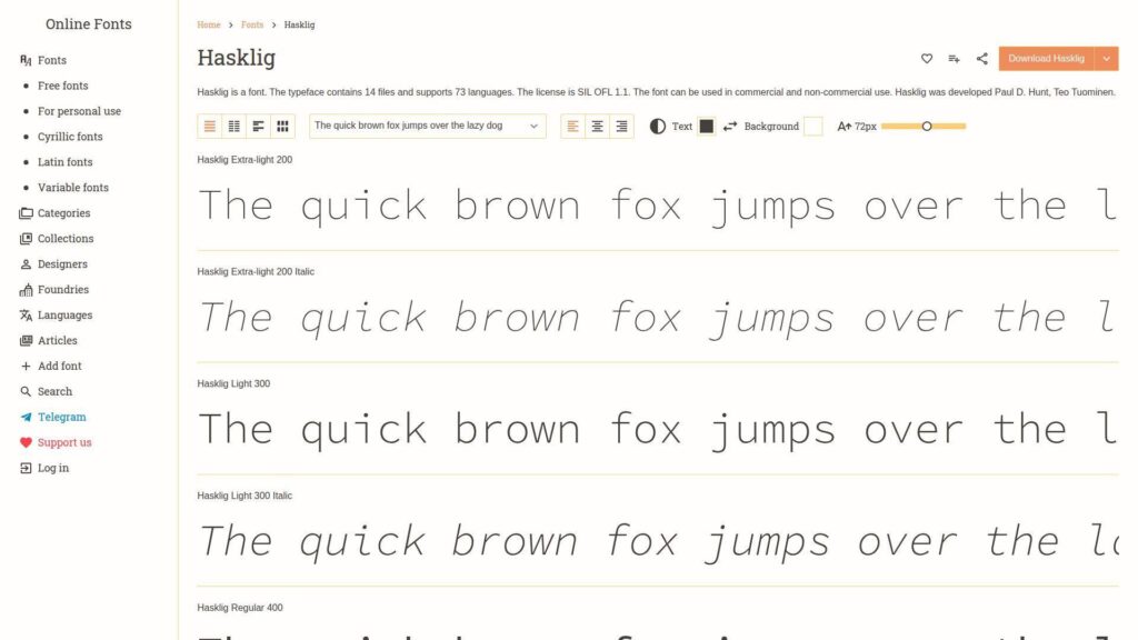
Hasklig was shaped for people who read functional code and dense operators. It builds on a familiar base and adds careful ligatures. The tone is pragmatic, with a slight academic edge.
Outcome: Make operator-heavy code feel less like punctuation rain.
Best for: Haskell and FP developers, plus polyglot engineers who like ligatures.
- FP-friendly ligature set → quicker recognition of common operator sequences.
- Works in ligature-capable editors → avoid manual symbol spacing tweaks in themes.
- Low-friction setup on most OSes → time-to-first-value is usually 5–10 minutes.
Pricing & limits: From $0/mo. Trial: N/A. Caps: open usage is typical, but verify any constraints for redistribution.
Honest drawbacks: In non-FP code, ligatures can feel unnecessary. Some terminals render the lighter weights less crisply at tiny sizes.
Verdict: If you write code full of operators, this helps you read expressions faster in a few sessions. Beats many fonts at FP ligature coverage; trails Fira Code on mainstream mindshare and defaults.
Score: 4.1/5
6. Commit Mono
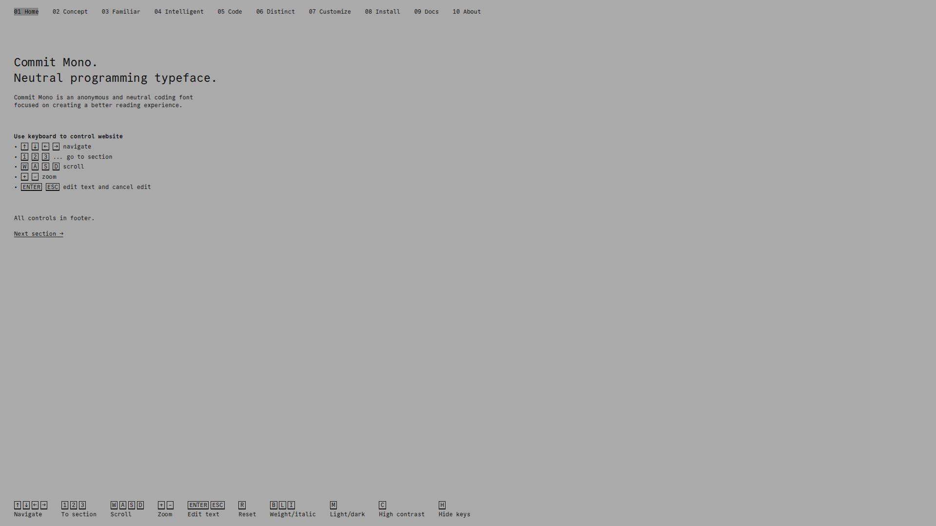
Commit Mono is a newer community-driven font with a clean, modern voice. It aims for readable code and pleasant rhythm. The shapes avoid drama, which is the point.
Outcome: Get a calm, consistent reading experience across editors and terminals.
Best for: Teams standardizing a font, and solo developers who hate visual noise.
- Neutral, legible letterforms → fewer micro-pauses when scanning long identifiers.
- Solid glyph coverage for coding → avoid 1–2 fallbacks when mixing symbols and text.
- Quick adoption with minimal tuning → time-to-first-value is often under 10 minutes.
Pricing & limits: From $0/mo. Trial: N/A. Caps: typically permissive for personal and team use, but check packaging rights.
Honest drawbacks: If you want flashy ligatures or extreme styles, it may feel plain. As a newer pick, long-term “every OS ships it” comfort is lower.
Verdict: If you want a modern default that won’t argue with your theme, this helps you settle in quickly within a day. Beats quirky fonts at neutrality; trails Iosevka on customization depth.
Score: 4.3/5
7. Cascadia Code
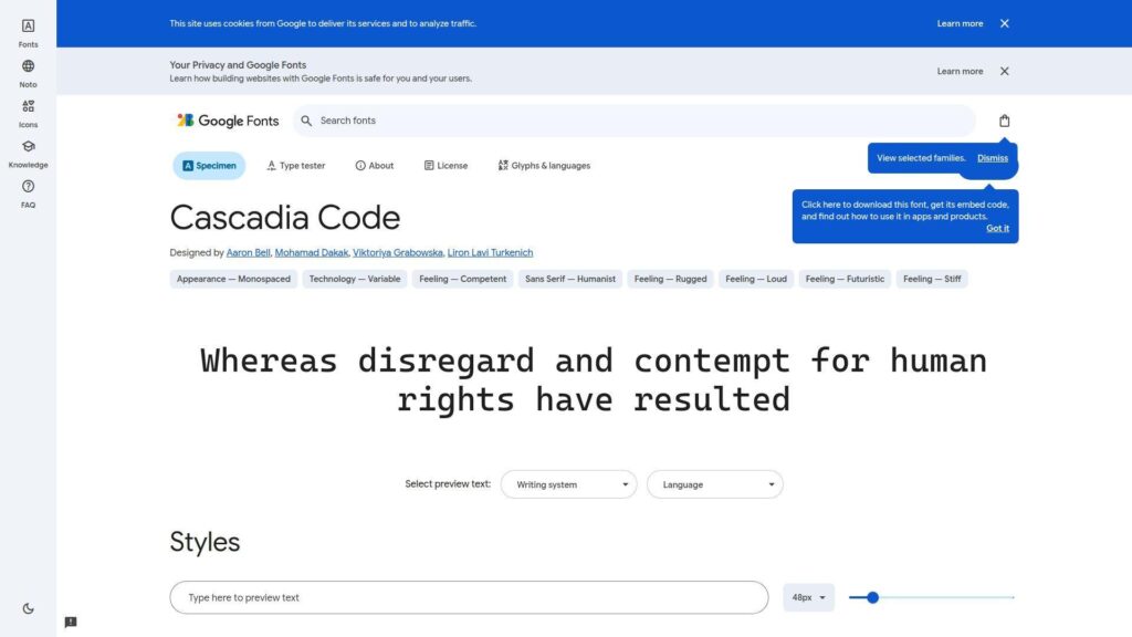
Cascadia Code is Microsoft’s modern terminal font effort, built with developer workflows in mind. It’s tuned for ClearType-era realities and modern editors. The result feels familiar, yet updated.
Outcome: Make Windows-heavy setups look crisp without font gymnastics.
Best for: Windows developers, and enterprise teams needing a safe standard.
- Terminal-first legibility → fewer misreads in PowerShell and long command output.
- Optional ligatures → reduce visual parsing steps with one setting toggle.
- Easy install and broad availability → time-to-first-value is often under 10 minutes.
Pricing & limits: From $0/mo. Trial: N/A. Caps: typically fine for internal use, though redistribution rules can differ by channel.
Honest drawbacks: On non-Windows setups, it can feel less “native” than local defaults. Some users prefer tighter spacing for dense code reviews.
Verdict: If you want a dependable Windows-friendly font, this helps you standardize fast in a single sprint. Beats Consolas at modern polish; trails JetBrains Mono on distinctiveness for similar glyphs.
Score: 4.4/5
8. Victor Mono
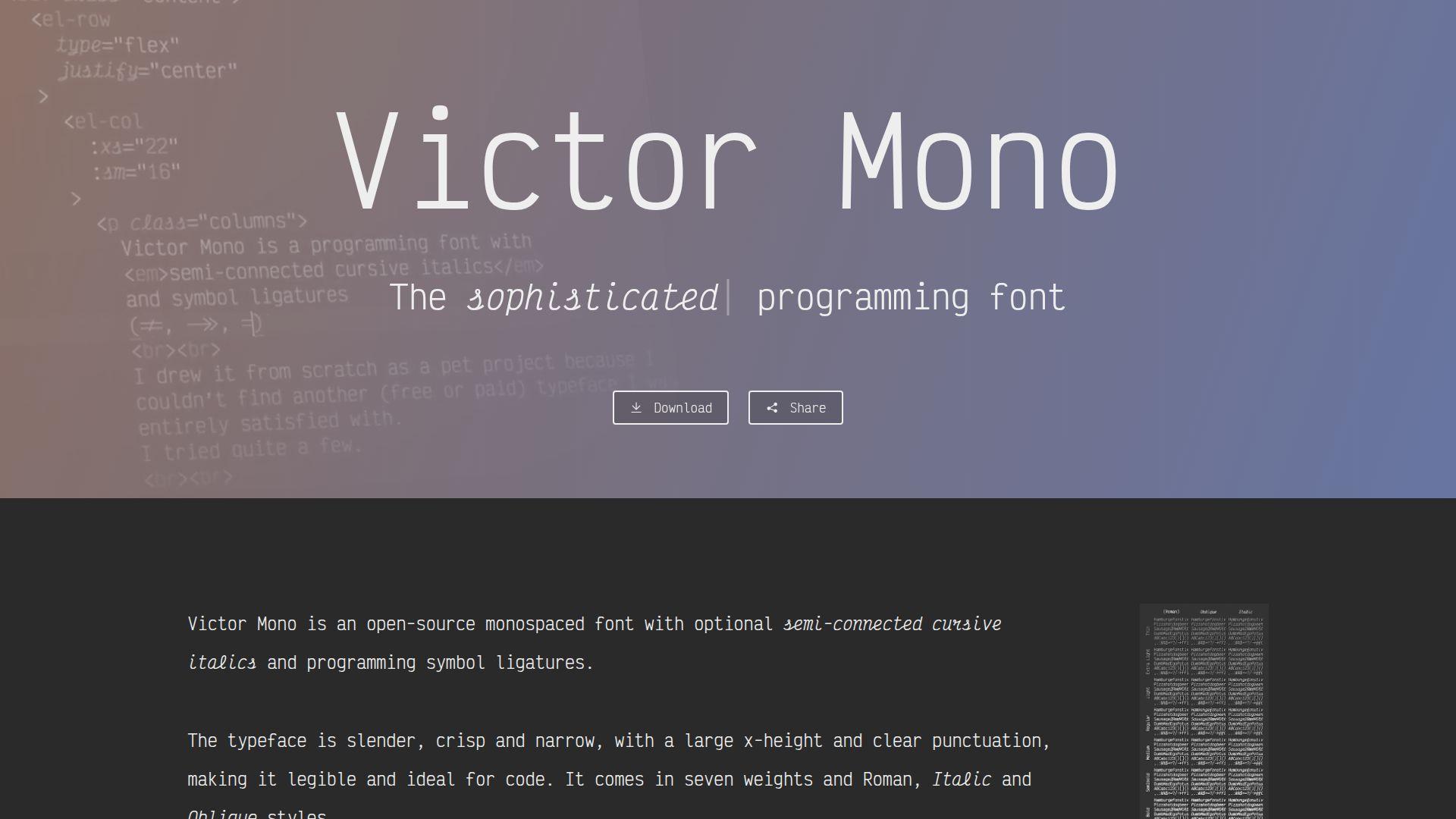
Victor Mono is an independent project with a designer’s love for italics. It leans expressive while staying functional. The cursive italics can make syntax highlighting feel more semantic.
Outcome: Add meaning to code through italics that actually look intentional.
Best for: Designers who code, and developers who rely on italics for emphasis.
- Distinctive italics → quicker scanning of comments, types, or emphasized tokens.
- Ligatures and alternates in supported editors → save manual styling tweaks across themes.
- Simple drop-in usage → time-to-first-value is often under 10 minutes.
Pricing & limits: From $0/mo. Trial: N/A. Caps: open usage is common, but confirm license details for commercial bundling.
Honest drawbacks: The personality can be polarizing for large teams. In tiny terminals, the stylized forms may reduce clarity.
Verdict: If you want code to feel more readable and less robotic, this helps you get there in a weekend. Beats most fonts at italic character; trails plainer choices on universal acceptance.
Score: 4.0/5
9. SF Mono
SF Mono is Apple’s developer-facing mono, built to match the system’s typography tone. It feels tight, clean, and quietly confident. Many macOS setups choose it because it “just fits.”
Outcome: Make macOS coding environments feel native and sharp.
Best for: macOS developers, and iOS teams standardizing editor typography.
- System-aligned shapes → less eye strain when switching between apps and code.
- Great pairing with Apple tooling → skip extra font hunting across machines.
- Instant familiarity on Macs → time-to-first-value is often under 5 minutes.
Pricing & limits: From $0/mo. Trial: N/A. Caps: availability and redistribution are more restrictive than typical open fonts.
Honest drawbacks: Cross-platform teams may struggle to match it everywhere. License constraints can block bundling in products or shared packages.
Verdict: If you live on macOS, this helps you settle on a native-feeling default today. Beats many third-party fonts at system cohesion; trails open fonts on portability and licensing simplicity.
Score: 4.2/5
10. Recursive

Recursive comes from a professional type effort with a variable-font mindset. It’s built to morph between “mono” and “sans” vibes. That flexibility is useful in docs, code, and UI mockups.
Outcome: Use one family for code, docs, and UI, without visual whiplash.
Best for: Product teams, and developers who write lots of documentation.
- Variable axes and styles → keep consistency across code blocks and prose.
- One family for multiple contexts → save a font pairing decision per project.
- Modern file formats and tooling → time-to-first-value is often 10–15 minutes.
Pricing & limits: From $0/mo. Trial: N/A. Caps: typically permissive for open fonts, though embedding rules can apply in some contexts.
Honest drawbacks: If you only need a terminal font, it’s more than necessary. Some editors handle variable fonts unevenly, which can complicate rollout.
Verdict: If you want typography consistency across product and code, this helps you unify quickly within a week. Beats single-purpose monos at breadth; trails JetBrains Mono on pure “coding-only” focus.
Score: 4.3/5
11. Monaspace
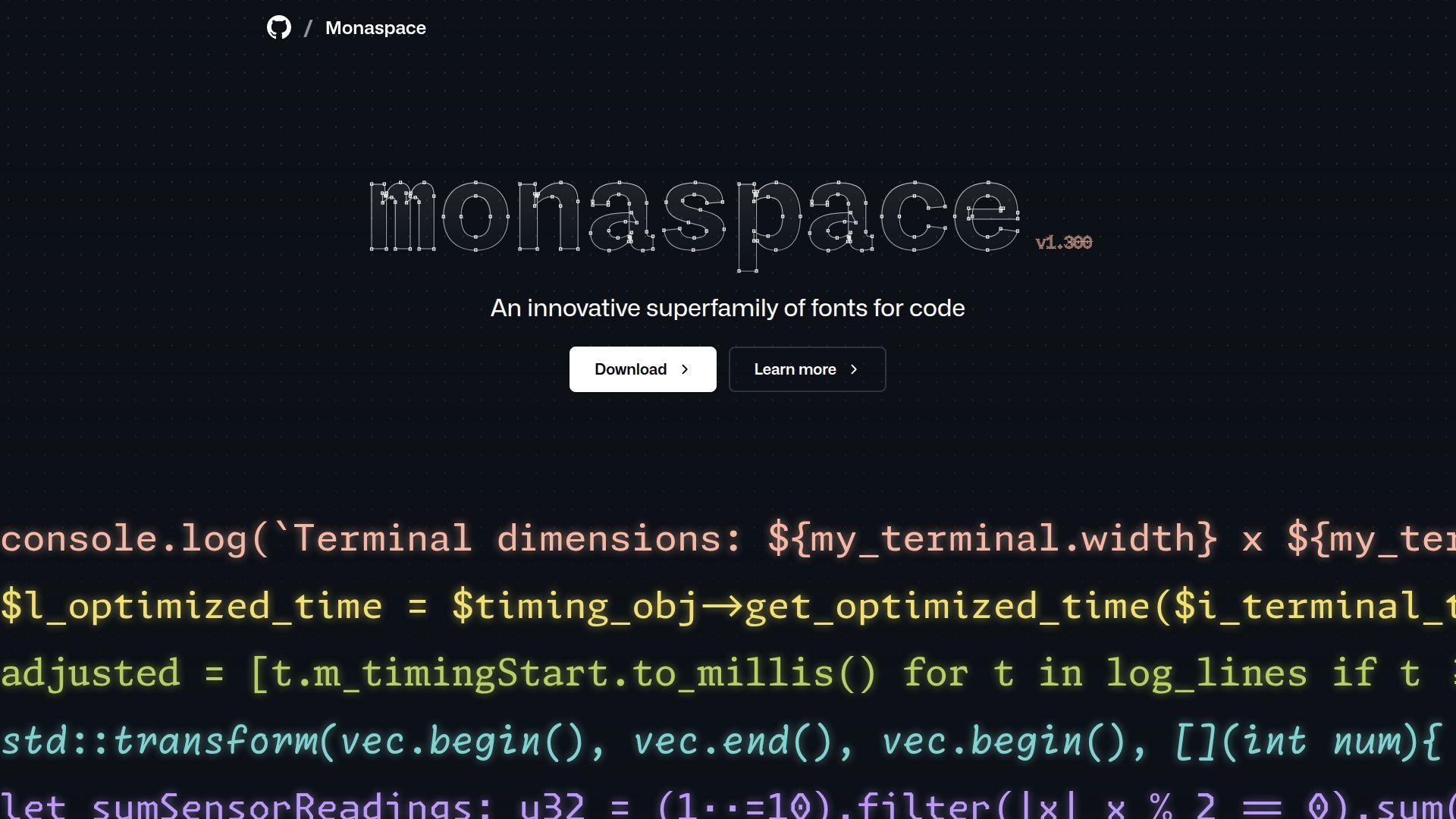
Monaspace comes from GitHub Next, shaped for modern code reading and review. It’s a family, not a single font. That matters when you want consistent metrics with different moods.
Outcome: Match your coding vibe to the task, without changing layout.
Best for: GitHub-heavy teams, and engineers doing lots of code review.
- Multi-font family with shared metrics → keep line breaks stable across styles.
- Designed for code comprehension → reduce “pattern blur” in long review sessions.
- Clear documentation and setup path → time-to-first-value is often 10–15 minutes.
Pricing & limits: From $0/mo. Trial: N/A. Caps: open licenses are common for such releases, yet confirm before bundling.
Honest drawbacks: Some styles may feel too opinionated for universal team standards. If your editor mishandles font features, the benefits can flatten.
Verdict: If you want a review-friendly family with consistent spacing, this helps you settle on a “set” in a few days. Beats many fonts at family coherence; trails older system fonts on ubiquitous preinstall availability.
Score: 4.4/5
12. Hack
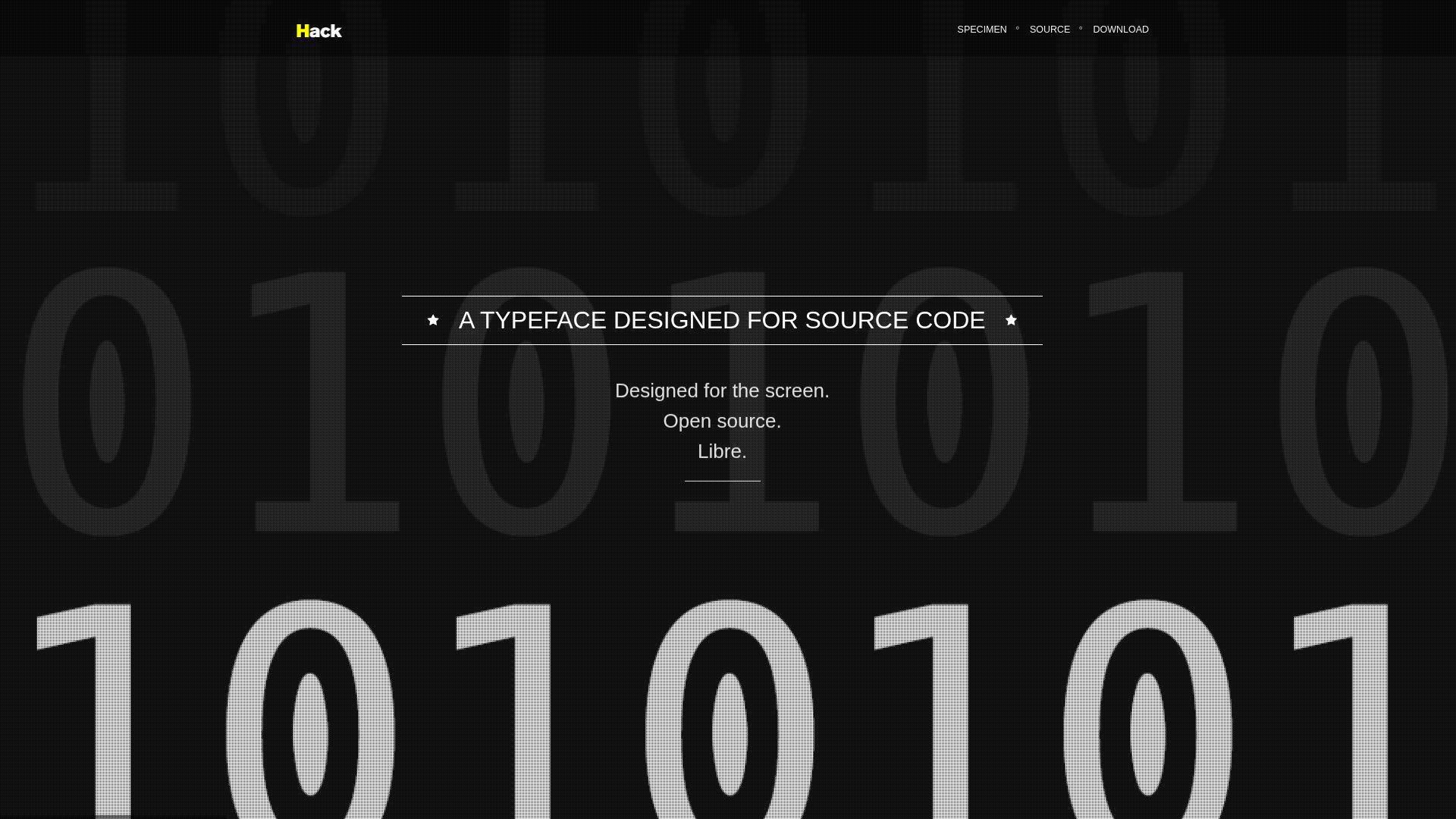
Hack is a Source Foundry project with an open, practical mission. It’s built for readability first. The vibe is sturdy, like a well-used tool, not a fashion piece.
Outcome: Get a reliable, no-surprises mono for everyday development.
Best for: Linux developers, and teams that want a stable open-source default.
- Comfortable letterforms → fewer misreads when scanning logs and config files.
- Wide distro availability → skip custom font deployment steps on shared machines.
- Minimal tuning needed → time-to-first-value is often under 5 minutes.
Pricing & limits: From $0/mo. Trial: N/A. Caps: none for typical open-source usage, but confirm any trademark or naming rules.
Honest drawbacks: It won’t wow you with ligatures or expressive italics. If you want tight density, Hack can feel a bit roomy.
Verdict: If you want a dependable open-source mono that fades into the background, this helps you standardize fast in a day. Beats many novelty fonts at long-session comfort; trails Iosevka on density and configurability.
Score: 4.2/5
13. DejaVu Sans Mono
DejaVu Sans Mono is a long-running community font with wide language coverage. It’s a staple in many Linux environments. The design is classic, with “it just works” energy.
Outcome: Avoid missing glyphs and weird fallbacks across languages and symbols.
Best for: Linux users, and developers who need broad Unicode coverage.
- Wide character set → fewer tofu boxes when logs include diverse text.
- Commonly installed by default → save a deployment step on fresh machines.
- Predictable rendering everywhere → time-to-first-value can be immediate on many systems.
Pricing & limits: From $0/mo. Trial: N/A. Caps: none for typical open licensing, though packaging should follow distribution rules.
Honest drawbacks: The look can feel dated beside newer monos. At small sizes, some glyphs feel crowded compared to modern designs.
Verdict: If you want maximum compatibility, this helps you avoid font surprises today. Beats many trendy fonts at coverage; trails JetBrains Mono on modern spacing and polish.
Score: 4.0/5
14. Source Code Pro
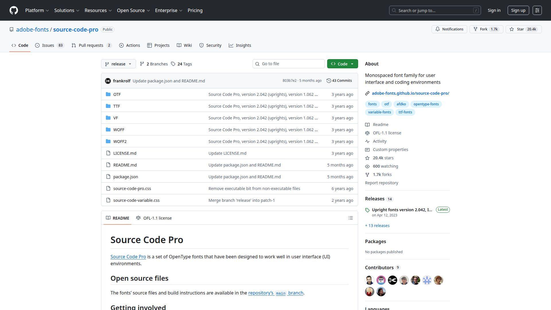
Source Code Pro is Adobe’s open-source coding mono, built with professional type rigor. It balances neutrality with clarity. The family feels “designed,” yet it stays out of your way.
Outcome: Keep code readable across sizes, without adopting a quirky aesthetic.
Best for: Mixed-discipline teams, and developers who want a safe default in docs.
- Large, well-tuned family → easier hierarchy in editors via weights and styles.
- Broad ecosystem adoption → save 1–2 onboarding steps when sharing editor configs.
- Smooth installation and dependable metrics → time-to-first-value is often under 10 minutes.
Pricing & limits: From $0/mo. Trial: N/A. Caps: typically permissive for open-source usage, but check embedding rules for apps.
Honest drawbacks: It can feel slightly wide in tight terminal layouts. If you crave ligatures, you’ll need a different pick.
Verdict: If you want a professional, broadly accepted mono, this helps you standardize within a week. Beats many system fonts at family depth; trails Fira Code on ligature-driven operator readability.
Score: 4.3/5
15. Monaco
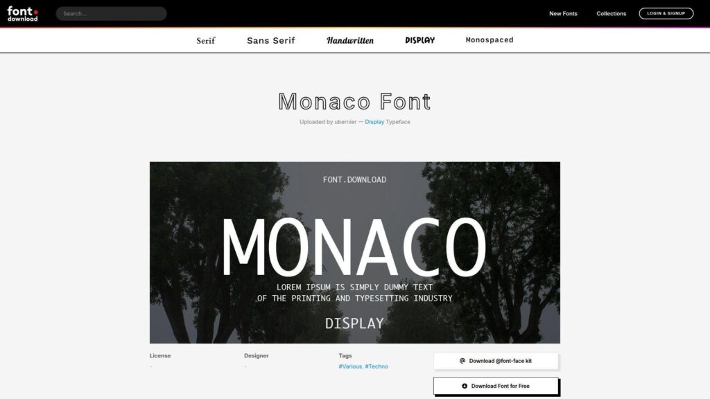
Monaco is an old-school macOS classic, shipped with developer culture baked in. It’s the font many people learned to code in. That legacy brings comfort and predictability.
Outcome: Get a familiar, stable look that never surprises you mid-debug.
Best for: Longtime Mac developers, and anyone who values classic terminal vibes.
- Classic, high-contrast forms → easier scanning in bare terminals and SSH sessions.
- Ubiquity in older tooling → skip hunting for matching screenshots and tutorials.
- Zero learning curve → time-to-first-value can be immediate on compatible systems.
Pricing & limits: From $0/mo. Trial: N/A. Caps: it’s typically bundled with systems, yet redistribution rules may be restrictive.
Honest drawbacks: The design shows its age next to newer monos. Cross-platform consistency is tough if teammates aren’t on macOS.
Verdict: If you want a nostalgic, steady terminal font, this helps you feel at home today. Beats many fonts at “classic Mac” familiarity; trails modern families on weights, ligatures, and tuning for today’s editors.
Score: 3.8/5
16. Menlo
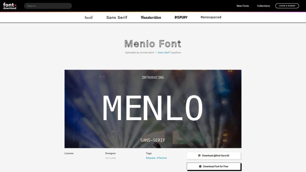
Menlo is Apple’s modernized Monaco successor, designed for screen legibility. It’s widely used across macOS developer setups. The shapes feel balanced, with fewer quirks than Monaco.
Outcome: Read code comfortably on macOS, especially in terminals.
Best for: macOS developers, and teams that want a predictable, preinstalled option.
- Clean screen rendering → fewer headaches during long terminal-heavy sessions.
- Preinstalled on many Macs → skip a setup step during onboarding.
- No configuration needed → time-to-first-value is often immediate.
Pricing & limits: From $0/mo. Trial: N/A. Caps: system fonts can carry redistribution limits, so treat bundling cautiously.
Honest drawbacks: The family isn’t as feature-rich as newer open-source monos. If you want ligatures, Menlo won’t scratch that itch.
Verdict: If you want a safe macOS baseline, this helps you standardize fast in one day. Beats Monaco at modern clarity; trails JetBrains Mono on distinctiveness and coding-specific refinements.
Score: 4.0/5
17. Consolas
Consolas is Microsoft’s long-standing coding font, built for ClearType and Windows defaults. It’s the baseline many Windows screenshots assume. That matters when you support users or ship docs.
Outcome: Keep Windows code and terminals readable with minimal setup.
Best for: Windows developers, and support teams writing reproducible instructions.
- Windows-native rendering → fewer fuzziness issues at small sizes.
- Default availability in many environments → skip downloads during locked-down IT setups.
- Stable metrics across apps → time-to-first-value is often immediate.
Pricing & limits: From $0/mo. Trial: N/A. Caps: bundled font licensing can restrict redistribution, so verify before packaging.
Honest drawbacks: It can feel bland compared to modern options. Some glyph distinctions aren’t as aggressive as newer coding-first designs.
Verdict: If you need a dependable Windows default, this helps you keep things consistent today. Beats many fonts at “already installed” convenience; trails Cascadia Code on modern styling and optional ligatures.
Score: 4.1/5
18. Inconsolata
Inconsolata is a beloved independent design by a well-known type and graphics mind. It leans humanist, with a gentle rhythm. Many developers choose it because it feels like reading text, not machinery.
Outcome: Make long coding sessions feel smoother and less harsh.
Best for: Writers-who-code, and developers who prefer humanist shapes.
- Humanist letterforms → faster word-shape recognition in long identifiers.
- Strong community footprint → avoid 1–2 debates during team font selection.
- Easy drop-in replacement → time-to-first-value is often under 10 minutes.
Pricing & limits: From $0/mo. Trial: N/A. Caps: open usage is typical, but confirm licensing if embedding in products.
Honest drawbacks: Some people find certain glyphs less distinct than coding-first fonts. In tiny terminals, the softer forms can blur.
Verdict: If you want code to read more like prose, this helps you settle into a calmer flow within days. Beats harsher monos at warmth; trails JetBrains Mono on strict disambiguation and coding-specific shaping.
Score: 4.1/5
19. Andale Mono
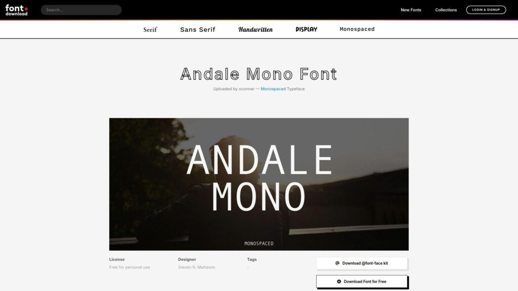
Andale Mono is a classic monospaced face with a long history in desktop publishing and older systems. It’s familiar to many, even if they don’t know the name. The design is straightforward and conservative.
Outcome: Use a classic mono that stays readable in plain text and logs.
Best for: Legacy projects, and teams maintaining older documentation or screenshots.
- Conservative shapes → fewer surprises when moving between old and new environments.
- Availability through commercial libraries → reduce procurement steps in some enterprises.
- Simple, no-feature setup → time-to-first-value is often under 10 minutes if available.
Pricing & limits: From $0/mo. Trial: N/A. Caps: licensing can be commercial, and seat limits may apply depending on how you obtain it.
Honest drawbacks: It lacks modern niceties like coding ligatures and rich weights. Cross-platform availability can be inconsistent without purchasing rights.
Verdict: If you need a conservative mono for compatibility, this helps you keep visuals stable today. Beats quirky fonts at predictability; trails open modern fonts on value and feature depth.
Score: 3.6/5
20. Droid Sans Mono
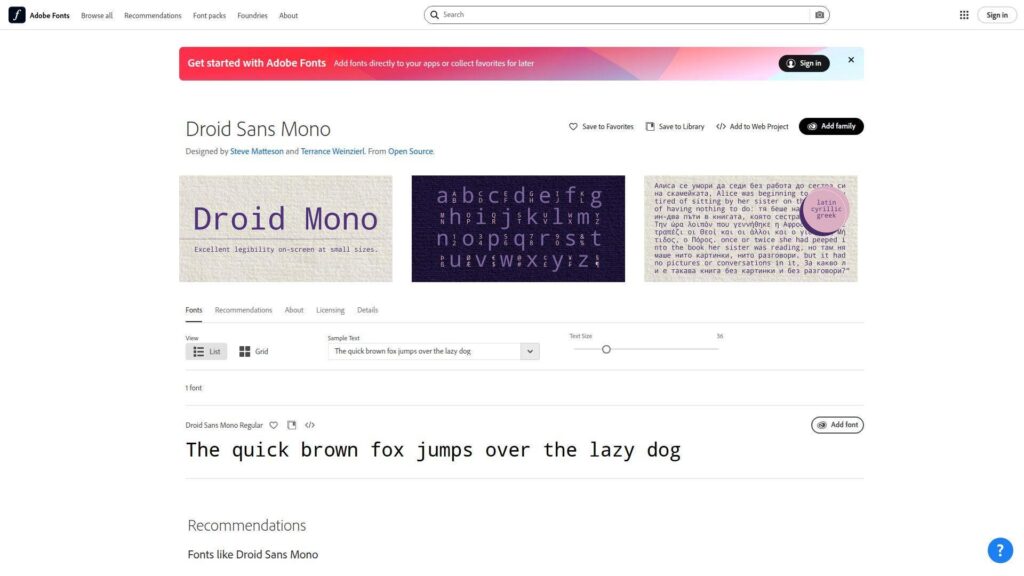
Droid Sans Mono comes from the Android-era push for practical screen fonts. It shows up in many older Linux and developer setups. The look is simple, readable, and a bit utilitarian.
Outcome: Get a lightweight mono that behaves well on many older systems.
Best for: Linux users on older distros, and developers working on embedded boxes.
- Practical screen-first forms → fewer rendering surprises on remote machines.
- Often present in package managers → save a manual download step.
- Low-maintenance deployment → time-to-first-value is often under 10 minutes.
Pricing & limits: From $0/mo. Trial: N/A. Caps: generally open usage, though confirm licensing for bundling in products.
Honest drawbacks: It can feel dated beside newer monos. Glyph differentiation isn’t as tuned as modern coding-first designs.
Verdict: If you need “good enough everywhere,” this helps you avoid font drama today. Beats some newer fonts on legacy compatibility; trails Hack and DejaVu on modern polish and coverage confidence.
Score: 3.8/5
21. Ubuntu Sans Mono
Ubuntu’s monospaced companion font is built for the distro’s visual voice. It aims to feel friendly without losing clarity. The result is a human, approachable mono for daily work.
Outcome: Keep terminals and editors readable, with a slightly warmer tone.
Best for: Ubuntu users, and teams that want a distro-aligned default.
- Friendly, open shapes → reduce fatigue during long terminal sessions.
- Easy install via common Linux packaging → skip a manual font install step.
- Minimal configuration required → time-to-first-value is often under 5 minutes.
Pricing & limits: From $0/mo. Trial: N/A. Caps: typically open for personal and team use, though redistribution terms still matter.
Honest drawbacks: If you want tight density, it can feel a bit airy. Cross-platform teams may not get the same default availability.
Verdict: If you want a warm, distro-native mono, this helps you settle into a consistent look quickly within a day. Beats harsher monos at friendliness; trails JetBrains Mono on sharp disambiguation and coding-focused detail.
Score: 4.0/5
22. M+
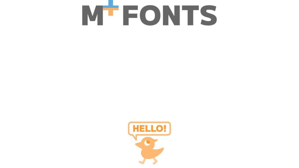
M+ is a long-running Japanese font project with multiple styles, including monospaced variants. It’s built with broad character needs in mind. That makes it valuable in multilingual environments.
Outcome: Keep code and mixed-language text consistent without glyph gaps.
Best for: Developers working with Japanese text, and international teams reading mixed logs.
- Multilingual-friendly coverage → fewer fallback fonts in terminals and editors.
- Multiple variants and weights → reduce style compromises across projects.
- Install-and-go packaging on many systems → time-to-first-value is often 10–15 minutes.
Pricing & limits: From $0/mo. Trial: N/A. Caps: open usage is common, though confirm terms if you redistribute builds.
Honest drawbacks: Some variants aren’t optimized purely for Latin-only coding. The look can feel less “coding trendy” than newer monos.
Verdict: If you need multilingual stability, this helps you stop fighting missing characters within a week. Beats many coding fonts at CJK friendliness; trails JetBrains Mono and Hack on Latin-only coding refinement.
Score: 4.1/5
23. Comic Mono
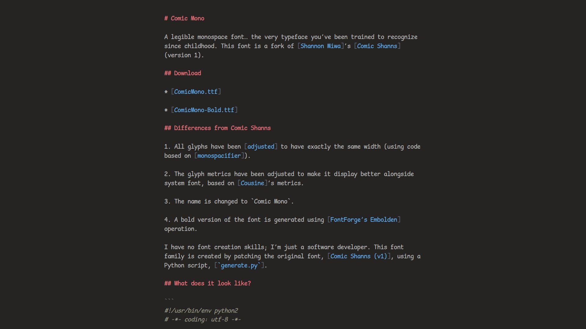
Comic Mono is a playful community project that borrows the spirit of comic lettering for code. It’s intentionally friendly. The goal isn’t elegance; it’s reducing intimidation and increasing comfort.
Outcome: Make code feel less severe, especially for learners and workshops.
Best for: Beginners, and educators running coding sessions or bootcamps.
- Friendly, informal tone → lower anxiety for learners reading unfamiliar syntax.
- Drop-in use in any editor → skip theme changes and keep setup simple.
- Fast install and instant feedback → time-to-first-value is often under 5 minutes.
Pricing & limits: From $0/mo. Trial: N/A. Caps: generally open usage, though verify terms if you bundle it in course materials.
Honest drawbacks: Many teams won’t accept it for professional codebases. In dense production code, the playful shapes can slow scanning.
Verdict: If you want a kinder first impression, this helps students start coding today. Beats most fonts at approachability; trails almost every “serious” mono on dense-code efficiency.
Score: 3.7/5
24. IBM Plex Mono
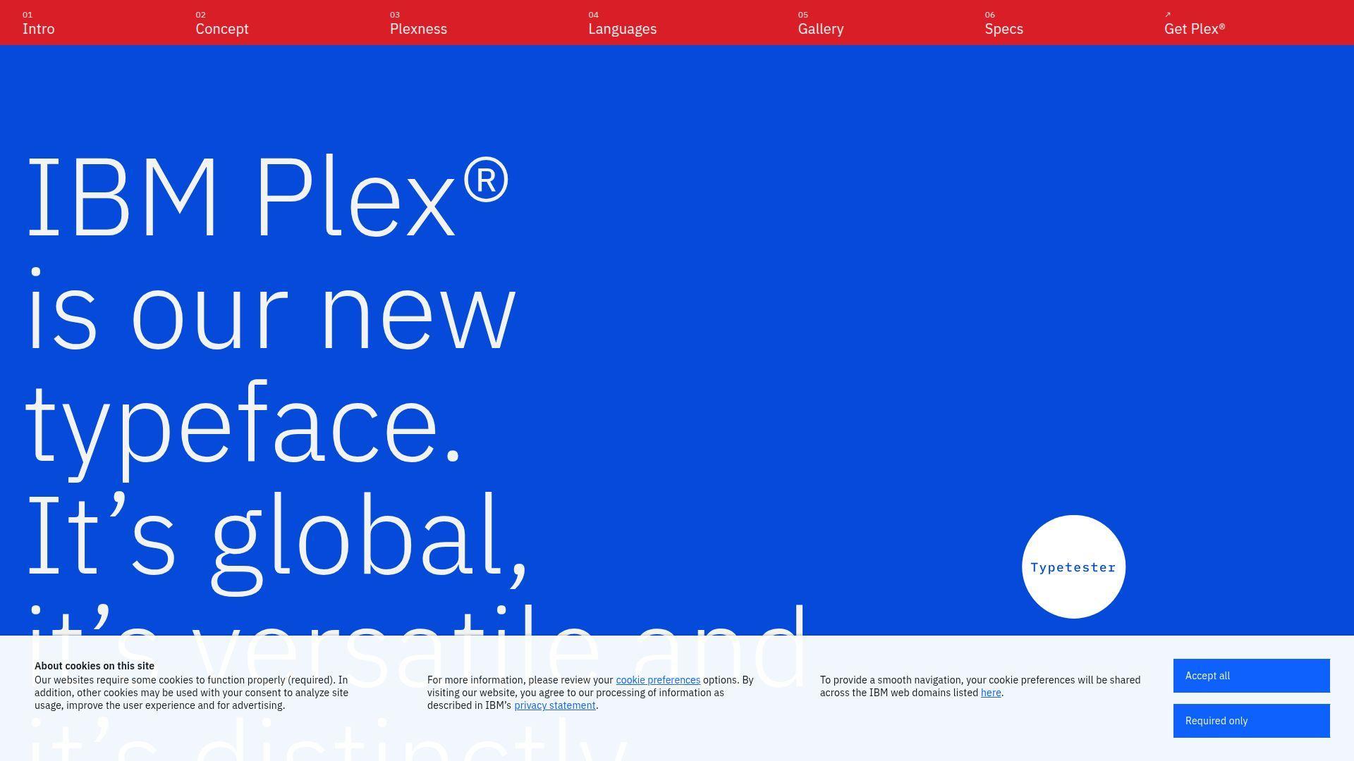
IBM Plex Mono is part of IBM’s unified type system, built by a serious typography program. It’s designed to work across brand, UI, and documentation. The mono variant stays readable while feeling polished.
Outcome: Keep code blocks and terminals aligned with professional documentation design.
Best for: Enterprise teams, and developers writing lots of product docs.
- Part of a full family → consistent typography across code, UI, and docs.
- Strong packaging and broad availability → save a font pairing decision per project.
- Predictable behavior across platforms → time-to-first-value is often under 10 minutes.
Pricing & limits: From $0/mo. Trial: N/A. Caps: typically open usage, but confirm embedding rules for shipped applications.
Honest drawbacks: Some developers find it slightly wide in tight editors. If you want coding ligatures, you’ll need another font.
Verdict: If you want code typography that plays well with serious documentation, this helps you standardize in a week. Beats many monos at brand coherence; trails JetBrains Mono on coding-specific micro-optimizations.
Score: 4.2/5
25. MonoLisa
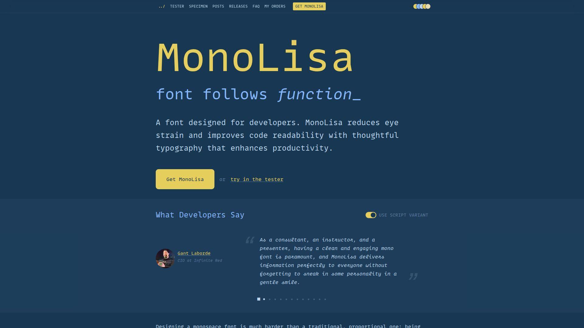
MonoLisa is a commercial coding font made by a small, design-led team. It aims for comfort, personality, and clarity. The letterforms feel friendly without going silly.
Outcome: Reduce eye strain while keeping code charming and readable.
Best for: Developers willing to pay for comfort, and teams optimizing for long sessions.
- Comfort-first shapes → fewer micro-pauses when scanning similar glyphs.
- Polished stylistic alternates → save manual “fix this glyph” tweaks across preferences.
- Smooth onboarding for a paid font → time-to-first-value is often 10–15 minutes.
Pricing & limits: From $0/mo. Trial: N/A. Caps: paid licensing may apply, often per user or per organization, so confirm before team rollout.
Honest drawbacks: Cost can be a hard stop for larger teams. Licensing terms can complicate open-source project distribution or shared dev containers.
Verdict: If you want a premium font that makes long days gentler, this helps you feel the difference within a week. Beats free fonts on personality polish; trails open fonts on frictionless sharing and zero-cost adoption.
Score: 4.0/5
26. Mononoki
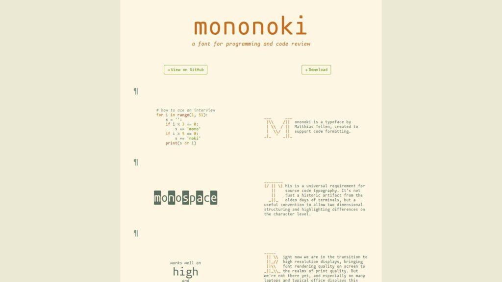
Mononoki is a community-loved mono with a modern, slightly playful edge. It’s designed for coding, not branding decks. The shapes are clear, with just enough character to stay pleasant.
Outcome: Get a lively, readable mono that still works in serious codebases.
Best for: Solo developers, and small teams that want something less sterile.
- Clear shapes with subtle personality → easier long-session reading without boredom.
- Good ecosystem presence via patches and forks → save a setup step for symbol coverage.
- Quick install and low tuning needs → time-to-first-value is often under 10 minutes.
Pricing & limits: From $0/mo. Trial: N/A. Caps: typically open usage, but check rules if you redistribute modified builds.
Honest drawbacks: Some glyph choices won’t match everyone’s taste. In very small terminals, the extra personality can reduce crispness.
Verdict: If you want a friendly daily driver, this helps you settle on a comfortable look in a few days. Beats sterile monos at charm; trails IBM Plex Mono on corporate documentation cohesion and full-family alignment.
Score: 4.1/5
27. monofur
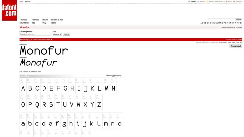
monofur is an older, indie-coded font with a distinctive, rounded style. It has fans because it’s different. The tone is soft and retro, which can reduce harshness on bright screens.
Outcome: Soften the look of code without losing monospaced discipline.
Best for: Developers who dislike sharp monos, and hobbyists customizing their setup.
- Rounded letterforms → reduce perceived glare during late-night coding.
- Simple compatibility across editors → skip special feature toggles and keep it plain.
- Lightweight setup with minimal knobs → time-to-first-value is often under 10 minutes.
Pricing & limits: From $0/mo. Trial: N/A. Caps: licensing varies by distribution, so verify terms before broad sharing.
Honest drawbacks: It may feel dated or “too cute” for some workplaces. Glyph differentiation is not as strict as newer coding-first fonts.
Verdict: If you want a softer aesthetic, this helps you change the mood in one sitting. Beats harsh monos at gentleness; trails JetBrains Mono on precision, weights, and modern polish.
Score: 3.7/5
28. Range Mono
Range Mono is a niche pick that shows up around specific communities and tooling. It’s the kind of font you choose on purpose. The design aims for clean monospace utility with a distinct flavor.
Outcome: Give your editor a unique, readable voice that stands apart.
Best for: Hobbyists, and developers who like off-the-mainline typography choices.
- Distinct look with readable forms → reduce monotony during long personal projects.
- Works anywhere monos work → avoid extra integrations beyond selecting it in settings.
- Small change, fast payoff → time-to-first-value is often under 10 minutes.
Pricing & limits: From $0/mo. Trial: N/A. Caps: availability and licensing can be less standardized, so confirm before team rollout.
Honest drawbacks: Because it’s niche, team adoption can be hard. Documentation, variants, and glyph coverage may be thinner than top-tier families.
Verdict: If you want something different that still reads well, this helps you refresh your workspace in a day. Beats mainstream fonts at uniqueness; trails widely adopted fonts on support, polish, and predictable distribution.
Score: 3.5/5
29. Pragmata Pro
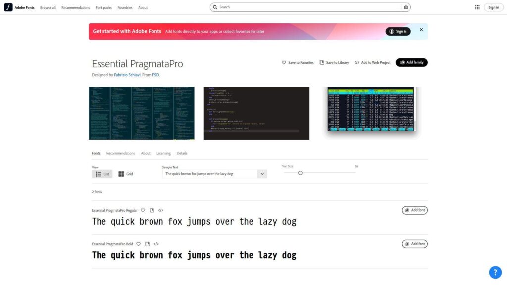
Pragmata Pro is a well-known commercial font with a cult following among typography nerds who code. It’s engineered for extreme clarity. The look is unapologetically technical, like a control panel.
Outcome: Maximize symbol clarity for dense, operator-heavy, high-precision work.
Best for: Senior engineers, and developers who treat typography as productivity tooling.
- Aggressive disambiguation → fewer errors when scanning complex code and math-like syntax.
- Feature-rich glyph set → reduce fallback issues without extra patched-font steps.
- Setup is simple after purchase → time-to-first-value is often 10–15 minutes.
Pricing & limits: From $0/mo. Trial: N/A. Caps: paid licensing is expected, often with seat or machine limits, so read terms before teams adopt it.
Honest drawbacks: Price and licensing can block broad rollout. The aesthetic is polarizing, especially for designers who want warmth.
Verdict: If you want maximum precision in code reading, this helps you reduce ambiguity within a week. Beats most fonts at strict clarity; trails open fonts on effortless sharing and zero-cost adoption.
Score: 4.1/5
30. Code New Roman
Code New Roman is a playful riff on a familiar serif classic, adapted for monospace coding. It’s not a corporate standard, and it doesn’t try to be. The appeal is comfort plus a wink.
Outcome: Make code feel more like reading a book, without breaking alignment.
Best for: Writers who code, and developers who want a serif look in the editor.
- Serif-inspired forms → improve readability for those who prefer bookish typography.
- Works in any editor that supports custom fonts → avoid extra plugins and keep it simple.
- Quick experiment and easy rollback → time-to-first-value is often under 5 minutes.
Pricing & limits: From $0/mo. Trial: N/A. Caps: usually simple for personal use, but confirm terms if you distribute it widely.
Honest drawbacks: Serif monos can reduce clarity at tiny sizes in terminals. Some teams will reject it as “too cute” for shared standards.
Verdict: If you want a more literary coding vibe, this helps you change the feel of your editor today. Beats many monos at uniqueness; trails JetBrains Mono and Source Code Pro on universally accepted, work-safe neutrality.
Score: 3.6/5
Best font for coding with ligatures: when they help and when they distract
1. What coding ligatures are and what they change in your editor
Ligatures are not new characters in your file. They are a display substitution inside the renderer. The editor still stores the same keystrokes. The “pretty operator” is a visual overlay.
That distinction matters in teams. Copy and paste still works as expected. Search still matches the typed characters. So, ligatures mostly influence scanning speed and perceived complexity, not semantics.
Why we treat them as a UI feature
- They can reduce visual parsing in operator-heavy code.
- They can hide subtle differences in similar operators.
- They can make screenshots less faithful to raw text.
If a font’s ligatures feel magical, we slow down. Magic is fun until it misleads.
2. Legibility checklist for ligatures: avoid collisions and ambiguous operators
Some ligatures are genuinely helpful. Others are pure decoration. We filter aggressively, especially for production code reviews.
Our checklist focuses on ambiguity. If two operators become visually similar, we disable that set. If an arrow becomes too “artistic,” we skip it. Clarity has to survive peripheral vision.
Practical checks we run
- Compare operators in a dense boolean expression.
- Scan diffs with minimal syntax highlighting.
- Verify that alignment remains monospace-correct.
A good ligature set improves rhythm. A bad set creates cleverness that no one asked for.
3. Unicode concerns and why some developers dislike ligatures
Ligatures can spark philosophical objections. Some developers want the screen to reflect typed characters exactly. Others worry about confusing screenshots in audits and incident retrospectives.
Unicode adds another angle. Some codebases include true Unicode operators or symbols. A ligature set can make those symbols resemble ASCII sequences, or vice versa. That increases confusion in mixed-text repos.
Our compromise stance
- Enable ligatures for personal flow, not team mandates.
- Disable them for shared training materials.
- Prefer conservative ligature sets in security work.
In regulated environments, we often default to “no surprises.” That posture keeps reviews and screenshots unambiguous.
4. Ligature coverage differences: basic sets vs extensive libraries
Not all ligature fonts are equal. Some cover a small set of common operators. Others ship an extensive library. Bigger is not automatically better.
Extensive libraries can create accidental substitutions. They also increase the chance that a rare sequence turns into an unexpected glyph. For teams, that unpredictability can become friction.
How we choose coverage depth
- Use basic coverage for general application development.
- Consider deeper coverage for niche languages with heavy operators.
- Reject any set that obscures character-level intent.
Our bias is toward boring. Boring scales across large codebases and rotating teams.
5. Smart kerning and OpenType features that can improve readability
Ligatures get all the attention, yet kerning and alternates matter too. Many fonts include features that improve punctuation spacing. Some also offer alternate glyph shapes for confusable characters.
We like features that improve clarity without changing meaning. A slightly better spacing for repeated punctuation can reduce eye strain. Alternate glyphs can make identifiers safer to scan.
Where OpenType helps without drama
- Clearer zero and similar characters.
- More readable italics for comments.
- Better punctuation balance in dense code.
We treat these features like editor extensions. They should earn their place by reducing friction.
6. Italic and cursive variants for comments without hurting clarity
Italic styles are a powerful tool for comment separation. They can also help highlight types in languages that support it. Still, cursive italics can become hard to parse.
We prefer italics that remain “monospace disciplined.” That means consistent width and clear stems. If the italic looks like handwriting, it may be delightful, yet it may slow scanning.
When italics work best for us
- Comments, docstrings, and prose inside code.
- Subtle emphasis in diffs and reviews.
- Reduced reliance on aggressive syntax colors.
For accessibility, italics should be optional. Teams often include readers who find italics fatiguing.
7. Editor compatibility pitfalls: ligatures that fail in specific IDEs
Compatibility issues are real. Some IDEs render ligatures inconsistently. Others support them, but break cursor movement expectations in rare cases. Terminals can be even more fragile.
We test cursor behavior in the worst places. That includes long lines, wrapped lines, and inline diffs. If selection feels “sticky,” we turn ligatures off. That is our simplest safety valve.
Common symptoms we watch for
- Cursor jumps across an operator unexpectedly.
- Selection highlights look offset from glyphs.
- Terminal prompts misalign after copy and paste.
For hosted shells and browser terminals, we recommend conservative fonts. Rendering stacks vary, and we cannot assume perfect typography everywhere.
Best font for coding in VS Code: setup tips and common gotchas
1. Set a practical font family stack with reliable monospace fallbacks
VS Code is forgiving, yet it still benefits from a thoughtful font stack. A stack ensures you always get a usable glyph. It also reduces the chance of proportional fallback characters breaking alignment.
We recommend a primary font, then a trusted system monospace fallback. After that, keep the list short. Long stacks can introduce subtle differences across machines.
A simple approach that usually works
Pick a primary coding font you install everywhere. Add the OS default monospace after it. End with the generic monospace family. This keeps behavior predictable.
2. Enable ligatures in editor settings and verify they actually apply
Ligatures are not always “on” by default. Enabling them is easy, yet verification is often skipped. We verify by pasting a snippet with common operators. Then we toggle the setting and confirm visible change.
In our experience, most confusion comes from partial enablement. The font supports ligatures, yet the setting is off. Alternatively, the setting is on, yet a different font is being used.
A minimal VS Code snippet we use in testing
{ "editor.fontFamily": "JetBrains Mono, ui-monospace, Menlo, Monaco, Consolas, monospace", "editor.fontLigatures": true}After setting it, restart the window. Then re-check your glyphs in a real project file.
3. Font not working in VS Code: exact font family name and spelling matters
Font names can be tricky. The installed font may expose a slightly different family name. That mismatch makes VS Code silently fall back. Users then blame the font, not the name.
We solve this by checking the OS font viewer. Then we copy the family name exactly. On shared machines, we also confirm the font is installed for the current user.
Our debugging flow
- Confirm installation in the operating system list.
- Copy the family name exactly as shown.
- Restart VS Code to refresh font discovery.
This sounds mundane, yet it fixes most “it won’t apply” reports we get from teams.
4. Variable font issues and when to use static font files instead
Variable fonts are great when they work. They reduce file clutter and offer smooth weight choices. Still, some renderers behave oddly with them. Remote desktops can also expose quirks.
When issues appear, we switch to static files. Static weights are less flexible, yet more predictable. Predictability matters when a team shares screenshots and expects identical wrapping.
Signs you should prefer static files
- Weights look inconsistent across machines.
- Italics fail to render as expected.
- Line metrics change after editor updates.
We aim for stability over novelty. Fonts are infrastructure for reading, not a place for surprises.
5. Pair fonts with themes and weights for accessibility and reduced eye strain
A font does not live alone. It interacts with your theme, contrast, and highlight colors. A thin font on a low-contrast theme can feel elegant, yet it can increase strain.
We tune three things together: weight, line height, and color contrast. Then we test in bright daylight and in dim rooms. A good setup should survive both contexts without forcing squinting.
Accessibility-friendly habits we like
- Prefer a slightly heavier weight for small text.
- Keep comments readable without making them too faint.
- Avoid neon syntax colors that cause halos.
For businesses, accessibility is not optional. It expands who can contribute comfortably across long-term projects.
Best font for coding across macOS, Windows, and Linux environments
1. macOS defaults and favorites: Menlo, Monaco, and SF Mono workflows
macOS has strong built-in monospace choices. Menlo remains a reliable default in many setups. Monaco still appeals to developers who like compact forms. SF Mono is a common “Apple-consistent” choice.
From our vantage point, macOS rendering often looks smooth. That can make thin weights tempting. We still recommend testing on external monitors, since sharpness changes fast across panels.
What we prioritize on macOS
- Consistent punctuation at small sizes.
- Clear italics for comments, if used.
- Stable metrics across IDE updates.
For teams, macOS defaults are a good baseline. They reduce setup effort for new machines.
2. Windows defaults and modern alternatives: Consolas and Cascadia positioning
Windows developers often land on Consolas because it is widely available. It is predictable in enterprise environments. That availability alone makes it valuable for teams.
Cascadia is a strong modern alternative. Microsoft positions it as a terminal-first font, and Cascadia Code ships with Windows Terminal in typical setups, which reduces distribution effort. For hosted Windows VMs, that default availability can simplify onboarding.
Our Windows-specific advice
- Test with the same ClearType settings used by the team.
- Confirm bold does not “fill in” punctuation.
- Validate terminal alignment with prompt icons disabled.
Windows rendering can vary by machine. That is why we test on more than one device class.
3. Linux rendering realities: DejaVu Sans Mono and distro-specific tweaks
Linux fleets are diverse. Distros ship different defaults. Rendering stacks also differ based on configuration. DejaVu Sans Mono is common because it is widely present and dependable.
On Linux, hinting and anti-aliasing settings matter a lot. A font can look crisp on one machine and fuzzy on another. We recommend testing inside the same desktop environment used for daily work.
Places Linux surprises show up
- Thin stems on low-DPI panels.
- Italic styles that look cramped in terminals.
- Fallback glyphs that break box-drawing alignment.
For remote SSH work, conservative fonts often win. They survive more rendering contexts with fewer surprises.
4. Cross-platform consistency: choosing fonts that render predictably everywhere
Cross-platform consistency is a team multiplier. It keeps line wraps stable in shared snippets. It makes screenshots comparable in reviews. It also prevents “works on my machine” documentation drift.
We recommend choosing one cross-platform font for the team. Then we standardize it in editor configs and dotfiles. For pairing, that reduces the cognitive shift when switching machines.
Fonts that usually behave well cross-platform
- JetBrains Mono, for balanced proportions.
- Source Code Pro, for neutral readability.
- IBM Plex Mono, for a distinctive yet stable feel.
When we host dev boxes, we also set a sane fallback stack. That keeps the experience usable if the primary font fails.
5. OS rendering controls: smoothing, anti-aliasing, bold, and line height tuning
Rendering controls can transform a font. Smoothing can improve comfort, yet it can reduce sharpness. Bold settings can add clarity, yet they can also blur punctuation. Line height can save your eyes in long sessions.
We recommend tuning systematically. Change one setting, then re-test. A rushed tweak often creates a subtle problem that shows up only after hours of work.
Our tuning order
- Pick font and size first, then adjust line height.
- Adjust weight second, especially for dark themes.
- Only then tweak OS smoothing, if needed.
For businesses, this is a cheap ergonomic win. It costs minutes and pays back daily.
Best font for coding for presentations, workshops, and printed handouts
1. Monospaced vs proportional on slides: alignment vs readability priorities
Slides change the rules. Alignment still matters, especially for code. Yet readability dominates, because viewers are far away. Projectors also flatten contrast and blur fine details.
We keep code monospaced on slides. That preserves indentation and structure. For surrounding text, we may use proportional fonts, since they read better at large sizes.
Slide-specific choices we make
- Use fewer lines, even if it means splitting examples.
- Prefer clear punctuation over “stylish” alternates.
- Turn off distracting ligatures for teaching basics.
In workshops, we also consider recording. Video compression punishes delicate strokes and thin weights.
2. Use widely available fonts when distributing decks to other machines
Deck distribution is where fonts break. If the recipient lacks your font, the deck reflows. Code blocks can wrap differently. That can ruin a step-by-step walkthrough.
We often pick a widely available font for distributed materials. Consolas and Menlo are common anchors, depending on the audience. If we need a custom font, we embed it in the deck when licensing allows.
Distribution-safe habits
- Test the deck on a “clean” machine before sending.
- Export a PDF for faithful layout when possible.
- Include screenshots for critical code, if needed.
For customer training, predictability matters. A broken deck erodes trust faster than a typo.
3. Readable code at low resolution: why conservative choices still win
Low resolution is brutal on typography. Fine serifs disappear. Thin diagonals shimmer. Ligatures can become blobs. Conservative fonts survive because their shapes are simple and their counters are open.
We prefer fonts with sturdy punctuation for low-res scenarios. That includes webinars, remote screen sharing, and older conference room projectors. A “boring” font can be the most professional choice in that context.
We test these scenarios explicitly
- Screen share at a lower resolution and record it.
- Project a slide and stand at the back of the room.
- Print a handout and scan it quickly.
If you cannot read it quickly, the audience cannot read it at all.
4. Presentation-safe favorites mentioned by developers: Consolas and Inconsolata
Two fonts show up repeatedly in developer presentations. Consolas is widely available, especially in Windows-heavy orgs. Inconsolata is popular in open-source circles and looks clean at larger sizes.
We like them for opposite reasons. Consolas wins by availability. Inconsolata wins by calm spacing. Both can be made presentation-safe with bigger size and generous line height.
How we make them work on stage
- Increase size until punctuation is unmistakable.
- Prefer a heavier weight when projected.
- Keep code blocks short and focused.
For workshops, we also provide a repo with the same font recommendation. That keeps attendees aligned with the instructor view.
5. Slide polish without losing function: size, spacing, and clean indentation
Polish comes from restraint. We avoid dense code blocks on slides. We keep indentation consistent. We use whitespace to signal structure, not decoration.
We also avoid over-highlighting. Too many colors make the viewer hunt. A clear font, a readable size, and a focused snippet do most of the work.
Our “polish” checklist
- Show only the lines the audience must understand.
- Use consistent indentation and avoid awkward wrapping.
- Prefer clarity over stylistic ligatures in teaching contexts.
When slides look clean, the audience listens. When slides look messy, they start debugging the typography instead of learning.
Downloads, licensing, and a testing checklist to confirm the best font for coding
1. Where to get fonts: official sites, curated lists, and trusted repositories
We prefer official sources. They reduce the chance of tampered files. They also keep licensing clear. For open-source fonts, GitHub repos are often the source of truth.
For example, JetBrains Mono is straightforward to obtain and install, and that simplicity matters for teams. Ligature users often start with Fira Code, which is widely supported in editors. Windows-heavy teams often evaluate Cascadia Code, since it is tuned for terminal use.
Curated sources we see teams rely on
- Font collections that respect licenses and attribution.
- Package manager fonts, when your distro maintains them well.
- Vendor repos that publish signed releases and changelogs.
Our advice is simple. If you cannot trace the source, do not install it on a work machine.
2. Open-source vs premium fonts: when paying improves your daily workflow
Open-source fonts cover most needs today. They are easy to standardize. They are easy to ship in dev containers. They are also easy to recommend in onboarding docs.
Premium fonts can still earn their place. Some offer exceptional italics or unique readability choices. Others provide broad glyph coverage with polished hinting. We treat premium fonts as personal productivity tools, not as team defaults.
When we see paid fonts make sense
- You spend most days reading code, not writing it.
- You value distinctive italics for comments and prose.
- You need niche glyph coverage for specialized work.
For teams, licensing friction can outweigh benefits. In many orgs, “free and consistent” beats “premium and uneven.”
3. Glyph coverage considerations: symbols, punctuation, and Unicode needs
Glyph coverage is easy to ignore until it breaks. A missing character triggers fallback. Fallback breaks alignment. Alignment breaks terminals, tables, and box-drawing UI.
We check coverage using real files. That includes infrastructure configs, not only code. YAML, Terraform, and shell scripts are punctuation-heavy. A font that weakens punctuation is a font that increases mistakes.
Coverage stress cases we test
- CLI output with box-drawing characters.
- Config files with dense punctuation and quotes.
- Docs with arrows, bullets, and inline code.
If you work across languages, coverage matters more. Mixed scripts and symbols show up faster than people expect.
4. Fast evaluation workflow: compare fonts side-by-side before committing
We evaluate fonts like we evaluate infrastructure changes. We run small experiments. We keep variables controlled. Then we decide based on comfort and correctness.
A side-by-side comparison is the fastest truth. Use the same file, the same theme, and the same size. Then switch only the font. If you have to “try to like it,” move on.
A quick workflow we recommend
- Pick three candidate fonts, not ten.
- Test them on a real repo, not a sample snippet.
- Include diffs, terminals, and markdown previews.
We also test in our browser-based consoles. Web rendering can differ from native apps, and many teams live in both.
5. Final test checklist: ambiguity, ligatures, italics, and editor compatibility
Before we recommend a font to a team, we run a final checklist. It is short, yet it catches most problems. If any item fails, we either tune settings or pick a different font.
Our final checklist
- Confusables are distinct at your smallest comfortable size.
- Operators remain unambiguous with ligatures on and off.
- Italics are readable, or you can disable them cleanly.
- Bold text does not blur punctuation or braces.
- Cursor movement and selection feel normal in your IDE.
- Terminal alignment stays correct in prompts and tables.
- Fallback glyphs do not break monospace layout.
After that, we document the choice in onboarding. We also provide a fallback option for personal preference. If you had to standardize one font this week, which codebase would you test it on first?