
- Before you start: where you are posting determines whether links become clickable
- HTML anchor element basics for how to make a link clickable
- Absolute and relative links: choosing the right path
- Link behavior and presentation: target, title, and styling
- Clickable images and buttons
- Create clickable email links with the mailto scheme
- Make links clickable in everyday tools: Microsoft 365, Markdown, Canva, and JavaScript
- How 1Byte helps customers publish secure clickable links online
- Conclusion: a quick checklist for how to make a link clickable
At 1Byte, we tend to think about links the way farmers think about irrigation: when the channels are clean, the whole system thrives; when they clog, everything downstream suffers. A “clickable link” sounds like a tiny, almost trivial feature, yet in practice it sits at the center of sales funnels, support workflows, compliance documentation, incident response runbooks, and the day-to-day mechanics of collaboration.
Because we host websites and applications for businesses that live and die by conversion and clarity, we see the same pattern repeat: a team writes great content, copies it into a new platform, and suddenly the links stop working. Somewhere between Word, a CMS editor, a ticketing system, and a marketing tool, the hyperlink turns into plain text—or worse, it becomes a broken URL that looks right but points wrong.
Before you start: where you are posting determines whether links become clickable
From the market side, the stakes keep rising as more workflows move online; Gartner, for example, forecasts worldwide end-user spending on public cloud services will total $723.4 billion in 2025, which means more customer journeys, internal tools, and knowledge bases depend on links behaving predictably.
In our own support logs, two real-world situations show up again and again. One is the “Word-to-web” migration: a policy team pastes a procedure from a document into a CMS, publishes it, and only later learns every reference link is inert. Another is the “design-to-email” handoff: a marketing team exports an asset from a design tool, drops it into an email signature or PDF handout, and discovers that only some viewers can click the call-to-action.
So our goal here is practical: we’ll explain how clickability works across HTML, documents, and popular editors, and we’ll do it in the way we’d explain it to a customer who wants fewer surprises in production.
1. Why copying from Word or rich text editors can remove hyperlinks when pasted into a website
Inside Word, a hyperlink is not “just text”; it’s structured document data with styling, relationship metadata, and a UI that makes the link feel native. When that content gets pasted into a website editor, the receiving platform has to translate Word’s rich representation into something the web can safely render, typically HTML plus CSS.
During that translation, many systems deliberately strip tags and attributes that could cause layout problems or security issues. Some editors keep the visible words but drop the underlying hyperlink, especially when you paste into a field that is configured as “plain text,” “safe HTML,” or “sanitized rich text.”
In other cases, the link survives but becomes malformed because the paste operation introduces hidden characters, line breaks, or smart punctuation in the URL. Our operational takeaway is simple: treat copy/paste as a lossy conversion step, and plan to reinsert links using the destination platform’s own linking tools.
2. HTML vs Markdown vs plain text in comment boxes and forums
Different platforms speak different “markup languages,” and clickable links are a feature of the markup, not a guarantee of the text itself. HTML supports links via the anchor element; Markdown supports links via bracket-and-parenthesis syntax; plain text supports neither unless the platform runs an auto-linker.
When a comment box accepts HTML, a properly formed anchor will usually be clickable. If the same box accepts Markdown, a bracketed label can become a clickable link after rendering. Meanwhile, if the box is plain text only, the best you can hope for is that the platform recognizes URLs and turns them into clickable tokens.
From a business standpoint, this matters because teams often assume “a URL is a URL.” Yet the difference between a rendered link and raw text changes usability, accessibility, and even the likelihood that someone follows the intended path.
3. When a platform does not allow clickable link text at all
Some platforms intentionally block clickable links to reduce spam, prevent phishing, or keep users inside a walled garden. A few systems go further and refuse “masked” links (where the label differs from the destination) because moderators want transparency.
Under those constraints, the workaround is not more clever HTML; the workaround is clear communication. Providing the full URL, adding context around what it does, and avoiding ambiguity becomes the entire game.
At 1Byte, we recommend planning for this reality early: if a critical workflow depends on click-through behavior, choose publishing surfaces that support it, and reserve link-restricted platforms for secondary or informational content.
HTML anchor element basics for how to make a link clickable
1. Use the href attribute to set the destination web address
In HTML, the destination lives in the href attribute, and the browser treats the element as a hyperlink only when href is present. The core rule is stricter than many people assume: the href value must be a valid URL (and may be surrounded by spaces), otherwise the browser can’t reliably navigate; the HTML standard describes this behavior in its section on links created by anchors and areas, including how the href attribute creates a hyperlink only when present.
Practically, that means two things in production. First, include the scheme (https://) for external destinations when you can, because it removes ambiguity. Second, watch for invisible whitespace or punctuation when links come from copy/paste, since a single hidden character can turn a clean link into a dead end.
A minimal anchor example
<a href="https://example.com/pricing">See pricing</a>2. Place the clickable label text between the opening and closing anchor tag
Anchor tags are not self-closing for typical link text; the clickable label is the content between <a> and </a>. That label can be plain text, or it can include nested inline elements like <span> for styling.
MDN’s anchor documentation is a good reminder that links can point to more than web pages, including schemes like email and phone, and that fragments can jump to specific sections of a page; we often point customers to MDN’s reference for the anchor element when they want practical examples beyond basic URLs.
In business content, the label is where clarity lives. A well-chosen label reduces support load because users know what they’re clicking before they click it.
3. Link label best practices and why the label does not change the destination
The visible label is not the destination; it’s the promise you make to the reader. Changing the words between the tags never changes where the link goes, because navigation is driven by href, not by the label. That separation is powerful: you can write human language while keeping machine-precise URLs.
Accessibility raises the bar further. Link text like “click here” is usually weaker than descriptive text, because many assistive tools expose a list of links out of context; W3C’s guidance on link purpose in context explains why descriptive link names reduce confusion for keyboard and screen reader users.
Our opinionated house style at 1Byte is to link the meaningful noun phrase (“Download the incident checklist”) rather than a generic verb (“Download”), because it survives copy/paste, scanning, and assistive navigation better.
Absolute and relative links: choosing the right path
1. Absolute links for external pages using a full web address
An absolute link includes the full address, which makes it portable across pages and platforms. If you paste an absolute link into email, chat, a PDF, or a CMS, it still points to the same destination because it carries its own context.
For customer-facing sites, we typically recommend absolute URLs for outbound links and for any content that might be syndicated. The extra characters are a small price to pay for predictable behavior when your content is embedded somewhere you don’t control.
From an operational view, absolute links also simplify troubleshooting: when a user reports a broken link, the destination is explicit, which shortens the path from report to fix.
2. Relative links for pages on the same site without the full address
Relative links omit the origin and rely on the browser to resolve them against the current page’s location. They’re excellent for internal navigation because they keep environments flexible: staging, testing, and production can share the same HTML without rewriting domains.
That flexibility cuts both ways. If the same HTML snippet is copied into a different directory—or rendered under a different base URL—the relative link may now point somewhere else entirely. In hosted environments, that can happen when content is served behind a reverse proxy, under a subpath, or inside a CMS that rewrites routes.
Our practical guideline is to use relative links when the content is guaranteed to live within the same site structure, and to prefer root-relative paths when you want stability across directories.
3. Common relative path patterns for same folder and site directories
Relative paths are small, but they encode assumptions about where the current document sits. A few patterns cover most production use cases, and knowing them prevents subtle navigation bugs during redesigns and content migrations.
Directory-relative and root-relative patterns
<!-- Same folder --><a href="pricing.html">Pricing</a><!-- Explicit same folder --><a href="./pricing.html">Pricing</a><!-- Parent folder --><a href="../docs/index.html">Docs</a><!-- From site root --><a href="/support/">Support</a><!-- Fragment on the same page --><a href="#faq">Jump to FAQ</a>In our hosting environment, root-relative links tend to be the safest internal default because they survive page moves better than directory-relative links. When teams insist on short URLs, we push for consistent site structure and automated link checking in the deployment pipeline.
Link behavior and presentation: target, title, and styling

1. target attribute options _self _blank _parent _top
The target attribute controls where navigation occurs. In plain terms, _self keeps the user in the same tab, while _blank usually opens a new tab. The other keywords exist for framed contexts, which are less common in modern site architecture but still relevant in embedded apps and legacy portals.
Security enters the chat the moment _blank appears. Opening a new tab can expose the window.opener relationship unless mitigated, so we treat rel as part of the “real” linking feature set; MDN’s explanation of rel=”noopener” is the cleanest, most implementable reference we’ve found for teams that want a secure default.
Our operational stance is conservative: use _blank when it improves user flow, and pair it with the right rel values when the destination is outside your trust boundary.
2. title attribute tooltips to add extra link context on hover
The title attribute can add a hover tooltip, which sometimes helps in dense interfaces like admin dashboards or data tables. In content-heavy pages, though, tooltips are often invisible on mobile and inconsistent across assistive technologies, so we treat them as an enhancement rather than a primary communication channel.
A better pattern is to make the visible label self-explanatory and use title only for optional detail, such as clarifying that a link leads to a PDF, an external site, or a login-protected portal.
From a business perspective, this is less about standards purity and more about user trust: surprises create friction, and friction shows up as abandoned flows, misfiled tickets, and “it doesn’t work” reports that are really “it wasn’t clear.”
3. Default link states unvisited visited active and styling with CSS
Browsers style links with a set of familiar states: unvisited, visited, hover, and active. Teams often want to “brand” those states, yet the visited state has privacy restrictions that prevent using it as a tracking signal or a fancy UI trick.
MDN’s documentation on the :visited pseudo-class explains that only a limited set of color-related properties can be changed, specifically to prevent history sniffing. That limitation is not a nuisance; it’s a security boundary, and we’re glad it exists.
A practical CSS pattern (ordered for predictable overrides)
a:link { color: #1a73e8; }a:visited { color: #6a1b9a; }a:hover { text-decoration: underline; }a:active { opacity: 0.8; }When customers complain that “visited links don’t style correctly,” the fix is usually not more CSS; it’s aligning expectations with what browsers intentionally allow.
Clickable images and buttons

1. Turn an image into a link by nesting the image inside an anchor element
An image becomes clickable when it sits inside an anchor tag, the same way text does. The anchor supplies the destination, while the image supplies the visible, clickable surface.
Image link example
<a href="https://example.com/demo"> <img src="/assets/demo.png" alt="Request a demo" /></a>Accessibility is the part teams forget under deadline pressure. The alt text becomes the link’s meaningful label for many assistive tools, so “image” or “button” is rarely sufficient.
In our hosting audits, image-only links are a common source of silent conversion loss: the design looks fine, but the link purpose is opaque to screen reader users and unclear to anyone scanning quickly.
2. Use a button as a link with an onclick event and document location
Buttons can navigate, but they do it via script rather than native link behavior. The most common pattern is attaching an onclick handler that assigns a new value to window.location, which triggers a navigation event; MDN’s reference on the Window.location property covers the mechanics of assignment and navigation methods.
Button navigation example
<button type="button" onclick="window.location.href='/signup'"> Start free trial</button>From a performance and resilience angle, native anchors degrade more gracefully if JavaScript fails. For critical journeys, we prefer an anchor styled as a button instead of a button pretending to be a link.
3. Accessibility considerations when using buttons for navigation
Semantics matter because browsers, assistive technologies, and keyboard users rely on them. A link is expected to navigate, while a button is expected to perform an action in place, like submitting a form or toggling UI state.
MDN’s guidance on the button element highlights a classic pitfall: if you forget type="button" inside a form, the button may submit the form unexpectedly. In production, that shows up as “random page reloads” and “why did my form submit” bug reports.
Our rule of thumb is blunt but effective: if it goes somewhere, use a link; if it changes something here, use a button. When design demands a button-like appearance for navigation, CSS should do the visual work while HTML preserves the semantic truth.
Create clickable email links with the mailto scheme
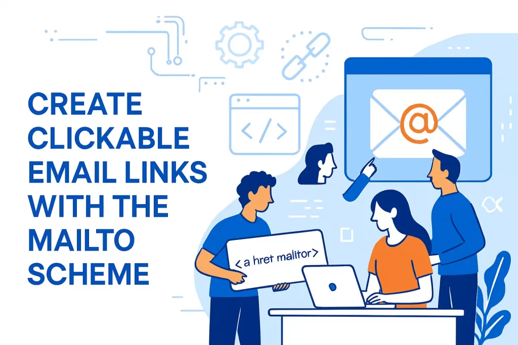
1. mailto in href to open the default email program and start a new message
A mailto: link is still an anchor tag; the difference is the URL scheme. Clicking it asks the device to open an email client (or configured handler) and prefill message fields based on the URI.
The underlying behavior and encoding rules are not folklore—they’re standardized. The IETF specification for the mailto URI scheme describes how characters must be percent-encoded and why the action is “create a message” rather than “fetch a resource.”
Basic mailto example
<a href="mailto:[email protected]">Email support</a>In business environments, mailto links are most useful when they reduce friction, such as pre-addressing the recipient and setting a meaningful subject line for routing.
2. Adding mailto links in a CMS or editor using a link dialog field
Most CMS editors and document tools provide a “link” dialog that accepts different types of destinations. When you choose an email option, the editor often builds the mailto: syntax for you; when you paste an email address directly, some editors infer the scheme automatically.
That convenience is helpful, yet it can hide details that matter. If your organization uses multiple support queues, or if routing depends on a subject keyword, you’ll want to verify exactly what the tool generated.
In our experience, the cleanest operational approach is to standardize a few approved mailto templates (support, billing, abuse) and reuse them consistently across the site, documentation, and customer emails.
3. Manual mailto markup and common mistakes like typos and extra spaces
When teams handwrite mailto links, the failures are rarely dramatic; they’re subtle. An extra space after mailto:, a missing percent-encoding in the subject, or an accidental line break in the middle of the URI can turn a neat “contact us” link into an unreliable click.
Mailto with subject and body (encoded where needed)
<a href="mailto:[email protected]?subject=Help%20with%20billing&body=Hi%20team%2C%0A%0AI%20need%20help%20with..."> Email billing help</a>At 1Byte, we also caution customers about scraping: publishing raw email addresses invites harvesting, so some teams prefer web forms or protected ticket portals for high-volume support.
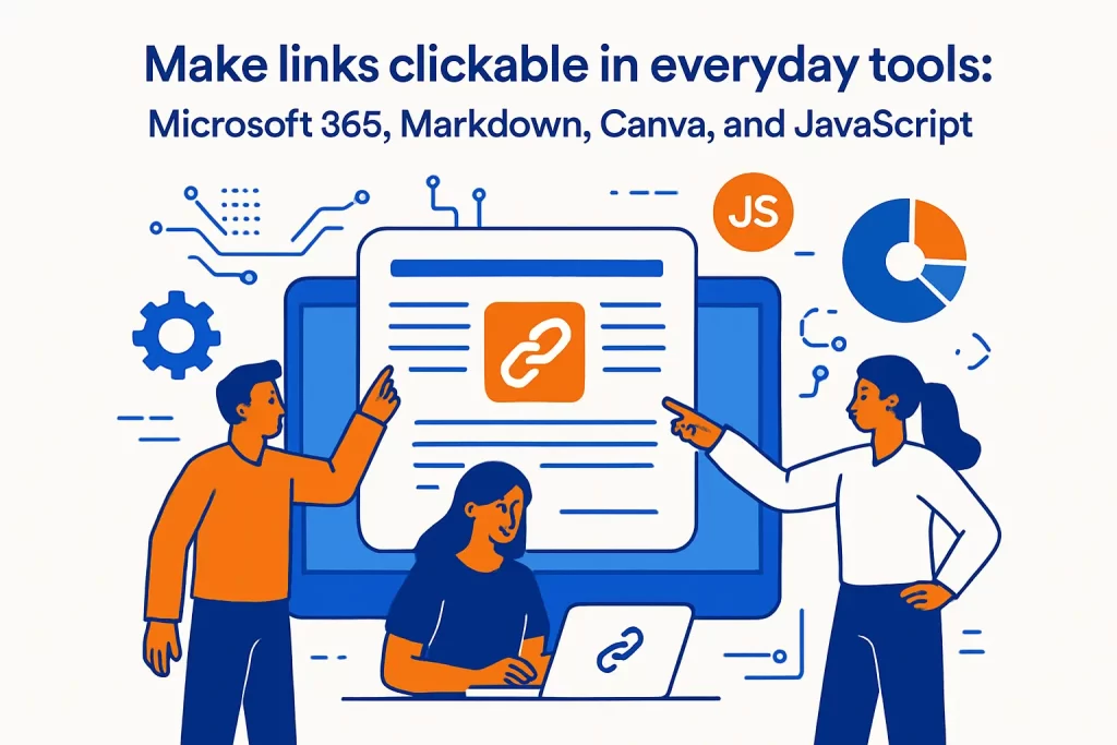
Make links clickable in everyday tools: Microsoft 365, Markdown, Canva, and JavaScript
1. Microsoft 365 automatic hyperlinks plus Insert tab Link for web pages, files, email, and places in a document
Microsoft 365 often creates links automatically when you type a URL and confirm it, which is convenient when drafting quickly. The more reliable method, especially for descriptive link text, is selecting text and inserting a hyperlink through the ribbon or shortcut keys.
Microsoft’s own guidance on how to create or edit a hyperlink covers both the auto-link behavior and the structured “Insert link” flow, including links to web pages, files, email addresses, and specific locations within a document.
From a process standpoint, we like Word for drafting, but we treat it as a staging environment. Before publishing to a website, we assume we’ll recreate the links in the web editor to avoid paste-related surprises.
2. Microsoft 365 editing options: change displayed text, adjust appearance, and set a ScreenTip
Editing a link is often more important than inserting it. A document evolves, and “old label, new destination” is a classic source of mistakes, especially in procedures and customer instructions.
Within Microsoft 365, you can adjust displayed text without changing the underlying URL, and you can also change formatting to match your document’s visual language. ScreenTips (tooltips) can add context, though we see them as optional rather than essential because they won’t help everyone equally.
Our practical viewpoint is to treat link editing as part of document hygiene: whenever you update a section, click the links in that section as part of the same review pass, the way you’d re-run a unit test after a code change.
3. Markdown syntax for turning words into clickable links on supported sites
Markdown is the quiet workhorse of engineering teams, support orgs, and modern documentation stacks. On supported platforms, it turns human-friendly text into clickable links without demanding that writers think in raw HTML.
The CommonMark specification is a stable reference for how links are represented, including link text, destination, and optional title; we often point teams to the CommonMark spec section on links when a platform’s Markdown behavior seems “off” compared to expectations.
Common inline Markdown link pattern
[Read our docs](https://example.com/docs)In business workflows, Markdown’s biggest advantage is consistency: the same source text can render into multiple outputs with fewer editor-specific quirks.
4. Canva steps: highlight text, select Insert Link, paste the URL, and confirm
Canva is a popular tool for assets that eventually land on the web, in PDFs, and inside email clients, which makes link behavior surprisingly important. The interface changes over time, but the workflow usually follows a similar path: select the element, open the link control, paste the URL, then export in a format that preserves interactivity.
Design Bundles’ walkthrough on how to add a hyperlink in Canva matches what we see customers do in practice, particularly when linking icons, images, or text elements for clickable PDFs and shared designs.
From our side, the key operational advice is to test the exported artifact, not just the editor preview. A link that looks fine in the design canvas can still fail in a PDF viewer or email client, and that failure tends to appear only after distribution.
5. JavaScript linkify using DOM targeting, innerHTML replacement, regex patterns, and XSS risk awareness
“Linkify” features—automatically turning raw URLs into clickable anchors—are common in forums, chat apps, and internal dashboards. The naive implementation uses regex to find URLs and then injects anchors via innerHTML, which is exactly where risk enters.
OWASP is clear that you should treat innerHTML as something to use with extreme caution when any part of the content is untrusted, because it can turn user input into script execution. In real deployments, “just linkify it” can become an XSS incident if you don’t validate schemes and sanitize output.
When we help customers build safe linkification, we push for an allowlist mindset: accept only safe protocols, build DOM nodes rather than concatenating strings, and sanitize any HTML that must be injected. DOMPurify’s explanation of how it filters unsafe URL protocols such as javascript: in href-like attributes aligns with how modern teams reduce risk without sacrificing usability.
How 1Byte helps customers publish secure clickable links online
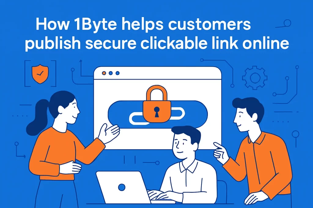
1. Domain registration and SSL certificates for trustworthy HTTPS links
Clickable is only half the story; trustworthy is the other half. When a link points to a domain that looks suspicious, or when a browser warns about insecure transport, many users won’t click—even if the link is technically correct.
At 1Byte, we focus on the fundamentals that make links feel safe to humans and verifiable to machines: clean domain ownership, consistent DNS configuration, and SSL/TLS so that destinations load over HTTPS. From there, we help teams avoid the little trust killers, like mixed-content warnings, redirect chains, or expired certificates that turn a working link into a user-facing alarm bell.
Operationally, the win is compounding: once HTTPS is stable, every campaign, document, and knowledge base article inherits that trust without needing special handling.
2. WordPress hosting and shared hosting for websites where links work reliably
Many of our customers publish through WordPress or similar CMS platforms, where link reliability depends on more than just correct HTML. Permalinks, redirect rules, caching layers, and plugin behavior can all influence whether a link resolves cleanly.
On managed hosting, we see fewer “it works on my laptop” link failures because the environment is consistent and the site’s URL structure is less likely to drift unnoticed. When customers run shared hosting, we still emphasize guardrails: backups before major content migrations, staging environments for testing, and link-checking workflows after bulk edits.
In our view, the best link is the one you never have to apologize for, which means treating link integrity as part of site operations—not as a copywriting detail.
3. Cloud hosting and cloud servers with guidance from an AWS Partner
On cloud infrastructure, links become part of system design. An app might generate password reset links, signed download URLs, invoice links, or onboarding flows, and those links have lifecycles, permissions, and security implications.
From the hosting side, we help customers align DNS, TLS, application routing, and observability so that a click produces a predictable outcome across regions and devices. When customers need deeper architecture work—especially around scalability, identity, and security controls—we can coordinate implementation guidance through an AWS Partner in our ecosystem, bridging the gap between “it should work” and “it works under load, during incidents, and under audit.”
What we like about this approach is that it treats clickability as a reliability problem. If a link is part of your product, it deserves the same engineering discipline as any other user-facing feature.
Conclusion: a quick checklist for how to make a link clickable
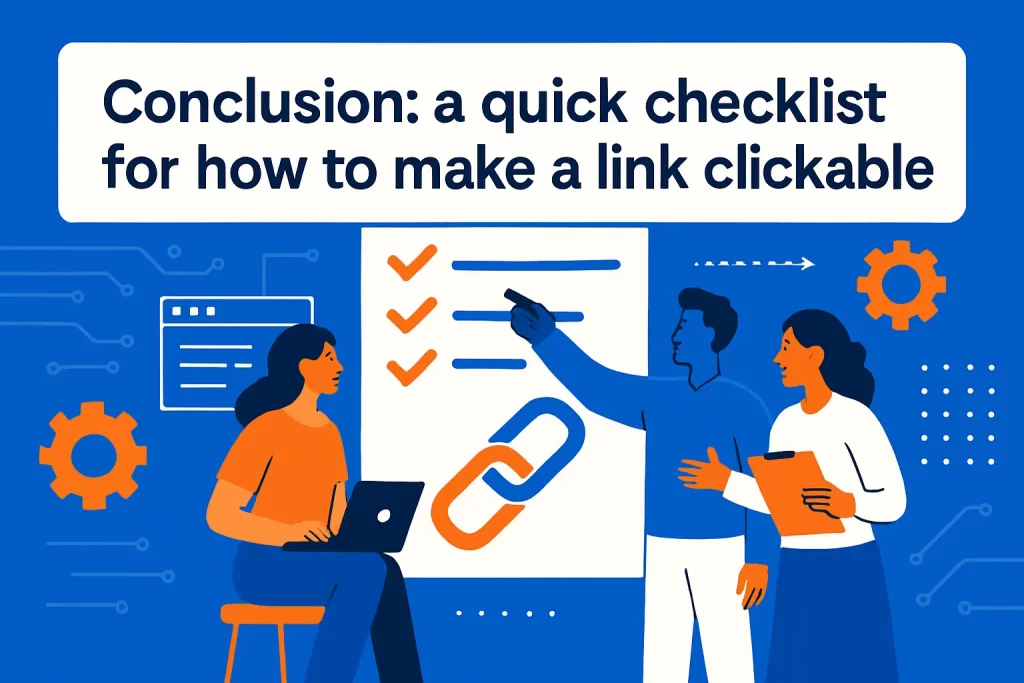
1. Confirm the platform supports HTML, Markdown, or a built in link tool
Before writing a single character of markup, identify what the destination platform actually supports. Some places accept HTML anchors, others accept Markdown, and a surprising number accept only plain text with optional auto-linking.
In our publishing playbooks at 1Byte, we treat this as a requirements step, not a formatting step. Once the constraint is known, the implementation becomes straightforward: use the platform’s native link tool when available, and avoid fighting sanitizers with brittle hacks.
2. Validate the destination, open behavior via target, and email link format
Accuracy beats elegance. Verify the destination URL, decide whether the link should open in the same context or a new one, and apply the right attributes to match that intent.
For email links, confirm that the mailto syntax is clean, encoded where needed, and aligned with the user experience you actually want. If the link should be secure, ensure the destination is HTTPS and the domain is the one your audience expects.
From a business lens, this is risk management: every broken or misleading link is a small trust withdrawal, and enough withdrawals can bankrupt a customer relationship.
3. Test the clickable link in the final publishing location before sharing
Preview is not production. Click the link in the final place it will live: the published web page, the exported PDF, the sent email, or the deployed app UI.
After that test, share it with the same devices and contexts your audience uses, because “works on desktop” does not guarantee “works on mobile,” and “works in the editor” does not guarantee “works after export.”
If we could leave you with one next step, it would be this: pick one critical piece of customer-facing content you published recently, run through the checklist above, and ask yourself—if a stranger clicked every link on that page today, would anything surprise them?