
- Why weird links are so popular: curiosity, creativity, and internet culture
- Quick Comparison of weird links
- Top 30 weird links you have to click at least once
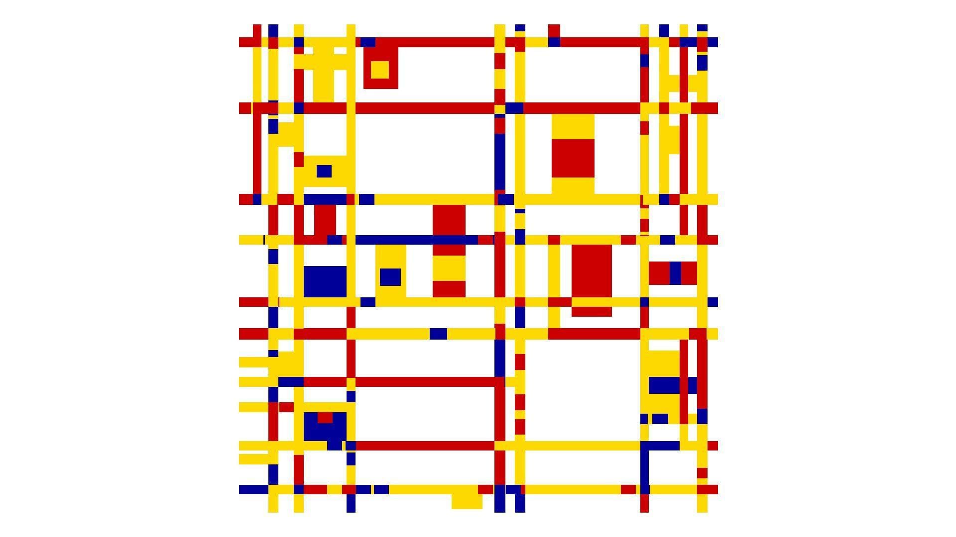
- What makes a weird link weird: content, design, and interaction patterns
- Quick safety notes before you click random weird links
- How to find more weird links: generators, hubs, and communities
- Create your own weird links website: simple launches, performance, and when to upgrade
- 1Byte for building and sharing weird links
As 1Byte, we spend our days staring into latency charts and log streams. At night, we still love the web’s odd little corners. Those corners keep the internet human. They also remind us why hosting exists at all.
Weird links are not just “fun.” They are tiny demonstrations of craft. A single page can carry a joke, a mood, or an interactive trick. In a world of heavy apps, that restraint feels radical.
Market overview: Gartner forecasts public cloud spending will surpass $675.4 billion in 2024, McKinsey argues $3 trillion in EBITDA by 2030 is in play, and Statista counts 5.56 billion internet users, so even “useless” sites run atop serious infrastructure.
When we talk about weird links, we are also talking about attention. A strange page can interrupt doomscrolling. It can pull a team into shared laughter. It can even spark a product idea.
Why weird links are so popular: curiosity, creativity, and internet culture
FURTHER READING: |
| 1. Top 30 Best Freelance Websites for Finding Freelance Work and Clients in 2026 |
| 2. 30 WordPress Alternatives to Consider in 2026 |
| 3. 30 Online Payment Methods You Should Know in 2026 |
1. Weird links stand out by deviating from the norm and leaving a lasting impression
Normal websites optimize for clarity and conversion. Weird websites optimize for a feeling. That feeling might be confusion, delight, or mild annoyance. The point is the aftertaste.
From our side of the stack, we notice something else. The “weird” moment is usually fast to render. A crisp first impression makes the joke land. Nobody laughs at a spinner.
Brands chase memorability with big campaigns. Weird links do it with a single idea. That efficiency is part of the charm.
2. Pointless fun, interactive art, mini games, calming loops, and rabbit holes in one click
Weird links act like palate cleansers. They are a break between tasks. They also feel safe, because the commitment is tiny.
Interactive art works because it makes us complicit. A page asks us to hover, drag, or press a key. Suddenly, we are not just consuming.
For teams, these links become micro-rituals. Someone drops one into chat. Everyone clicks. For a moment, the office shares a single absurdity.
3. Weird links vs fun sites: the “one oddly specific idea” taken to the extreme
Fun sites can be broad. Weird sites are narrow. They take a single premise and refuse to let go.
That narrowness is why they work as engineering artifacts. A single-purpose page is a clean lab. It isolates a technique, a trick, or a timing.
In our hosting work, we see these pages as “small systems.” Small systems teach big lessons about performance and failure modes.
4. Humor, irony, and absurdity as the main “purpose” of a weird website
Absurdity is a kind of honesty. It admits the web is strange. It also mocks the web’s obsession with productivity.
Irony works well online because context travels poorly. A weird site can carry its own context. It explains itself through behavior.
We also like the humility of it. Many weird links never ask for a signup. That restraint feels almost rebellious now.
5. Niche appeal: websites built for extremely specific interests and hobbies
Niche weird sites are love letters. They exist because a creator cared. They do not exist because a committee approved a roadmap.
That care shows up in tiny details. It might be a sound cue. It might be a perfectly timed animation. Those details are expensive in attention, not money.
For businesses, niche weirdness can be a signal. It tells customers, “We are real people here.”
6. How weird websites shape internet culture, memes, and online communities
Weird links spread like inside jokes. The recipient becomes a co-conspirator. Sharing becomes the distribution channel.
Memes often start as small interactive bits. A loop, a sound, or a visual gag becomes portable. Then communities remix it.
From our perspective, this is also an uptime story. A meme link that dies breaks the chain. The web remembers what stays reachable.
Quick Comparison of weird links
We evaluate weird links like we evaluate infrastructure. We look for instant feedback, low friction, and a clear “why.” The “why” can be nonsense. The clarity still matters.
| Tool | Best for | From price | Trial/Free | Key limits |
|---|---|---|---|---|
| Useless Web | Random weird-site roulette | Free | Free | Quality varies by destination |
| Neal.fun | Polished web experiments | Free | Free | Some pages are CPU-heavy |
| Pointer Pointer | Quick laugh with a cursor trick | Free | Free | Novelty is the whole point |
| Zoomquilt | Mesmerizing “infinite zoom” art | Free | Free | Can feel intense for some viewers |
| Cat Bounce | Chaotic physics play | Free | Free | Can be distracting fast |
| Silk | Generative doodling with symmetry | Free | Free | Sound may surprise on first load |
| Patatap | Keyboard-driven audio visuals | Free | Free | Flashing visuals possible |
| WindowSwap | Calm, ambient “travel” | Free | Free | Needs stable streaming |
| RRR GGG BBB | Minimal abstract interaction | Free | Free | Feels cryptic by design |
| Most Dangerous Writing App | High-pressure writing flow | Free | Free | Stressful for perfectionists |
The Full Weird Link Index (All Picks)
We keep this list practical. Each link is memorable, strange, and simple to explain. We also prefer pages that work without accounts.
- Useless Web for a roulette wheel of internet oddities and quick surprises.
- Neal.fun for experiments that feel like product demos from a parallel universe.
- Pointer Pointer for a playful cursor gag that lands instantly.
- Staggering Beauty for chaotic motion, flashing visuals, and a jolt of absurdity.
- Zoomquilt for an endless zoom that turns patience into a visual trance.
- Zoomquilt Two for a second endless zoom with a different mood.
- Endless Horse for pure scrolling commitment and an internet-era punchline.
- Cat Bounce for physics chaos and an oddly joyful screen full of cats.
- Rainy Mood for ambient rain that pairs well with deep work.
- HEEEEEEEEY for a looping greeting that becomes a shared office chant.
- Scream Into the Void for catharsis that gets safely “deleted” into nothing.
- Is It Christmas for a single-bit answer that feels weirdly comforting.
- Is It Halloween for the same gag, but spookier in spirit.
- Corndog for a spinning snack that refuses to be meaningful.
- Long Doge Challenge for endless clicking and a meme stretched past reason.
- Eel Slap for stress relief that is ridiculous on purpose.
- Silk for generative art that makes anyone feel briefly talented.
- Patatap for reactive sound and animation driven by your keyboard.
- This Is Sand for calming “digital sand” that invites slow attention.
- WindowSwap for quiet travel through other people’s windows.
- Radio Garden for spinning the globe and hearing what it sounds like.
- MapCrunch for random Street View jumps into the world’s weird corners.
- Hacker Typer for movie-style “coding” that looks convincing from afar.
- Koalas to the Max for pixel-splitting that turns an image into a reveal.
- Always Judge a Book by Its Cover for bizarre book covers curated with affection.
- Has the Large Hadron Collider Destroyed the World Yet for deadpan reassurance in a single word.
- RRR GGG BBB for minimalist interaction that feels like a design riddle.
- OMFGDOGS for maximalist loop energy and unapologetic repetition.
- Paper Toilet for scrolling a virtual roll until the absurdity clicks.
- The Most Dangerous Writing App for writing pressure that forces momentum.
Top 30 weird links you have to click at least once
These aren’t “tools” in the grown-up sense. Still, they solve real micro-jobs. They break a slump, reset your brain, or give you a tiny laugh on demand. To keep it fair, we score each link like a product. We weight value-for-money and feature depth highest, because even nonsense should earn its tab. Ease of setup matters next, since friction kills the joke. Integrations and ecosystem count too, mostly as “shareability” and how well it plays with modern browsers. UX and performance cover load speed, smoothness, and whether it melts your laptop fan. Security and trust reflect basic web hygiene, plus how safe it feels to click. Support and community measure any visible “made by” trail, updates, and a path to context.
Every score is a weighted total on a 0–5 scale. A perfect site here is instant, harmless, and oddly sticky. A weak one is broken, loud in the wrong way, or unclear about what happens next. Click with curiosity. Close tabs with confidence.
1. Endless Horse
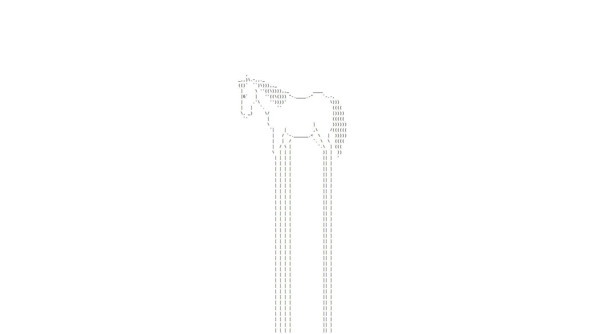
Endless Horse is a tiny single-serving page that behaves like a joke with stamina. Credited creators are hard to spot on-page, which reads like a two-person hackathon artifact.
Outcome: turn “five dead minutes” into a low-stakes grin by scrolling.
Best for: bored office workers, and anyone who needs a harmless distraction between meetings.
- Infinite scroll gag → you reset your brain without thinking.
- Shareable URL simplicity → saves about 3 steps versus explaining the joke.
- No onboarding at all → time-to-first-value is roughly 3 seconds.
Pricing & limits: From $0/mo; trial length is unlimited; caps are basically one browser tab and your scroll wheel patience.
Honest drawbacks: Novelty fades fast if you want interaction beyond scrolling. Also, the “point” is the lack of a point.
Verdict: If you want a clean mental palate cleanser, this helps you laugh and move on in under a minute. Beats many “funny sites” at immediacy; trails interactive toys like Cat Bounce on replay value.
Score: 4.0/5
2. Falling Falling
Falling Falling is presented as internet art by Rafaël Rozendaal, with the “team” vibe of a lone artist plus collaborators. The page feels like a gallery piece that happens to live in your browser.
Outcome: induce calm through looping motion and sound.
Best for: designers in need of a visual reset, and remote workers who miss ambient space.
- Endless cascading visuals → you unwind without opening a meditation app.
- Browser-only loop → saves 2–3 minutes versus installing anything.
- Minimal controls → time-to-first-value is about 5 seconds.
Pricing & limits: From $0/mo; trial length is unlimited; caps are limited customization and whatever your device can render smoothly.
Honest drawbacks: If audio loops irritate you, it can become a liability. Meanwhile, accessibility controls are thin, so sensitive users should be cautious.
Verdict: If you want a tiny, hypnotic break, this helps you downshift in one song-length. Beats RGB at soothing; trails Zoomquilt on depth and exploration.
Score: 4.1/5
3. Paper Toilet
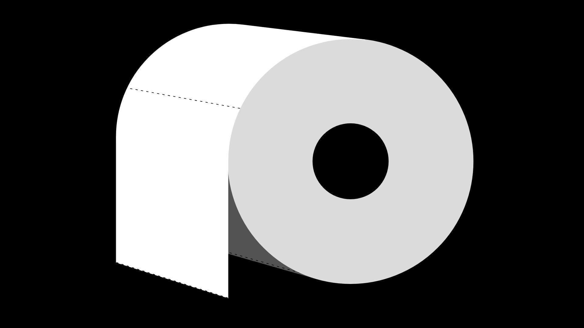
Paper Toilet is framed as a single artwork by Rafaël Rozendaal, with a “made like a poem” sensibility. The “company” here is the browser itself, and the team is the artist’s long arc of web pieces.
Outcome: give your eyes a weird, minimalist loop to chew on.
Best for: art-curious scrollers, and anyone collecting internet oddities for later.
- Single-screen artwork loop → you get instant novelty without commitment.
- Zero account, zero setup → saves 4–6 steps versus typical content platforms.
- Loads as a lightweight page → time-to-first-value is around 5–10 seconds.
Pricing & limits: From $0/mo; trial length is unlimited; caps are no “modes,” no progress, and few obvious controls.
Honest drawbacks: If you want clear instructions, you won’t get them. Also, the piece can feel too spare if you crave interaction.
Verdict: If you want a quick hit of internet-art strangeness, this helps you reset your attention in under two minutes. Beats some meme sites at calm; trails Quick, Draw! on interactivity.
Score: 3.8/5
4. Is It Christmas?

Is It Christmas? is a micro-site credited on-page to @konklone, with the vibe of a solo builder and a single joke. The “team” shows up as a clean byline, which is more than many links here provide.
Outcome: answer one question instantly, forever.
Best for: people who love deadpan humor, and teams that need a low-effort inside joke.
- One-word verdict → you stop overthinking and move on.
- Always-linkable status page → saves 30 seconds of explaining the bit.
- No controls required → time-to-first-value is about 1 second.
Pricing & limits: From $0/mo; trial length is unlimited; caps are exactly one feature and one joke.
Honest drawbacks: It’s only funny if you’re in on “single-purpose internet.” Also, there’s no extra context unless you dig.
Verdict: If you want a fast laugh disguised as utility, this helps you settle the matter in a heartbeat. Beats most novelty sites at speed; trails Zombo.com on theatricality.
Score: 4.2/5
5. Zombo.com
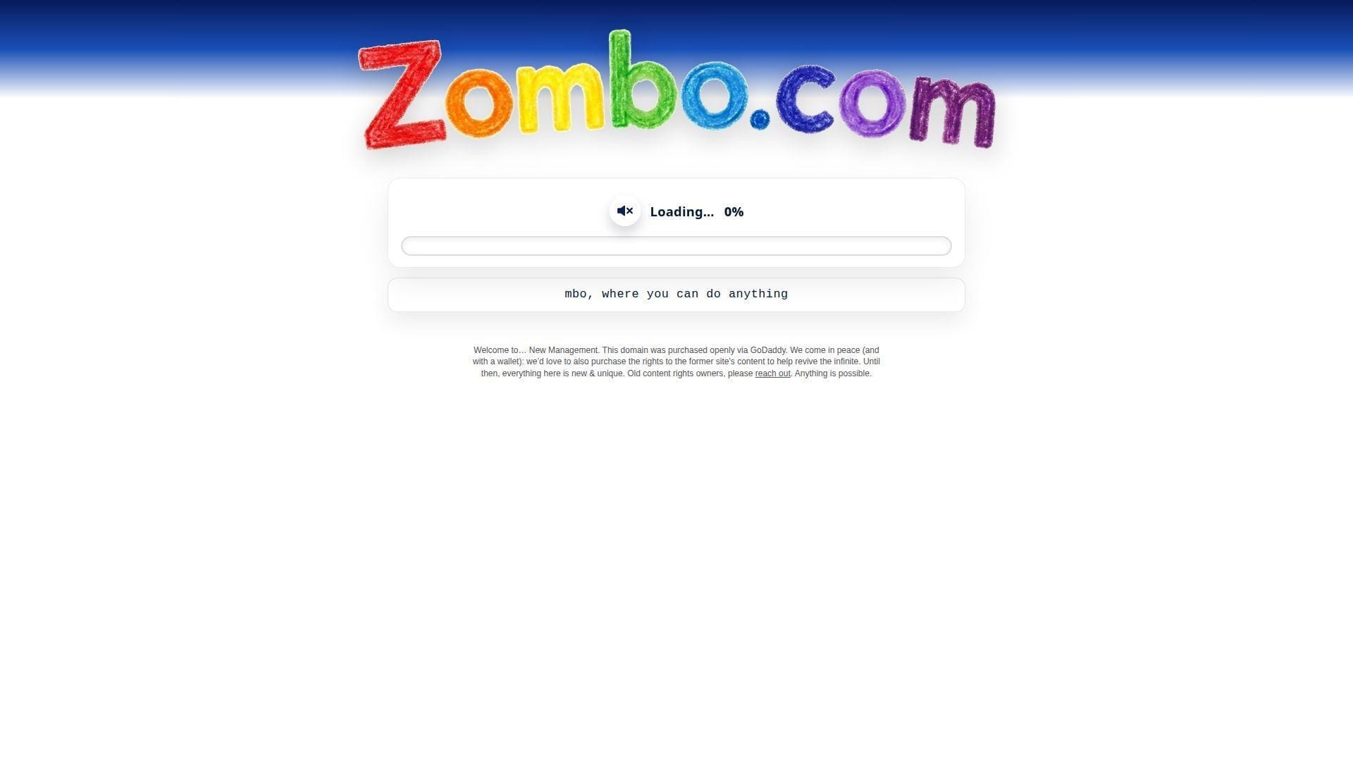
Zombo.com is an old-school single-serving site with a long cultural shadow and changing stewardship. Recent on-page messaging signals “new management,” which makes the team story part of the experience now.
Outcome: get hypnotized by a promise that keeps promising.
Best for: nostalgia nerds, and anyone who enjoys internet theater more than content.
- Endless intro parody → you laugh at the web’s old bad habits.
- Auto-loop pacing → saves you from choosing what to do next.
- One-page commitment → time-to-first-value is roughly 10 seconds.
Pricing & limits: From $0/mo; trial length is unlimited; caps are minimal interaction and an experience that may change over time.
Honest drawbacks: The “new management” era may not match the classic vibe. Also, repetition can flip from funny to annoying fast.
Verdict: If you want an internet relic with a self-aware smirk, this helps you feel the joke in under a minute. Beats Paper Toilet at bombast; trails The Useless Web on variety.
Score: 3.7/5
6. Electric Boogie-Woogie
Electric Boogie-Woogie is cataloged as a single-serving artwork by Rafaël Rozendaal. The “team” footprint is artist-led, with art-world context rather than product polish.
Outcome: watch color and motion do a quiet dance on your screen.
Best for: visual thinkers, and anyone who wants ambient motion without social media.
- Abstract animated grid → you get calm stimulation without narrative.
- No signup, no feed → saves 5+ steps versus platforms that demand attention.
- Instant load-and-loop behavior → time-to-first-value is about 5 seconds.
Pricing & limits: From $0/mo; trial length is unlimited; caps are no settings and no obvious way to “do” more.
Honest drawbacks: If you need a goal, you’ll feel stranded. Also, the piece can read as “just colors” to some viewers.
Verdict: If you want a soft-focus reset, this helps you breathe and stare for a minute. Beats Falling Falling at punchy color; trails Zoomquilt on depth and navigation.
Score: 3.9/5
7. Koala to the Max
Koala to the Max is credited in write-ups to Vadim Ogievetsky, made for Annie Albagli, and it feels like a small, clever build. The “team” shows up as a tidy experiment that invites remixing.
Outcome: reveal an image by “petting” pixels into detail.
Best for: curious coworkers, and anyone who wants a soothing click-to-reveal loop.
- Progressive circle splitting → you get a satisfying reveal without skill.
- Custom image URL input → saves a few steps versus editing and uploading elsewhere.
- Tap or hover interaction → time-to-first-value is about 10 seconds.
Pricing & limits: From $0/mo; trial length is unlimited; caps depend on JavaScript and a reachable image URL.
Honest drawbacks: Without JavaScript, it’s dead on arrival. Also, results vary with image choice, so “wow” is not guaranteed.
Verdict: If you want a gentle, tactile reveal, this helps you get a small dopamine hit in two minutes. Beats Endless Horse on interaction; trails Quick, Draw! on surprise density.
Score: 4.4/5
8. That’s The Finger
That’s The Finger is attributed to Tim Holman and Guy Trefler in some directories, with the feel of a mischievous micro-team. The site’s “company” is basically the punchline.
Outcome: flip the bird in the most unserious way possible.
Best for: group chats, and stressed humans who need a safe, silly vent.
- Click-to-transform gesture → you express frustration without typing a rant.
- Share-ready single page → saves 20 seconds versus hunting for the right GIF.
- One interaction, instant payoff → time-to-first-value is about 5 seconds.
Pricing & limits: From $0/mo; trial length is unlimited; caps are one joke and a vibe that can wear thin.
Honest drawbacks: It’s immature by design, so it’s not workplace-safe everywhere. Also, there’s no depth once you’ve seen it.
Verdict: If you want a quick pressure release, this helps you laugh and move on in under 30 seconds. Beats Is It Christmas? at interactivity; trails The Useless Web on repeat variety.
Score: 3.9/5
9. Cat Bounce
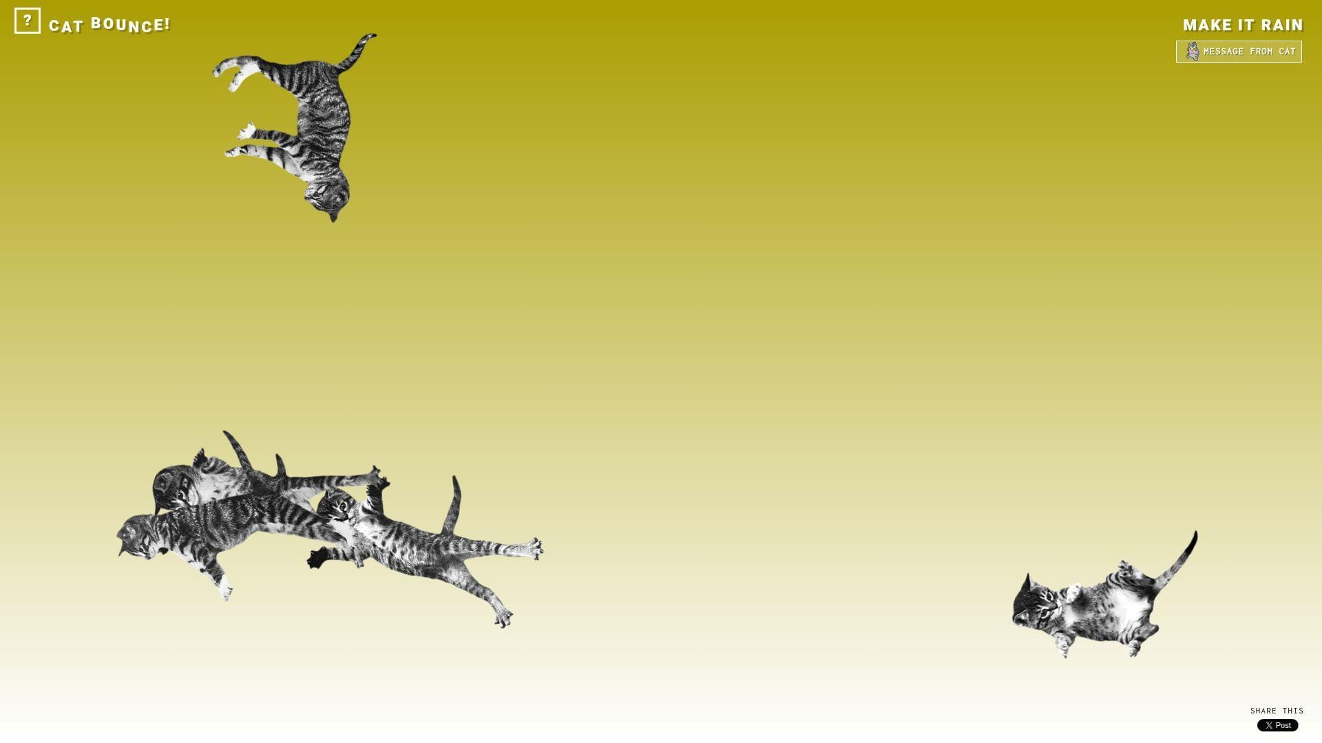
Cat Bounce was created by artist Tara Sinn, with a later modern-browser update by Nick Hulea. The “team” feels like playful craft, plus maintenance that kept the joke alive.
Outcome: turn restless energy into controlled chaos, with cats.
Best for: bored students, and anyone who needs a quick mood lift.
- Physics-based cat bouncing → you fidget and decompress without doomscrolling.
- “Make it rain” style burst → saves 10 seconds versus finding a new distraction.
- Immediate interaction on load → time-to-first-value is about 3 seconds.
Pricing & limits: From $0/mo; trial length is unlimited; caps are performance on weaker devices and your tolerance for noise.
Honest drawbacks: It can spike CPU, especially with lots of cats on-screen. Also, the joke can feel chaotic rather than calming.
Verdict: If you want instant, tactile silliness, this helps you reset your mood in one minute. Beats Endless Horse on replay value; trails Koala to the Max on “gentle” satisfaction.
Score: 4.5/5
10. RGB
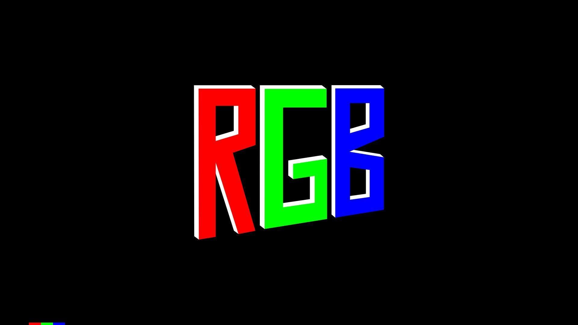
RGB (rrrgggbbb.com) is credited by The Useless Web as a creation by Ewoudt Boonstra, with sound by Rimer London. The “team” reads like a design-led duo making color feel like a toy.
Outcome: make your brain hum on pure color and sound.
Best for: designers killing time, and anyone who enjoys sensory minimalism.
- Color-space tribute visuals → you get a fast, clean hit of novelty.
- Built to be shared in one link → saves 2–3 minutes versus sending a video.
- Single-screen focus → time-to-first-value is about 5 seconds.
Pricing & limits: From $0/mo; trial length is unlimited; caps are limited controls and reliance on modern browser support.
Honest drawbacks: Without context, it can feel like “nothing is happening.” Also, sound can be a deal-breaker in quiet spaces.
Verdict: If you want a minimalist sensory break, this helps you reset in under a minute. Beats Electric Boogie-Woogie at graphic boldness; trails Zoomquilt on long-form immersion.
Score: 4.0/5
11. Zoomquilt
Zoomquilt is a collaborative “infinitely zooming painting” project started by Nikolaus Baumgarten, with many illustrators named on-site. The team is explicitly the point, and that clarity builds trust fast.
Outcome: fall into an endless artwork without hitting an end screen.
Best for: art lovers, and anyone who wants a mesmerizing screen for a break.
- Infinite zoom canvas → you get wonder without choosing a destination.
- Keyboard navigation support → saves time versus fiddling with clunky controls.
- Loads as a simple experience → time-to-first-value is about 10 seconds.
Pricing & limits: From $0/mo; trial length is unlimited; caps are limited interactivity beyond navigation and potential motion sensitivity.
Honest drawbacks: Motion can be tiring if you’re sensitive to zoom effects. Also, it’s easy to lose time when you meant to take a short break.
Verdict: If you want to get pleasantly lost, this helps you escape your day in under five minutes. Beats Falling Falling on detail richness; trails Quick, Draw! on “active” participation.
Score: 4.6/5
12. You Should Have Seen This
You Should Have Seen This is associated with Greg Rutter’s “definitive list” of internet things, shaped like a one-person directory. The “team” is basically a curator with a big bookmark file.
Outcome: jump-start nostalgia and discovery with a single page of links.
Best for: internet historians, and procrastinators who prefer rabbit holes with a map.
- Curated link dump → you get instant options without searching.
- One-page structure → saves 5–10 minutes versus making your own list.
- Click-and-go format → time-to-first-value is about 15 seconds.
Pricing & limits: From $0/mo; trial length is unlimited; caps are link rot, mixed availability, and occasional site instability.
Honest drawbacks: Some destinations will be dead, blocked, or dated. Also, the tone can feel very “internet of its era.”
Verdict: If you want a guided stumble through old web culture, this helps you find something fast in two minutes. Beats The Useless Web at curation; trails The Useless Web on freshness.
Score: 3.0/5
13. Please Like

Please Like presents as a Rafaël Rozendaal web artwork, with the “team” energy of one artist making attention visible. The page itself is the statement, not a platform.
Outcome: feel the internet’s neediness in one silent glance.
Best for: creatives, and anyone who enjoys art that comments on behavior.
- Single-concept page → you get the idea instantly, then you’re free.
- No account or feed mechanics → saves 5 steps versus social platforms.
- Loads as pure artifact → time-to-first-value is roughly 5–10 seconds.
Pricing & limits: From $0/mo; trial length is unlimited; caps are minimal interaction and a joke that lands once.
Honest drawbacks: If you want “something to do,” it may disappoint. Also, meaning depends on your tolerance for meta commentary.
Verdict: If you want a sharp, tiny mirror held up to the web, this helps you get the point in under a minute. Beats Paper Toilet at cultural punch; trails Cat Bounce on playfulness.
Score: 3.6/5
14. Ever Dream This Man?
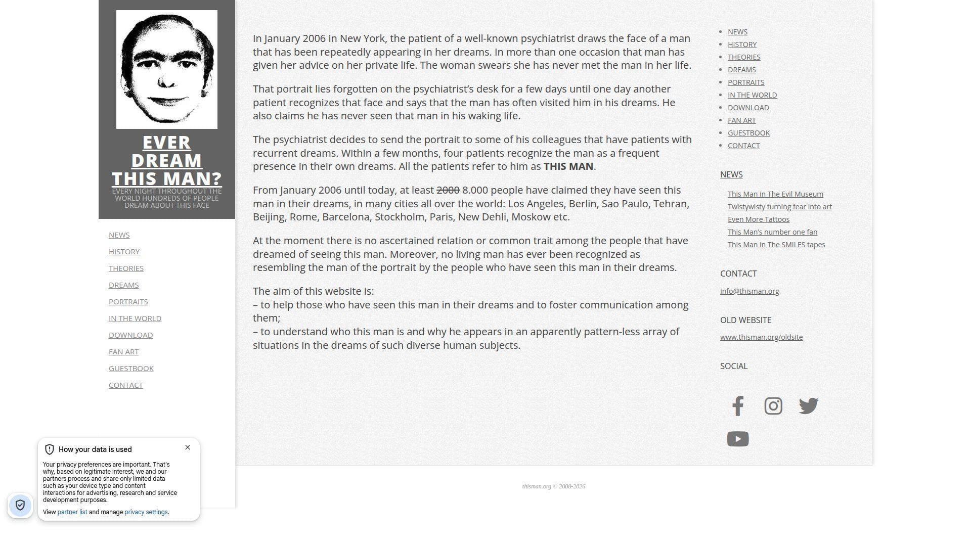
Ever Dream This Man? is widely documented as a conceptual art project and hoax by Andrea Natella. The “team” here is storytelling craft, plus the audience that spreads it.
Outcome: get spooked, then question why you got spooked.
Best for: horror-curious readers, and anyone who loves internet folklore mechanics.
- Myth-format narrative page → you get a full creep story without a video.
- Searchable cultural footprint → saves time versus piecing the legend together alone.
- Reads quickly on one page → time-to-first-value is about 60 seconds.
Pricing & limits: From $0/mo; trial length is unlimited; caps are that it’s text-heavy and relies on your willingness to play along.
Honest drawbacks: Some readers will feel manipulated once they learn the context. Also, the site can spread “false mystery” unless you treat it as art.
Verdict: If you want a clean example of viral mythmaking, this helps you feel the hook in five minutes. Beats zombie dating sites at narrative; trails Zoomquilt on pure visual wonder.
Score: 3.5/5
15. The Useless Web
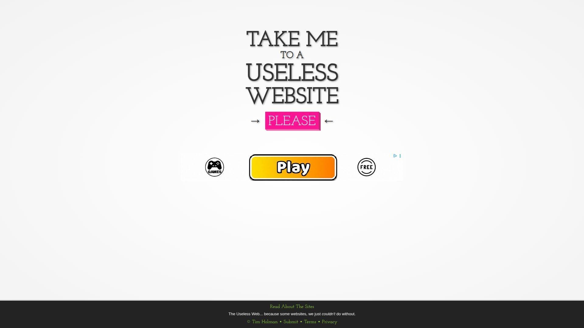
The Useless Web is credited on-site to Tim Holman, and it behaves like a one-button curator with taste for chaos. The “team” is a maker plus a submission pipeline that keeps the roulette spinning.
Outcome: outsource your next pointless click to one pink button.
Best for: anyone bored at a desk, and friends who want a shared “what is this” moment.
- Random-site launcher → you skip choosing and get surprise instantly.
- Submission loop and site notes → saves 5 minutes versus hunting manually.
- One-tap interface → time-to-first-value is about 3 seconds.
Pricing & limits: From $0/mo; trial length is unlimited; caps are uneven quality and occasional dead links.
Honest drawbacks: Random means you’ll hit duds. Also, some destinations may be loud, flashing, or just annoying.
Verdict: If you want curated randomness, this helps you find a new weird tab in under 10 seconds. Beats You Should Have Seen This on freshness; trails You Should Have Seen This on intentional curation.
Score: 4.5/5
16. Pointer Pointer

Pointer Pointer is credited in coverage to Studio Moniker in Amsterdam, which shows in the clean gag execution. The “team” feels like a studio that knows how to land a joke fast.
Outcome: watch strangers point at your cursor like it’s the world’s tiniest magic trick.
Best for: curious coworkers, and anyone demoing “the internet is weird” to a friend.
- Cursor-targeted photo swap → you get surprise with every mouse move.
- No signup, no settings → saves 1–2 minutes versus most interactive toys.
- Instant start on load → time-to-first-value is roughly 5 seconds.
Pricing & limits: From $0/mo; trial length is unlimited; caps are that it’s mouse-centric and less fun on touch screens.
Honest drawbacks: The joke can feel “samey” after a few swaps. Also, performance depends on quick image loading.
Verdict: If you want a quick laugh that looks like clever engineering, this helps you get it in 30 seconds. Beats That’s The Finger on novelty; trails Cat Bounce on longer play.
Score: 4.1/5
17. The Pug In A Rug
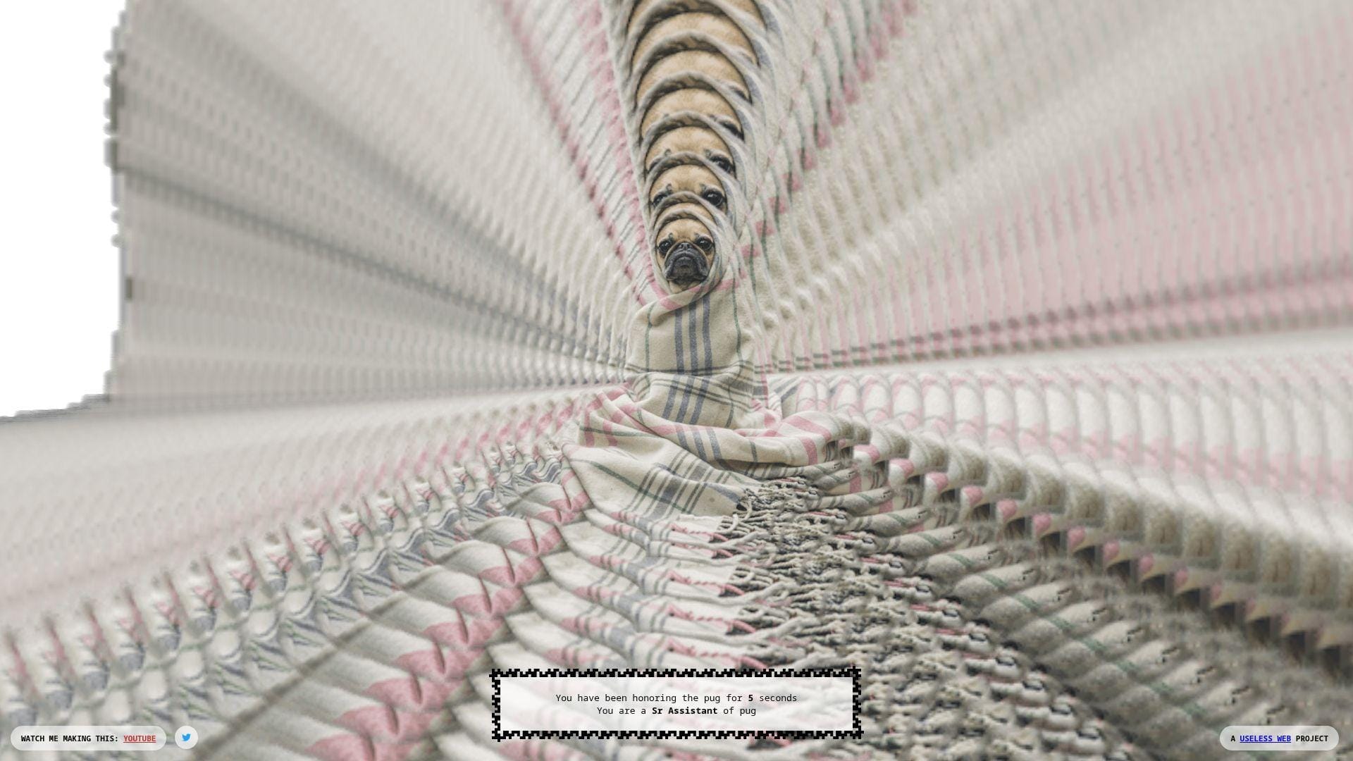
The Pug In A Rug presents as a “Useless Web project,” with the feel of a playful, anonymous maker. The page tracks how long you’ve been “honoring the pug,” turning nothing into fake status.
Outcome: turn idle time into a ridiculous badge of devotion.
Best for: meme-forward friends, and anyone who likes leveling systems with zero stakes.
- Live timer and rank text → you feel progress without doing anything.
- Built-in “watch me making this” trail → saves time versus guessing its origin.
- Loads fast, does one thing → time-to-first-value is about 5 seconds.
Pricing & limits: From $0/mo; trial length is unlimited; caps are that the joke is mostly idle and may not explain itself.
Honest drawbacks: If you expect interaction, you may bounce immediately. Also, the humor leans absurdist, which isn’t universal.
Verdict: If you want a silly “background tab” flex, this helps you commit to the bit in one minute. Beats Endless Horse at “progress”; trails The Useless Web on variety.
Score: 3.7/5
18. Staggering Beauty
Staggering Beauty is credited in Google’s experiment archive to George Michael Brower, with audio credit to Jon Baken. The “team” is small, and the experience is deliberately sensory and chaotic.
Outcome: wiggle a worm, then trigger full-screen mayhem if you go hard.
Best for: prank-leaning friends, and anyone who likes interactive weirdness with a warning label.
- Mouse-follow creature → you get instant responsiveness and a tactile feel.
- Escalation mechanic on vigorous motion → saves time versus finding a louder distraction.
- Starts the moment you move → time-to-first-value is about 3 seconds.
Pricing & limits: From $0/mo; trial length is unlimited; caps include flashing images and loud sounds that won’t suit everyone.
Honest drawbacks: Photosensitive users should avoid the “shake” payoff. Also, the original domain’s availability and delivery can shift over time.
Verdict: If you want controlled chaos, this helps you go from calm to ridiculous in under 20 seconds. Beats Cat Bounce at shock value; trails Zoomquilt on “safe” long viewing.
Score: 3.2/5
19. Quick, Draw!
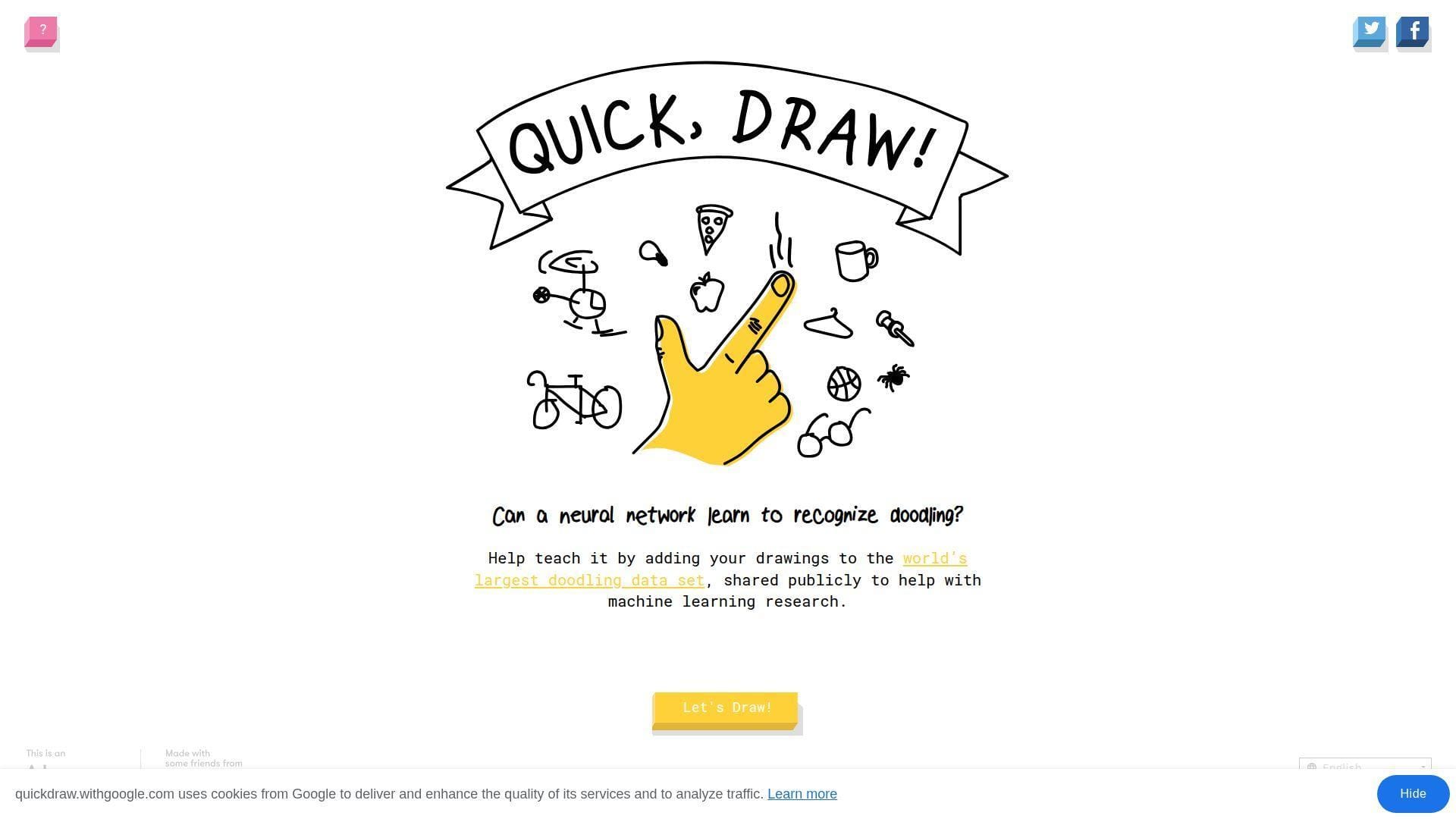
Quick, Draw! is built by Google Creative Lab with a named team and an AI-forward mission. The “company” is obvious, and the production quality shows in the smooth loop.
Outcome: get a neural net to guess your doodle in real time.
Best for: curious kids and parents, plus designers who like playful machine learning.
- 20-second drawing rounds → you practice fast thinking without pressure.
- ML guessing loop → saves minutes versus explaining AI with slides.
- Runs in-browser with clear prompts → time-to-first-value is about 15 seconds.
Pricing & limits: From $0/mo; trial length is unlimited; caps are that it’s a game, not a drawing suite.
Honest drawbacks: The AI misses can feel unfair if you want “accuracy.” Also, repeat prompts can get old in long sessions.
Verdict: If you want playful AI literacy, this helps you learn by doing in five minutes. Beats most entries here on depth and trust; trails none on polish, unless you count full creative apps.
Score: 4.7/5
20. Patience Is a Virtue

Patience Is a Virtue is a deliberately slow-loading joke site with a mostly anonymous maker footprint. The “team” is invisible, which matches the gag: waiting is the whole product.
Outcome: practice doing nothing, while your tab “loads.”
Best for: people who enjoy anti-productivity humor, and anyone who needs a reminder to pause.
- Perpetual loading screen → you stop chasing outcomes for once.
- Cookie consent attitude baked in → saves time versus long policy reading.
- One page, one premise → time-to-first-value is about 10 seconds.
Pricing & limits: From $0/mo; trial length is unlimited; caps are that “waiting” is the only interaction.
Honest drawbacks: If you expect a payoff, you may get annoyed. Also, slow or blocked loads can blur the line between joke and broken.
Verdict: If you want a tiny satire of modern impatience, this helps you sit with boredom for one minute. Beats Is It Christmas? at concept depth; trails Is It Christmas? on clarity and speed.
Score: 3.4/5
21. Zombie Passions
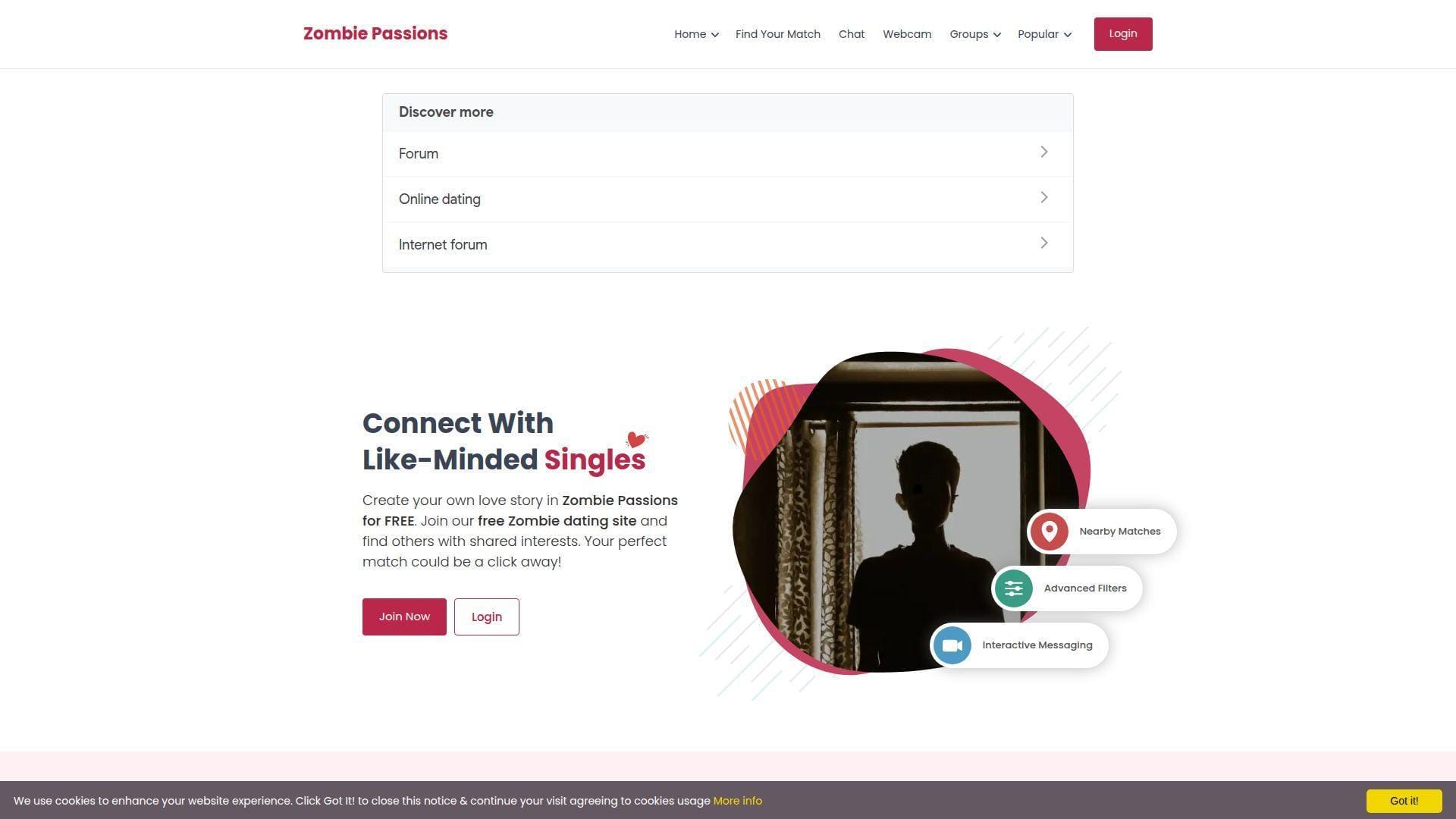
Zombie Passions is a niche dating and community site with a visible product structure and ongoing updates. The “team” feels like a network operator running many “Passions” communities, not a one-off joke.
Outcome: meet people who share your undead-themed sense of humor.
Best for: niche dating explorers, and community seekers who prefer themed spaces.
- Profile + groups structure → you find your niche without forcing small talk.
- Free chat baseline with upgrades → saves steps versus paid-first dating apps.
- Signup-driven experience → time-to-first-value is roughly 5–10 minutes.
Pricing & limits: From $0/mo; trial length is unlimited; caps include upgraded-only features like audio and webcam chat.
Honest drawbacks: Any dating site can attract spam, so vigilance matters. Also, the UI can feel “network template” rather than modern-first.
Verdict: If you want themed community dating, this helps you start conversations in an evening. Beats random social apps at niche alignment; trails mainstream dating apps on polish and scale.
Score: 3.1/5
22. The Long Doge Challenge
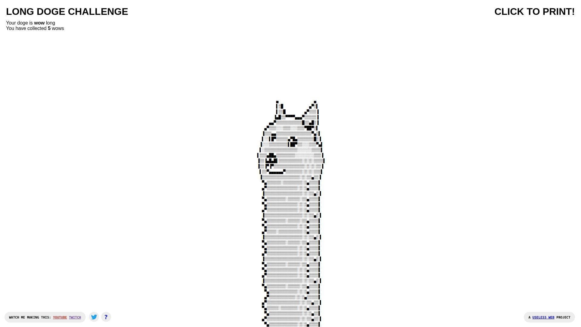
The Long Doge Challenge is labeled on-page as a Useless Web project, with links to its maker’s trail. The “team” energy is one playful builder who kept adding modes like secrets and printing.
Outcome: stretch an ASCII doge into a strangely goal-driven time sink.
Best for: procrastinators, and anyone who likes clicker-style progression without stakes.
- “Collect wows” progression → you get goals from pure nonsense.
- Print output option → saves effort versus screenshotting for a joke.
- Starts instantly, grows with clicks → time-to-first-value is about 5 seconds.
Pricing & limits: From $0/mo; trial length is unlimited; caps are that it’s mostly text art and can feel repetitive.
Honest drawbacks: It’s easy to lose more time than planned. Also, the interface is intentionally busy once you unlock extras.
Verdict: If you want a dumb little “number go up” loop, this helps you disappear for ten minutes fast. Beats Endless Horse on game-ification; trails Cat Bounce on tactile interaction.
Score: 4.0/5
23. Binary Music Player
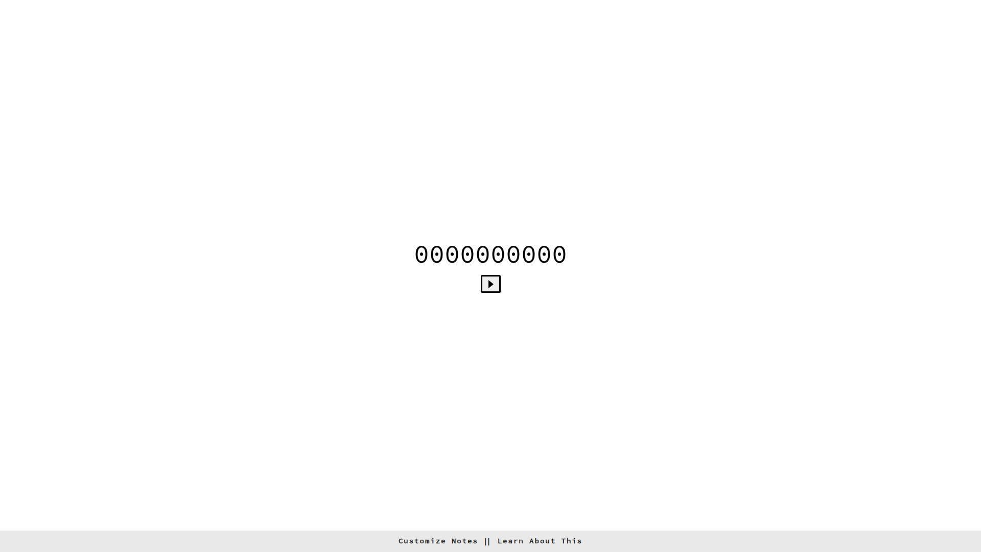
Binary Music Player is explicitly built by Tim Holman, with clear attribution and a link to its underlying tech. The “team” footprint is one maker, plus the open web tools it leans on.
Outcome: make music feel like code, without writing code.
Best for: curious developers, and music dabblers who like visual structure.
- Binary-to-note grid play → you translate patterns into sound quickly.
- Tone.js-based build → saves 30–60 minutes versus coding a synth demo.
- “Customize notes” entry point → time-to-first-value is about 30 seconds.
Pricing & limits: From $0/mo; trial length is unlimited; caps are browser audio permissions and limited composition tooling.
Honest drawbacks: Some automated security tools may flag niche domains, so cautious users should use common sense. Also, it’s a toy, not a DAW.
Verdict: If you want a playful music-tech demo, this helps you hear patterns in five minutes. Beats RGB on “do something” depth; trails Quick, Draw! on mainstream accessibility.
Score: 4.2/5
24. Eel Slap!

Eel Slap! is a single gag executed with surprising polish when it’s reachable. The “team” isn’t clearly credited in the core experience, which makes it feel like a folk artifact of the web.
Outcome: slap a face with a virtual eel, and feel weirdly better.
Best for: stressed-out workers, and friends who like sending absurd links.
- Mouse-driven slap arc → you vent without words or consequences.
- One-action loop → saves 1–2 minutes versus searching for the right meme.
- Instant interaction design → time-to-first-value is about 5 seconds.
Pricing & limits: From $0/mo; trial length is unlimited; caps include occasional availability issues and an experience that’s pure gag.
Honest drawbacks: The joke is physical and repetitive, so it’s not for everyone. Also, if the site is intermittently down, the magic dies.
Verdict: If you want fast, physical comedy, this helps you discharge annoyance in 30 seconds. Beats That’s The Finger on “action”; trails Cat Bounce on richer interaction.
Score: 3.6/5
25. Can’t Not Tweet This

Can’t Not Tweet This is associated with Tim Holman, with the vibe of a tiny experiment that comments on compulsive sharing. The “team” is essentially one builder poking at social UX.
Outcome: tempt you into tweeting, even when you swear you won’t.
Best for: social media skeptics, and product people who enjoy interaction design jokes.
- Text that resists easy capture → you feel friction where sharing is “too easy.”
- Built-in tweet trigger → saves steps versus composing the gag manually.
- Single-page immediacy → time-to-first-value is about 10 seconds.
Pricing & limits: From $0/mo; trial length is unlimited; caps depend on platform behavior and whether Twitter flows still work smoothly.
Honest drawbacks: If you dislike social prompts, it will irritate you on purpose. Also, it’s less meaningful if you never tweet.
Verdict: If you want a small critique of online compulsions, this helps you feel the trap in one minute. Beats Please Like at interactivity; trails Please Like on quiet subtlety.
Score: 3.8/5
26. Find The Invisible Cow
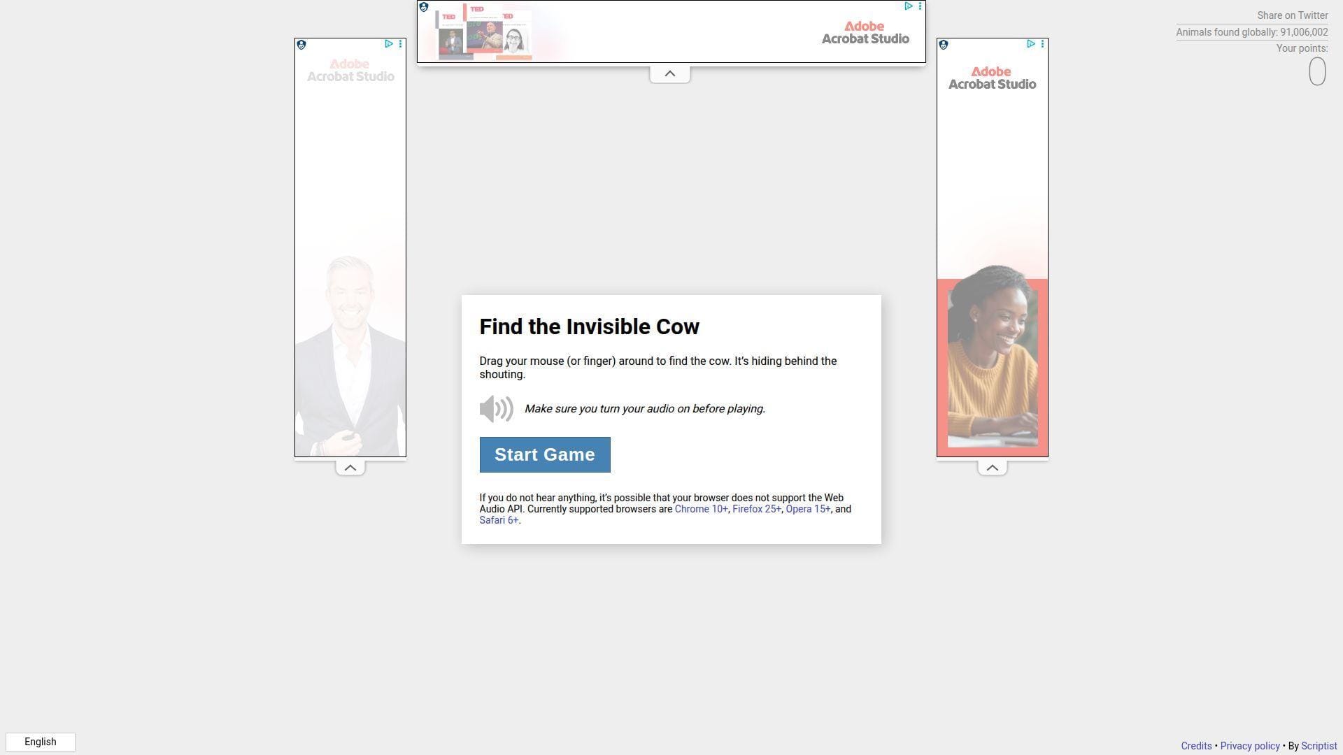
Find The Invisible Cow is credited in some write-ups to Mike Solomon, and it feels like a simple game built with care. The “team” shows up as one maker who understood audio as a mechanic.
Outcome: hunt an invisible target using sound like a hot-and-cold compass.
Best for: families, and anyone who wants a quick game that makes you smile.
- Audio proximity cue → you get a real “aha” moment without graphics.
- No instructions needed beyond “listen” → saves time versus reading a tutorial.
- One-screen gameplay loop → time-to-first-value is about 20 seconds.
Pricing & limits: From $0/mo; trial length is unlimited; caps include needing sound enabled and a quiet enough environment.
Honest drawbacks: Without audio, the game collapses completely. Also, repeated play can feel identical once you learn the trick.
Verdict: If you want a tiny, shareable party trick, this helps you feel clever in two minutes. Beats Endless Horse at “game”; trails Quick, Draw! on replay variety.
Score: 4.3/5
27. Noooooo!
Noooooo! is known as a scream-button style link, built for catharsis, even when availability varies. The “team” isn’t reliably visible from the outside, so it lands like web folklore.
Outcome: press a button and let the dramatic “no” do the talking.
Best for: frustrated humans, and anyone who wants a theatrical reaction without typing.
- One-button release valve → you vent without sending a message you regret.
- Shareable reaction link → saves 15–30 seconds versus hunting a sound clip.
- Zero learning curve → time-to-first-value is about 3 seconds.
Pricing & limits: From $0/mo; trial length is unlimited; caps include possible downtime and reliance on audio output.
Honest drawbacks: If the site is unreachable, the whole promise breaks. Also, loud audio can be awkward in public spaces.
Verdict: If you want a fast emotional punctuation mark, this helps you externalize annoyance in under 10 seconds. Beats Patience Is a Virtue at immediacy; trails Is It Christmas? on consistent reliability.
Score: 2.8/5
28. Procatinator

Procatinator is a music-and-cat procrastination machine with a clear “Made with love in Barcelona” signature. The “team” feels small, but the library depth hints at ongoing curation.
Outcome: replace guilt with cats and a buffering soundtrack.
Best for: serial procrastinators, and anyone who wants background joy while they avoid work.
- Random cat + song pairing → you get instant mood shift without choosing content.
- Social sharing hooks built in → saves 2 steps versus screen-recording the moment.
- Loads and starts “buffering” quickly → time-to-first-value is about 10 seconds.
Pricing & limits: From $0/mo; trial length is unlimited; caps include dependency on embedded media and occasional buffering quirks.
Honest drawbacks: If you dislike autoplay vibes, it’s not subtle. Also, it’s designed to steal time, which is the danger.
Verdict: If you want sanctioned procrastination, this helps you laugh and drift for ten minutes fast. Beats The Useless Web at consistency; trails The Useless Web on “surprise” breadth.
Score: 4.4/5
29. Cornify
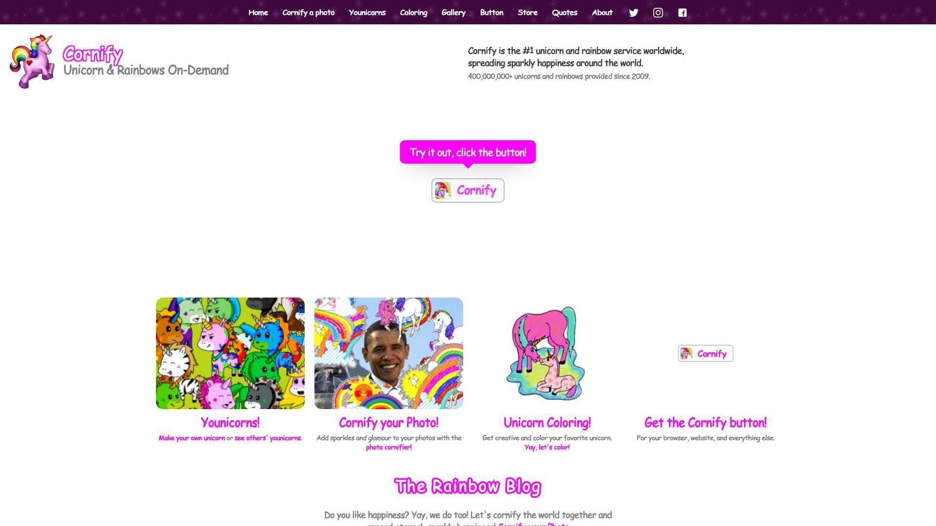
Cornify is a longer-running playful service credited in its footer to “Germany’s Best Kept Secret,” which reads like a studio-backed prank. The “team” has expanded the idea beyond one button into multiple mini-tools.
Outcome: add unicorn-and-rainbow chaos to your otherwise serious internet.
Best for: office pranksters, and anyone who wants glittery absurdity on demand.
- Cornify button antics → you transform dull pages into instant visual comedy.
- Extension and share mechanics → saves a few minutes versus manual image editing.
- Click-to-chaos workflow → time-to-first-value is about 10 seconds.
Pricing & limits: From $0/mo; trial length is unlimited; caps include that “too much” is the default, by design.
Honest drawbacks: The aesthetic is maximalist, so minimalists will recoil. Also, extra features can distract from the core one-button joy.
Verdict: If you want to sabotage seriousness with sparkle, this helps you do it in under a minute. Beats That’s The Finger at wholesome chaos; trails Quick, Draw! on “learn something” value.
Score: 4.1/5
30. Nyan Cat
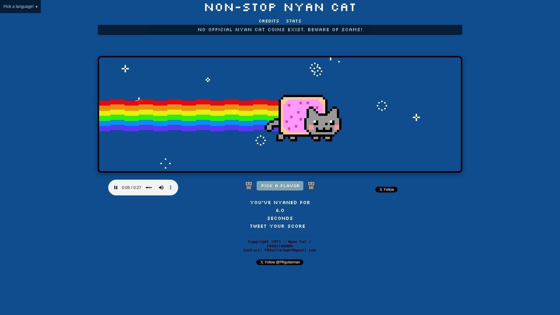
Nyan Cat runs as a dedicated, polished home for the endlessly looping meme, with visible social handles and an explicit scam warning on-page. The “team” feels like an official caretaker presence around a classic artifact.
Outcome: loop the rainbow cat until time stops meaning anything.
Best for: nostalgia fans, and anyone who wants a background tab that refuses to end.
- Non-stop loop with stats → you get a silly endurance challenge for free.
- Shareable score-and-tweet flow → saves steps versus explaining “how long” you lasted.
- Starts fast and keeps going → time-to-first-value is about 5–10 seconds.
Pricing & limits: From $0/mo; trial length is unlimited; caps include repetitive audio and a premise that can hijack focus.
Honest drawbacks: The soundtrack can become a productivity hazard. Also, anyone sensitive to repetition will quit quickly.
Verdict: If you want a classic web loop with extra polish, this helps you relive the bit for as long as you dare. Beats Zombo.com at clarity; trails Zoomquilt on artistic depth.
Score: 4.0/5
What makes a weird link weird: content, design, and interaction patterns
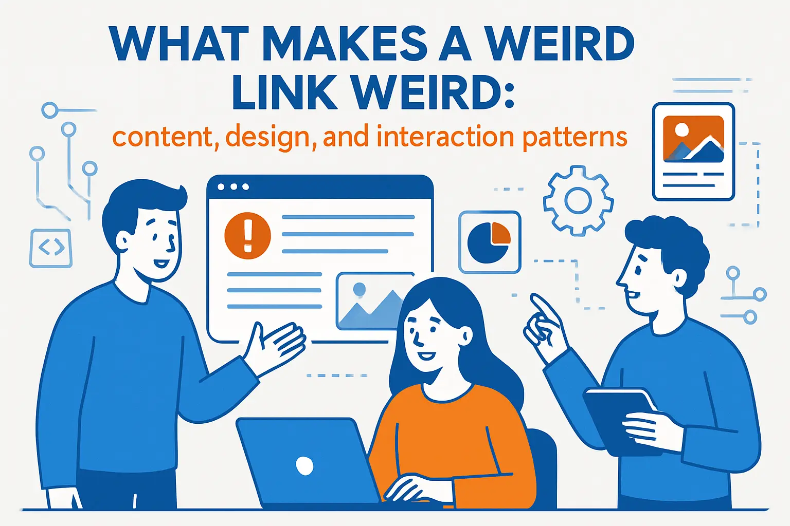
1. Unique content: strange animations, unusual topics, and quirky games
Weird content is usually specific and unscaleable. That is the point. It does not try to be a platform.
Strange topics also disarm our defenses. A page about nothing invites us to stop optimizing. Suddenly, we are just present.
In business terms, this is anti-SEO content. It wins by being shared, not searched.
2. Unconventional web design: odd navigation, abstract graphics, eccentric color schemes
Conventional design reduces cognitive load. Weird design raises it, then rewards it. The visitor becomes an explorer again.
Abstract graphics can also hide technical cleverness. A messy page may still be architected cleanly. That contrast is fun.
We think of it as “intentional friction.” The friction itself becomes part of the joke.
3. Unusual purpose or function: vague goals or no practical use at all
Purpose is usually a product requirement. Weird links treat purpose as optional. They can exist just to exist.
That absence changes how we click. There is no “right” outcome. There is only exploration.
Oddly, this can feel more relaxing than goal-driven apps.
4. Quirky interactive elements: dragging, hovering, and endless scrolling experiences
Weird interactions often rely on bodily intuition. Dragging feels physical. Hovering feels like poking the page.
Endless scrolling can also become performance art. It turns time into an input. That is a bold choice.
As hosts, we love this because it tests the browser, not the backend.
5. Humor-first experiences: ironic and absurd elements meant to entertain or confuse
Humor can be structural, not just visual. The layout itself can be the punchline. The timing can be the punchline too.
Absurdity also creates plausible deniability. If a page fails, that failure may feel “on theme.”
Still, the best weird sites are quietly robust.
6. Niche appeal: ultra-specific audiences and inside-joke internet concepts
Inside jokes are sticky. They create belonging. A niche weird site is basically a clubhouse door.
For creators, niche also reduces pressure. You can make something strange without pleasing everyone. That freedom improves the work.
For organizations, niche weirdness can humanize a technical brand.
7. Single-page interactions: one idea, one page, heavy JavaScript
Single-page weird sites are the web’s haiku. They compress an experience into a tiny footprint. That compression forces creative decisions.
Heavy JavaScript is common because interaction is the product. Yet the best pages still load fast. They keep scripts focused.
We advise creators to keep failure graceful. If scripts fail, the page should still say something meaningful.
8. Generative art patterns: Canvas and WebGL visuals powered by randomness
Generative art feels alive because it is never identical twice. Randomness becomes the co-author. That co-authorship is addictive.
Canvas-based work also rewards modern GPUs. The browser turns into a tiny art engine. That is still magical to us.
From a platform standpoint, generative art is a benchmark. It exposes device differences fast.
9. WebAudio toys: reactive sounds, loops, and browser-based audio experiments
Sound changes the stakes of clicking. It can delight, but it can also startle. Weird links often play with that boundary.
WebAudio can be surprisingly sophisticated. A “toy” may include layering, timing, and interaction mapping. That complexity hides behind a simple UI.
We recommend predictable controls. A mute toggle is a kindness.
10. API mashups: maps, time zones, and public data turned into playful web experiences
API mashups turn real data into weird play. The raw material is serious. The result is not.
Maps are especially fertile. They bring the real world into the browser. Then a creator can bend it into a game.
For companies, mashups are also a lesson. Public APIs enable culture, not just products.
11. Static hosting done right: lightweight HTML and assets with aggressive caching
Many weird links are static pages. That is not a limitation. It is a superpower.
Static assets cache well and scale cleanly. A sudden wave of visitors becomes a bandwidth problem, not a database crisis.
At 1Byte, we see this pattern succeed repeatedly. Simple pages survive attention spikes better than complex stacks.
Quick safety notes before you click random weird links
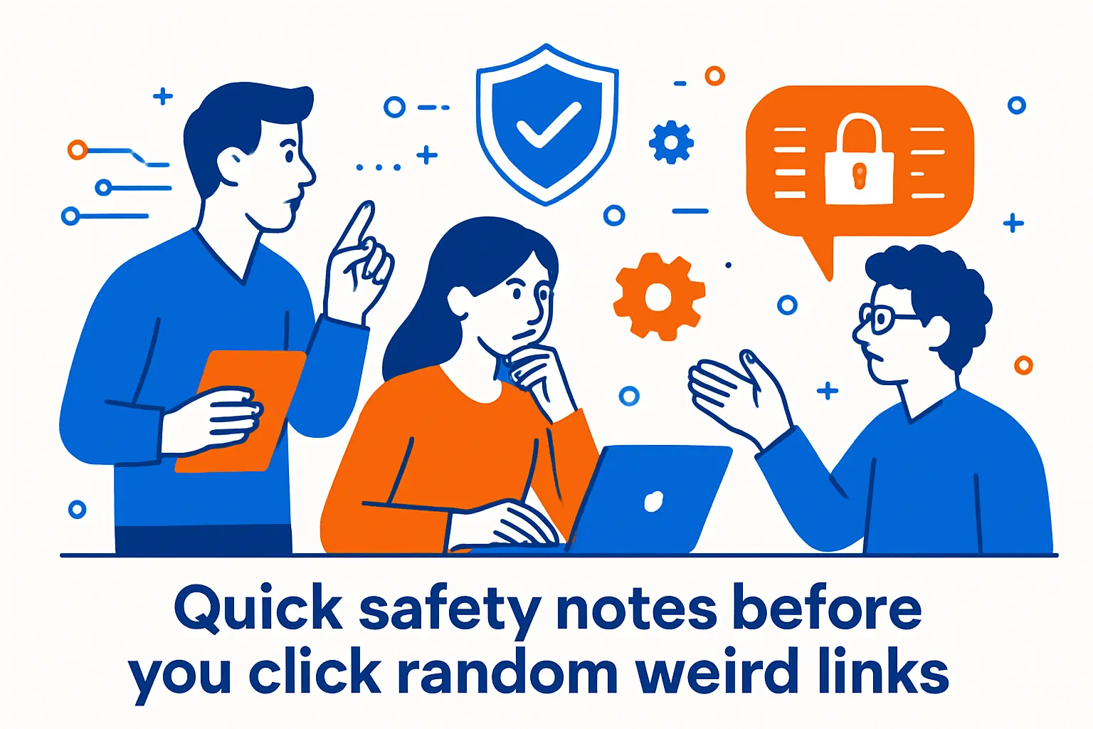
1. Avoid downloads from random sites
Weird links should be mostly browser-native. If a page insists on a download, we treat that as a warning. Curiosity is not a security policy.
When a download is truly needed, we expect context. We expect a known publisher. We also expect a reason.
In doubt, close the tab and move on.
2. Never enter passwords or payment information on untrusted weird links
Many weird sites are anonymous art. That is fine. It also means there is no trust relationship.
Credentials belong only on domains you already trust. Payment details belong only in audited checkout flows. Weird links are rarely that.
If a “joke” asks for a login, it is no longer a joke.
3. Use a private browsing window when exploring lots of unknown links
Private browsing helps reduce cross-site tracking. It also prevents your session cookies from leaking into unknown places.
We like it as a clean-room habit. It keeps experiments separate from real work.
Think of it as putting on gloves before touching mystery objects.
4. Start with low volume and watch for loud audio surprises
Audio can jump-scare, even when it is not malicious. Some WebAudio toys assume you want full impact.
Lower volume protects your ears and your meeting. It also protects your trust in the web.
If you are sharing links with a team, warn them about sound.
5. Be cautious with flashing visuals if you are sensitive to strobe effects
Flashing visuals are common in glitch art and kinetic experiments. They can also be a health risk for some people.
We suggest easing in and watching your reaction. If a page feels intense, exit quickly.
Sharing a quick heads-up is basic community care.
6. Close pages with aggressive popups and keep your browser updated
Most weird sites do not need popups. Aggressive popups are usually a monetization tactic. Sometimes they are worse.
Keeping browsers updated closes known holes. That matters even when you are “just browsing.”
Security is not only for serious work. It is for play too.
7. Respect age warnings when a list flags content as 18+
Some weird links lean into shock value. Others lean into adult themes. A warning is not an invitation to ignore it.
We also think about context. What is funny alone may be unacceptable at work. Timing and audience matter.
If you curate a list, label responsibly and be explicit.
How to find more weird links: generators, hubs, and communities
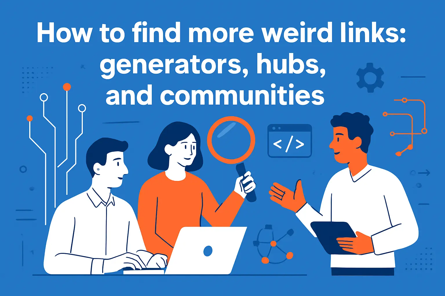
1. Random button sites that send you somewhere new with every click
Random-button sites are the slot machines of web discovery. They are also surprisingly useful for creative breaks.
We like them as idea generators. A random site can spark a UI pattern or a content format.
If you use them, combine curiosity with the safety habits above.
2. Curated hubs of polished weird experiments and classic web toys
Curated hubs filter out the worst surprises. They also preserve the best classics. Curation becomes a form of cultural memory.
We recommend saving hubs as bookmarks. Treat them like a small museum of the web.
In a team setting, curated hubs are great for “creative warmups.”
3. Wiki-style rabbit holes: roulette browsing and “unusual articles” lists
Wikipedia is not a weird site, but it enables weird journeys. The built-in randomness creates playful learning.
For an instant rabbit hole, try Special:Random and keep clicking when the topic feels dull.
We like this because it is low-risk. It is weirdness with guardrails.
4. Wayback-style time travel for dead weird links that disappear over time
Weird sites vanish often. Domains expire. Creators move on. Hosting bills still exist.
The Wayback Machine is our favorite reminder that the web is mortal.
If you build weird things, plan for archival. Export static snapshots early.
5. Reddit communities for weird links and unique sites like r/InternetIsBeautiful
Communities are the web’s distribution layer. People share what made them laugh, think, or stare.
For a steady stream of discoveries, browse r/InternetIsBeautiful and note what keeps resurfacing.
We advise reading comments too. People often flag surprises and risks.
6. Old-school discovery nostalgia: remembering StumbleUpon-style browsing
StumbleUpon is gone, but the impulse remains. We still want guided randomness. We still want curated serendipity.
Today, discovery often happens inside social feeds. That is efficient, but it is also homogenizing.
Our recommendation is simple: rebuild a bookmark habit. Serendipity needs a place to live.
Create your own weird links website: simple launches, performance, and when to upgrade
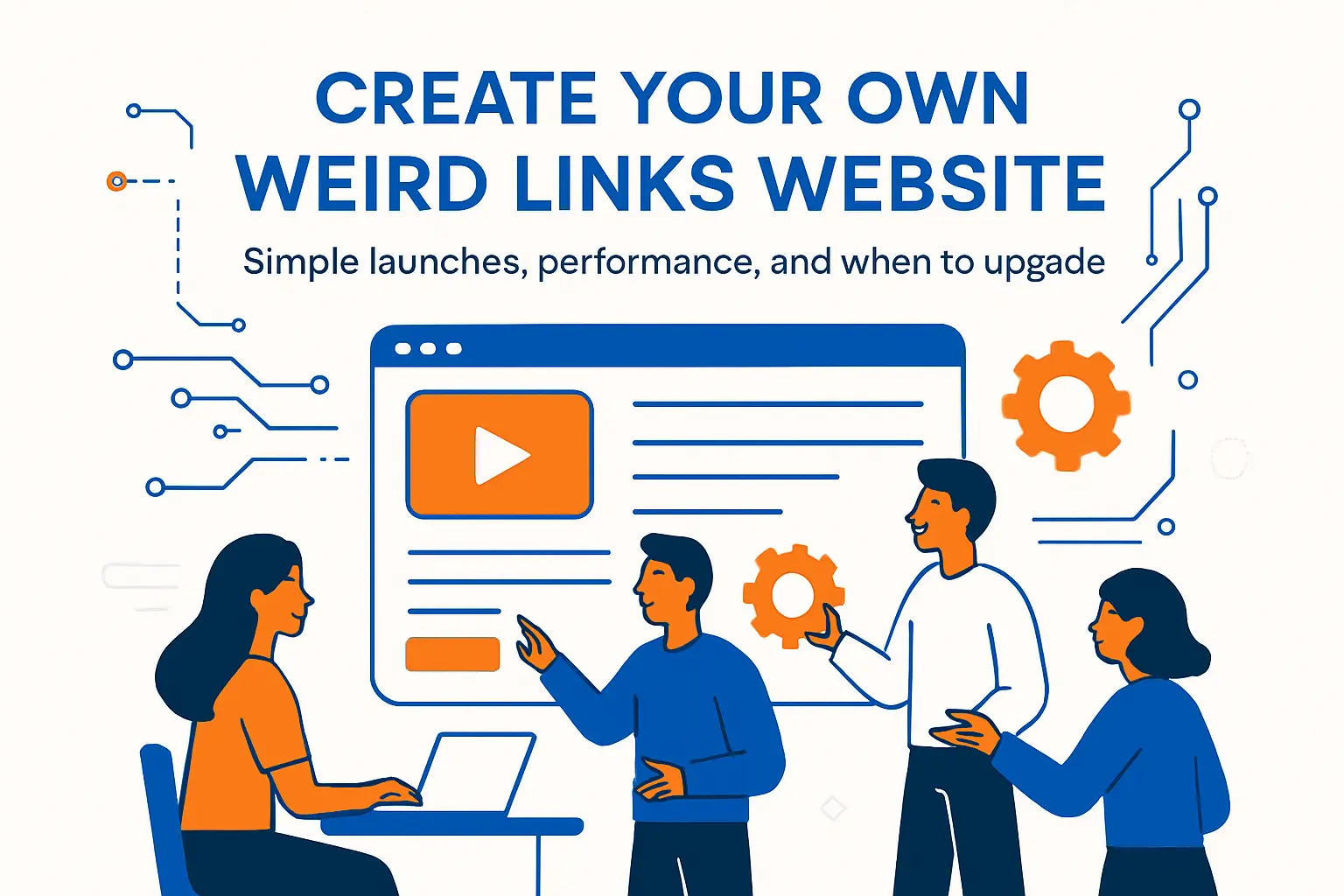
1. Start small: single-page jokes, galleries, and weird link hubs
Start with a single page and a single premise. A weird site does not need a roadmap. It needs a clean punchline.
In practice, the best first version is disposable. Ship fast, then watch what people share.
We also suggest writing a short “about.” It builds trust without killing the mystery.
2. No-code vs code: when a drag-and-drop builder is enough and when it is not
No-code is great for quick weirdness. It gets you to “live on the internet” without setup friction.
Code becomes important when interaction is the art. Real-time input, custom animation, and audio control often need it.
Our pragmatic view: choose the smallest tool that fits the gimmick.
3. Keep it fun by keeping it fast: ship less JavaScript and compress images
Speed is part of the joke. A weird page that loads instantly feels like a magic trick. A slow page feels like a trap.
Reduce scripts and lazy-load heavy media. Compress images without destroying the aesthetic. Keep fonts simple.
We treat performance as kindness. It respects the visitor’s time and battery.
4. Cache aggressively so repeat visits feel instant
Weird links often spread in bursts. Someone shares it, then people revisit to show friends.
Caching makes those repeat visits feel instant. It also reduces server load during attention spikes.
At 1Byte, we like static assets with strong caching and clean invalidation practices.
5. Plan for spikes: CPU and RAM headroom matters when a weird link goes viral
Viral traffic is rarely polite. It comes as a stampede, not a line. A small server can crumble fast.
If your weird site is compute-heavy, plan for headroom. If it is static, plan for bandwidth and caching.
We also recommend graceful degradation. If a feature fails, keep the page alive.
6. Know when cheap hosting is not enough: throttling, hidden limits, and instability
Cheap hosting can be perfect for prototypes. It can also hide constraints. Throttling can turn a fun link into a broken promise.
Watch for slow responses under load. Track errors and timeouts. Those signals usually appear before a full outage.
Upgrading should be boring and predictable. If it feels scary, the platform is wrong.
7. Make it “real” with essentials like SSL, backups, and reliable support
Weird does not mean careless. SSL helps visitors trust that the page is the page. Backups help you recover from accidents.
Support matters because weird sites break in weird ways. Browser updates can change behavior overnight.
Our rule is simple: play on the surface, be serious underneath.
1Byte for building and sharing weird links
1. Domain registration to claim memorable weird links and publish your site under your own name
Memorable weird sites usually have memorable domains. A good domain is part of the experience. It is also part of the shareability.
At 1Byte, we encourage creators to own their link identity. A stable domain protects your project from platform churn.
For teams, domains also enable internal experiments. You can ship a weird demo under a clean, controlled name.
2. SSL certificates to keep your weird links website secure and trusted
SSL is non-negotiable for trust. Even silly pages should be encrypted. Visitors notice browser warnings immediately.
We like SSL because it turns “random link anxiety” into confidence. It also protects integrity against network tampering.
If you share weird links publicly, SSL is part of being a good citizen.
3. WordPress hosting, shared hosting, cloud hosting, and cloud servers backed by our AWS Partner status
Some weird sites are a single static page. Others become galleries, collections, or community projects. Those need a stronger foundation.
At 1Byte, we match the platform to the weirdness. Shared hosting can fit lightweight hubs. Cloud hosting fits projects that might spike unpredictably.
When a weird link becomes a real product, cloud servers offer control. Our AWS Partner work helps us design that path without drama.
Now we want to hear from you. Which link will we all regret clicking first, and what would you build if weirdness was the goal?