

- What to learn from the best web developer portfolio examples
- Quick Comparison of web developer portfolio examples
- Top 30 web developer portfolio examples to bookmark and study
- Must-have sections for building your own web developer portfolio
- Design and UX patterns seen across standout web developer portfolio examples
- Project presentation tactics: case studies, demos, and proof of work
- Technical checklist for a fast, secure, and hire-ready portfolio site
- How 1Byte supports portfolio websites with domains, SSL, WordPress hosting, shared hosting, cloud hosting, and AWS Partner cloud servers
We’re 1Byte, and we make a living on the unglamorous side of the web: domains, hosting, uptime, and the quiet dignity of pages loading fast.
That vantage point changes how we read portfolios. We don’t just see “design.” We see delivery, intent, and operational maturity.
A portfolio is a tiny production system. It has users, failure modes, and a conversion goal.
Market snapshot: Gartner puts worldwide public cloud end-user spending at $723.4 billion, and that scale keeps raising expectations for web reliability.
Statista expects a global developer population of 28.7 million people, so “good enough” portfolios get buried by volume.
McKinsey estimates generative AI could add $2.6 trillion to $4.4 trillion annually, which intensifies the “prove your taste” hiring loop.
In practice, we watch recruiters skim on phones between meetings. We also watch candidates lose leads from broken forms and flaky hosting.
So we wrote the guide we wish more developers followed. It’s part design critique, part delivery checklist, and part hard-earned hosting paranoia.
What to learn from the best web developer portfolio examples
1. Balance creativity with clarity so both developers and non-technical hirers “get it”
Clarity wins interviews, while creativity wins attention. Great portfolios deliver both without making visitors work.
Instead of hiding the role, they state it plainly in the first screen. That single choice reduces bounce and awkward follow-up calls.
Our favorite approach pairs a distinctive visual idea with plain-language project outcomes. That combination reads well to engineers and buyers.
2. Make navigation instantly understandable and keep key pages easy to reach
Navigation should feel inevitable, not clever. When menus get artsy, hiring teams assume the codebase is also chaotic.
Strong portfolios keep “Work,” “About,” and “Contact” one click away. They also preserve a predictable back path from case studies.
From our logs, repeat visits often land deep. A clear global nav helps those visitors recover context fast.
3. Use personality-driven “About” details (including fun facts) to stand out
Personality is an information scent. It signals how you collaborate, write, and handle ambiguity.
The best “About” pages include small, specific details that feel unverifiable. That is exactly why they’re believable.
We like when the fun facts reinforce work style. A “coffee nerd” note pairs well with performance obsession.
4. Show your range beyond code: writing, speaking, art, or side projects (when relevant)
Range is leverage, but only when it supports the target role. A portfolio should not feel like a junk drawer.
Writing proves you can explain tradeoffs. Speaking proves you can persuade without hiding behind pull requests.
Side projects matter when they show sustained taste. A tiny tool with perfect UX can beat a giant clone.
5. Use interactive UI thoughtfully (3D, scroll effects, microinteractions) without harming usability
Interactivity should communicate competence, not demand patience. The best interactive portfolios provide an “exit ramp” to content.
We look for a graceful fallback when motion fails. A portfolio is still a document, even when it’s playful.
Performance budgets matter here. Heavy effects should earn their bytes by demonstrating relevant skills.
6. Offer light/dark mode (and make the toggle feel intentional)
Theme switching is a small detail with outsized trust impact. It says you respect user preferences and varied environments.
Strong portfolios treat the toggle as a design decision. They tune contrast, shadows, and media for both themes.
We recommend remembering the choice. A portfolio that forgets feels oddly careless.
7. Design for mobile first: smooth performance and responsive layouts
Mobile-first design is not a slogan. It is a constraint that forces hierarchy, typography discipline, and lighter assets.
Good portfolios avoid hover-only interactions and tiny tap targets. They also keep project cards readable without pinch zoom.
From a hosting perspective, mobile failures often trace back to oversized media. Responsive images are your silent ally.
8. Add social proof: testimonials, notable clients, awards, or community recognition
Social proof compresses decision time. It answers, “Can someone else vouch for you?” without another meeting.
Portfolios do best when proof is specific. A short quote with context beats a wall of praise.
Community recognition can substitute for clients. Open-source maintainership is a form of long-term accountability.
9. Make it easy to contact you: clear CTA plus a prominent contact form
Contact friction kills momentum. If a buyer can’t act in seconds, they often move to the next tab.
Best-in-class portfolios place a clear call to action on every page. They also provide an email fallback beside the form.
We’ve debugged enough missing inquiries to be blunt. Deliverability is part of your “design system.”
10. Curate inspiration sources: community threads, curated lists, and portfolio galleries
Inspiration works best when you collect patterns, not screenshots. We recommend building a swipe file of layouts, not just aesthetics.
Curated galleries help, but your real learning comes from reverse-engineering structure. Try rewriting a case study headline in your own voice.
Below is our current set of real portfolios we revisit for craft and clarity. Use them like a tasting menu.
Thirty Portfolio Examples We Keep Bookmarking
- Brittany Chiang — crisp project archive and calm accessibility-first UI.
- Bruno Simon — playful navigation that still communicates serious engineering.
- Adham Dannaway — split identity done right, with strong scannability.
- Tim Roussilhe — microinteractions that feel deliberate, not decorative.
- Julien Renau — technical work presented like a gallery, with restraint.
- Thomas Aufresne — case-study grid that stays readable and fast.
- Lei Xing — minimal portfolio copy with genuine personality.
- Aristide Benoist — editorial motion language and strong pacing.
- Josh W. Comeau — writing-first craft, plus interactive teaching moments.
- Ahmad Shadeed — deep CSS thinking presented with a product designer’s eye.
- Sara Soueidan — accessibility authority, with clear speaking and writing pathways.
- Lea Verou — standards perspective, sharp essays, and strong personal framing.
- Una Kravets — community energy, sketchnotes, and useful “around the web” links.
- Addy Osmani — engineering leadership voice with practical learning trails.
- Paul Irish — tooling credibility, written like a human resume.
- Jake Archibald — technical writing that doubles as portfolio evidence.
- Rachel Andrew — professional depth with a calm, navigable structure.
- Jen Simmons — design advocacy presented with crisp hierarchy.
- Sindre Sorhus — open-source output framed as a living body of work.
- Dan Abramov — essays as proof of taste and systems thinking.
- Lee Robinson — career narrative paired with developer education.
- Guillermo Rauch — builder identity, told with founder-level clarity.
- Cassidy Williams — playful copy that still signals competence.
- Tania Rascia — “digital garden” structure with strong project proof.
- Marko Denic — practical tools and articles that support hiring decisions.
- Kent C. Dodds — teaching output organized like a product catalog.
- Locomotive — agency portfolio with consistent case-study rhythm.
- ToyFight — brand personality paired with clear “work” pathways.
- Pierre Nel — minimal typography and confident whitespace decisions.
- Robby Leonardi — gamified storytelling that remains surprisingly legible.
11. Prioritize scannability: strong typography, whitespace, and obvious hierarchy
Scannability is your conversion engine. Most visitors skim, decide, and only then read.
Strong portfolios make headings informative, not poetic. They also use whitespace to separate concepts, not just to look premium.
Our litmus test is simple. If we screenshot the page, does the structure still make sense?
Quick Comparison of web developer portfolio examples
Choosing “the best” portfolio stack is mostly about constraints. Decide what you need to edit often, and what must be code-first.
Here are compact starting points we see developers actually ship. The key is picking one and finishing the last mile.
| Tool | Best for | From price | Trial/Free | Key limits |
|---|---|---|---|---|
| GitHub Pages | Code-first static portfolios | Free | Free | Static only; DIY workflows |
| Webflow | Design-forward portfolios | $14 billed yearly | Free starter | Export friction; CMS costs |
| Framer | Fast visual builds | $10 per month | Free plan | Less code control |
| Carrd | Single-page simplicity | $9 / year | Free plan | Limited routing |
| WordPress.com | Writing-first portfolios | $8 billed yearly | Free plan | Platform constraints |
| Squarespace | Polished templates | $16 paid annually | Trial | Limited dev workflows |
| Wix | Quick marketing sites | $17 paid annually | Free plan | Editor lock-in risk |
| Ghost(Pro) | Newsletter plus blog | $18 USD / mo | Trial | Theme work required |
| Vercel | Modern app portfolios | $20 / month per paid seat | Free hobby | Usage add-ons vary |
| Super | Notion-driven portfolios | $12/site/month | Try free | Notion dependency |
Top 30 web developer portfolio examples to bookmark and study
These portfolios earn a spot here for one reason: they make your work easy to trust. Each one solves the same job fast. It answers, “Can you build the thing I need?” It also answers, “Can I work with you?”
Selection is outcome-first. We look for clear positioning, scannable proof, and a journey that feels deliberate. Strong examples reduce recruiter effort. They also reduce client anxiety. Weak ones make you hunt.
Each entry gets a 0–5 weighted score. Value-for-money is 20%. Feature depth is 20%. Ease of setup & learning is 15%. Integrations & ecosystem is 15%. UX & performance is 10%. Security & trust is 10%. Support & community is 10%.
Because these are public portfolios, “value” often means time saved. “Integrations” means how smoothly you reach code, demos, and contact. The best examples feel like a product. They ship a promise, then prove it.
1. Charles Bruyerre
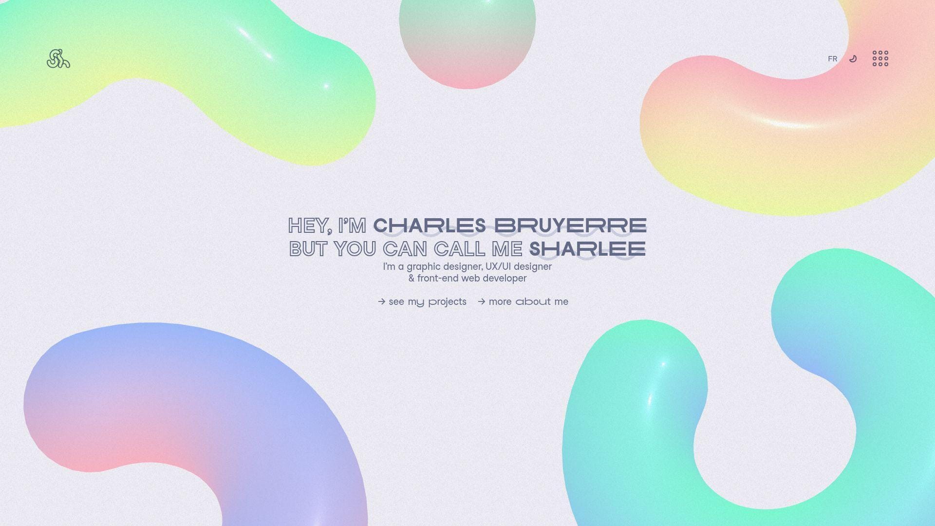
Charles Bruyerre’s portfolio reads like a one-person product team shipped it. The voice feels intentional, and the pacing keeps you moving. You spend less time guessing. You spend more time seeing proof.
Tagline: A crisp narrative that turns “interesting” into “hireable.”
Best for: a frontend developer applying to product teams; a hybrid dev-designer pitching boutique clients.
- Guided project flow → reviewers find proof points without extra tabs.
- Direct demo and code paths → saves 2–3 “can I see it?” follow-ups.
- Fast-scanning layout → time-to-first-value is about 60–90 seconds.
Pricing & limits: From $0/mo. Trial: none, since it’s public. Limits: no seats, no usage caps, but heavier visuals can stress older laptops.
Honest drawbacks: If you want long case studies, you may crave more process detail. Animation-forward choices can distract a “just the facts” reviewer.
Verdict: If you need a tight pitch with confident proof, this helps you look senior in one review cycle. Beats many minimal one-pagers at storytelling; trails blog-first sites on depth.
Score: 4.3/5
2. Keita Yamada
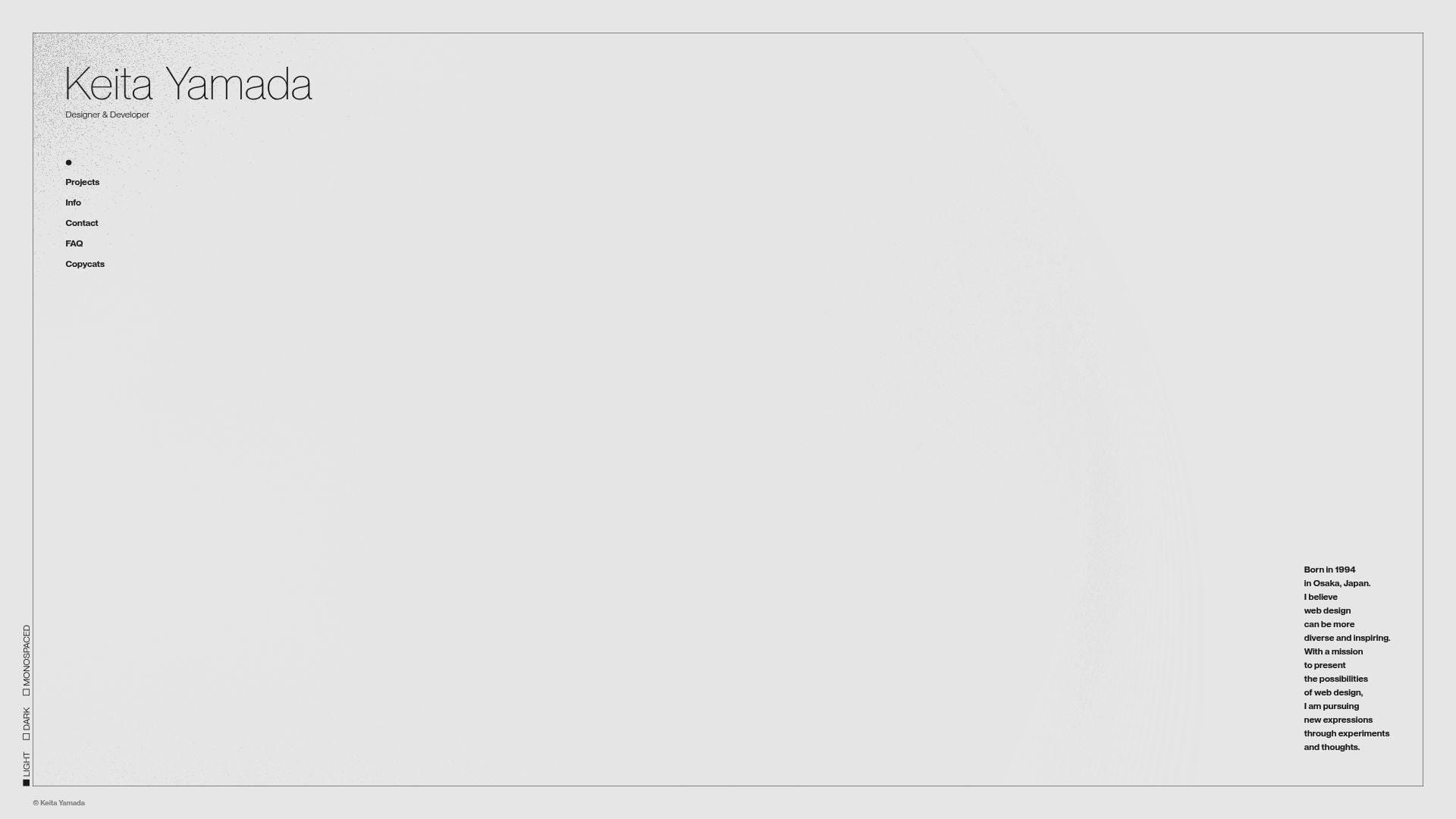
Keita Yamada presents work like a creative engineering studio, even when it’s solo. The portfolio leans into experiments and interaction. That choice signals taste. It also signals technical playfulness.
Tagline: Make your craft feel alive, not listed.
Best for: creative coders; frontend engineers aiming for immersive brand work.
- Experiment-led navigation → visitors remember you after one scroll.
- Sketch-style demonstrations → saves 10 minutes of explanation in interviews.
- Immediate interaction → time-to-first-value is about 30–60 seconds.
Pricing & limits: From $0/mo. Trial: none, since it’s open. Limits: no account gates, but some effects may not shine on low-power devices.
Honest drawbacks: Hiring managers seeking “enterprise UI” may miss familiar app screenshots. Interaction-heavy pages can feel slower on mobile connections.
Verdict: If you want to be remembered for creative code, this helps you stand out the same day. Beats template portfolios at personality; trails straightforward case-study sites on skimmable outcomes.
Score: 4.2/5
3. Bruno Simon

Bruno Simon’s portfolio is a small world, not a page. The work signals a team-level polish, even when the author is one person. Every interaction feels like a deliberate demo of capability.
Tagline: Turn your portfolio into a playable proof of skill.
Best for: WebGL-focused developers; creative technologists courting agencies and studios.
- Game-like exploration → reviewers stay longer and remember your name.
- Embedded “show, don’t tell” demos → saves 2–3 portfolio clicks per project.
- Instant novelty factor → time-to-first-value is about 20–40 seconds.
Pricing & limits: From $0/mo. Trial: none, since it’s public. Limits: performance depends on device GPU, and motion can overwhelm some users.
Honest drawbacks: If you want quick scanning, the playful interface can slow evaluation. Accessibility expectations may require extra care if you copy the format.
Verdict: If you’re selling immersive experiences, this helps you prove it before a call happens. Beats static grids at stickiness; trails simple sites on recruiter speed.
Score: 4.1/5
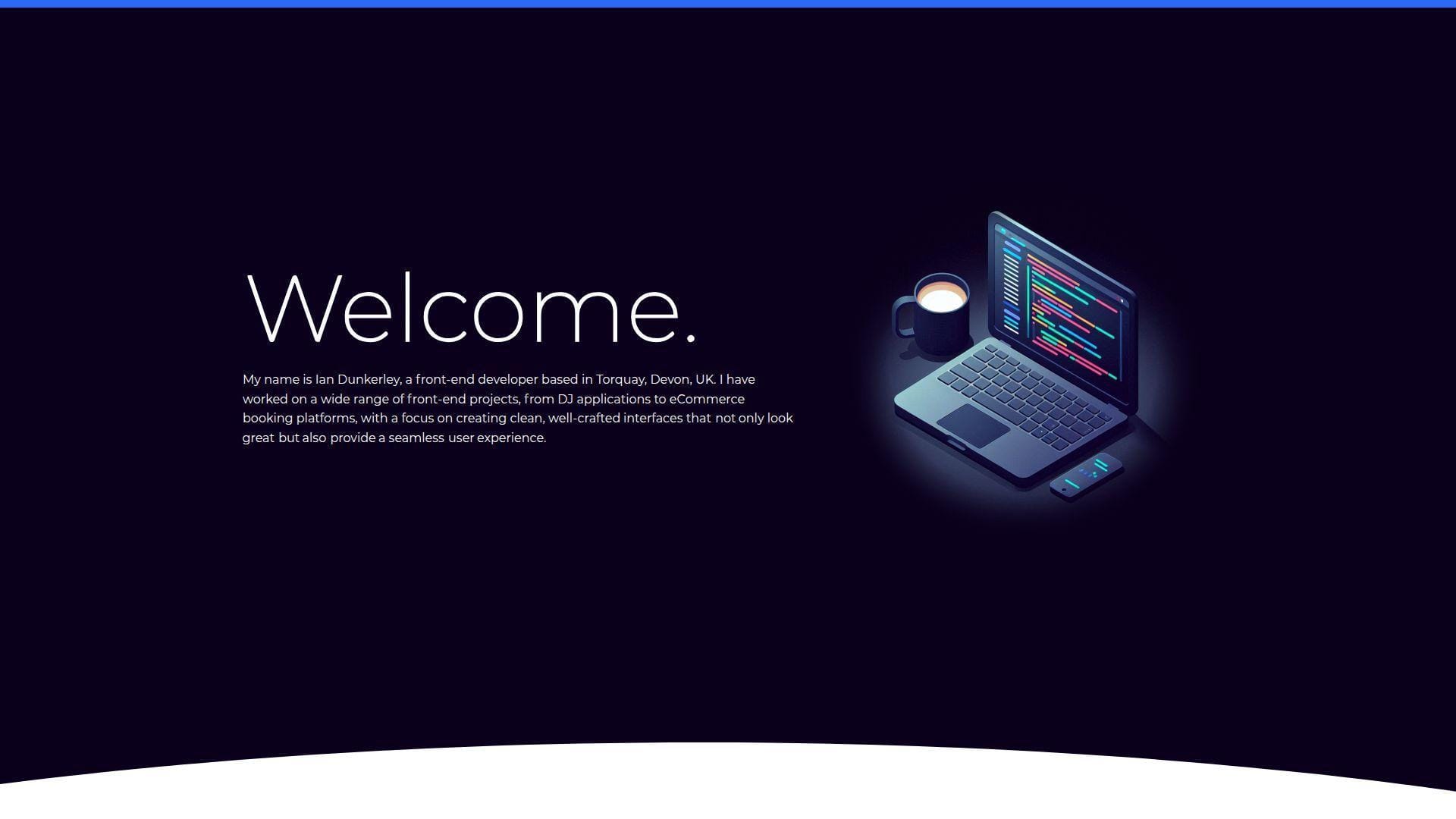
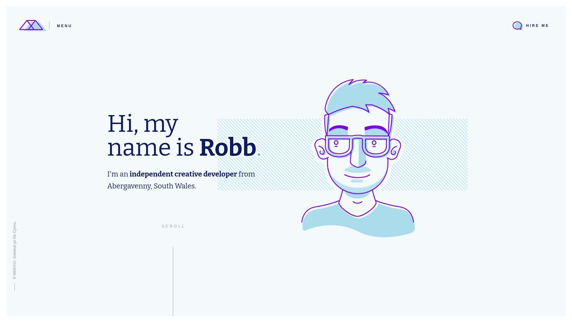
4. Ian Dunkerley
Ian Dunkerley’s portfolio feels like a seasoned maker showing receipts. The tone suggests confidence without shouting. It’s a helpful model for “quietly impressive” positioning.
Tagline: Let craft do the talking, then guide the reader anyway.
Best for: senior frontend engineers; freelancers who want credibility without gimmicks.
- Clear project framing → stakeholders grasp your role in under two minutes.
- Practical outbound paths → saves 1–2 steps to reach demos or contact.
- Low-friction reading experience → time-to-first-value is about 60–120 seconds.
Pricing & limits: From $0/mo. Trial: none, since it’s open. Limits: no explicit caps, but any media-heavy sections can load slower on weak networks.
Honest drawbacks: A conservative approach can feel less memorable in a crowded stack. If you need flashy motion, this may under-serve that goal.
Verdict: If you want “trusted engineer” energy, this helps you land shortlists within a week of applications. Beats experimental sites on clarity; trails them on surprise.
Score: 4.1/5
5. Patrick David
Patrick David’s portfolio carries studio confidence, even when viewed as an individual site. The presentation prioritizes impact and craft. You get a sense of taste quickly.
Tagline: Make your work feel premium before anyone reads a resume.
Best for: creative developers; devs applying to design-forward product teams.
- Impact-first presentation → reviewers see outcomes before implementation details.
- Fast routes to proof → saves 2–3 “where’s the demo?” questions.
- Strong visual hierarchy → time-to-first-value is about 45–90 seconds.
Pricing & limits: From $0/mo. Trial: none, since it’s public. Limits: no sign-up, but high-fidelity visuals can tax older browsers.
Honest drawbacks: If you need deep technical writing, visuals alone may not close the deal. Some teams prefer plain, fast, and searchable pages.
Verdict: If you want to look like the “polish” hire, this helps you signal that in one visit. Beats barebones GitHub pages on perception; trails blog-heavy sites on teaching.
Score: 4.1/5
6. Brittany Chiang
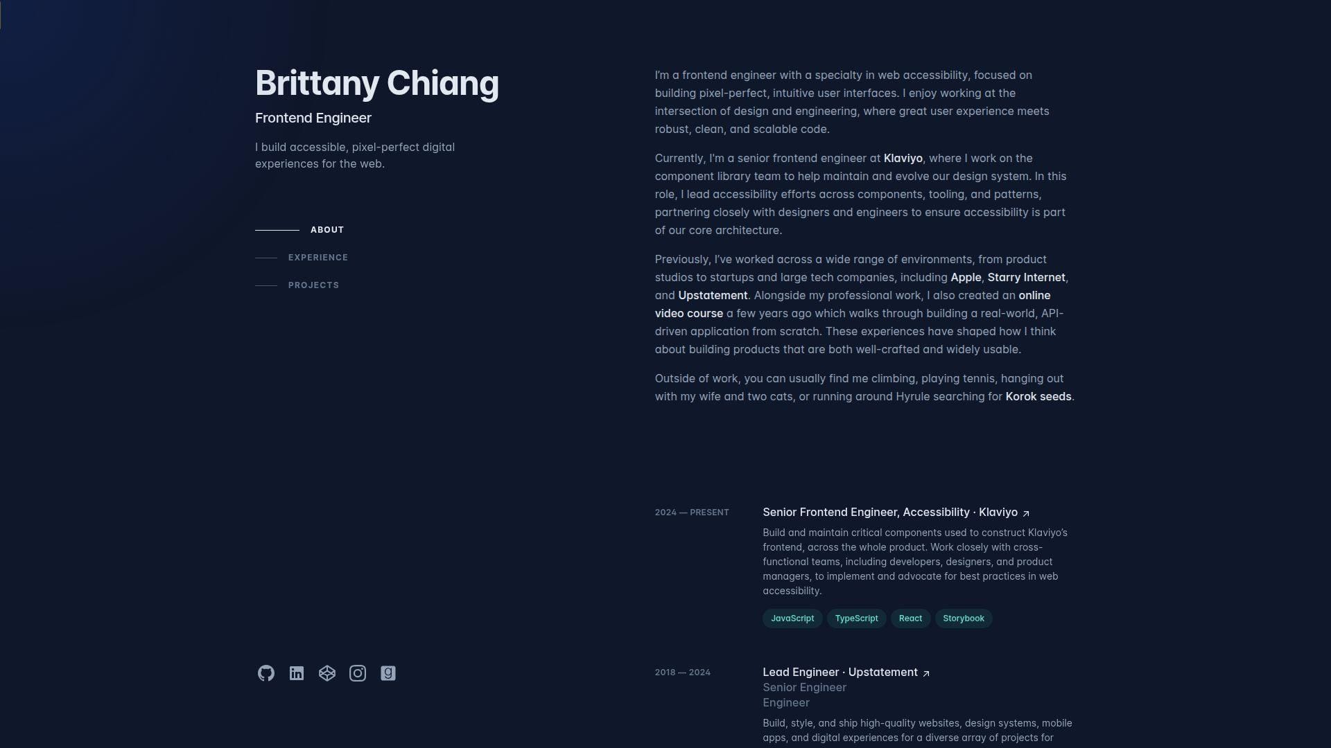
Brittany Chiang’s portfolio is a masterclass in clean, developer-friendly clarity. The site reads like a well-structured README for a human. It respects the visitor’s time and attention.
Tagline: Ship a portfolio that recruiters can scan and trust.
Best for: early-to-mid frontend engineers; job seekers targeting product companies.
- Simple sectioning → hiring teams find skills, work, and contact fast.
- Clear outbound links → saves 2 steps when verifying code and experience.
- Low learning curve → time-to-first-value is about 30–60 seconds.
Pricing & limits: From $0/mo. Trial: none, since it’s open. Limits: no usage caps, but your “limit” is how much detail you choose to write.
Honest drawbacks: The popular structure can feel familiar if copied too closely. If you need a standout “wow,” you must add personality elsewhere.
Verdict: If you want a dependable portfolio that converts scans into interviews, this helps you do it in one afternoon of content work. Beats many flashy sites on speed; trails immersive sites on memorability.
Score: 4.4/5
7. Matt Farley
Matt Farley’s portfolio feels like a friendly studio front desk. The voice is approachable, and the structure is easy to borrow. It balances personality with straightforward proof.
Tagline: Make it simple to believe you, then make it easy to contact you.
Best for: freelancers; generalist developers who juggle design, build, and delivery.
- Service-and-work framing → prospects self-qualify without a discovery call.
- Clean paths to examples → saves 5–10 minutes of explanation per lead.
- Comfortable reading rhythm → time-to-first-value is about 60–90 seconds.
Pricing & limits: From $0/mo. Trial: none, since it’s public. Limits: no seats, no usage caps, but long pages can feel dense if overstuffed.
Honest drawbacks: If you want a “cutting-edge” vibe, this is intentionally grounded. Some teams may want more technical depth or architecture detail.
Verdict: If you want steady inbound and fewer confusing leads, this helps you set expectations in one visit. Beats sparse portfolios at warmth; trails highly technical sites on deep proof.
Score: 4.3/5
8. Lauren Waller
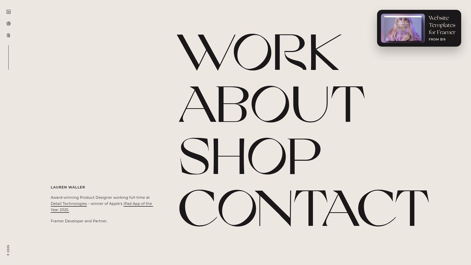
Lauren Waller’s portfolio presents like a composed creative practice. The site aims for confidence, not clutter. You can study it for pacing, restraint, and deliberate emphasis.
Tagline: Put a calm frame around sharp work.
Best for: devs who collaborate closely with designers; creatives who need a polished first impression.
- Curated selection → visitors focus on best work, not everything you’ve done.
- Direct proof links → saves 1–2 context switches per project review.
- Easy-to-read layout → time-to-first-value is about 60–120 seconds.
Pricing & limits: From $0/mo. Trial: none, since it’s public. Limits: no explicit caps, but rich media can slow loading on mobile.
Honest drawbacks: Minimal text can under-explain your role in team projects. If you need to prove leadership, add process and decisions.
Verdict: If you want a portfolio that feels art-directed, this helps you look “ready” in one scroll session. Beats loud sites at calm credibility; trails long-form case studies on detail.
Score: 4.1/5
9. Alex Calia
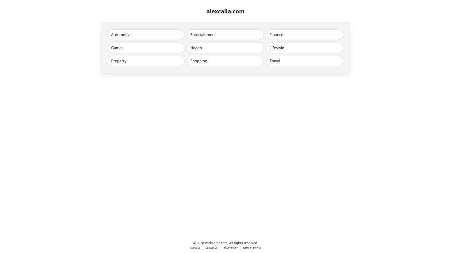
Alex Calia’s portfolio signals focus and strong taste. The structure favors scanning, yet it still leaves room for personality. It’s a solid reference for “simple, but not bland.”
Tagline: Cut the noise so the work lands.
Best for: developers applying to mid-size product teams; freelancers who want fewer, better leads.
- Clear content hierarchy → reviewers find key projects without hunting.
- Fast access to artifacts → saves 2–3 clicks per verification loop.
- Low friction navigation → time-to-first-value is about 45–75 seconds.
Pricing & limits: From $0/mo. Trial: none, since it’s open. Limits: none in principle, but over-animated sections can reduce perceived speed.
Honest drawbacks: If your work needs heavy context, minimal layouts can flatten it. Some hiring loops want measurable outcomes, not just visuals.
Verdict: If you want a clean portfolio that supports quick “yes” decisions, this helps you get there in a single edit pass. Beats messy multi-page sites at focus; trails educational blogs on depth.
Score: 4.2/5
10. Olaolu Olawuyi
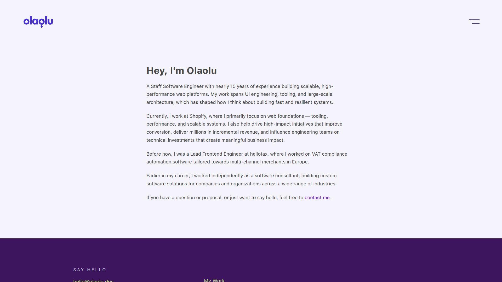
Olaolu Olawuyi’s portfolio reads like a developer who ships and communicates. The presence often blends work with writing or community energy. That mix builds trust fast.
Tagline: Prove you can build, then prove you can explain.
Best for: developer advocates; engineers who want roles with visibility and leadership.
- Content plus projects → hiring teams see range in under three minutes.
- Strong ecosystem signals → saves 10 minutes of “does this person share?” checking.
- Skimmable structure → time-to-first-value is about 60–90 seconds.
Pricing & limits: From $0/mo. Trial: none, since it’s public. Limits: no caps, but deeper content requires good information architecture.
Honest drawbacks: A content-heavy footprint can distract from core portfolio proof. If the goal is strict product engineering, keep outcomes front and center.
Verdict: If you want roles where influence matters, this helps you look credible within one hiring screen. Beats project-only sites at authority; trails minimal sites on pure speed.
Score: 4.4/5
11. Adenekan Wonderful
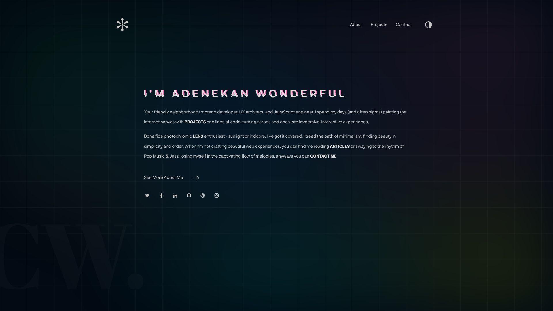
Adenekan Wonderful’s portfolio presents like a focused personal brand. The naming alone suggests intent, not accident. You can study it for how to frame work as a “world,” not a folder.
Tagline: Turn your portfolio into a clear promise with proof attached.
Best for: early-career frontend developers; builders who want a memorable identity.
- Brand-forward framing → reviewers recall you after a stack of similar candidates.
- Clear paths to external proof → saves 2–3 minutes per reviewer.
- Simple navigation patterns → time-to-first-value is about 60–100 seconds.
Pricing & limits: From $0/mo. Trial: none, since it’s open. Limits: no formal caps, but too many projects can dilute impact.
Honest drawbacks: Strong branding can feel “too much” for conservative teams. If the copy is thin, the brand promise may outgrow the evidence.
Verdict: If you want to be remembered while staying readable, this helps you do both in one pass. Beats generic templates at identity; trails long case studies on detailed role clarity.
Score: 4.3/5
12. Gift Egwuenu
Gift Egwuenu’s portfolio carries the feel of a builder who also teaches. The presence tends to center clarity and communication. That combination makes teams feel safer hiring you.
Tagline: Show your work, then show your thinking.
Best for: devrel and community-facing engineers; senior-leaning generalists with a public voice.
- Authority through explanation → hiring teams trust your decisions faster.
- Strong ecosystem touchpoints → saves 5–10 minutes of background verification.
- Clear content scaffolding → time-to-first-value is about 60–120 seconds.
Pricing & limits: From $0/mo. Trial: none, since it’s public. Limits: no explicit caps, but content needs ongoing maintenance to stay sharp.
Honest drawbacks: If you dislike public writing, this style is hard to imitate. Content sprawl can bury the best projects if not curated.
Verdict: If you want to be hired for both output and clarity, this helps you signal that within one visit. Beats project-only portfolios at trust; trails ultra-minimal sites on speed.
Score: 4.3/5
13. Adham Dannaway
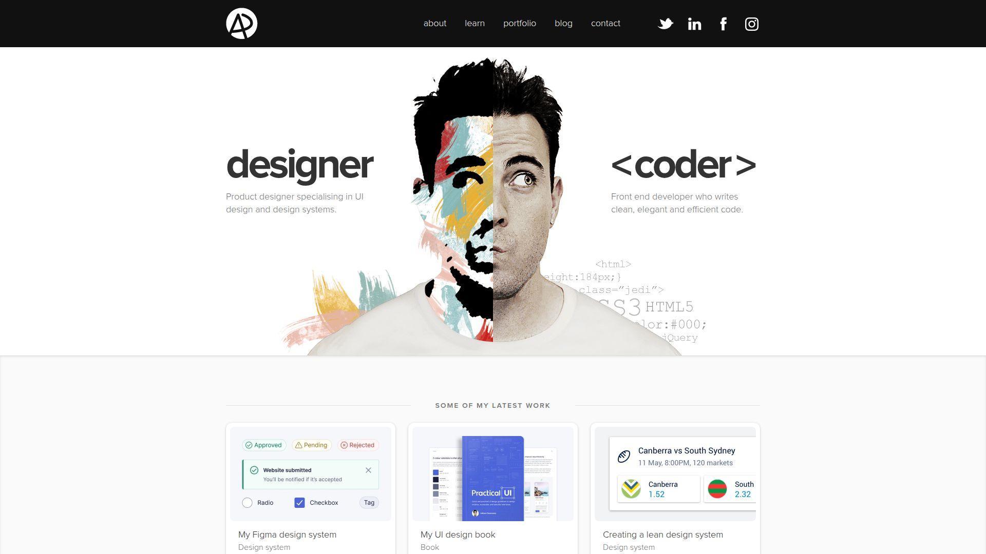
Adham Dannaway’s portfolio is often cited because it commits to a concept. The presentation feels designed, not merely assembled. You can learn a lot about contrast and role clarity here.
Tagline: Make your dual skillset instantly legible.
Best for: dev-design hybrids; frontend engineers applying to UX-sensitive teams.
- Concept-driven layout → visitors understand your positioning in under one minute.
- Clear proof routing → saves 2 steps when validating work quality.
- Strong visual cues → time-to-first-value is about 45–90 seconds.
Pricing & limits: From $0/mo. Trial: none, since it’s open. Limits: no caps, but concept layouts can be harder to keep updated.
Honest drawbacks: A strong motif can age if not maintained. Some recruiters prefer conventional sections and simple scrolling.
Verdict: If you need to communicate “I do both,” this helps you do it before a cover letter is read. Beats generic one-pagers at differentiation; trails blog-first sites on ongoing depth.
Score: 4.2/5
14. Ram Maheshwari
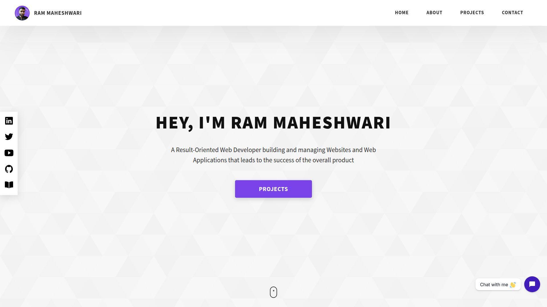
Ram Maheshwari’s portfolio feels like a direct conversation with a hiring manager. The choices favor readability and quick proof. It’s a useful reference for straightforward, modern portfolio structure.
Tagline: Reduce doubt with clear proof and clean presentation.
Best for: engineers job hunting in product; developers who want a no-drama, high-signal site.
- Role-and-impact framing → reviewers understand scope without reading every line.
- Easy access to external artifacts → saves 2–3 minutes of verification.
- Predictable navigation → time-to-first-value is about 45–75 seconds.
Pricing & limits: From $0/mo. Trial: none, since it’s public. Limits: no formal caps, but too many sections can dilute the headline message.
Honest drawbacks: Clean patterns can feel interchangeable if you copy them verbatim. Without sharp project writing, the site may read like a checklist.
Verdict: If you want a portfolio that supports fast screening decisions, this helps you earn interviews in one application batch. Beats over-designed sites on clarity; trails immersive sites on novelty.
Score: 4.2/5
15. Kenneth Jimmy
Kenneth Jimmy’s portfolio suggests a builder who values structure. The site aims to make competence obvious quickly. As a study piece, it’s strong for hierarchy and “what matters first.”
Tagline: Make the yes easy by making the proof obvious.
Best for: junior-to-mid developers; engineers who want a clean personal site without overthinking.
- Scannable project summaries → visitors grasp value without opening five tabs.
- Clear outbound links → saves 2 steps to validate code and results.
- Simple reading flow → time-to-first-value is about 60–90 seconds.
Pricing & limits: From $0/mo. Trial: none, since it’s open. Limits: no usage caps, but thin case studies can weaken credibility.
Honest drawbacks: If you’re applying for highly competitive roles, you may need richer metrics and context. Minimal styling can feel less memorable in crowded pipelines.
Verdict: If you want a clean baseline portfolio done right, this helps you ship it in a weekend. Beats messy multi-page portfolios at focus; trails essay-style sites on deep narrative.
Score: 4.2/5
16. Edewor Onyedika
Edewor Onyedika’s portfolio presents like a practical, builder-first site. It favors clarity over spectacle. That’s a good lesson when your goal is hiring, not applause.
Tagline: Show capability with minimal friction.
Best for: software engineers applying broadly; developers who want a simple, credible web presence.
- Direct project listing → reviewers find relevant work without extra scrolling.
- Quick verification routes → saves 2–3 minutes per reviewer on average.
- Easy mental model → time-to-first-value is about 60–100 seconds.
Pricing & limits: From $0/mo. Trial: none, since it’s public. Limits: no caps, but a short portfolio can feel light without strong writing.
Honest drawbacks: Conservative presentation may not stand out in design-heavy roles. If you want premium clients, you may need stronger visual polish.
Verdict: If you want a reliable portfolio that doesn’t get in its own way, this helps you look credible in one screening pass. Beats chaotic sites at readability; trails high-concept sites on memorability.
Score: 4.1/5
17. Seán Halpin
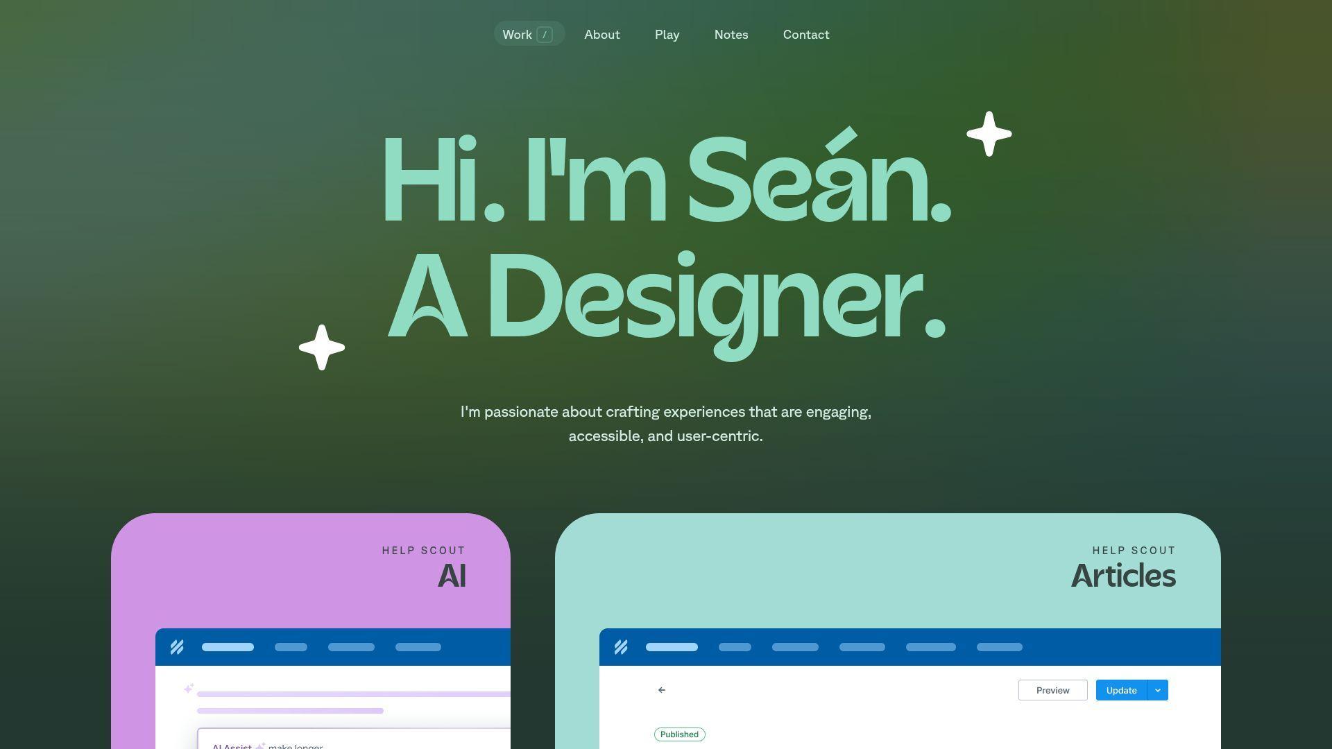
Seán Halpin’s portfolio is a classic reference for calm, personable presentation. The tone feels human. The structure feels considerate. It’s a strong reminder that “simple” can still be premium.
Tagline: Make your work feel approachable and trustworthy.
Best for: freelancers; dev-design generalists who want a warm, confident presence.
- Friendly storytelling → prospects feel comfortable reaching out sooner.
- Clear contact pathways → saves 1–2 steps to start a conversation.
- Low cognitive load → time-to-first-value is about 60–90 seconds.
Pricing & limits: From $0/mo. Trial: none, since it’s open. Limits: no usage caps, but overly minimal pages can under-prove technical depth.
Honest drawbacks: If you target highly technical roles, you may need more hard evidence. A classic style can feel less “current” without small updates.
Verdict: If you want to feel like a safe pair of hands, this helps you do that in one visit. Beats edgy portfolios on warmth; trails code-heavy sites on technical granularity.
Score: 4.2/5
18. Maxime Bonhomme
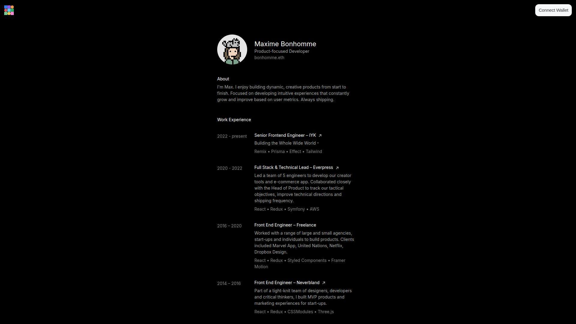
Maxime Bonhomme’s portfolio leans playful and experimental. The tone suggests a maker who enjoys the medium. That energy can be a competitive advantage, if your target work rewards it.
Tagline: Make experimentation feel like a professional skill.
Best for: creative developers; engineers targeting agencies, studios, or interactive storytelling teams.
- Bold visual identity → visitors remember you after one browse session.
- Interactive proof moments → saves 5 minutes of “what do you mean?” explanation.
- Quick immersion → time-to-first-value is about 30–60 seconds.
Pricing & limits: From $0/mo. Trial: none, since it’s public. Limits: performance varies by device, and some users prefer reduced motion.
Honest drawbacks: The style can be polarizing for conservative enterprise hiring loops. If you copy this approach, you must still keep work scannable.
Verdict: If you want to signal creative range fast, this helps you do it within one minute of arrival. Beats many standard sites at personality; trails minimal sites on recruiter speed.
Score: 4.1/5
19. Jesse Zhou

Jesse Zhou’s portfolio reads like a focused professional presence. It aims for clarity and credibility first. You can study it for structure choices that reduce confusion during screening.
Tagline: Make your best work easy to find and easy to believe.
Best for: software engineers interviewing regularly; developers who want a clean, modern personal site.
- Project-first organization → reviewers locate relevant examples without guessing.
- Fast paths to proof → saves 2–3 clicks during a quick evaluation.
- Predictable layout → time-to-first-value is about 60–90 seconds.
Pricing & limits: From $0/mo. Trial: none, since it’s open. Limits: no caps, but weak project descriptions can make strong work look average.
Honest drawbacks: If your differentiator is personality, you may need more voice. A clean style can blend in if the work isn’t sharply framed.
Verdict: If you want a portfolio that supports fast shortlisting, this helps you get there in one editing weekend. Beats cluttered sites on signal; trails concept portfolios on uniqueness.
Score: 4.2/5
20. Edward Hinrichsen
Edward Hinrichsen’s portfolio feels engineered for quick understanding. The presentation tends to favor concise proof. It’s a good model when you want “professional, modern, and readable.”
Tagline: Make competence obvious, then let curiosity do the rest.
Best for: frontend and full-stack engineers; candidates applying to fast-moving startups.
- Concise project summaries → reviewers understand impact without long reading.
- External proof touchpoints → saves 2 steps when validating claims.
- Quick scan experience → time-to-first-value is about 45–80 seconds.
Pricing & limits: From $0/mo. Trial: none, since it’s public. Limits: no usage caps, but overly brief pages can under-sell complex work.
Honest drawbacks: If you need to show leadership and collaboration, add more narrative. A tight layout can feel impersonal without a clear voice.
Verdict: If you want a portfolio that supports rapid screening, this helps you look organized in a single visit. Beats chaotic portfolios at clarity; trails writing-led sites on depth.
Score: 4.2/5
21. Cyd Stumpel
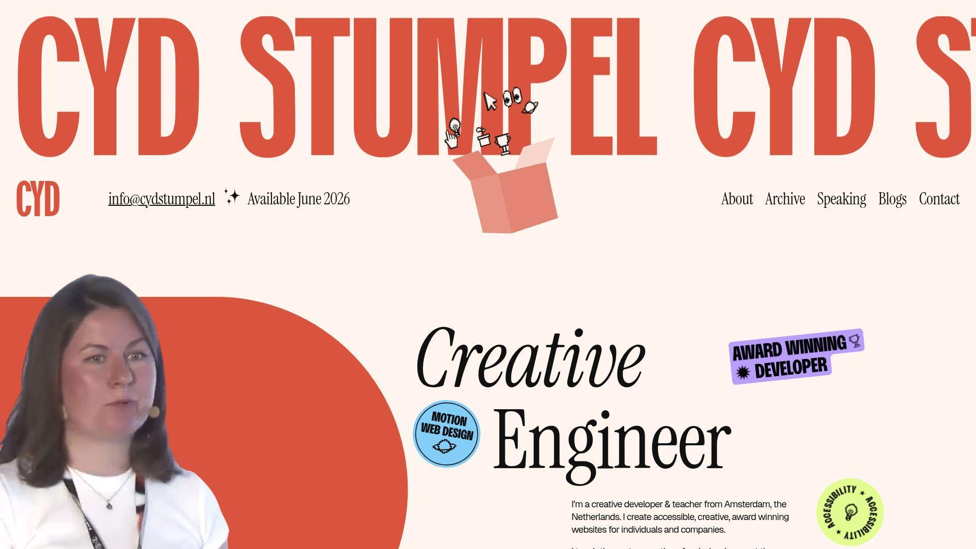
Cyd Stumpel’s portfolio tends to emphasize craft and interaction. The overall feel signals a designer’s eye with developer execution. It’s useful study material for playful, controlled motion.
Tagline: Show polish that feels intentional, not decorative.
Best for: creative frontend developers; devs applying to design-led teams.
- Motion that guides attention → viewers notice key work without being told.
- Strong proof routing → saves 2–3 minutes in early-stage evaluation.
- Quick immersion → time-to-first-value is about 40–70 seconds.
Pricing & limits: From $0/mo. Trial: none, since it’s open. Limits: motion and effects can reduce performance on older devices.
Honest drawbacks: If your audience is accessibility-first, you must provide strong reduced-motion behavior. Some recruiters prefer plain text and fast searchability.
Verdict: If you want to communicate “taste plus execution,” this helps you do it in a single scroll. Beats static grids on delight; trails simple portfolios on raw speed.
Score: 4.1/5
22. Tamal Sen
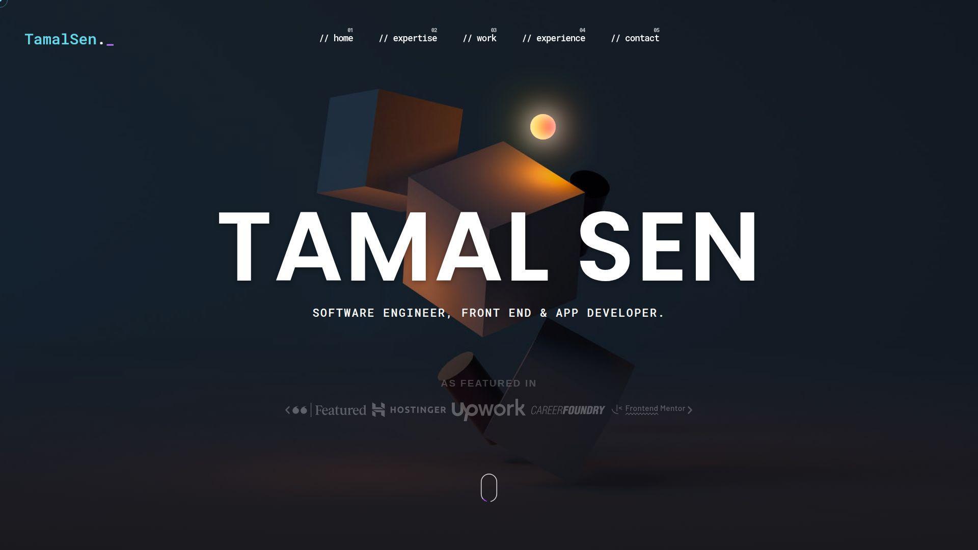
Tamal Sen’s portfolio presents like a developer who values clarity and delivery. The structure is typically easy to follow. As a reference, it’s strong for organizing work without clutter.
Tagline: Make your projects legible to non-technical readers.
Best for: engineers interviewing at startups; solo developers who need a clean “about + work” site.
- Clear project framing → visitors understand the “why” without extra calls.
- Direct proof links → saves 2 steps in code and demo verification.
- Low-friction navigation → time-to-first-value is about 60–90 seconds.
Pricing & limits: From $0/mo. Trial: none, since it’s public. Limits: no caps, but weak thumbnails or titles can hide strong work.
Honest drawbacks: A straightforward style can feel less distinctive. If you want premium perception, invest in sharper writing and visual hierarchy.
Verdict: If you want a clean portfolio that helps you pass initial screens, this helps you get there within one editing session. Beats cluttered sites on readability; trails concept-heavy sites on uniqueness.
Score: 4.2/5
23. Dustin Brett
Dustin Brett’s portfolio is a strong reminder that theme can be strategy. The experience leans into a bold interface concept. That choice makes the visit feel like an event, not a task.
Tagline: Make your portfolio an experience people talk about.
Best for: creative technologists; developers targeting interactive and experiential web roles.
- Interface-as-storytelling → visitors explore longer and remember more details.
- Clear internal pathways → saves 2–3 steps once users learn the pattern.
- High novelty on entry → time-to-first-value is about 30–60 seconds.
Pricing & limits: From $0/mo. Trial: none, since it’s open. Limits: heavy UI concepts can be slower on mobile, and not every reviewer will engage.
Honest drawbacks: Some recruiters want “scan in 20 seconds,” and this resists that. If you copy the idea, you must still keep contact and proof easy.
Verdict: If you want to be remembered in creative pipelines, this helps you stand out the same day. Beats minimalist sites on memorability; trails them on instant scannability.
Score: 4.2/5
24. Cassie Codes
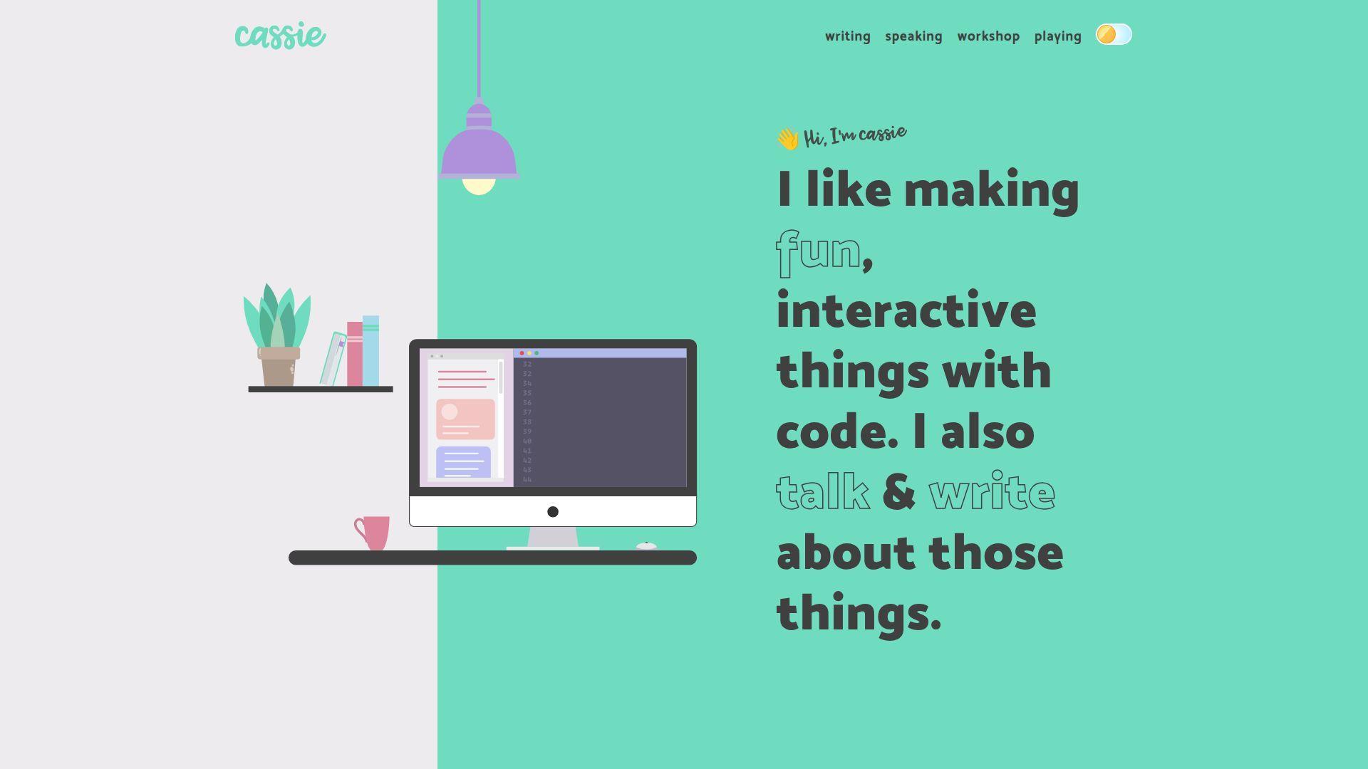
Cassie Codes feels like a builder with a teacher’s instincts. The portfolio presence often balances demos with explanation. That pairing builds trust, because the work is both visible and understandable.
Tagline: Teach through doing, and let the proof sell you.
Best for: frontend specialists; developers who want to be hired for animation and interaction.
- Demo-forward presentation → viewers see capability without reading a wall of text.
- Shareable examples and touchpoints → saves 10 minutes of “can you show more?” requests.
- Friendly learning curve → time-to-first-value is about 45–90 seconds.
Pricing & limits: From $0/mo. Trial: none, since it’s public. Limits: no caps, but maintaining many demos can require ongoing upkeep.
Honest drawbacks: A demo-heavy identity can pigeonhole you if you want general roles. Some hiring loops undervalue creative frontend unless outcomes are stated clearly.
Verdict: If you want to be hired for interactive craft, this helps you prove it within one browsing session. Beats many portfolios at teachability; trails strict case studies on business metrics.
Score: 4.4/5
25. Jhey Tompkins
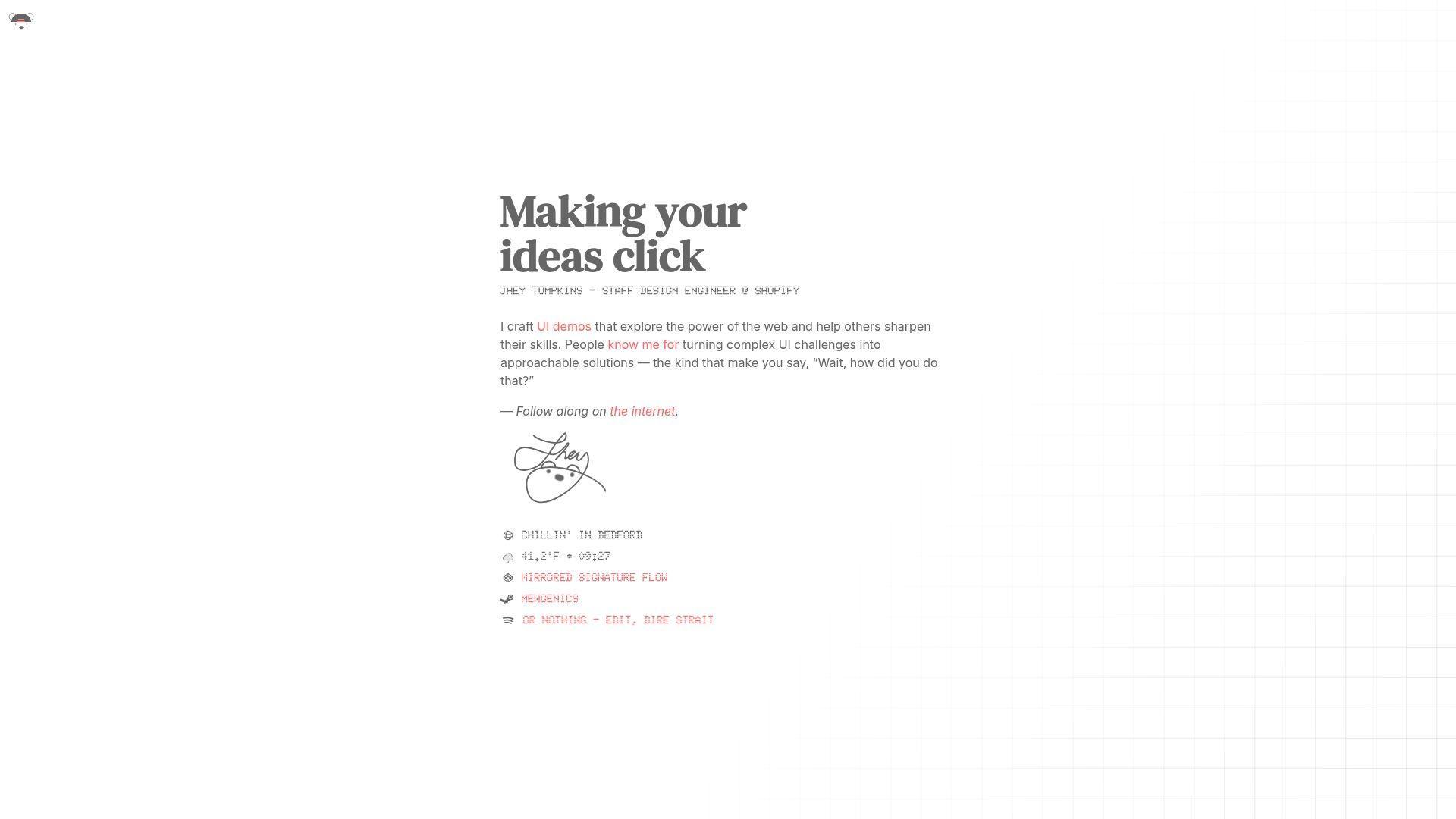
Jhey Tompkins’ portfolio presence is known for bold, playful frontend craft. The work often feels like a lab of sharp experiments. As study material, it’s great for modern CSS thinking and motion taste.
Tagline: Make small demos feel like big proof.
Best for: CSS specialists; frontend engineers aiming for creative, performance-aware teams.
- Experiment-led proof → reviewers understand your strengths in under two minutes.
- Strong ecosystem signals → saves 5–10 minutes of background validation.
- Immediate craft payoff → time-to-first-value is about 30–60 seconds.
Pricing & limits: From $0/mo. Trial: none, since it’s open. Limits: no caps, but many experiments can overwhelm visitors without curation.
Honest drawbacks: If you want enterprise roles, you may need more “product UI” examples. Animation-heavy work can feel less accessible if reduced-motion isn’t emphasized.
Verdict: If you want to prove you can push the platform, this helps you do it in minutes, not paragraphs. Beats generic job-hunt sites on originality; trails straightforward portfolios on recruiter speed.
Score: 4.3/5
26. Rob Bowen
Rob Bowen’s portfolio reads like a practical professional presence with personality. The structure generally supports scanning. It’s a useful reference when you want simple clarity with a bit of spark.
Tagline: Make it easy to trust you, then make it easy to reach you.
Best for: product-focused frontend engineers; freelancers who need a clean credibility page.
- Clear project selection → visitors see your range without drowning in links.
- Quick proof touchpoints → saves 2–3 clicks during verification.
- Comfortable UX patterns → time-to-first-value is about 60–90 seconds.
Pricing & limits: From $0/mo. Trial: none, since it’s open. Limits: no usage caps, but too little context can weaken team-project stories.
Honest drawbacks: If your work is complex, short summaries may not be enough. A safe layout may not differentiate you in design-heavy competitions.
Verdict: If you want a portfolio that supports fast screening and steady trust, this helps you get there in one content sprint. Beats messy pages on readability; trails concept sites on surprise.
Score: 4.2/5
27. Josh Comeau
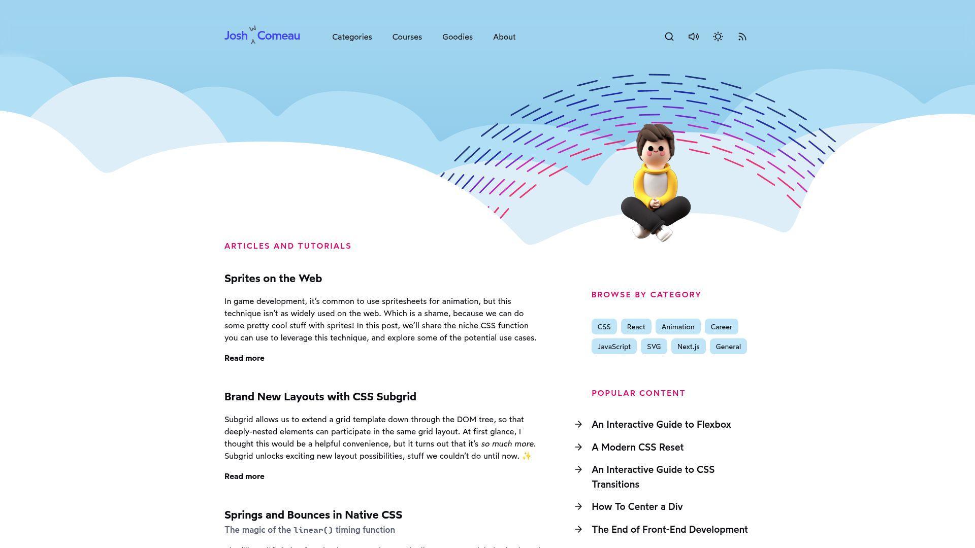
Josh Comeau’s site feels like a small media company built by one engineer. The presentation blends writing, teaching, and product-level UX polish. It’s a benchmark for trust, clarity, and long-term audience building.
Tagline: Turn explanation into authority, then turn authority into opportunity.
Best for: developers who write; engineers building a long-term personal brand and inbound pipeline.
- Deep, structured learning content → readers trust you before they contact you.
- Ecosystem strength and discoverability → saves hours of “prove yourself” effort over time.
- Excellent reading UX → time-to-first-value is about 60 seconds for trust.
Pricing & limits: From $0/mo to browse public pages. Trial: none for the free content. Limits: deeper offerings may be paid, and long-form content demands consistent upkeep.
Honest drawbacks: This model is a marathon, not a weekend build. If you hate writing, copying the approach will feel like punishment.
Verdict: If you want compounding career leverage, this helps you build trust that pays off within months. Beats most portfolios at authority; trails quick one-pagers on setup speed.
Score: 4.7/5
28. Lynn Fisher
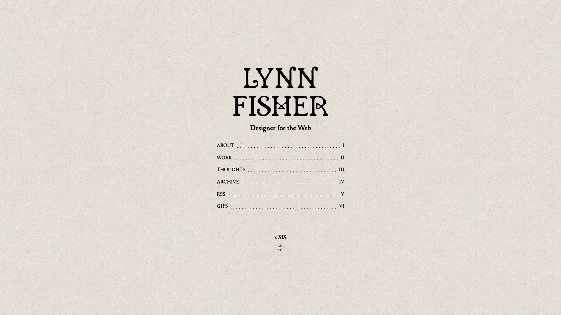
Lynn Fisher’s portfolio presence is famous for experiments and playful constraint. The work often feels like a series of clever challenges. As a reference, it’s excellent for originality and “small idea, big impact.”
Tagline: Make curiosity your differentiator.
Best for: creative frontend developers; engineers who want roles in playful, brand-forward teams.
- Experiment catalog framing → visitors remember your approach, not just outputs.
- Shareable demos → saves 10 minutes of explanation and earns organic sharing.
- Immediate novelty → time-to-first-value is about 30–60 seconds.
Pricing & limits: From $0/mo. Trial: none, since it’s public. Limits: experiments can be hard to summarize, and some require modern browser support.
Honest drawbacks: If hiring managers want business outcomes, you must translate experiments into skills. A lab-style portfolio can feel less “product” without context.
Verdict: If you want to stand out through creative thinking, this helps you do it within one scroll session. Beats standard project grids at uniqueness; trails case studies on measurable impact.
Score: 4.2/5
29. Anurag Hazra
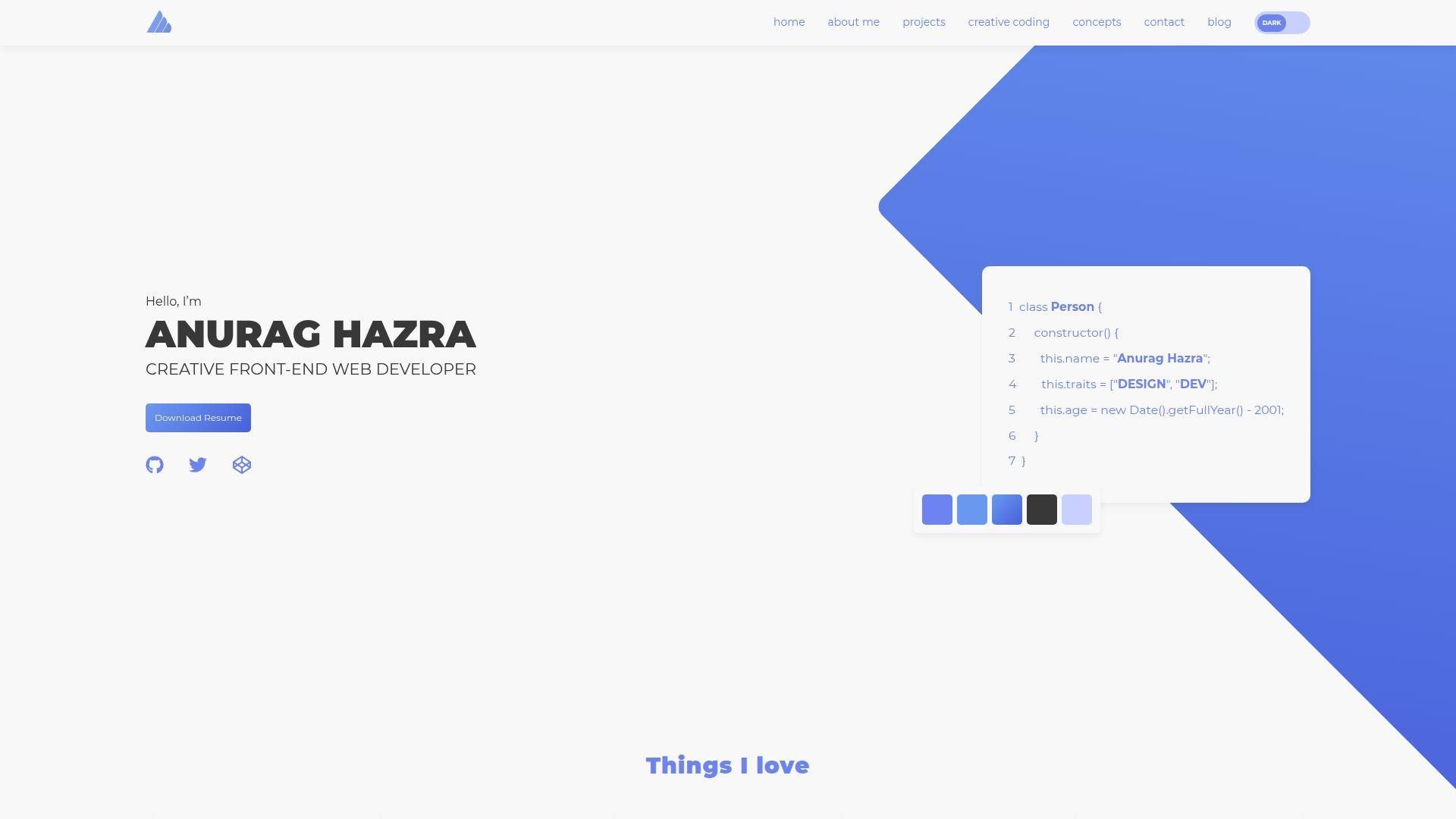
Anurag Hazra’s portfolio presence is tightly tied to open-source energy. The impression is “builder with receipts.” It’s strong study material for how to leverage ecosystem signals without sounding salesy.
Tagline: Let open source act as your always-on reference check.
Best for: open-source maintainers; developers who want credibility through public work.
- Proof-through-output positioning → reviewers trust skill faster than with private screenshots.
- Ecosystem visibility hooks → saves 10–15 minutes of portfolio verification time.
- Direct, no-fluff presentation → time-to-first-value is about 45–75 seconds.
Pricing & limits: From $0/mo. Trial: none, since it’s open. Limits: public repos can invite scrutiny, and maintaining them takes ongoing effort.
Honest drawbacks: If your best work is proprietary, this model may under-represent you. Some teams still want polished case studies and collaboration stories.
Verdict: If you want “credible by default” through public building, this helps you earn trust within one review loop. Beats closed portfolios at verifiability; trails narrative case studies on context.
Score: 4.5/5
30. Lucas Regazzi
Lucas Regazzi’s portfolio presents as a clean, professional engineering homepage. The structure tends to support quick scanning and low-friction proof. It’s a solid reference when you want modern, readable, and focused.
Tagline: Keep the message simple, and let the work carry weight.
Best for: software engineers applying to product roles; developers who want a fast, credible portfolio baseline.
- Clear project framing → reviewers understand relevance without extra questions.
- Easy proof access → saves 2–3 clicks in a typical screening pass.
- Simple UX patterns → time-to-first-value is about 60–90 seconds.
Pricing & limits: From $0/mo. Trial: none, since it’s public. Limits: no usage caps, but thin writing can hide impact and ownership.
Honest drawbacks: If you need strong differentiation, you must add voice or sharper positioning. A clean template-like approach can blend in without standout projects.
Verdict: If you want a portfolio that helps you pass screens with less friction, this helps you get there in a weekend. Beats cluttered pages on focus; trails high-concept portfolios on memorability.
Score: 4.2/5
Must-have sections for building your own web developer portfolio
1. Hero intro: who you are, what you build, and who you build it for
First impressions should remove ambiguity. Say what you build, for whom, and why you’re credible.
Strong heroes avoid buzzwords and name the domain. “Design systems,” “ecommerce,” or “developer tools” beats “passionate creator.”
From a conversion angle, the hero also sets the CTA. Make the next click obvious.
2. About page that feels human: values, interests, and short “fun facts”
Human context helps teams imagine working with you. Values are a proxy for how you handle conflict.
Good “About” pages balance warmth with precision. They include a short bio, then supporting details for skimmers.
We like a small “working style” section. It reduces mismatched expectations before interviews begin.
3. Skills and tech stack with context (not just a keyword list)
A keyword list is easy to fake. Context is harder, and that’s why it’s persuasive.
Pair each skill with a short “where it shows up.” Mention the project type, the constraint, and your decision.
For infrastructure skills, include the boring bits. Caching, DNS, and observability often separate seniors from juniors.
4. Projects index that’s easy to scan (cards, tags, and clear titles)
The projects index is your storefront. It should be scannable like a product shelf.
Clear titles beat clever names. Add short tags that reflect outcomes, not only frameworks.
We recommend limiting the initial grid. Too many cards can signal a lack of curation.
5. Project detail pages with goals, constraints, and what you delivered
Case studies are where you prove judgment. They reveal how you choose tradeoffs under real constraints.
Great pages start with the goal, then the constraints. Only then do they explain implementation choices.
Delivery should be concrete. “Shipped a redesign” is weaker than “improved checkout clarity and reduced support tickets.”
6. Multiple ways to validate work: live link, repository link, and demo link
Validation reduces skepticism. Give visitors multiple paths to confirm the work is real.
A live link shows craft. A repository shows how you structure thinking and change.
Demos help when a project is private. Short screen recordings can substitute for source visibility.
7. Resume/CV access (including a downloadable version when appropriate)
Some hiring flows still require a resume file. Ignoring that reality can cost you easy wins.
We recommend a readable web version first. Then provide a downloadable copy for forms and recruiters.
Keep the resume consistent with the portfolio. Contradictions create needless doubt.
8. Blog or writing section to show thinking, teaching, and consistency
Writing is a force multiplier for credibility. It shows you can teach, document, and lead.
Strong writing sections highlight a few cornerstone posts. They also show recency through a simple archive.
We like “notes” formats too. Short, frequent posts can beat rare, perfect essays.
9. Testimonials and social proof (clients, teams, or collaborators)
Testimonials should be specific and attributable. Anonymous praise reads like marketing copy.
Ask collaborators for a short note about your role. Good quotes mention how you work, not just output.
If you lack testimonials, use artifacts. Pull requests, talks, or public docs can serve a similar role.
10. Contact page plus a frictionless contact form and clear CTA
A contact page is not a formality. It is the bottom of your funnel.
Keep the form short and predictable. Ask for what you need to reply, not what feeds curiosity.
We also suggest a “what happens next” line. It sets response expectations and calms anxious clients.
11. Social links that support hiring decisions (GitHub, LinkedIn, relevant platforms)
Social links should reduce uncertainty. Link to profiles that contain work evidence, not just opinions.
GitHub matters for many engineering roles. LinkedIn helps recruiters verify timeline and titles.
Choose selectively. Too many icons create noise and weaken the narrative you want remembered.
Design and UX patterns seen across standout web developer portfolio examples

1. One-page portfolios vs multi-page portfolios: when each layout wins
One-page layouts work when your story is tight. They reduce navigation decisions and keep momentum.
Multi-page structures win when you have deep case studies. They also scale better as your work grows.
We advise matching layout to audience. Recruiters skim, while hiring managers may explore in depth.
2. Sticky side navigation and split layouts for fast browsing
Sticky navigation supports scanning. It turns long pages into predictable, low-effort exploration.
Split layouts can communicate dual identity well. Designers and developers often use them to show range.
From usability tests we’ve seen, the danger is cramped mobile views. Ensure the pattern collapses cleanly.
3. Large typography + bold contrast to create instant hierarchy
Large type can be a content strategy. It forces you to write fewer, better words.
Bold contrast helps non-technical reviewers parse structure. They see the shape of the page before reading it.
We like when typography choices feel intentional. A clean type scale can be a signature on its own.
4. Clean, minimalist layouts that feel professional and client-friendly
Minimalism is often a trust play. It signals restraint and a bias for clarity.
Client-friendly layouts avoid inside jokes and obscure metaphors. They present work like a business asset.
As hosts, we notice minimal layouts also age better. They survive new content without collapsing visually.
5. Colorful/pastel sectioning to guide attention without clutter
Color sectioning is a navigation tool. It gives memory anchors across scroll depth.
Pastels can keep the mood light while preserving readability. The trick is maintaining contrast for text and buttons.
We recommend testing in different lighting. A palette that works indoors can fail in bright environments.
6. Retro and nostalgia-inspired UI as a brand choice
Retro UI can be a shortcut to personality. It also shows you understand interface history.
The best nostalgic portfolios keep modern usability. They borrow the vibe, not the friction.
We like when retro elements support a story. A developer with game roots can make it feel authentic.
7. 3D scenes and playful navigation as a “show, don’t tell” skill demo
Playful scenes can demonstrate advanced rendering skill. They can also demonstrate interaction design maturity.
Great examples provide quick routes to content. They treat the scene as an invitation, not a gate.
Our operational note is simple. Always include a lightweight mode for slower devices and networks.
8. Pixel art and illustrated elements to create a signature style
Illustration builds brand memory. It makes your site recognizable in a sea of template sameness.
Pixel art works well for developers. It feels adjacent to craft, constraint, and playful precision.
We suggest using illustrations sparingly. A few strong motifs beat a full page of visual noise.
9. Flip cards and animated project tiles to keep dense content digestible
Animated tiles can increase engagement when used carefully. They add just enough delight to encourage a click.
Flip cards should never hide essential information. Titles and roles should remain visible without interaction.
Accessibility matters here. Ensure keyboard focus states and reduced-motion behavior are first-class citizens.
10. Motion design and scroll-triggered animation to add polish
Motion can communicate hierarchy and transitions. It can also hide rough layout decisions, so use it honestly.
Polished portfolios treat motion like typography. It has rhythm, consistency, and clear intent.
We advise measuring performance early. Animation choices can change hosting needs more than most developers expect.
11. Light/dark theme switching as a small but memorable UX detail
Theme switching becomes memorable when it feels integrated. A toggle that matches the brand voice feels “designed.”
Good implementations avoid reflow jank. They also keep images and charts legible across themes.
From a maintenance view, keep theme tokens centralized. Portfolios often break when colors are hard-coded everywhere.
12. Copywriting that sounds like you (and keeps people scrolling)
Copywriting is the hidden layer of UX. It decides whether a visitor trusts you enough to continue.
The best portfolios write like a person, not a product page. They avoid exaggeration and explain what they actually did.
We suggest reading your copy aloud. If it sounds awkward, it will read awkward too.
Project presentation tactics: case studies, demos, and proof of work
1. Show outcomes: what changed because you built it (not just what you used)
Outcomes convert, while tools merely describe. Teams hire for impact, not for a stack bingo card.
When outcomes are confidential, describe the direction. Mention what improved, what simplified, or what became more reliable.
We also like “before and after” narratives. They demonstrate empathy for users and systems.
2. Explain your role clearly (especially for team or client work)
Role clarity prevents misunderstandings in interviews. It also shows professional honesty.
Strong case studies separate responsibilities. They list what you owned and what you influenced.
We recommend stating collaboration style. Mentoring, pairing, and review culture are part of real delivery.
3. Link everything that matters: live sites, repos, demos, and write-ups
Links are trust infrastructure. Each link gives a visitor a way to verify the story.
Keep links consistent across the portfolio. A predictable “View live” and “View code” pattern reduces cognitive load.
From experience, broken links signal neglect. A quick quarterly link audit is worth the small effort.
4. Use screenshots and short media previews to help projects “pop”
Visual previews accelerate understanding. They also help non-technical reviewers evaluate craft quickly.
Use images that show real UI states. Landing-page hero shots alone often hide the complexity.
We recommend compressing media aggressively. Heavy previews can sabotage the very first impression you need.
5. Tell the story behind the build: decisions, tradeoffs, and iterations
Story is where seniority becomes visible. Tradeoffs reveal how you think under pressure.
Great case studies include a “what we would do next” section. It shows humility and continuous improvement.
We also like explicit constraints. Tight deadlines, legacy code, and stakeholder needs are real engineering forces.
6. Make services and availability obvious for freelance-friendly portfolios
Freelance portfolios are sales pages, whether we admit it or not. Availability should be easy to find.
List services in plain language. “Design systems” may mean nothing to a small business owner.
We recommend a simple intake path. A short form and a clear next step keep deals moving.
7. Curate your strongest work first (quality beats quantity)
Ordering is editorial judgment. Put your best work where tired humans will see it first.
Quality-first curation also reduces maintenance. Fewer projects means fewer broken links and fewer stale claims.
We suggest rotating older work out. Archive pages can exist, but don’t lead with them.
8. Use writing-first portfolios when your strength is teaching and explaining
Writing-first portfolios can out-perform flashy sites. They communicate clarity, empathy, and technical depth.
Many hiring managers prefer this format. They can evaluate reasoning without fighting animations.
We advise adding lightweight project snapshots. Even writers benefit from a small “proof of build” section.
9. Keep projects updated so your portfolio stays current and credible
Recency signals seriousness. A stale portfolio feels like an abandoned codebase.
Updating does not require rewrites. Refresh screenshots, fix links, and add a short “what changed” note.
We recommend scheduling maintenance. Treat your portfolio like production, because hiring decisions are production stakes.
Technical checklist for a fast, secure, and hire-ready portfolio site

1. Choose a memorable domain (including developer-friendly extensions)
A memorable domain reduces friction in referrals. People should be able to type it from memory.
Choose a name you can say out loud without spelling. That matters in meetups, podcasts, and interviews.
From a DNS angle, simpler is safer. Fewer records usually means fewer mistakes during migrations.
2. Pick reliable web hosting to keep your portfolio fast and consistently reachable
Reliability is a portfolio feature. A site that times out during review is a silent self-own.
Great hosting choices match the site type. Static sites want global caching, while dynamic sites need stable runtime resources.
We’ve seen candidates lose opportunities from downtime. It’s rarely “fair,” but it is real.
3. Enable HTTPS with an SSL certificate for trust and professionalism
HTTPS is table stakes for trust. Without it, browsers and users assume danger.
SSL also protects form submissions and login flows. Even a simple contact form deserves encryption end to end.
From our side, automation matters. Renewals should be hands-off, because humans forget.
4. Build responsive layouts and test on real mobile devices
Emulators catch many issues, but not all. Real devices reveal tap pain and scroll stutter.
Test the contact flow on mobile. That is the most important path for many portfolios.
We also suggest testing low-power mode. It exposes animation and rendering assumptions quickly.
5. Optimize performance when using heavy visuals, animations, or 3D
Optimization starts with restraint. Ship the smallest experience that communicates the idea.
Use lazy loading and progressive rendering. Show content first, then enhance interaction after.
Our hosting viewpoint is pragmatic. If your site needs special headers or caching rules, document them clearly.
6. Accessibility basics: keyboard navigation, contrast, and readable typography
Accessibility is professionalism, not a bonus. It shows you can build for real humans.
Keyboard navigation is a fast litmus test. If focus order breaks, the UI is likely fragile.
We also recommend plain contrast checks. Readability is the quickest win you can ship.
7. SEO essentials: titles, meta descriptions, and crawlable project pages
SEO for portfolios is mostly about discoverability. You want your name and specialty to be findable.
Make project pages crawlable and descriptive. A case study without context is invisible to search.
We suggest structured internal linking. It helps both bots and humans understand your site map.
8. Contact form deliverability and spam protection (so leads don’t get lost)
Contact forms fail quietly. Messages can vanish into spam folders or misconfigured mail routing.
Use basic spam protection that respects user experience. Simple rate limiting often beats aggressive puzzles.
From our support desk, DNS email records are common culprits. Treat email setup like an engineering task.
9. Version control and open-source signals when relevant to your target roles
Version control is proof of process. It shows how you work over time, not only the final result.
Open-source signals matter when the role values collaboration. Even small fixes show you can engage responsibly.
We recommend thoughtful READMEs. Documentation is often the most reusable artifact you can create.
10. Use analytics and feedback to iterate on what visitors actually click
Analytics should answer specific questions. Which projects get clicked, and where do visitors exit?
Pair analytics with qualitative feedback. A short “Was this helpful?” prompt can surface surprising friction.
We like iteration loops that stay small. Tiny improvements compound faster than big redesigns.
How 1Byte supports portfolio websites with domains, SSL, WordPress hosting, shared hosting, cloud hosting, and AWS Partner cloud servers
1. Domain registration to launch a professional portfolio URL and manage DNS
Domains are the front door of your professional identity. At 1Byte, we treat DNS as critical infrastructure, not an afterthought.
Our approach is to make records easy to manage and hard to misuse. Clean DNS reduces broken email, broken deploys, and lost inquiries.
When a portfolio grows, domains often become shared assets across tools. We help keep that complexity understandable.
2. SSL certificates to secure your web developer portfolio and build visitor trust
SSL should feel invisible when it works. We focus on automated issuance and renewal, because manual security does not scale.
Trust signals matter for portfolios. Hiring teams notice browser warnings, even when they pretend not to.
We also think of SSL as operational hygiene. It supports safer forms, safer logins, and safer reputation over time.
3. WordPress hosting, shared hosting, cloud hosting, and scalable cloud servers backed by 1Byte as an AWS Partner
Different portfolios have different runtime needs. Some are static, some are CMS-driven, and some are full applications.
At 1Byte, we support that range with WordPress hosting, shared hosting, and cloud hosting. When you need more control, we also provide scalable cloud servers as an AWS Partner.
Our opinion is simple: your portfolio deserves production-grade care. Which part will you improve first—case studies, performance, or contact reliability?