
- CSS text outline basics: stroke and fill terminology vs the CSS outline property
- Creating a css text outline with -webkit-text-stroke
- Fill color, transparency, and fallbacks for text stroke
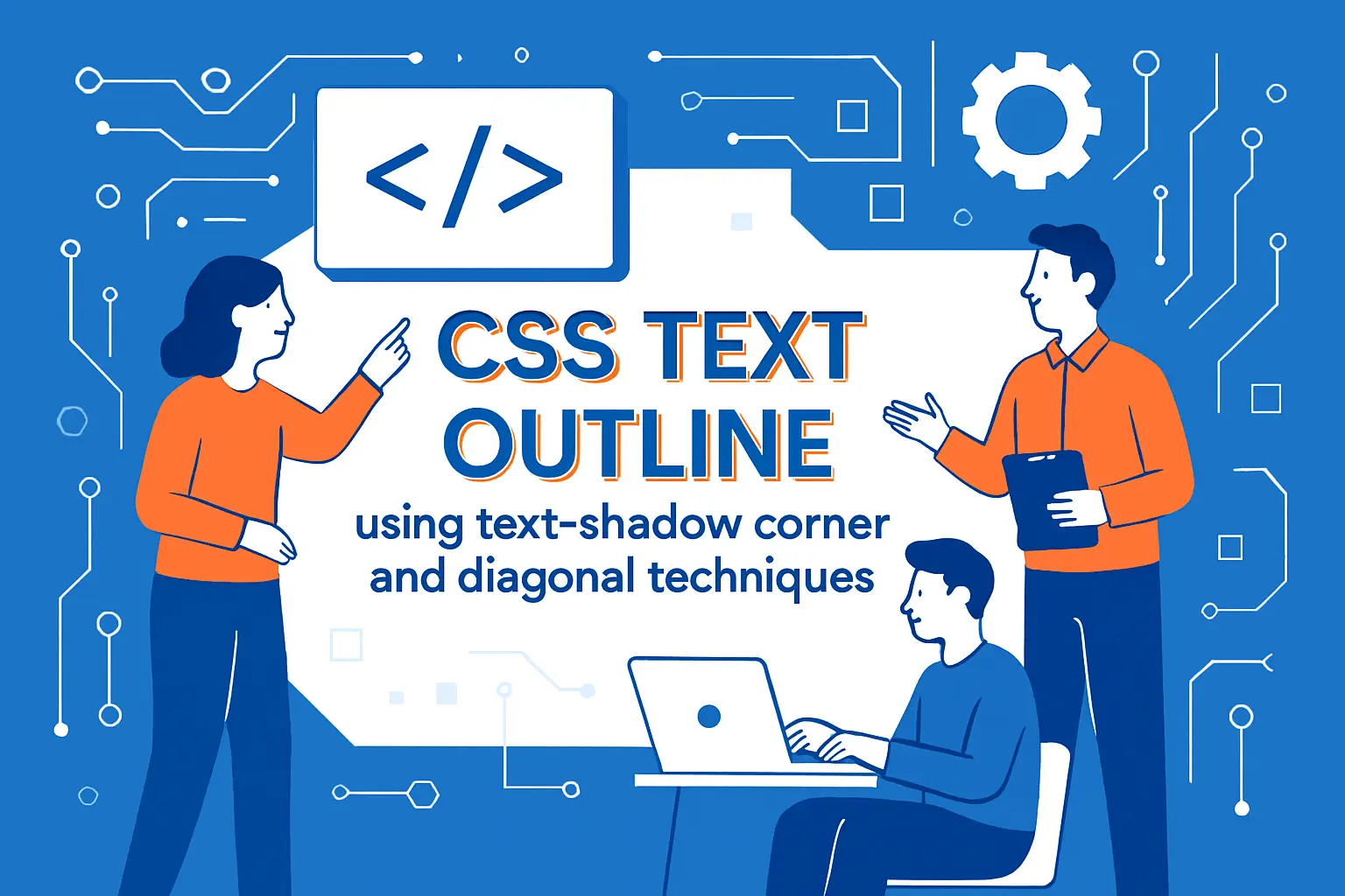
- CSS text outline using text-shadow corner and diagonal techniques
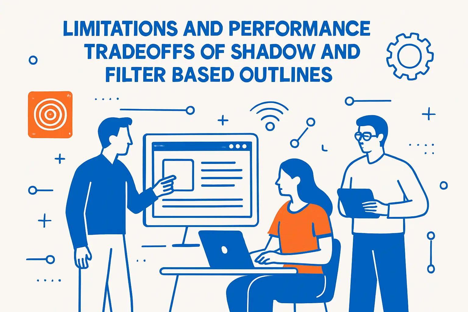
- Limitations and performance tradeoffs of shadow and filter based outlines
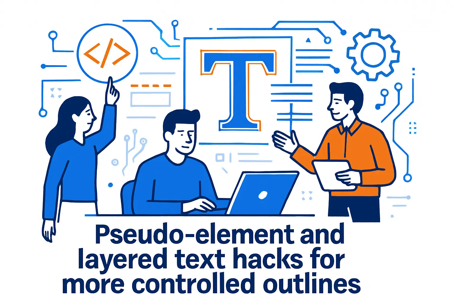
- Pseudo-element and layered text hacks for more controlled outlines
- SVG approaches for stroked text, advanced stroke styling, and accessibility
- 1Byte cloud computing and web hosting support for projects using css text outline
- Conclusion: choosing the right css text outline technique for your design and browser targets
At 1Byte, we spend our days living at the seam where typography meets infrastructure: landing pages that must stay readable during traffic spikes, product dashboards rendered on everything from high-DPI laptops to budget Android devices, and marketing hero sections that insist on placing a headline over a photo, a video, or a gradient that refuses to sit still. Outlined text—stroked letterforms with a distinct edge—is one of those deceptively “small” design decisions that can make a site feel premium, legible, and brand-consistent, or muddy, glitchy, and oddly cheap.
Because we’re a cloud computing and web hosting provider, we tend to evaluate front-end patterns with a backend mindset. Readability is conversion, conversion is revenue, and revenue is what keeps the lights on. In that context, even a typography technique becomes operational: it affects rendering cost, layout stability, cross-browser behavior, and long-term maintainability across teams.
Market reality reinforces that mindset. Gartner’s forecast that worldwide end-user spending on public cloud services would total $675.4 billion in 2024 is a reminder that modern websites are now “cloud-native products,” even when they look like simple brochures; the same competitive pressure that pushes workloads into the cloud also pushes design systems toward higher polish.
Outlined typography shows up everywhere once we start noticing it. Sports broadcasts rely on stroked score overlays so white text doesn’t dissolve into a bright jersey. Game UI frequently outlines quest labels so they remain readable over complex scenes. Brand teams love the “sticker” look for short, punchy headlines, and product teams love anything that increases legibility without redesigning every background.
Still, CSS text outlining is not one technique—it’s a toolbox with sharp edges. Some methods are crisp but non-standard. Others are compatible but approximate. SVG can be standards-based and powerful, yet it introduces its own accessibility and font-loading questions. In the sections below, we’ll lay out the tradeoffs the way we do internally at 1Byte: not as theory, but as a set of practical choices you can defend in a code review, a design critique, and a production incident postmortem.
CSS text outline basics: stroke and fill terminology vs the CSS outline property
1. Stroke and fill as the building blocks of outlined and stroked text
In typography tooling—Illustrator, Figma, even old-school print workflows—the mental model is straightforward: a letterform has a fill (the interior paint) and a stroke (the contour line drawn along its edge). When we say “outlined text,” we usually mean one of two visual outcomes: either (a) fill plus stroke (a colored interior with a contrasting edge), or (b) stroke-only (a hollow glyph that’s all border and no interior).
That vocabulary matters on the web because different rendering paths interpret it differently. SVG treats stroke and fill as first-class citizens; a single <text> node can carry both. HTML text, by contrast, is fundamentally “filled” via the color property, and anything that looks like a stroke is typically an effect layered around that fill—sometimes true stroking, sometimes an illusion.
From our side of the hosting aisle, this is where teams either gain leverage or lose time. Once everyone agrees on what “stroke” means, engineers can choose a technique that matches the design intent instead of chasing a near-miss: “It looks outlined, but the corners are chunky,” or “It’s crisp, but Firefox broke,” or “It passed QA, then the marketing team changed the background video and the headline vanished.”
2. Why outlined text helps readability on busy backgrounds
Readability is rarely a “pure CSS” problem; it’s a composition problem. When text sits on a busy background, the issue isn’t just contrast, but local contrast: a single word may span both bright and dark areas of an image, and our eyes can’t adapt per letter. Outlines help because they create a consistent edge contrast around every glyph, making the letter boundaries stable even when the interior sits over visual noise.
In practice, we see outlined headings used as a defensive design move during late-stage content changes. A campaign team swaps a hero image, the new image has unexpected highlights, and suddenly the previously readable headline fails. An outline technique—done well—absorbs those changes, allowing the design system to stay resilient under content churn.
Operationally, that resilience matters. On high-traffic pages, “small” redesigns often ship quickly, and quick shipping tends to amplify risk. Outlines can reduce the number of emergency tweaks a team needs to keep text readable across devices, which is a quiet win for both marketing velocity and engineering sleep.
3. CSS outline draws a line around elements outside borders, not around letterforms
The word “outline” is overloaded in CSS. The CSS outline property is not typographic stroking; it’s a box-level decoration. In fact, Outline is a line outside of the element’s border, which means it wraps the element’s box, not the shapes of the letters inside it.
That distinction is more than semantics. If we apply outline to a heading, we get a rectangle (or a border-radius-shaped perimeter), not a stroke around each glyph. If we apply it to a button, we may get a focus indicator—which is exactly what outline is often used for and why it’s tied to accessibility expectations.
At 1Byte, we treat CSS outline as sacred territory for interactivity. Removing focus outlines without a replacement is one of the fastest ways to ship an accessibility regression. So when a designer asks for “outlined text,” we push the team to be precise: do we mean a focus ring around a component, or a stroke around letterforms?
4. Outline shorthand parts: outline-width, outline-style, and outline-color
The CSS outline property is a shorthand that bundles width, style, and color. Even though it won’t outline glyphs, the pattern is still instructive: shorthand properties encode “do the obvious thing with fewer lines,” but the defaults can surprise us—especially when a missing style yields an invisible result.
We like to emphasize this in design system documentation because shorthand thinking carries over to text stroke approaches. If a team uses a vendor-prefixed text-stroke feature, they often assume reasonable defaults; sometimes they exist, sometimes they don’t, and the fallback behavior can be counterintuitive.
On the hosting side, we also notice a workflow detail: teams that separate focus outline styling from typographic effects end up with cleaner component APIs. The button gets focus styling; the heading gets typographic styling; neither steals responsibilities from the other. That separation reduces the odds of “mysterious outlines” showing up in one browser when a CSS reset shifts behavior.
Creating a css text outline with -webkit-text-stroke
1. What -webkit-text-stroke does and when it is a good fit
When we want a true, crisp stroke around HTML text, the most direct lever is specifies the width and color of strokes for text characters via -webkit-text-stroke. Despite the prefix, it has become a practical workhorse across modern browsers, and it produces the cleanest edges of the common CSS-first approaches.
As a fit, we like it for display typography: hero headlines, short labels, big numeric stats, and brand moments where the text is essentially a graphic. For body copy, it’s usually the wrong tool. Thin strokes can degrade at small sizes, and thick strokes can overwhelm counters (the enclosed spaces in letters like “o” and “e”), making paragraphs feel heavier or blurrier than intended.
In production, the biggest advantage is predictability. The stroke hugs the glyph outline instead of approximating it with shadows. That means fewer “why do the corners look stepped?” bug reports, and fewer per-font hacks when a team changes typefaces mid-quarter.
2. Shorthand and longhand options with -webkit-text-stroke-width and -webkit-text-stroke-color
The shorthand -webkit-text-stroke is convenient, but longhand properties are often clearer in design systems where tokens and overrides matter. For thickness, specifies the width of the stroke for text, and for color, specifies the stroke color of characters of text.
Longhand becomes especially useful when the stroke color is derived from theme context while the width is derived from typography scale. In a multi-brand platform, we might keep a consistent stroke thickness for a given heading size while swapping stroke color per theme. That’s harder to express cleanly if every usage collapses into a shorthand that mixes semantics.
Code structure is not just a style preference; it’s a maintenance strategy. When we host sites for teams with multiple contributors, the CSS that survives is the CSS that is legible under pressure. Longhand properties can be self-documenting in a way that reduces accidental regressions.
/* A token-friendly pattern */.hero-title { --stroke-w: 0.075em; color: var(--fill, #f8f8f8); -webkit-text-stroke-width: var(--stroke-w); -webkit-text-stroke-color: var(--stroke, #101010);}3. Syntax fundamentals: width and color values plus global values
The syntax is intentionally simple: a stroke width plus a stroke color, with the ability to inherit or reset like other CSS properties. Where teams stumble is not the grammar, but the interaction with the rest of the cascade. If a component sets stroke properties high in the tree and a nested element changes color, some browsers treat the “current color” relationship differently than designers expect.
From our perspective, the best practice is explicitness: set fill color, stroke color, and stroke width in the same rule block when the effect is central to the design. Then, treat overrides as first-class API—custom properties, component variants, or theme layers—rather than ad hoc local fixes.
We also encourage teams to test different font rendering modes. Variable fonts, hinting differences, and platform rasterizers can subtly shift how a stroke looks. The technique is stable, but typography is a living system, and live systems deserve test coverage.
4. Non-standard status and practical browser support considerations
Despite its popularity, -webkit-text-stroke carries a vendor prefix for a reason: it sits in the world of compatibility features rather than clean standards. MDN’s overview of WebKit (-webkit-) vendor-prefixed CSS extensions is a good reminder that “widely implemented” is not the same as “standardized.”
In our deployment checklists, we treat prefixed features like we treat beta infrastructure flags: useful, sometimes necessary, but always deserving of fallbacks. The good news is that real-world support is strong; Can I use reports 96.35% global usage for CSS text-stroke and text-fill support, which is enough for many commercial projects to ship confidently.
Even with strong support, we still recommend feature detection for critical UI text. If the outline is decorative, failure is acceptable. If the outline is carrying readability, failure becomes a usability incident, and that is where engineering discipline pays for itself.
Fill color, transparency, and fallbacks for text stroke
1. Transparent fill use cases and why thick strokes can swallow the fill
Stroke-only text is seductive: it looks like signage, stickers, or a comic-book caption. Designers often ask for transparent fill to let backgrounds show through the interior of letters. The trap is geometric: strokes are drawn along the glyph outline, and a sufficiently thick stroke can intrude into the interior space, collapsing thin strokes inside the font and visually “filling in” what was meant to be hollow.
In brand-heavy headings, that risk is manageable because the text is large and the font choice can be tuned. In compact UI labels, it becomes ugly fast. A hollow “e” turns into a blob. A thin “s” loses its internal rhythm. At that point, the technique is no longer decorative; it’s destructive.
We’ve learned to frame this as a typography constraint rather than a CSS constraint. If the stroke must be thick, choose a font with generous counters and sturdier letterforms, or accept that the fill can’t be fully transparent without sacrificing legibility.
2. Keeping text visible in unsupported browsers with a color fallback
The simplest fallback strategy is surprisingly effective: set color first, then apply the stroke effect. If the browser ignores the stroke properties, users still see readable text. If the browser supports them, the text becomes outlined.
When we want to be more deliberate, we wrap the stroke rules inside @supports. That allows us to pair a baseline design with an enhanced design, rather than hoping the cascade sorts it out. The fallback stays intentional, and the upgraded rendering stays scoped.
.headline { color: #ffffff; /* baseline: readable */}@supports (-webkit-text-stroke: 0.08em #111111) { .headline { -webkit-text-stroke: 0.08em #111111; }}In our experience, this pattern reduces cross-browser QA time because it turns “unsupported” into “designed-for,” which is a much calmer place to be.
3. Using -webkit-text-fill-color to set fill while retaining a fallback color
Sometimes we want a different fill than the normal color would imply, yet we still want color to exist as a fallback in case the fill/stroke system isn’t honored. That’s where specifies the fill color of characters of text via -webkit-text-fill-color becomes useful.
The mental model we recommend is: treat color as the guaranteed baseline, then layer -webkit-text-fill-color for browsers that support it. This lets a team ship “outlined and filled” typography without making the fallback unexpectedly transparent or mismatched.
.badge-title { color: #0b1020; /* fallback fill */ -webkit-text-fill-color: #f4f6ff; -webkit-text-stroke: 0.06em #0b1020;}For marketing pages, that separation can prevent a very real failure mode: a headline that goes invisible when a fill is set to transparent but the stroke doesn’t render.
4. Using paint-order to place stroke under fill and the risk of inconsistent support
In ideal stroked typography, we often want stroke behind fill. That keeps the interior color clean and prevents the stroke from visually “eating” the letter edges. SVG has long offered paint ordering, and CSS is catching up; MDN notes that paint-order lets you control the order in which the fill and stroke (and painting markers) of text content and shapes are drawn.
In a pure HTML context, support and behavior can be uneven depending on the browser’s text rendering pipeline. Our rule of thumb is pragmatic: treat paint-order as an enhancement, not a dependency, unless the entire text is already in SVG. If the design is acceptable with stroke-on-top, ship it; if it is unacceptable, consider moving the specific asset to SVG rather than relying on paint-order to rescue the look everywhere.
We also advise teams to document the intended stacking order in the design system itself. The most expensive bugs are the ones where designers and engineers disagree on which layer is “supposed to win,” and no one wrote it down.
CSS text outline using text-shadow corner and diagonal techniques
1. Four-shadow outline pattern for a fast stroked look
When -webkit-text-stroke isn’t an option—or when we want a broadly compatible approximation—text shadows can simulate an outline by placing crisp copies of the text in multiple directions. MDN summarizes the core mechanism: The text-shadow CSS property adds shadows to text, and multiple shadows can be layered as a comma-separated list.
The canonical “fast outline” uses four shadows: left, right, up, and down. It’s not perfect, but it is shockingly effective for short UI strings and headings that need a readability bump. In our production work, it often serves as the “default safe” technique: it degrades gracefully, it’s easy to reason about, and it doesn’t require prefixed properties.
.shadow-outline { --o: 0.09em; --c: #0d0f14; text-shadow: var(--o) 0 var(--c), calc(-1 * var(--o)) 0 var(--c), 0 var(--o) var(--c), 0 calc(-1 * var(--o)) var(--c);}Notice what we’re doing here: we push the “magic number” into a variable. That keeps the outline thickness adjustable without rewriting a brittle list of offsets.
2. Adding diagonal shadows for smoother corners and fewer visible steps
Four shadows leave corner gaps because no diagonal pixels are covered. The next refinement is adding diagonals: top-left, top-right, bottom-left, bottom-right. This fills the corners and reduces the “plus sign” look that the four-shadow pattern can create.
In design systems, we like to treat diagonal shadows as a quality tier. The four-shadow pattern is “minimum viable outline.” The diagonal-enhanced pattern is “headline-grade outline.” That language helps teams choose intentionally rather than accidentally shipping jagged corners because no one remembered the diagonals.
.shadow-outline--diagonal { --o: 0.07em; --c: #0b0b10; text-shadow: var(--o) 0 var(--c), calc(-1 * var(--o)) 0 var(--c), 0 var(--o) var(--c), 0 calc(-1 * var(--o)) var(--c), var(--o) var(--o) var(--c), calc(-1 * var(--o)) var(--o) var(--c), var(--o) calc(-1 * var(--o)) var(--c), calc(-1 * var(--o)) calc(-1 * var(--o)) var(--c);}Is it more verbose? Absolutely. Does it look better for most fonts? In our eyes, yes—especially on mid-weight sans-serif typefaces where corner artifacts are otherwise obvious.
3. Using blur radius for softer outlines and glow-like effects
Not every outline should be crisp. Sometimes we want a soft halo, a neon glow, or a gentle separation that feels less “sticker” and more “atmospheric.” Adding blur to text-shadow can produce that, especially when the fill remains high-contrast and the glow is used as a secondary readability aid.
We prefer to separate “outline” from “glow” in our naming. An outline implies a defined edge; a glow implies diffusion. That naming prevents a common design-system mistake: a “stroke” token that quietly becomes a “glow” token, then gets reused in contexts where diffusion makes the text look out of focus.
.shadow-glow { --g: 0.12em; --c: rgba(0, 0, 0, 0.55); text-shadow: 0 0 var(--g) var(--c);}When we host pages that use glow effects heavily, we also ask teams to test on lower-end GPUs. Soft shadows can be cheap—or surprisingly costly—depending on how many elements are glowing at once.
4. Scaling shadow offsets with em values for font-size friendly outlines
Pixel-based offsets can look fine at one font size and wrong at another. A shadow that feels like a tasteful outline at a large heading size can become a chunky mess at smaller sizes. Using em-scaled offsets ties the outline thickness to the font size, which generally tracks how our eyes perceive weight.
In responsive layouts, we see this pay off immediately. A headline might scale via clamp-based sizing, and em-scaled outlines scale along with it without requiring breakpoint-specific overrides. That’s exactly the kind of “less CSS, fewer bugs” outcome we like to enable for teams.
There is, however, a practical warning: em scaling also scales the cost. A huge headline with a multi-shadow outline can become a heavy paint operation on scroll or animation. Our advice is to keep outlined text largely static, and to avoid animating shadow-heavy headlines when possible.
Limitations and performance tradeoffs of shadow and filter based outlines
1. Discontinuous corners and gaps when shadow offsets exceed 1px
Text-shadow outlines are fundamentally a sampling trick. Each shadow is a copy displaced by a certain offset, and the outline is the union of those copies. When offsets get large, discontinuities appear: corners look stepped, diagonal edges show gaps, and the illusion stops feeling like a stroke and starts feeling like eight separate shadows.
Even at small offsets, the issue can show up depending on font rasterization. Some fonts have sharp corners, others have softer curves, and the shadow union can emphasize quirks in glyph geometry. In other words, the same CSS can look “perfect” in one typeface and “cheap” in another.
We handle this in practice by defining per-typeface outline recipes in the design system. It feels like extra work until the day a brand refresh swaps fonts and every outlined heading breaks at once.
2. Thicker strokes require many more shadows and can render poorly
Thick outlines using text-shadow often demand many shadows—sometimes dozens—if we want something close to a true stroke. That’s where the approach collapses under its own verbosity. The CSS becomes unreadable, designers keep changing the thickness, and engineers dread touching it because one wrong comma breaks the whole thing.
Rendering can also degrade in subtle ways. More shadows can mean muddier edges, especially when the browser anti-aliases each layer slightly differently. The result is a stroke that looks “furry” rather than crisp, and that fuzziness is more visible on high-contrast combinations like white fill on black outline.
From our operational view, thick shadow-outlines are a red flag. If a design truly needs a thick stroke, we tend to steer teams toward -webkit-text-stroke or SVG rather than building a fragile tower of shadows.
3. Why generating many shadows can become cumbersome and error-prone
There’s a tooling temptation here: “We’ll just generate it.” Teams write a script, a Sass mixin, or a build-step helper that outputs a ring of shadows around the text. That can work, but it introduces an indirection cost: the CSS you ship is no longer the CSS you read.
In our experience, indirection is fine when it’s standardized. It becomes painful when it’s bespoke. One project’s generator differs from another’s, the next engineer can’t reproduce the output, and the technique becomes tribal knowledge.
Our preference is boring on purpose: if the outline requires more than the diagonal pattern, it’s often time to change methods. The web rewards simplicity, and the debugging bill for complex shadow generators arrives eventually.
4. Filters and drop-shadow considerations including computational cost
CSS filters and SVG filters can produce outline-like effects too, especially with drop-shadow() or morphology-based filter tricks. The upside is expressiveness; the downside is that filters often trigger offscreen rendering and compositing work that is more expensive than a simple paint.
On animated or scrolling pages, filter-heavy typography can contribute to jank. Users feel that as “the site is heavy,” even if the network is fast and the servers are healthy. That kind of performance perception is brutal because it’s hard to attribute; it just feels like low quality.
When we host projects that rely on filter-based typography, we recommend performance budgets and real-device testing. Desktop emulation is not enough, and “it’s fine on my machine” is not a strategy we can defend when a campaign page goes viral.
Pseudo-element and layered text hacks for more controlled outlines
1. Outside-aligned outline illusion using a surrogate pseudo-element under the text
One of the cleverer hacks is layering: render the text twice, once as the “stroke layer” behind, once as the “fill layer” on top. With pseudo-elements, we can position a duplicate under the main text and apply stroke-like styling to the duplicate.
This is attractive because it offers control over alignment. True strokes are centered on the glyph edge; a layered surrogate can be biased outward by slightly increasing its size or using transforms, creating the illusion of an outside-aligned stroke that doesn’t intrude as much into counters.
We do treat this as a “power tool.” It can solve real design problems, but it also introduces duplication and complexity that can backfire when content becomes dynamic.
2. Duplicating text content via data attributes with content attr
To duplicate text with CSS, teams often store the string in a data attribute and use content: attr(data-text) on a pseudo-element. The primary risk is obvious: the text exists twice, and the two sources can drift.
Localization makes that drift more likely. CMS pipelines make it more likely. A/B testing makes it almost inevitable unless the pattern is wrapped in a component abstraction that enforces consistency.
.layered { position: relative; color: #f7f7ff;}.layered::before { content: attr(data-text); position: absolute; inset: 0; z-index: -1; -webkit-text-stroke: 0.1em #111111;}When we see teams adopt this, we recommend treating it as a component-level concern rather than a page-level trick. If it’s going to exist, it should exist in one place, tested once, and reused consistently.
3. Layering techniques with positioning and z-index to separate stroke and fill
Layering also opens the door to mix-and-match techniques. The bottom layer could use -webkit-text-stroke while the top layer uses normal fill. Alternatively, the bottom layer could use a heavy multi-shadow outline while the top layer remains plain text for maximum compatibility.
From a design-system standpoint, we like this because it decouples concerns: one layer is responsible for edge contrast, the other for typographic color. It becomes easier to adjust readability without changing the perceived brand color of the fill.
There is a cost, though: the DOM becomes more complex, and text selection can feel odd depending on how the layers are constructed. We encourage teams to test selection, copy/paste, and screen-reader output, because a visual win that harms interaction can be a net loss.
4. Stroke width behavior and why the visible outline can be half the declared value
Designers sometimes expect stroke thickness to behave like a border added outward. Many stroke systems, however, draw the stroke centered on the glyph outline. That means half of the stroke goes outward and half goes inward, reducing the interior space and making the visible “outside outline” feel thinner than the declared width.
Layering tricks can counteract that perception by moving the “stroke layer” behind and slightly scaling it. Yet scaling introduces its own typographic distortions: stems can look too bold, and the outline can drift away from the fill at sharp corners.
Our recommendation is to treat stroke thickness as a typographic parameter, not a simple measurement. The declared width is only the beginning; the font’s geometry and the renderer’s anti-aliasing decide what the human eye actually experiences.
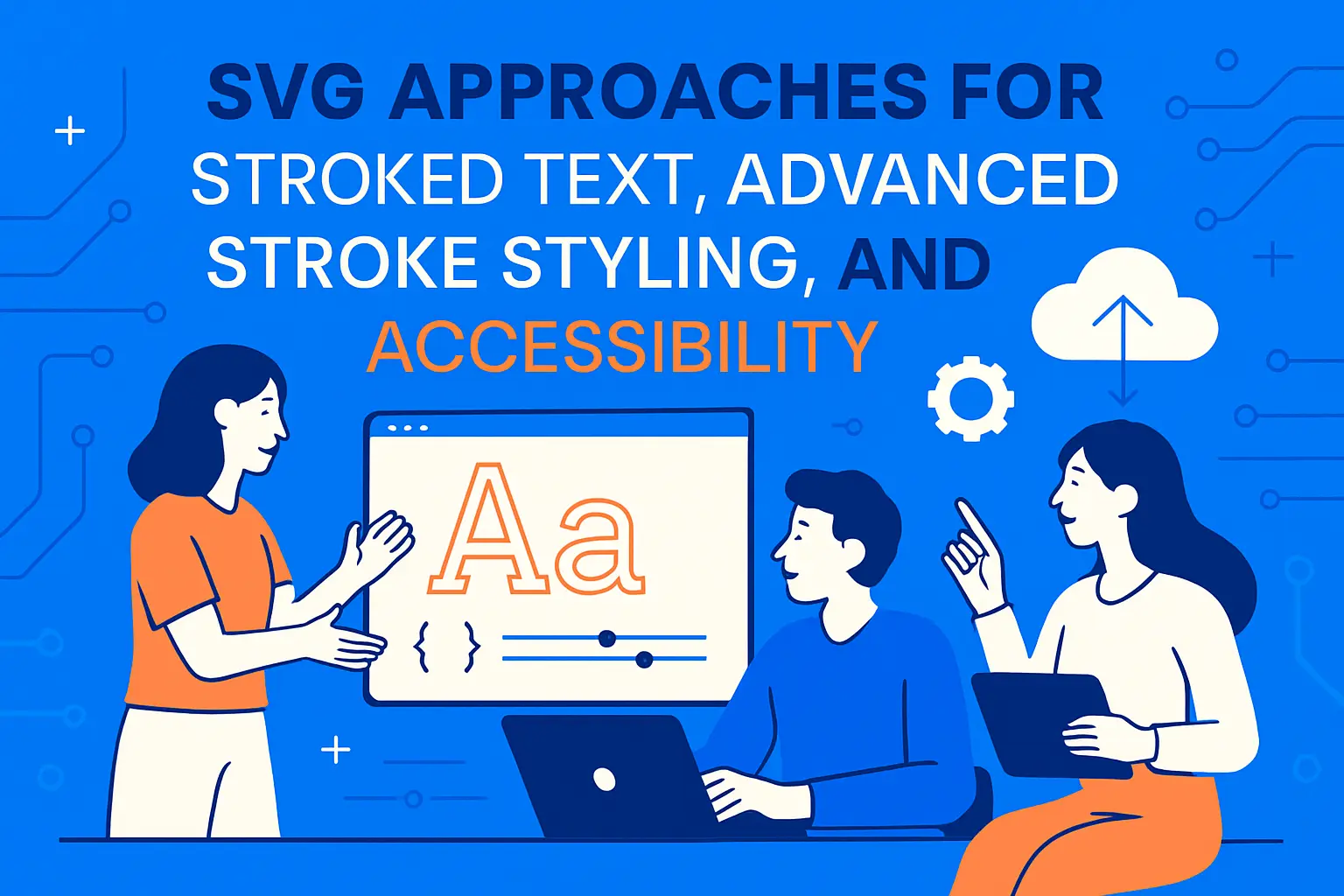
SVG approaches for stroked text, advanced stroke styling, and accessibility
1. SVG text attributes for stroke, stroke-width, and fill
When teams need standards-based stroke control, SVG is often the cleanest answer. MDN notes that the draws a graphics element consisting of text element can be styled like other SVG graphics, including applying fill and stroke directly to the glyph shapes.
The advantage is conceptual purity: stroke is stroke, fill is fill, and the browser’s SVG renderer is built for this. We can specify stroke joins, stroke miter limits, dash patterns, and paint order with fewer hacks than HTML-based approaches typically require.
<svg xmlns="http://www.w3.org/2000/svg" viewBox="0 0 900 180" role="img"> <text x="40" y="120" fill="#ffffff" stroke="#101018" stroke-width="10" paint-order="stroke"> Outlined Title </text></svg>In our opinion, SVG text becomes especially compelling when the headline is essentially a logo element, and crisp consistency matters more than editable HTML flow.
2. Text converted to path and the font loading tradeoff
Converting text to paths is the “no surprises” option: the exact glyph shapes ship as vector outlines, eliminating font substitution issues. Branding teams love this because it looks the same everywhere. Engineering teams often dislike it because it’s no longer text; it’s geometry.
Font loading is the hidden tradeoff. SVG text that relies on a web font inherits the same performance and flash-of-unstyled-text issues as HTML. Path-based text avoids that, but it increases asset complexity and can bloat the markup for long strings. Editing becomes a design-tool task, not a CMS task.
At 1Byte, we usually reserve path conversion for short, high-value strings: a product wordmark, a campaign lockup, or a hero headline that must be pixel-perfect. For anything that changes frequently, we prefer SVG text or HTML text with a stroke technique plus fallbacks.
3. Accessibility: adding aria-label when SVG text content is not readable by assistive tech
SVG introduces accessibility nuances that teams can miss. If SVG is used as an image-like element, assistive technologies may not interpret inner text the way we expect, especially when the SVG is embedded in ways that isolate it from the document’s semantic flow.
A practical mitigation is explicit labeling. MDN describes that aria-label defines a string value that can be used to name an element, which can help when the visual text is present but the accessible name isn’t reliable.
We also recommend pairing labeling with visible redundancy when possible. If the outlined SVG headline is purely decorative, keep a real HTML heading in the DOM for semantics and SEO. If the SVG headline is the actual content, ensure it has a robust accessible name and is tested with screen readers rather than assumed “probably fine.”
4. SVG filters for outlines: black-only and colored outlines with feMorphology, feFlood, feComposite, and feMerge
SVG filters allow outline effects even when we can’t or don’t want to rely on stroke. The core idea is to “grow” the alpha of the text, color that grown shape, then composite the original fill on top. The primitives are well suited: used to erode or dilate the input image, fills the filter subregion with the color and opacity defined by flood-color and flood-opacity, performs the combination of two input images pixel-wise, and allows filter effects to be applied concurrently instead of sequentially.
In practice, we can build a “colored outline behind text” filter like this:
<svg xmlns="http://www.w3.org/2000/svg" width="0" height="0" aria-hidden="true"> <filter id="textOutline"> <feMorphology in="SourceAlpha" operator="dilate" radius="2" result="grown"/> <feFlood flood-color="#000000" result="ink"/> <feComposite in="ink" in2="grown" operator="in" result="outline"/> <feMerge> <feMergeNode in="outline"/> <feMergeNode in="SourceGraphic"/> </feMerge> </filter></svg><h2 style="filter:url(#textOutline); color:#ffffff;">Filter-Outlining</h2>Filters are powerful, but we treat them as a premium technique: great for hero moments, risky for large volumes of text. The more we filter, the more we should measure.
1Byte cloud computing and web hosting support for projects using css text outline

1. Domain registration and SSL certificates to launch and secure web projects
Outlined typography is often part of a launch: a rebrand, a campaign, a new product. Before any of that matters, the site must resolve, load securely, and behave consistently across environments. That’s where we come in.
At 1Byte, we think of domains and SSL as the “transport layer” of design credibility. A headline can be beautifully stroked, but if the browser warns about security—or if mixed content blocks assets—the perceived quality collapses. When teams set up domains and certificates early, they remove an entire class of last-minute fire drills that derail front-end polish.
We also encourage staging environments that mirror production TLS behavior. Typography effects can depend on font delivery, and font delivery depends on correct caching headers and secure loading. Getting the foundation right makes the fancy parts safer to ship.
2. WordPress hosting and shared hosting for fast site publishing and iteration
Not every project needs a complex cloud architecture. Many marketing sites and editorial properties live in WordPress, and speed of iteration matters more than architectural novelty. In those environments, outlined text techniques are often used by theme developers and page builders who want a strong visual hook without editing images for every headline.
From our angle, the key is to keep those techniques maintainable. A WordPress site can accumulate CSS quickly, especially when plugins inject their own styling. We like to help teams centralize outline utilities—one class for text-stroke, one for shadow-outline, one for SVG headline blocks—so the site doesn’t become a museum of one-off hacks.
When the site’s hosting is stable and the deployment process is smooth, teams can actually afford to test. That sounds mundane, but it’s the difference between “we shipped outlined headings everywhere” and “we shipped it on the homepage and prayed.”
3. Cloud hosting and cloud servers backed by our AWS Partner capabilities
For product teams, the typography story is inseparable from the delivery story. Outlined text tends to show up in high-visibility UI: onboarding screens, dashboards, and branded experiences. Those are also the parts of the product most likely to be A/B tested, personalized, and served globally.
With 1Byte cloud hosting and cloud servers—supported by our AWS Partner capabilities—we help teams build environments where performance and correctness are repeatable. That includes caching strategies for font files, predictable rollouts for CSS changes, and the ability to test browser variations without turning QA into a manual nightmare.
Just as importantly, we push a culture of progressive enhancement. If a project chooses -webkit-text-stroke, we help make sure the fallback is deliberate. If a project chooses SVG for standards-based control, we help ensure that accessibility labeling and rendering tests are part of the release checklist. In our world, good typography is not only how a site looks; it’s how reliably it behaves under real user conditions.
Conclusion: choosing the right css text outline technique for your design and browser targets
1. Prefer -webkit-text-stroke when supported and crisp edges are required
If we need crisp, glyph-true strokes on HTML text, -webkit-text-stroke is usually our first choice. It matches the designer’s mental model of stroke and fill more closely than shadow tricks, and it tends to look professional with fewer layers of CSS.
Still, we treat it like any compatibility feature: ship it with a fallback, document the intended look, and test the edge cases—especially small sizes, thin fonts, and unusual letterforms. A stroke that looks gorgeous on a wordmark can look awkward on a sentence.
2. Use text-shadow methods for broad compatibility and quick readability gains
When compatibility is the priority, text-shadow outlines remain a pragmatic option. They’re easy to deploy, easy to revert, and often “good enough” for UI labels and headlines that just need separation from a background image.
In our playbook, shadows are the fast, safe lever: great for incremental improvements and constrained environments. As long as teams respect the limitations—corner artifacts, scaling behavior, and the temptation to generate absurd shadow lists—they can deliver tangible readability benefits quickly.
3. Adopt SVG when standards-based stroke control and accessibility are priorities
For standards-based control, advanced styling, and robust stroke behavior, SVG is hard to beat. It also unlocks filter techniques that can produce distinctive brand effects without resorting to fragile CSS illusions.
The price is complexity: accessibility labeling, font-loading decisions, and the need to ensure the SVG integrates cleanly with the rest of the document. When those concerns are handled well, SVG becomes a long-term asset rather than a one-off trick.
So what are we optimizing for in your project: the crispest possible edges, the broadest compatibility, or the most standards-forward control—and what would it look like to prototype two approaches this week, then choose with real browser evidence instead of guesswork?